North star · Keep the page mostly white and let oversized dark type, real product previews, and precise orange accents carry the story.
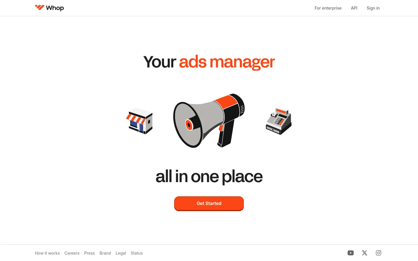
Whop builds its visual identity around a clean white canvas, using black and charcoal typography for structure and a concentrated vivid orange for emphasis. The header is restrained, while the centered hero stages large display text, playful business-themed illustrations, a compact CTA, and ample surrounding whitespace. Lower sections shift between a left-aligned business statistic with a live activity card, a centered row of diverse product previews, and a developer-focused embed showcase. The orange full-width CTA band creates the page’s strongest visual break before a quiet multi-column footer. Acid Grotesk gives display headlines a distinctive, tightly tracked shape; Inter handles interface text and supporting copy. The overall layout is spacious but purposeful, with repeated CTA buttons and section transitions guiding the scroll. Product imagery is treated as contained previews rather than decorative backgrounds, so the typography and orange accents remain the dominant brand signals.
Navigation, body copy, buttons, captions, and supporting interface text.
Aa 设计
Acid Grotesk
网络字体 · 字重 500 / 700 · 占比 9%
免费替代:Space Grotesk
Display headline and primary hero heading.
角色
示例
字号
字重
行高
字距
特大标题
Oversized brand or campaign display headlines where present.
Whop
128px
700
1
-0.03em
一级标题
Primary hero and major section headlines.
Whop
56px
500
1
-0.03em
二级标题
Supporting section headings and prominent explanatory copy.
The quick brown fox 敏捷的狐狸
20px
400
1.4
-0.009em
正文
General explanatory text, navigation details, and feature copy.
The quick brown fox 敏捷的狐狸
14px
500
1.7
0
辅助文字
Compact labels, preview metadata, and footer details.
The quick brown fox 敏捷的狐狸
13px
400
1.4
-0.014em
按钮
CTA labels and concise action text.
The quick brown fox 敏捷的狐狸
14px
500
1.43
-0.006em
间距与布局
基准单位 8px · 密度:适中
64px版块间距
24px元素间距
—卡片内边距
1200px内容最大宽度
4px
8px
10px
12px
16px
24px
32px
40px
64px
80px
160px
Use a centered content frame with a measured maximum width of 1200px, while allowing the orange CTA section to run full bleed. The opening hero is centered and unusually spacious; later content alternates between a left-aligned statistic-and-card split and centered product or developer showcases. Keep section gaps generous, with comfortable rather than dense content grouping. Align the footer columns to the left and maintain a clear hierarchy between its headings and link lists. The overall page is a vertical sequence of distinct blocks, not a tightly packed dashboard.
圆角与层次
按钮 · 8px
卡片 · 24px
hairline · other, card
Favor flat white sections and fine gray borders over ambient shadows. Cards read as contained product surfaces with rounded corners and restrained outlines. The primary orange CTA may use a distinct darker lower edge, producing a compact, tactile button effect. Avoid layering decorative shadows across the page.
组件
下面的预览按实测的按钮、输入框、徽标、卡片样式重建(字体用替代字体)。
Header navigation
A slim white header with the Whop mark at left and understated enterprise, API, and sign-in links at right; a subtle bottom divider separates it from the page.
Hero composition
Centered display headline with orange-highlighted wording, a row of business illustrations, a second dark headline, and a compact orange Get Started CTA.
Primary CTA button
Orange filled button with white label, rounded corners, and a darker orange lower edge; repeat at key conversion points.
Business proof block
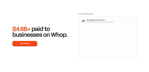
Large monetary proof statement on the left, paired with a bordered live-activity card on the right.
Creation preview cards
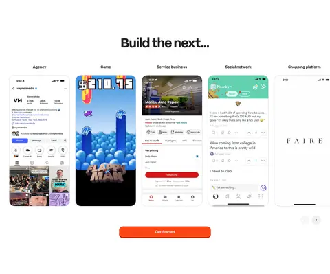
Pale cards with subtle gray borders and rounded corners, each representing a business type or AI creation entry point.
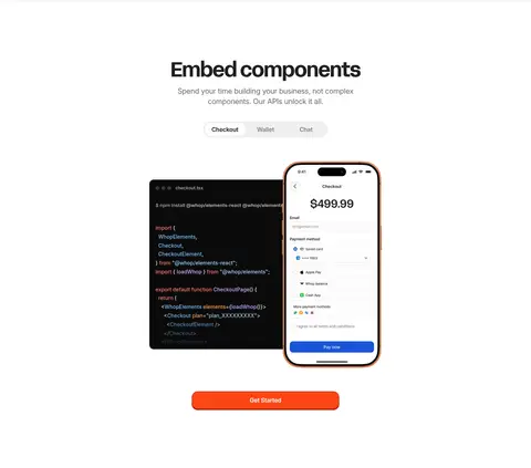
Embed showcase
A centered product explanation supported by tab-like controls, dark code imagery, and a phone checkout preview.
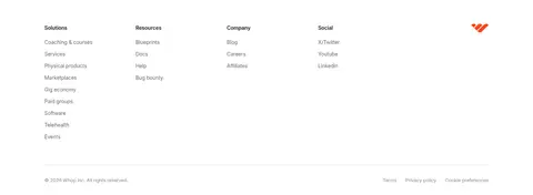
Footer link columns
Quiet white footer with grouped link lists, small headings, brand mark, and low-contrast legal details.
Imagery · Use crisp product screenshots, mobile interface previews, and business-themed illustrated objects rather than lifestyle photography. The hero’s storefront, megaphone, and checkout imagery sits in a loose horizontal arrangement between large headline lines. Product mockups are displayed as contained vertical previews, while the developer section pairs a dark code panel with a phone checkout screen. Keep media centered, cleanly framed, and subordinate to the whitespace around it.
Reserve Whop Orange for key emphasis and conversion actions.
Use Acid Grotesk for display headlines and Inter for utility text.
Give major sections generous whitespace.
Show product previews as contained, readable interface imagery.
Use subtle gray hairlines to separate cards and footer areas.
✕ 不该做
Do not turn the page into a dark interface.
Do not spread orange across large areas except the closing CTA band.
Do not crowd the hero with extra copy or controls.
Do not replace product previews with generic stock photography.
Do not add gradients or ambient shadows without evidence.
Do not make the footer visually louder than the main content.
给 AI 的提示词
想快速出一个同风格的新页面,把这段话连同 DESIGN.md 一起发给 AI。
Build a new Whop-style business platform page on a Gallery White (#ffffff) canvas. Use Near Black (#202020) for headings and core copy, with Acid Grotesk-like bold, tightly tracked display headlines and Inter for navigation, body text, captions, and controls. Apply Whop Orange (#fa4616) selectively to highlighted words, prominent CTA buttons, and—if the page needs a closing conversion moment—a full-width CTA band. Keep the layout spacious and centered within the measured 1200px maximum width, with a centered hero, clear alternating content blocks, and a restrained multi-column footer. Present business illustrations and interface previews as clean, contained media. Use Soft Concrete (#f0f0f0) card surfaces with Card Hairline (#d9d9d9) outlines, minimal elevation, and no ornamental gradients. Maintain strong contrast and a clear scroll rhythm.