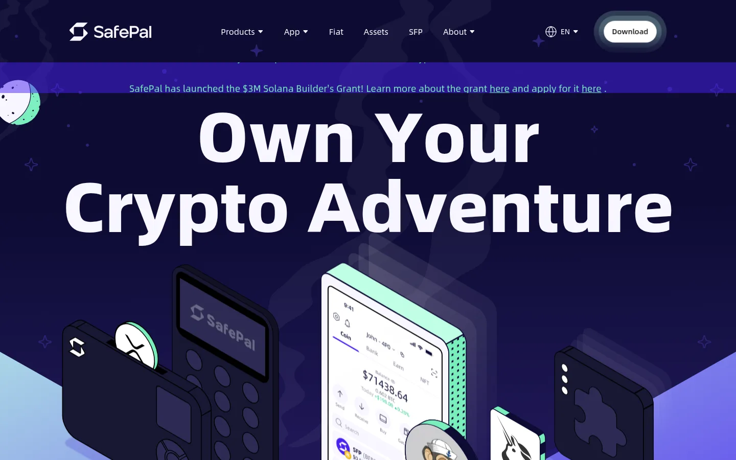
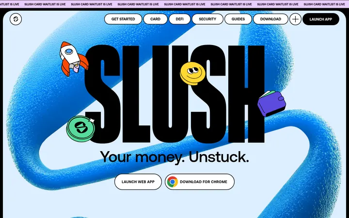
North star · Build a vivid crypto product journey by alternating deep-space illustration with bold violet bands, keeping mint actions and oversized white headlines unmistakable.
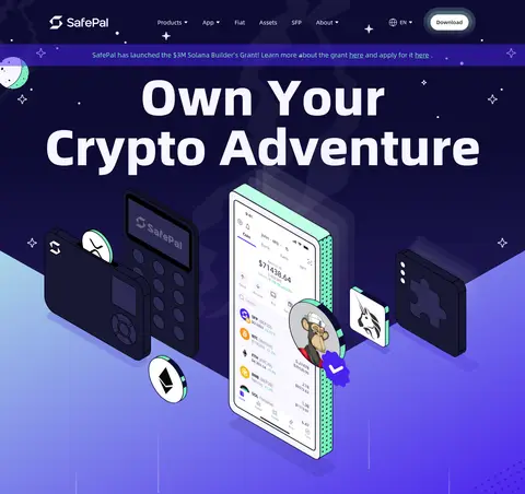
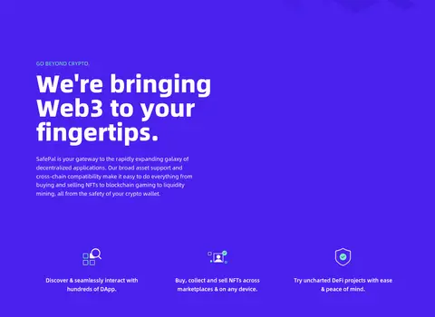
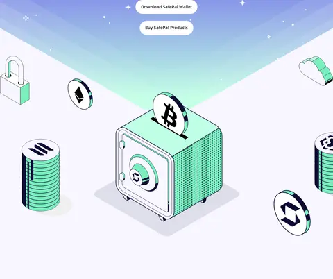
The page alternates between dark, star-speckled product scenes and saturated violet content bands, with white and near-white surfaces reserved for contrast and the large safe illustration. The measured palette’s #4a21ef is the defining section colour; #0d0b33 and #1d1d1d provide the inky depth seen in the hero and feature panel. Mint #79efbd highlights actions and small emphasis, while #bfffe4 appears as part of the soft mint-to-violet gradient treatment. AlibabaPuHuiTi-2 drives the full hierarchy: exceptionally heavy, large display headings contrast with readable regular-weight copy. The layout is spacious and modular, moving from a centered hero into three wallet choices, partner marks, feature areas, and a final download call to action. Product imagery is primarily bespoke 3D illustration rather than conventional photography, with devices and crypto symbols floating against decorative space motifs. Rounded buttons and cards soften the bold, high-contrast composition.
Site-wide display, headings, body copy, navigation, links, and buttons.
角色
示例
字号
字重
行高
字距
特大标题
Oversized hero and feature display headlines.
SafePal
137px
1000
1
0
一级标题
Primary hero headline and major page title.
SafePal
80px
1000
1
0
二级标题
Section headings such as product and feature introductions.
SafePal
48px
900
1
0
三级标题
Wallet card titles and smaller feature headings.
SafePal
32px
800
1
0
四级标题
Compact strong headings in cards and footer groups.
The quick brown fox 敏捷的狐狸
24px
900
1.6
0
正文
Product explanations and supporting feature copy.
The quick brown fox 敏捷的狐狸
18px
400
1.6
0
辅助文字
Small labels, eyebrow text, and secondary descriptions.
The quick brown fox 敏捷的狐狸
16px
400
1.6
0
按钮
Download and product-purchase action labels.
The quick brown fox 敏捷的狐狸
18px
700
1.6
0
导航
Header navigation and footer navigation links.
The quick brown fox 敏捷的狐狸
16px
400
1.56
0
链接
Inline calls to action and text links.
The quick brown fox 敏捷的狐狸
18px
400
1.2
0
间距与布局
基准单位 4px · 密度:宽松
100px版块间距
20px元素间距
53px卡片内边距
1200px内容最大宽度
4px
10px
12px
13px
16px
20px
24px
30px
36px
39px
43px
48px
50px
53px
90px
120px
A spacious, vertically sequenced page uses a centered hero, a three-column wallet selection area, wide partner strip, split feature content, and broad conversion sections. The measured maximum content width is 1200px, with a 100px section gap and a 20px element gap. Align large headings centrally for the opening and selected conversion blocks, while feature copy and footer groups use left alignment. The overall density is spacious, with generous breathing room around media and text.
圆角与层次
按钮 · 9999px
卡片 · 24px
导航 · 9999px
没有测到阴影:页面是扁平的,层次靠底色和描边区分。
The measured interface has no prominent shadows, so rely on colour blocks and illustration layering instead of generic drop shadows. Cards use a pale #f7f6ff surface with a measured 24px radius; pill buttons and navigation use fully rounded ends. Decorative stars, gradients, and overlapping devices create depth without adding heavy borders.
组件
下面的预览按实测的按钮、输入框、徽标、卡片样式重建(字体用替代字体)。
Pill action
Fully rounded button shape; primary Learn More uses #79efbd with #0d0b33 text. Download variants may be outlined in #f7f6ff or appear as dark text on a light face.
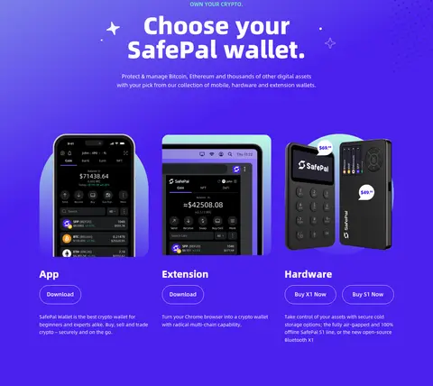
Wallet choice card
Three-column App, Extension, and Hardware product choices with device imagery, concise copy, and download or purchase actions.
Pale content card
Measured #f7f6ff card with #1d1d1d text, a 24px radius, and generous internal padding.
Partner strip
A compact, full-width violet band with a small centered label and a horizontal row of partner marks.
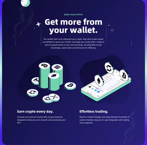
Illustrated feature panel
Dark, rounded feature surface combining centered headline copy with paired crypto illustrations and lower explanatory text.
Space-themed CTA
Centered white headline and mint download action over a deep violet star field, followed by grouped footer links.
Imagery · Use bespoke 3D-style product illustrations rather than generic stock photography: hardware wallets, phone screens, crypto coins, and security motifs. Frame devices as floating objects against star fields and atmospheric gradients, with crisp outlines and mint highlights. Product cards may use screenshots or device renders; preserve clear separation between artwork and readable copy.
Alternate deep-space scenes with saturated violet sections.
Use #79efbd sparingly to make primary actions easy to spot.
Set display headings in very heavy white type.
Pair wallet content with distinctive device illustrations.
Keep product cards and buttons generously rounded.
Preserve spacious vertical rhythm between major blocks.
✕ 不该做
Do not replace the vivid violet bands with generic corporate blue.
Do not use stock photography in place of product illustrations.
Do not let decorative gradients reduce text contrast.
Do not crowd the page with dense copy or tight spacing.
Do not scatter mint accents across every surface.
Do not add heavy shadows or sharp-edged card styling.
给 AI 的提示词
想快速出一个同风格的新页面,把这段话连同 DESIGN.md 一起发给 AI。
Create a new SafePal-style crypto page with a spacious, product-led layout and a cosmic visual atmosphere. Use Electric Violet (#4a21ef) for bold full-width content bands, Deep Cosmos (#0d0b33) for starry dark scenes, and Gallery White (#ffffff) for strong headline contrast. Apply Mint Signal (#79efbd) selectively to primary actions and small emphasis; use Lavender Chalk (#f7f6ff) for pale cards. Use a Noto Sans-like sans serif, with very heavy oversized headlines and regular, readable supporting copy. Build generous vertical sections, a clear max-width content area, rounded pill buttons, and soft-corner cards. Favor bespoke 3D-style wallet, phone, and crypto illustrations, layered with subtle stars and gradients. Keep navigation and footer links understated, and make download actions clear without adding heavy shadows.