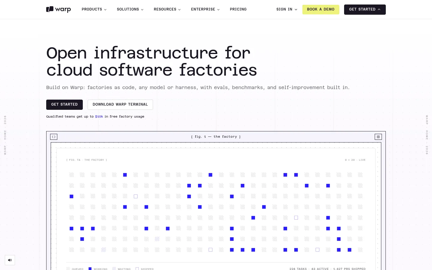
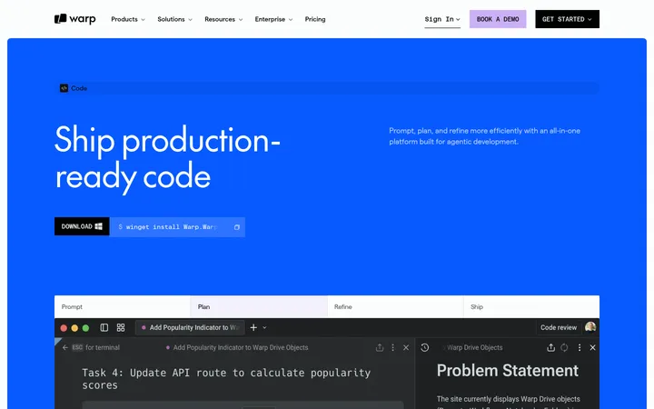
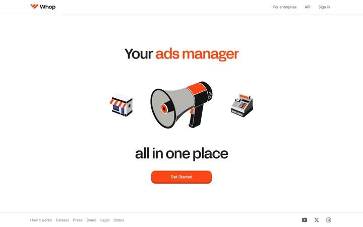
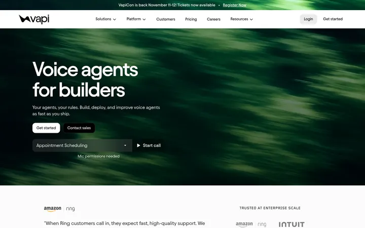
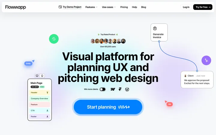
North star · Keep the page calm and code-native, using blue as a precise functional signal and product interfaces as the main visual proof.
The page is built on a near-white lavender canvas (#fbf9fe), with dark ink text and hairline rules establishing a quiet technical baseline. Vivid blue (#2a1eff) is reserved for selected interface marks, active states, links, and the full-width case-study band, so it reads as a signal rather than a wash. A lemon button distinguishes the demo action while dark and white buttons keep other calls to action restrained. Azeret Semi Mono carries most of the interface: navigation, body copy, labels, buttons, and code-like captions; The Future adds a contrasting sans-serif voice to section headings. The layout is a long, left-aligned product narrative with repeated section dividers, framed dashboards, diagrams, and code panels. Real customer imagery appears in the enterprise section, while the rest of the page relies on product UI and diagrams. Generous vertical breathing room is balanced by compact, information-dense previews.
配色
点色块复制色值。用途说明来自对页面的实测位置(背景、文字、描边、按钮)与截图判读。
品牌色
强调色
表层色
中性色
功能色
页面底色 · Lavender Mist表层 · Paper White主文字 · Deep Ink次要文字 · Muted Graphite弱文字 · Ash Gray描边 · Quiet Rule强调 · Electric Signal强调 2 · Soft Periwinkle强调 3 · Signal Violet
Primary interface and editorial type: navigation, body, labels, buttons, captions, and code.
Aa 设计
theFuture
网络字体 · 字重 400 / 600 / 700 / 500 · 占比 10%
免费替代:Inter
Section headings and selected display headings.
角色
示例
字号
字重
行高
字距
一级标题
Hero headline, set in a prominent monospace display style.
Warp
34px
400
1.65
-0.059em
二级标题
Section headings, using contrasting bold lowercase sans-serif.
The quick brown fox 敏捷的狐狸
18px
700
1.65
-0.02em
正文
Supporting copy, descriptions, and explanatory text.
The quick brown fox 敏捷的狐狸
13px
400
1.65
0
辅助文字
Small supporting labels and product-preview annotations.
The quick brown fox 敏捷的狐狸
12.5px
400
1.65
0
按钮
Calls to action with spaced, clear monospace lettering.
The quick brown fox 敏捷的狐狸
15px
400
1
0.05em
导航
Compact uppercase navigation labels.
The quick brown fox 敏捷的狐狸
12px
500
1.65
0.05em
眉题
Small uppercase section identifiers above headings.
The quick brown fox 敏捷的狐狸
9px
400
1.65
0.05em
代码
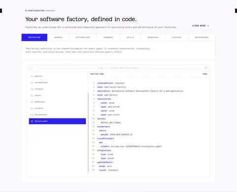
Code-like content and technical product-preview text.
const style = 1;
13px
400
1.65
0
间距与布局
基准单位 2px · 密度:适中
56px版块间距
6px元素间距
—卡片内边距
1132px内容最大宽度
2px
3px
4px
5px
6px
8px
10px
12px
14px
16px
18px
20px
22px
24px
32px
56px
Use a centered, wide content frame capped at the measured 1132px maximum, with headings and copy aligned to the left. The page reads as a long single-column narrative, interrupted by split layouts, multi-column product cards, and broad framed previews. Sections share the pale canvas and are separated by fine rules and generous vertical gaps. Keep copy compact and let diagrams and interface captures occupy the visual center. The density is comfortable: sparse page-level composition, dense detail inside product previews.
圆角与层次
按钮 · 4px
卡片 · 6px
徽标 · 9999px
导航 · 4px
md · card
The visual language is mostly flat, relying on fine borders and framed panels rather than shadows. Product previews use nested outlines and light surfaces to create depth and structure. Keep any shadow exceptionally restrained; the measured medium card shadow is subtle and should not become a general treatment.
组件
下面的预览按实测的按钮、输入框、徽标、卡片样式重建(字体用替代字体)。
Navigation bar
Compact horizontal header with uppercase monospace links, dark text, a citrus demo button, and a dark GET STARTED button.
Hero actions
Pair a dark filled GET STARTED action with a white bordered DOWNLOAD WARP TERMINAL action below the supporting line.
Framed product preview
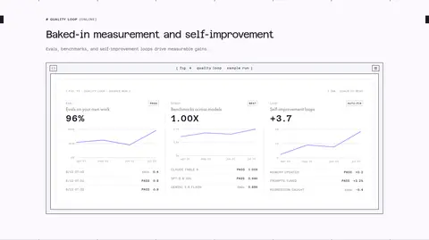
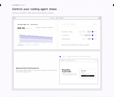
Large white interface panel enclosed by thin dark rules, with small mono figure captions and product data inside.
Feature tabs
Compact horizontal category labels above a code-and-configuration showcase; emphasize the active item in blue.
Feature list and detail
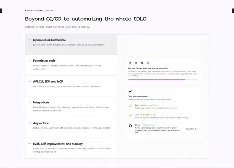
Stacked numbered feature rows sit beside a product demonstration, separated by fine horizontal rules.
Case-study band
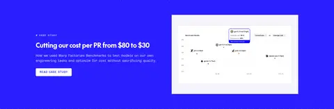
Full-width electric-blue section with a short headline, concise explanatory copy, link action, and supporting image.
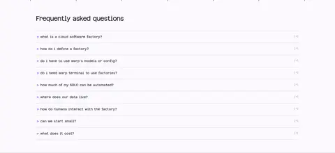
FAQ rows
Simple question-and-answer list with compact labels, fine separators, and small expand affordances.
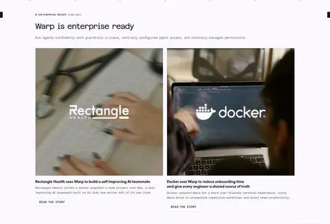
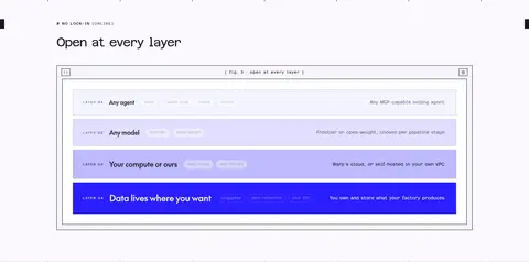
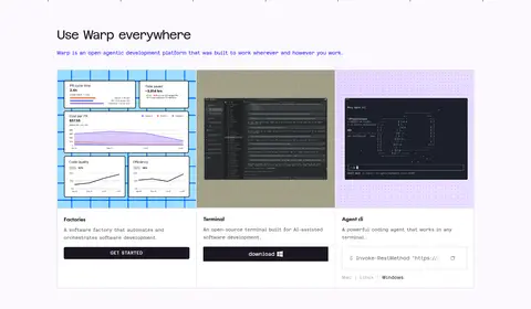
Imagery · Product UI, code panels, system diagrams, and dashboard previews are the primary imagery. Present them as crisp, pale panels inside thin dark or gray frames, often with tiny mono figure captions and plotted data. Customer photography appears in paired enterprise case-study cards; treat it as contextual evidence rather than the site’s dominant visual language. Avoid decorative 3D or unrelated stock imagery.
Reserve electric blue for purposeful accents and selected states.
Set navigation, body copy, and labels in a monospace face.
Frame product previews with fine, crisp outlines.
Keep headings left-aligned and section copy concise.
Separate long sections with whitespace and subtle rules.
✕ 不该做
Do not turn the page into a dark theme.
Do not flood large areas with blue outside the featured case-study band.
Do not add decorative gradients that are absent from the measured page.
Do not round interface frames into soft marketing cards.
Do not use oversized, loose sans-serif body copy.
Do not make customer photography the primary visual language.
给 AI 的提示词
想快速出一个同风格的新页面,把这段话连同 DESIGN.md 一起发给 AI。
Build a new page in Warp’s code-native visual style. Use Lavender Mist (#fbf9fe) as the main canvas, Deep Ink (#1a1522) for text and outlines, and Quiet Rule (#d2d1d8) for restrained dividers. Use Electric Signal (#2a1eff) sparingly for active states, links, and diagram marks; reserve Citrus Highlight (#eef17c) for a standout demo action. Make Azeret Mono the dominant voice for navigation, body copy, labels, and controls, with a contrasting sans-serif heading face. Keep the layout left-aligned within a broad centered frame, with generous section breathing room and compact copy. Build visual proof from framed product UI, code, and diagrams. Use flat surfaces, crisp thin borders, and minimal shadow. Keep calls to action compact and uppercase.