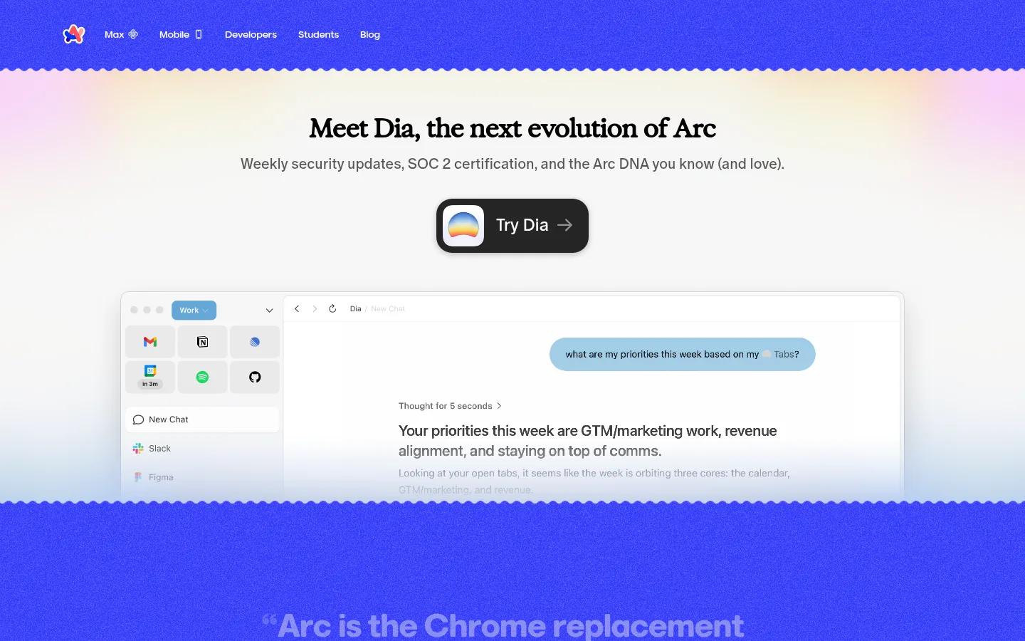
North star · Use vivid blue as a confident structural anchor, then let generous white space and real interface screenshots explain the product.
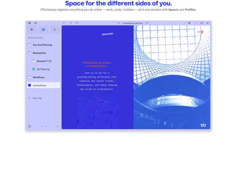
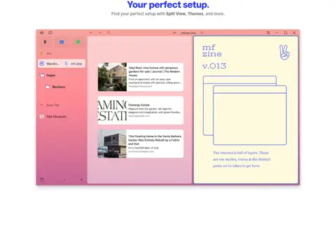
Arc’s visual strategy is built around a sharp contrast between saturated electric blue, warm ivory, and open white space. The blue fills the navigation, testimonial/download bands, and key review section, while the ivory announcement and testimonial areas soften the strong color. White feature sections give the browser screenshots room to read as the main content. Headlines use Marlin Soft SQ in a heavy, compact style with tight tracking; supporting copy is smaller and quieter, while mono uppercase labels add a technical accent. The long page alternates broad color fields and spacious product showcases rather than relying on dense cards. Screenshots show Arc’s interface in varied, colorful contexts, but remain framed as product demonstrations, not as the site’s core palette. Scalloped horizontal transitions add a playful signature. CTA buttons are rounded and lightly elevated; most content remains flat, with blue links and restrained borders keeping attention on the product.
配色
点色块复制色值。用途说明来自对页面的实测位置(背景、文字、描边、按钮)与截图判读。
品牌色
强调色
表层色
中性色
功能色
页面底色 · Browser White表层 · Warm Ivory主文字 · Arc Electric Blue次要文字 · Quiet Gray弱文字 · Warm Ivory描边 · Arc Electric Blue强调 · Arc Electric Blue强调 2 · Deep Violet
Primary display, section headings, body copy, navigation, and links.
Aa 设计
InterVariable
网络字体 · 字重 500 / 600 / 700 · 占比 24%
免费替代:Inter
Small captions and secondary interface labels.
Aa 设计
Marlin
网络字体 · 字重 400 · 占比 6%
免费替代:Nunito Sans
Selected regular-weight navigation and secondary link text.
Aa 设计
ABC Oracle
网络字体 · 字重 400 · 占比 4%
免费替代:DM Sans
Minor supporting text where the page uses its secondary text face.
Aa 设计
ABC Favorit Mono
网络字体 · 字重 700 / 400 · 占比 4%
免费替代:IBM Plex Mono
Uppercase eyebrow labels, badges, and compact technical annotations.
Aa 设计
-apple-system
系统字体 · 字重 600 · 占比 3%
免费替代:Inter
Download button labels.
角色
示例
字号
字重
行高
字距
一级标题
Main page or hero statement in compact, bold display type.
The Browser Company
45.5px
700
0.93
-0.04em
二级标题
Section titles above feature screenshots and review content.
The Browser Company
40px
700
0.98
-0.04em
三级标题
Occasional expressive feature heading.
The Browser Company
36px
700
1
-0.02em
四级标题
Smaller subheadings within content sections.
The Browser Company
28px
700
1.07
-0.05em
正文
Short explanatory copy and testimonial statements.
The quick brown fox 敏捷的狐狸
16px
700
normal
0
辅助文字
Supporting labels and small interface annotations.
The quick brown fox 敏捷的狐狸
12px
600
normal
0.033em
按钮
Download and product-action labels.
The quick brown fox 敏捷的狐狸
14px
600
2.07
-0.01em
导航
Top-level site navigation.
The quick brown fox 敏捷的狐狸
14px
500
normal
-0.02em
链接
Inline links and prominent editorial quotations.
The quick brown fox 敏捷的狐狸
16px
700
normal
0
眉题
Uppercase mono category or attribution label.
The quick brown fox 敏捷的狐狸
12px
700
normal
0.05em
代码
Compact uppercase mono technical marker.
const style = 1;
12px
700
normal
0.05em
间距与布局
基准单位 8px · 密度:适中
48px版块间距
12px元素间距
—卡片内边距
1200px内容最大宽度
3px
4px
6px
8px
10px
12px
16px
20px
24px
32px
48px
The page is a long, single-column marketing sequence with broad full-bleed color bands and centered feature sections. The measured maximum content width is 1200px, with screenshots centered and sized as the visual focus. The feature showcases use generous vertical separation and minimal surrounding chrome; the announcement and CTA sections center their content. A four-column testimonial band is the main denser region. The comfortable density and measured 48px section rhythm create clear pauses between product stories.
圆角与层次
按钮 · 8px
徽标 · 8px
链接 · 4px
sm · button
sm · button
The overall treatment is mostly flat: strong color bands and white space define sections instead of card shadows. Product screenshots sit clearly against white, with subtle separation that keeps interface details legible. Download buttons use a small measured shadow; rounded CTA corners and scalloped section boundaries provide depth and character without adding heavy borders.
组件
下面的预览按实测的按钮、输入框、徽标、卡片样式重建(字体用替代字体)。
Top navigation
Compact brand mark and links sit on the saturated blue band; use light navigation text and keep the row visually quiet.
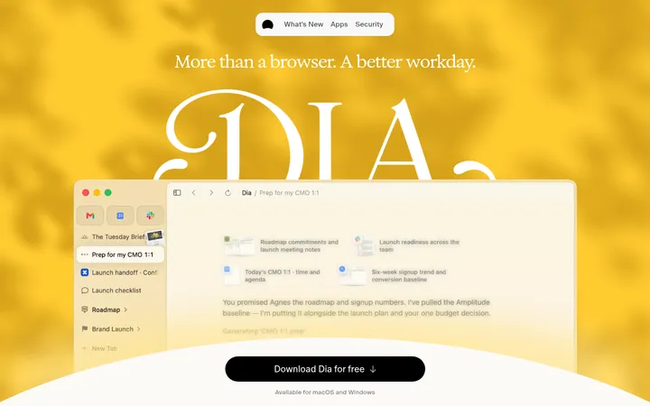
Announcement hero
Warm ivory field with centered product announcement, supporting line, prominent Try Dia action, and a wide browser demonstration.
Blue review hero
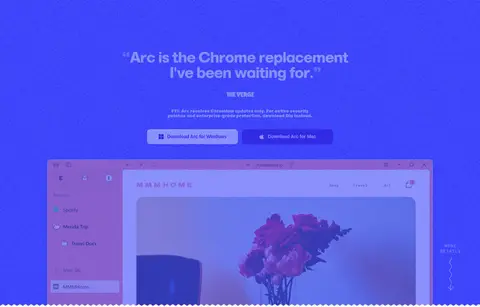
Full-width electric-blue section centers a large review headline, attribution, download actions, and a large Arc screenshot.
Feature showcase
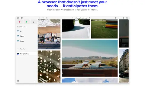
White, spacious section with a centered blue headline, muted supporting copy, and a wide browser screenshot.
Download CTA
Electric-blue band with a centered invitation and rounded white download button using violet text.
Testimonial strip
Warm ivory band arranged in four columns, with bold blue quotes and compact outlined attribution badges.
Footer
Blue two-column link area with compact product and resource lists, brand mark, social icons, and company signature.
Imagery · Large browser-interface screenshots are the primary imagery, showing varied workspaces, tabs, and colorful web content inside Arc. They are centered, wide, and presented as product evidence rather than decorative thumbnails. The announcement includes a browser/video demonstration. Colorful content within screenshots can introduce pinks, greens, and blues, but the surrounding page stays anchored in the measured blue, white, and ivory palette.
Use Arc Electric Blue (#3139fb) for major structural bands and link emphasis.
Place feature screenshots on clean white space.
Keep headings bold, compact, and closely tracked.
Use Warm Ivory (#fffcec) to soften announcement or testimonial areas.
Make download actions concise, rounded, and high contrast.
Separate major stories with generous vertical breathing room.
✕ 不该做
Do not turn every section into a card grid.
Do not use screenshot colors as the site-wide brand palette.
Do not crowd product demonstrations with explanatory text.
Do not replace the strong blue bands with subtle gradients.
Do not use heavy shadows on ordinary content.
Do not make every heading the same scale or weight.
给 AI 的提示词
想快速出一个同风格的新页面,把这段话连同 DESIGN.md 一起发给 AI。
Build a new Arc-style product page using a clear alternation of full-width bands and spacious white feature sections. Anchor the layout with Arc Electric Blue (#3139fb); use Browser White (#ffffff) for the main canvas and Warm Ivory (#fffcec) for occasional softer sections. Keep Deep Violet (#2702c2) for download-action emphasis, with Quiet Gray (#696969) supporting copy. Set major headings in a bold, compact rounded sans similar to Marlin Soft SQ, with tighter tracking than body text; use uppercase mono for small labels. Center large, realistic browser-interface screenshots within a measured 1200px maximum content width. Favor long vertical pauses, uncluttered composition, and scalloped section transitions where appropriate. Use rounded, lightly shadowed CTAs, but keep most content flat. Treat colorful interface content as product imagery, not as a replacement brand palette.