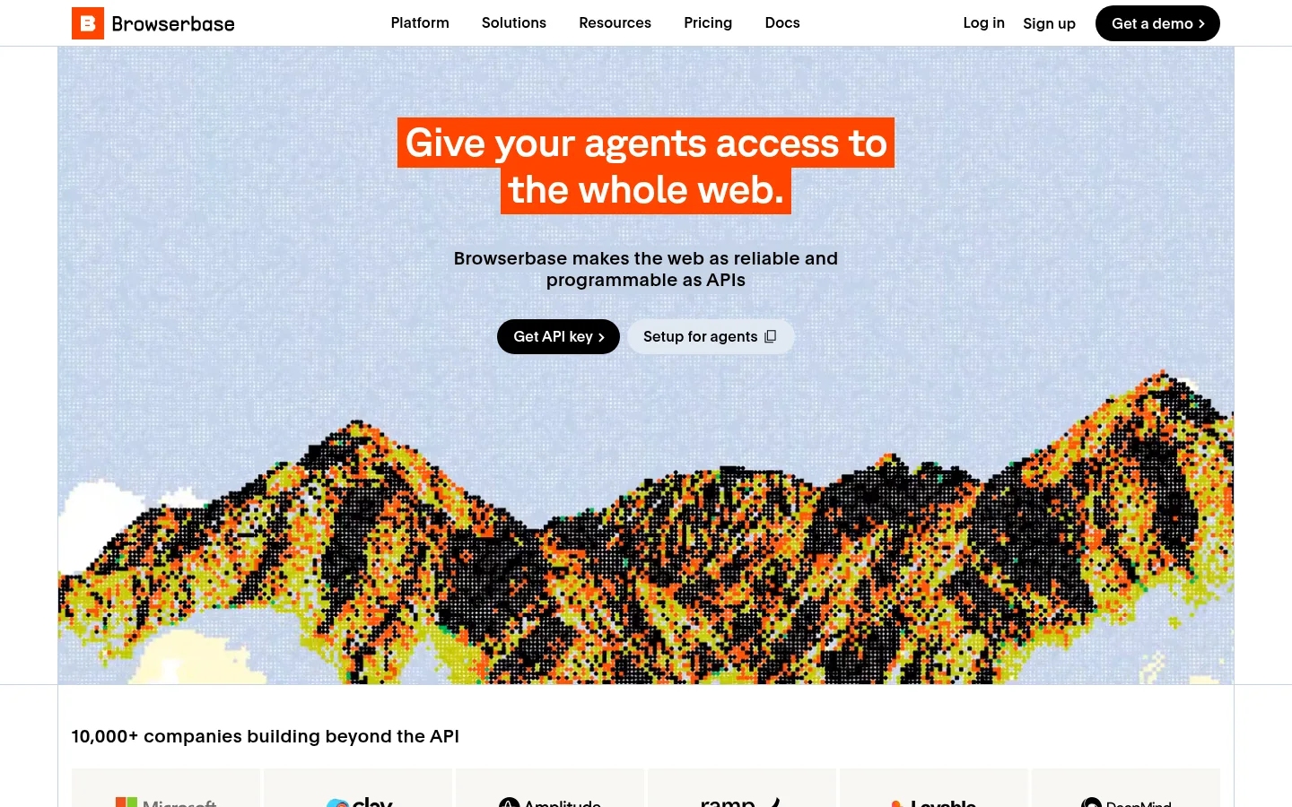
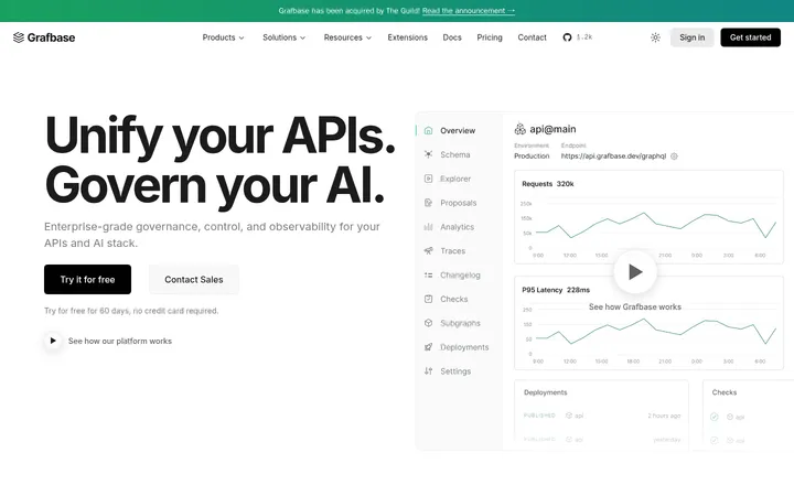
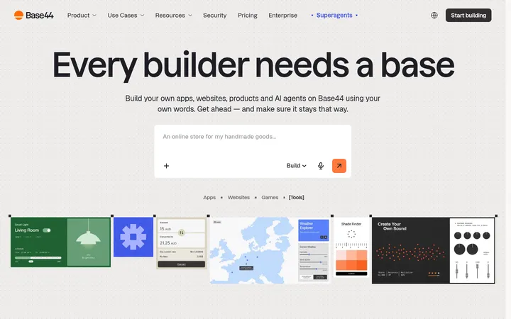
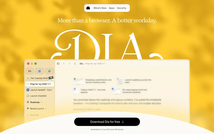
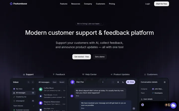
North star · Keep the interface editorial and precise, letting white space, crisp black type, pale blue structure, and selective orange carry the story.
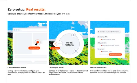
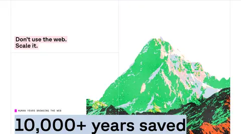
The visual system starts with a white canvas and near-black text, giving the navigation, headings, and product copy a clean, high-contrast foundation. Pale blue-gray panels and fine borders organize demos and content without making the page feel card-heavy; orange is reserved for emphatic highlights, including the hero headline treatment, selected inline words, and the full-width footer. Typography mixes GT Planar for large, compact display headings, plain sans-serif for navigation and body copy, and GT Standard Mono for uppercase utility labels and technical annotations. The page follows a long, carefully segmented vertical rhythm: a centered media-led hero, product explanations, feature grids, templates, workflow steps, proof points, and a contrasting footer. Pixel-art landscapes and browser-interface mockups provide color and texture, while broad white space and squared edges keep the surrounding interface precise and technical.
Navigation, body copy, buttons, and compact feature headings.
Aa 设计
gtStandardMono
网络字体 · 字重 500 / 400 · 占比 14%
免费替代:Space Mono
Uppercase eyebrows, utility links, and technical labels.
Aa 设计
gtPlanar
网络字体 · 字重 500 / 400 · 占比 10%
免费替代:Space Grotesk
Display headlines and primary section headings.
角色
示例
字号
字重
行高
字距
特大标题
Oversized hero and campaign display headlines.
Browserbase
104px
500
1.1
0
一级标题
Primary page headline and major section titles.
Browserbase
45px
500
1.15
-0.02em
二级标题
Feature and product section headings.
Browserbase
36px
500
1.05
-0.01em
三级标题
Card, template, and feature-item headings.
The quick brown fox 敏捷的狐狸
20px
500
1.2
0.02em
正文
Supporting descriptions and explanatory product copy.
The quick brown fox 敏捷的狐狸
16px
400
1.2
0.01em
辅助文字
Uppercase technical labels and compact metadata.
The quick brown fox 敏捷的狐狸
14px
500
1.2
0.06em
按钮
Primary and secondary CTA text.
The quick brown fox 敏捷的狐狸
16px
400
1.5
0
导航
Header navigation links.
The quick brown fox 敏捷的狐狸
16px
500
1
0.01em
眉题
Small uppercase section labels above content.
The quick brown fox 敏捷的狐狸
14px
500
1.2
0.06em
代码
Monospaced technical annotations and code-like labels.
const style = 1;
14px
500
1.2
0.06em
间距与布局
基准单位 4px · 密度:适中
80px版块间距
8px元素间距
5px卡片内边距
1280px内容最大宽度
3px
4px
5px
6px
7px
8px
10px
12px
14px
16px
18px
20px
24px
64px
80px
The page is a long, centered sequence of full-width bands, with content held to a measured maximum width of 1280px. A mostly single-column editorial flow alternates with two-column product splits, multi-column feature and statistics grids, and a centered CTA. Hairline borders mark section boundaries and columns. Sections feel spacious, with a comfortable density and a measured section gap of 80px; local content groups stay closer together. Align most headings and copy to the left, reserving centered alignment for selected hero, template, and conversion moments.
圆角与层次
按钮 · 9999px
徽标 · 9999px
inset · nav
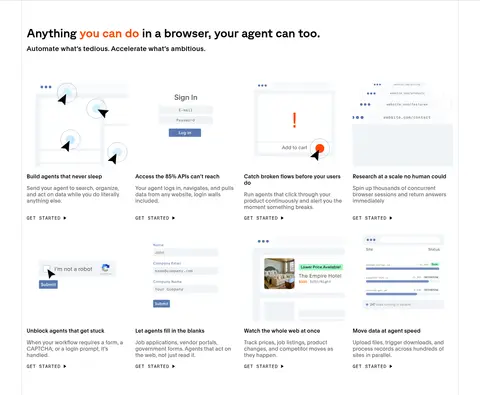
Keep surfaces predominantly flat. Use fine pale blue-gray hairlines to divide sections and outline selected product cards; avoid drop shadows. Layer imagery, highlighted text blocks, and interface mockups directly on the canvas or on restrained tinted panels. Rounded pills are for buttons and badges, while most cards and section edges remain square.
组件
下面的预览按实测的按钮、输入框、徽标、卡片样式重建(字体用替代字体)。
Primary CTA
Black pill button with white, medium-weight plain sans text; use for prominent actions such as Get a demo.
Secondary CTA
Pale blue-gray pill with black text, paired with a black primary action; keep the contrast understated.
Technical link
Black uppercase monospaced label, used as a compact text link such as TRY FOR FREE.
Product demo panel
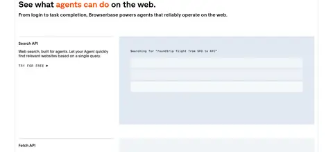
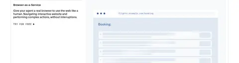
Wide browser or workflow preview framed by pale blue-gray surfaces and thin borders, paired with explanatory copy.
Template selector
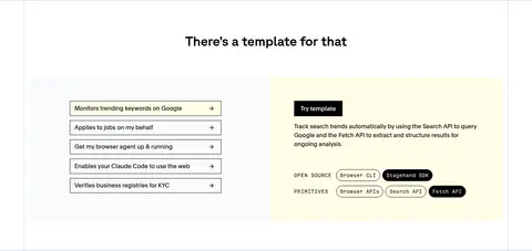
Stacked square-cornered rows with thin black outlines, balanced by a pale yellow detail panel.
Metric tile
Short uppercase mono label and prominent metric inside a softly tinted, square-cornered block.
Footer band
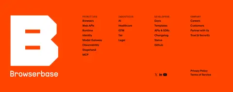
Full-width Signal Orange field with white brand mark and grouped black navigation links.
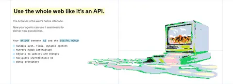
Imagery · Use media as a defining brand feature: pixel-art mountain landscapes, browser and workflow mockups, and illustrated product scenes. Keep artwork large and often edge-spanning within its section, with browser-interface visuals contained in pale blue frames. The pixel landscapes are vivid and deliberately textured; treat their colors as illustration content rather than expanding the core UI palette.
Keep the main canvas white and the text near-black.
Use orange sparingly for high-value emphasis and the footer band.
Structure product content with pale blue-gray surfaces and hairlines.
Pair large display headings with straightforward sans-serif body copy.
Use monospaced uppercase labels for utility and technical details.
Let pixel-art and product demos provide most of the visual texture.
✕ 不该做
Do not introduce gradients or unmeasured brand colors.
Do not round cards or section frames; reserve pills for actions and badges.
Do not add decorative drop shadows to otherwise flat content.
Do not use orange as a general background across regular sections.
Do not let illustration colors redefine the UI palette.
Do not crowd sections with dense copy or tightly packed modules.
给 AI 的提示词
想快速出一个同风格的新页面,把这段话连同 DESIGN.md 一起发给 AI。
Build a new Browserbase-style page as an editorial, technical SaaS experience. Use Gallery White (#ffffff) for the main canvas and Carbon Ink (#000000) for primary text, navigation, headings, and dark CTA pills. Apply Glacier Blue (#c5d3e8) and Haze Blue (#d3deed) as restrained panel and border colors; reserve Signal Orange (#ff4500) for focused emphasis and an occasional high-contrast band. Use GT Planar or a close substitute such as Space Grotesk for display headings, plain sans-serif such as Inter for body and navigation, and GT Standard Mono or Space Mono for uppercase technical labels. Organize content in spacious, bordered sections, alternating editorial text with browser previews, pixel-art illustrations, feature grids, and metrics. Keep cards mostly square and flat; make buttons pill-shaped. Avoid gradients, heavy shadows, and invented colors.