North star · Use a calm editorial canvas to frame the product, reserving saturated gold for the hero and letting real interface imagery carry the story.
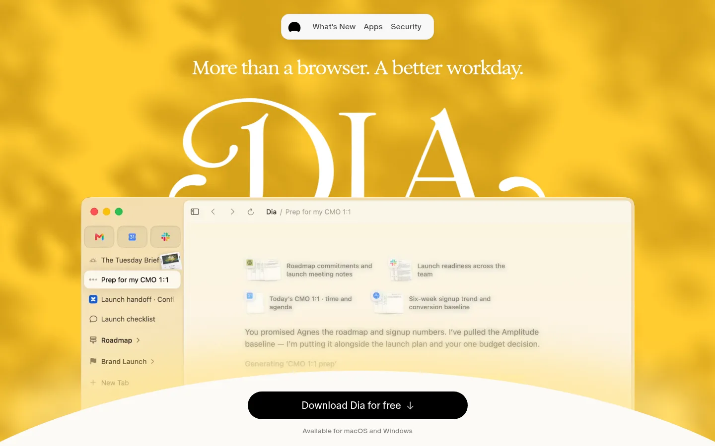
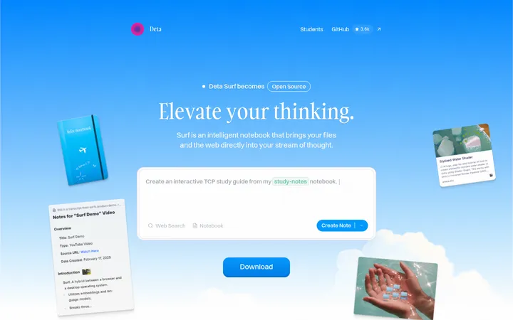
The page is built around a warm off-white canvas, with a concentrated golden hero that gives the first screen its energy without turning the rest of the page into a colourful interface. Large, elegant serif display lettering sets an editorial tone; lighter sans-serif headings and body copy keep the product story approachable. Small uppercase mono labels add a functional, technical counterpoint. The hero layers a browser-window demo over a softly blurred yellow field, while the curved pale foreground leads attention toward a pill-shaped black download CTA. Below, generous whitespace separates concise feature stories, split product demonstrations, and a privacy-controls section. Text is mostly near-black or muted charcoal, with pale neutral controls and fine hairlines reserved for navigation and separation. The visual strategy is spacious, product-led, and deliberately restrained outside the hero.
Main sans-serif for body copy and the light, prominent hero heading.
Aa 设计
ABC Oracle Triple
网络字体 · 字重 400 · 占比 26%
免费替代:Inter
Compact navigation labels, buttons, and small interface-oriented copy.
Aa 设计
ABC Favorit Mono
网络字体 · 字重 400 · 占比 8%
免费替代:Space Mono
Uppercase navigation and eyebrow labels.
Aa 设计
Exposure VAR
网络字体 · 字重 500 · 占比 5%
免费替代:Instrument Serif
Serif display headings and editorial feature titles.
角色
示例
字号
字重
行高
字距
一级标题
Hero statement and primary headline, set in light sans-serif.
Dia Browser
54px
300
1.11
-0.04em
二级标题
Large editorial section headings in the display serif.
Dia Browser
48px
500
1.17
-0.05em
三级标题
Feature-story headings in the display serif.
Dia Browser
39px
500
1.1
-0.04em
四级标题
Smaller feature titles and subheads in the display serif.
The quick brown fox 敏捷的狐狸
24px
500
1.25
-0.03em
正文
Feature descriptions and supporting product narrative.
The quick brown fox 敏捷的狐狸
20px
350
1.5
-0.02em
辅助文字
Compact interface labels and supporting captions.
The quick brown fox 敏捷的狐狸
16px
400
2.19
0
按钮
Download and browser-control button labels.
The quick brown fox 敏捷的狐狸
16px
400
2.19
0
导航
Uppercase mono navigation labels.
The quick brown fox 敏捷的狐狸
13px
400
1.23
0.1em
眉题
Uppercase mono section markers and small labels.
The quick brown fox 敏捷的狐狸
13px
400
1.23
0.1em
代码
Technical or product-context labels in uppercase mono.
const style = 1;
13px
400
1.23
0.1em
间距与布局
基准单位 2px · 密度:宽松
152px版块间距
14px元素间距
—卡片内边距
1180px内容最大宽度
5px
10px
12px
14px
16px
20px
24px
30px
70px
Use a centered, spacious composition with a measured maximum content width of 1180px. The hero is a single centered column with full-bleed media; subsequent feature content alternates between compact editorial text and two-column product storytelling. Keep the page density low, with broad section pauses and clear separation between stories. Align section headings and supporting content deliberately rather than forcing every block to center. Navigation is compact and visually detached from the broad page canvas.
圆角与层次
按钮 · 9999px
卡片 · 12px
图片 · 12px
徽标 · 9999px
导航 · 16px
xl · card
md · nav
inset · text
Most of the page is flat: warm canvas, open whitespace, and minimal visible borders. Use fine hairlines sparingly for navigation or separation. Product windows and floating navigation can gain quiet layered depth from restrained shadows; avoid heavy card outlines or dramatic elevation that competes with the hero.
组件
下面的预览按实测的按钮、输入框、徽标、卡片样式重建(字体用替代字体)。
Floating navigation
Compact rounded light navigation near the top of the hero, with small links and a soft shadow; uppercase mono treatment is used for the FOR WORK label.
Golden hero
Full-bleed yellow media field with centered editorial headline, oversized Dia wordmark, and a browser demo layered across the lower half.
Download CTA
Black pill-shaped primary action with white label and download arrow, placed over the pale curved hero foreground.
Feature story
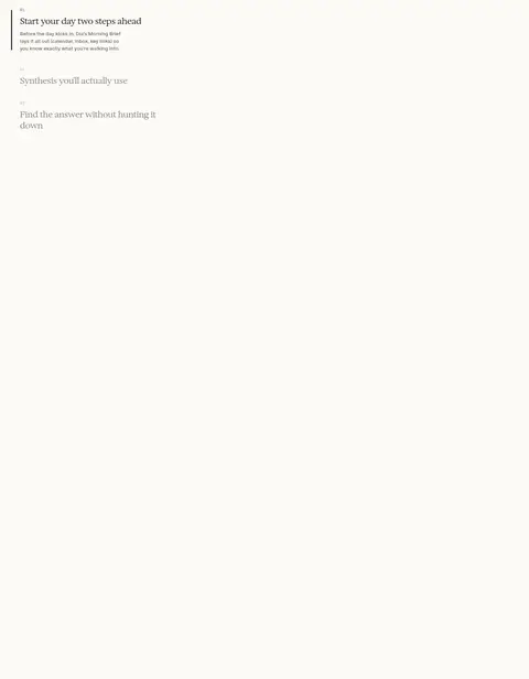
Short numbered feature entries pair restrained serif titles and compact copy with product imagery or video; keep the surrounding canvas open.
Product showcase
Two-column feature storytelling combines display-serif headings and browser or settings interface demonstrations with clear, uncluttered framing.
Privacy controls
A concise privacy section uses pale neutral pill controls and clear on/off states against the consistent warm canvas.
Footer link groups
Quiet multi-column footer with compact uppercase group headings and straightforward product, resource, and company links.
Imagery · Lead with a full-bleed, softly blurred golden video or image backdrop and an oversized Dia wordmark. Place a large browser-window product demo across the lower hero, with the pale curved foreground and black download control layered in front. Feature sections rely on browser screenshots and product clips rather than decorative illustration. Keep imagery softly framed, gently rounded, and legible as a real interface.
Keep the page canvas warm and consistently off-white.
Concentrate saturated gold in the hero treatment.
Pair expressive serif display headings with restrained sans-serif copy.
Use expanded-tracking mono type for short uppercase labels.
Let real browser UI demos lead product storytelling.
Preserve broad whitespace between feature sections.
Keep controls rounded, quiet, and easy to scan.
✕ 不该做
Do not spread the golden hero palette across every section.
Do not replace the warm canvas with stark white.
Do not turn product stories into dense dashboard grids.
Do not use heavy borders or dramatic shadows on every card.
Do not make navigation or labels oversized.
Do not add decorative imagery that competes with the browser demo.
给 AI 的提示词
想快速出一个同风格的新页面,把这段话连同 DESIGN.md 一起发给 AI。
Build a new page in Dia Browser’s warm, editorial product style. Use Gallery Cream (#fbfaf6) as the main canvas, Soft Ink (#242424) for primary text, and Slate Copy (#646462) for supporting copy. Reserve Sunlit Gold (#ffcb30) and Pale Marigold (#ffe48c) for a prominent media-led hero rather than coloring every section. Set display headings in an elegant serif close to Instrument Serif; use a light sans close to Inter for body copy, with expanded-tracking Space Mono-style uppercase labels. Keep the composition spacious and centered within the measured 1180px content width. Layer a browser-window demonstration over the hero and use concise feature stories with product imagery below. Favor pill-shaped controls, subtle hairlines, restrained shadows, and a clear black primary CTA. Maintain generous whitespace and make the product interface the visual proof point.