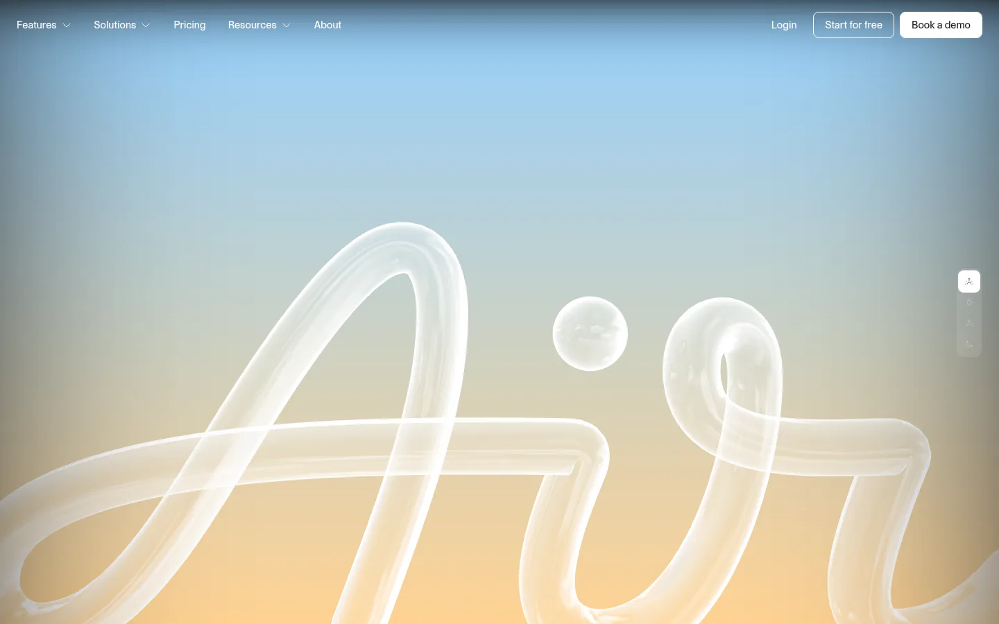
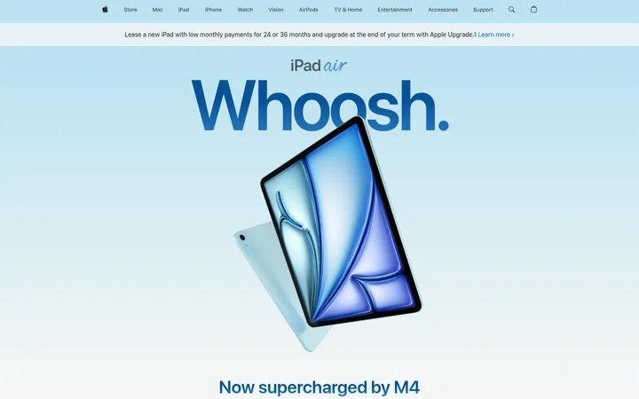
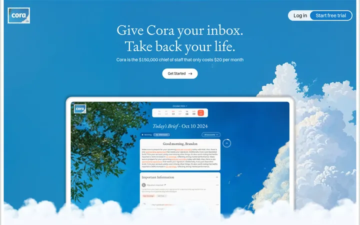
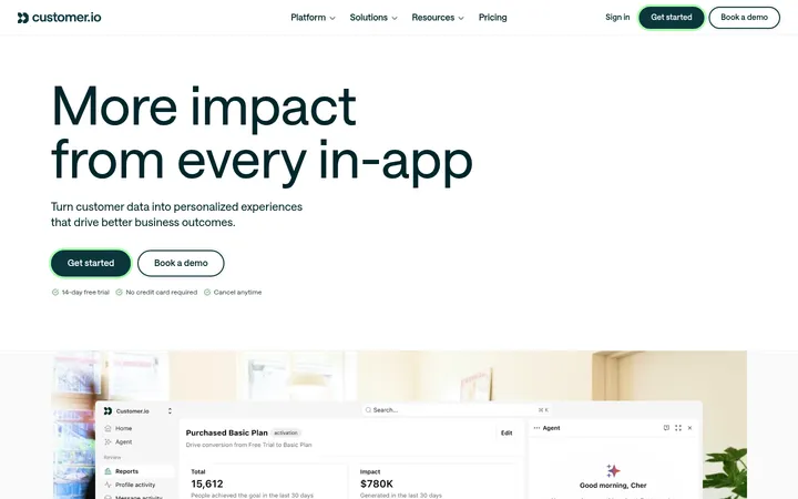
Air 首页以大面积深蓝为底,搭配醒目的窄体大字与沉浸式创意影像。界面克制留白,让品牌叙事、产品演示和转化入口更突出。
North star · Keep the interface calm and sparse against a continuous deep-blue field, reserving oversized white type and vivid imagery for the story.
The page is built around a nearly continuous deep-blue canvas (#13396a), which gives the long-form homepage a unified, cinematic field. White (#ffffff) carries high-contrast display messaging and key controls; muted blue-gray (#a1b0c3) softens supporting copy. The first viewport notably shifts into a full-bleed pastel visual, so treat that imagery as a distinct hero treatment rather than a replacement for the measured site canvas. Typography combines a heavy, condensed uppercase display face for emphatic statements with Control’s compact, practical sans-serif for navigation and body text. The layout is intentionally sparse: a slim top navigation, expansive vertical intervals, and centered media or content groups. Rounded outlined buttons and fine borders provide interface definition without relying on shadows. Product and creative visuals bring warmer colors into the otherwise controlled blue-and-white system, keeping the page expressive while its UI stays restrained.
配色
点色块复制色值。用途说明来自对页面的实测位置(背景、文字、描边、按钮)与截图判读。
品牌色
强调色
表层色
中性色
功能色
页面底色 · Air Deep Blue表层 · Paper Mist表层 2 · Cloud White主文字 · Cloud White次要文字 · Soft Black弱文字 · Haze Blue描边 · Quiet Line强调 · Air Deep Blue强调 2 · Dusk Blue
文字
背景
对比度
WCAG
#ffffff Cloud White
#13396a Air Deep Blue
11.53:1
AAA
#ffffff Cloud White
#f5f5f5 Paper Mist
1.09:1
不达标
#1b1b1b Soft Black
#13396a Air Deep Blue
1.49:1
不达标
#1b1b1b Soft Black
#f5f5f5 Paper Mist
15.8:1
AAA
#1b1b1b Soft Black
#ffffff Cloud White
17.22:1
AAA
#a1b0c3 Haze Blue
#13396a Air Deep Blue
5.22:1
AA
字体
字号阶梯:Custom(比例约 2.006,正文 16px)。示例用免费替代字体渲染,数值为实测。
Aa 设计
Control
网络字体 · 字重 500 · 占比 96%
免费替代:Inter
Primary sans-serif for navigation, body copy, labels, and standard interface text.
Aa 设计
Control Compressed
网络字体 · 字重 900 · 占比 2%
免费替代:Oswald
Oversized display statements and emphatic uppercase headings.
Aa 设计
Control Cursive
网络字体 · 字重 500 · 占比 1%
免费替代:Caveat
Measured secondary heading role; use for select expressive heading moments.
角色
示例
字号
字重
行高
字距
特大标题
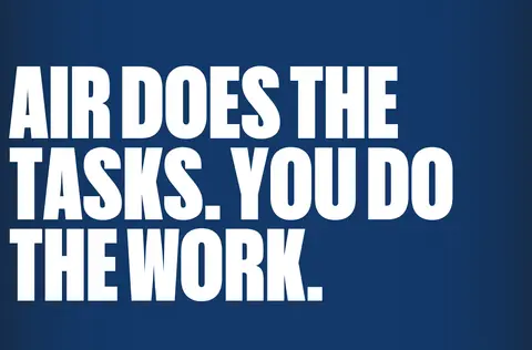
Oversized uppercase condensed statements such as the work-focused headline.
Air
259px
900
0.85
0
一级标题
Primary page or section heading in the measured heading system.
Air
40px
400
1
0
二级标题
Expressive secondary section headings.
Air
32px
500
1.1
0
三级标题
Feature and card headings, including workflow concepts.
The quick brown fox 敏捷的狐狸
20px
500
1.4
0
正文
Standard explanatory copy and product descriptions.
The quick brown fox 敏捷的狐狸
16px
500
1.5
0
辅助文字
Small supporting labels and media details.
The quick brown fox 敏捷的狐狸
13px
500
1.5
0
导航
Top-level navigation links and header controls.
The quick brown fox 敏捷的狐狸
16px
500
1.5
0
间距与布局
基准单位 8px · 密度:宽松
120px版块间距
24px元素间距
—卡片内边距
1150px内容最大宽度
2px
4px
6px
8px
10px
12px
16px
20px
24px
32px
48px
120px
Use a spacious, vertically extended single-page composition with a measured maximum content width of 1150px. The header aligns navigation to the left and account or conversion actions to the right. Large areas of uninterrupted blue separate major content moments; feature content can use three columns, while media and form content sit in centered, contained groups. Keep alignment clean and typography-led, with measured section gaps of 120px and element gaps of 24px as the rhythm anchors. Avoid dense dashboard-like packing.
圆角与层次
按钮 · 8px
输入框 · 4px
卡片 · 12px
图片 · 8px
导航 · 8px
没有测到阴影:页面是扁平的,层次靠底色和描边区分。
The interface is mostly flat, with no measured shadow system. Separate elements using fine borders, blue-on-blue outlines, and contrast rather than raised cards. Rounded corners define buttons, media, and cards; light form surfaces create the strongest layer contrast against the deep-blue background.
组件
下面的预览按实测的按钮、输入框、徽标、卡片样式重建(字体用替代字体)。
Top navigation
Compact Control sans links sit at the top; actions align opposite, with Login and outlined or filled-looking light CTA treatments.
Outlined CTA
Use a measured 8px radius, white border, and 0 16px horizontal padding for the white-text “Get some Air” treatment.
Workflow feature cards
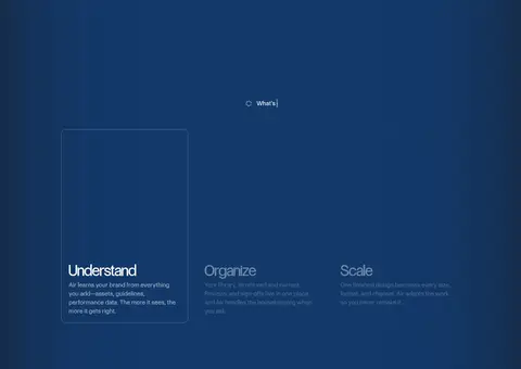
Three-column story content introduces Understand, Organize, and Scale; cards use white text and subtle #2b4d79 outlines.
Product video
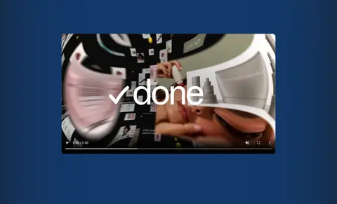
Embedded creative footage acts as a visual pause within the blue page, with softly rounded media framing.
Lead form
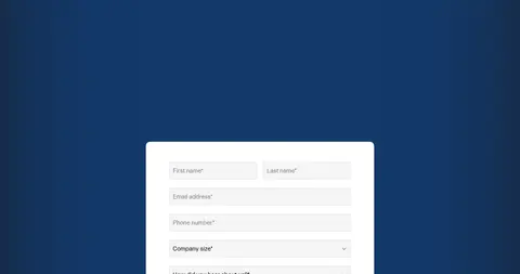
Light card surface with dark text; inputs use #f5f5f5 fill, #e5e5e5 borders, and a measured 4px radius.
Large display statement
A high-impact, uppercase condensed headline in white, set apart from smaller practical copy.
Imagery · Lead with full-bleed, soft pastel creative imagery featuring translucent sculptural forms; this hero visual is distinct from the measured deep-blue canvas. Farther down, use embedded product or brand video, creative assets, and restrained interface previews. Frame media as focal moments within generous blue space, with rounded edges where appropriate. Warm imagery is expressive content, not evidence of a broader warm UI palette.
Reserve oversized uppercase type for major statements.
Keep navigation and supporting copy compact.
Use white text to establish strong contrast on blue.
Give media and major sections generous breathing room.
Use fine borders instead of prominent shadows.
✕ 不该做
Do not replace the blue canvas with a generic white SaaS layout.
Do not use display typography for every heading.
Do not treat pastel hero imagery as the site-wide UI palette.
Do not crowd the long-form page with dense content blocks.
Do not add heavy shadows or excessive card elevation.
Do not introduce unmeasured colors or arbitrary component dimensions.
给 AI 的提示词
想快速出一个同风格的新页面,把这段话连同 DESIGN.md 一起发给 AI。
Build a new Air-style page with a spacious, editorial SaaS feel. Use Air Deep Blue (#13396a) as the dominant canvas, Cloud White (#ffffff) for high-impact type and key controls, and Haze Blue (#a1b0c3) for quieter supporting copy. Keep the header slim, with navigation on one side and account or CTA actions on the other. Use a heavy condensed uppercase display face only for headline moments; set practical UI and body content in a clean medium-weight sans. Organize content into widely separated sections with occasional centered media and light form surfaces. Use restrained outlines such as Dusk Blue (#2b4d79), Quiet Line (#e5e5e5), and measured rounded corners rather than shadows. Let creative imagery add color without changing the interface palette.