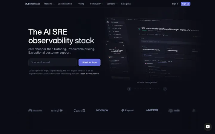
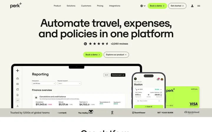
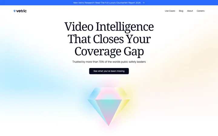
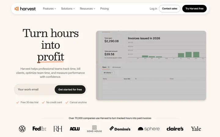
North star · Pair an energetic violet product moment with calm ivory storytelling, using bold type and real interface imagery to keep every section clear.
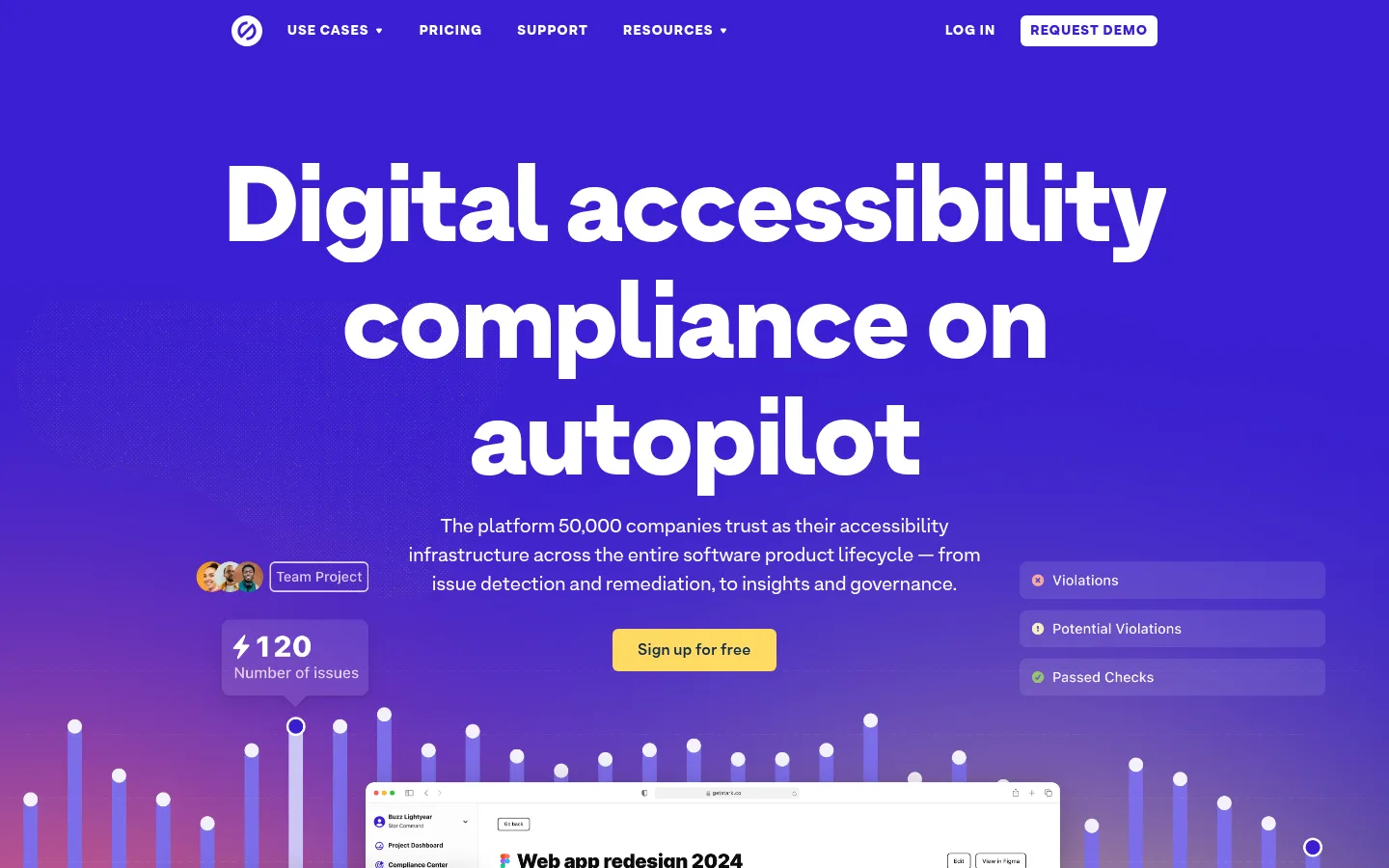
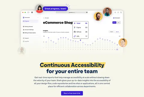
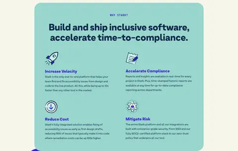
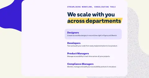
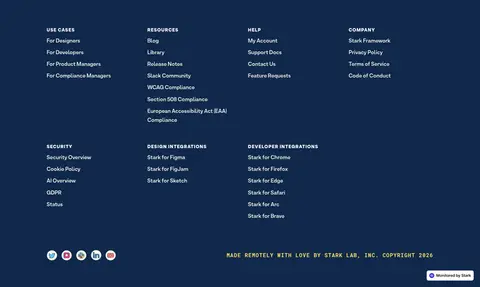
Stark’s visual strategy starts with a full-bleed saturated violet hero, setting oversized white display type against the brand’s quieter warm ivory canvas. Deep navy anchors headings and body copy on light sections, while bright yellow marker-like highlights draw attention to selected phrases and calls to action. Teal and pale lavender appear as large rounded feature surfaces rather than competing page backgrounds. ArminGrotesk supplies the rounded, heavy headline voice and readable supporting copy; RobotoMono is reserved for compact uppercase eyebrow labels. The layout is centered and spacious, with product screenshots and platform illustrations breaking up otherwise restrained text sections. Repeated centered feature stories lead into compact multi-column grids, followed by a more decorative pastel role card and a dark navy footer. Keep the page flat and graphic: rely on color blocks, generous breathing room, rounded cards, and layered product visuals instead of ornamental borders or heavy shadows.
Display, headings, body copy, navigation, and buttons throughout the page.
Aa 设计
RobotoMono
网络字体 · 字重 700 · 占比 5%
免费替代:Roboto Mono
Compact uppercase eyebrow and code-like labels above section headings.
角色
示例
字号
字重
行高
字距
特大标题
Oversized hero and display-scale headline treatment.
Stark
110px
900
1.1
-0.02em
一级标题
Main page and primary section headings.
Stark
56px
900
1.1
-0.01em
二级标题
Large centered section headings.
Stark
48px
900
1.1
-0.01em
三级标题
Feature, card, and benefit headings.
The quick brown fox 敏捷的狐狸
24px
900
1.1
0
四级标题
Smaller supporting section or card titles.
The quick brown fox 敏捷的狐狸
20px
400
1.5
0
正文
Feature descriptions and explanatory paragraph copy.
The quick brown fox 敏捷的狐狸
16px
400
1.7
0
辅助文字
Compact uppercase labels and category captions.
The quick brown fox 敏捷的狐狸
14px
900
1.5
0.08em
按钮
Uppercase CTA and utility button labels.
The quick brown fox 敏捷的狐狸
14px
900
1.43
0.08em
导航
Hero-scale display navigation role in the measured styles; visible site navigation is compact.
Stark
110px
900
1.1
-0.02em
眉题
Monospaced uppercase section labels such as platform and workflow markers.
The quick brown fox 敏捷的狐狸
16px
700
1.4
0.08em
代码
Monospaced uppercase technical or compact interface labels.
const style = 1;
16px
700
1.4
0.08em
间距与布局
基准单位 8px · 密度:适中
64px版块间距
16px元素间距
64px卡片内边距
1200px内容最大宽度
6px
8px
12px
16px
17px
24px
32px
40px
48px
56px
64px
80px
144px
Use a centered content column capped at the measured 1200px page width, with comfortable density and clear separation between stories. The first viewport is a full-bleed hero; the rest sits on the ivory canvas, mostly centered with a single main column. Use a four-column platform feature area and two-column lower card layouts where measured. Maintain the measured 64px section gap, 16px element gap, and 64px card padding as the reference rhythm, not as arbitrary decoration.
圆角与层次
按钮 · 6px
卡片 · 40px
链接 · 20px
没有测到阴影:页面是扁平的,层次靠底色和描边区分。
The design is primarily flat, with bold section color fields and rounded cards doing the structural work. The screenshots and hero UI collage provide the main sense of layering, with restrained image shadows where visible. Avoid adding decorative borders or strong card shadows; measured shadow data is empty.
组件
下面的预览按实测的按钮、输入框、徽标、卡片样式重建(字体用替代字体)。
Primary CTA
Violet fill (#381fd1), white label, compact 6px radius, and measured 24px horizontal padding; use as the primary action on ivory.
Secondary CTA
Marker Gold (#fedb63) fill with Midnight Ink (#10284b) text and the same compact button treatment.
Hero navigation
Compact white navigation and utility actions sit across the top of the violet hero, with a white request-demo control.
Highlight heading
Dark, heavy heading text with a bright yellow marker-like band behind selected words, not a full heading panel.
Platform feature grid
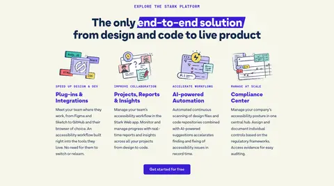
Four compact feature columns pair illustrated icons, uppercase eyebrow labels, violet headings, and concise body copy.
Benefit card
Seafoam surface with 40px measured card radius and 64px padding; arrange four benefits in a two-column layout.
Department links
Lavender card with 20px measured link radius and violet text; emphasize one role with a pale filled row.
Footer
Full-width Midnight Ink background with compact white link columns and a small muted copyright line.
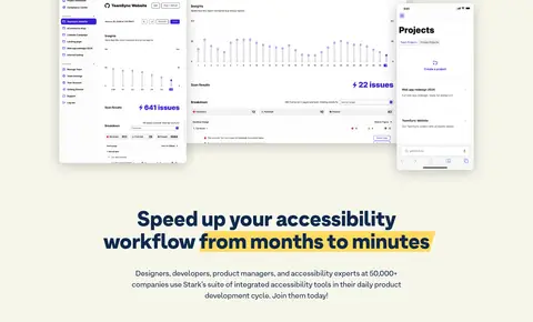
Imagery · Use product-interface screenshots as the key proof point: layered desktop and mobile views, reports, charts, and collaboration UI. Pair these with colorful illustrated platform and security graphics rather than lifestyle photography. The hero’s interface collage sits over a violet-to-magenta visual field with chart-like bars; later visuals float in open ivory space. Keep images crisp, large enough to read as software, and integrated with the surrounding color rather than boxed into generic frames.
Use Electric Violet (#381fd1) as the defining hero field.
Keep the main content canvas Gallery Ivory (#f6f6eb).
Use Midnight Ink (#10284b) for light-section headings and copy.
Highlight selected heading phrases with Marker Gold (#fedb63).
Let product screenshots and custom illustrations carry the visual proof.
Reserve Seafoam and Lavender Mist for distinct large card surfaces.
✕ 不该做
Do not turn every section into a colored panel.
Do not replace the warm ivory canvas with stark white.
Do not use yellow as a general page background.
Do not add heavy shadows or ornamental borders.
Do not crowd the centered content with dense, wide text blocks.
Do not use lifestyle photography in place of software visuals.
给 AI 的提示词
想快速出一个同风格的新页面,把这段话连同 DESIGN.md 一起发给 AI。
Build a new SaaS page in Stark’s visual style. Start with a full-bleed Electric Violet (#381fd1) hero, compact white navigation, an oversized heavy headline, concise centered copy, and a contrasting Marker Gold (#fedb63) CTA. Continue on a Gallery Ivory (#f6f6eb) canvas with Midnight Ink (#10284b) headings, spacious centered feature stories, and selective yellow marker highlights. Use ArminGrotesk or a close DM Sans substitute for rounded, weighty display and readable body text; use tracked uppercase Roboto Mono for small eyebrows. Include crisp, layered product UI screenshots and purpose-made illustrations. Build distinct Seafoam (#99d6cc) and Lavender Mist (#faf5ff) rounded cards, not repeated generic panels. Keep the layout comfortable, use clear column groupings, and finish with a Midnight Ink footer.