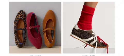
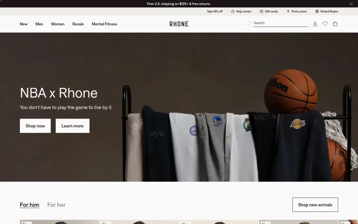
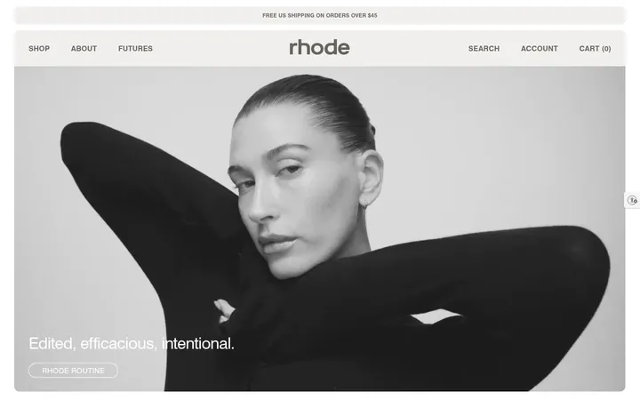
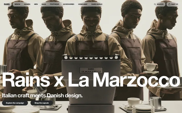
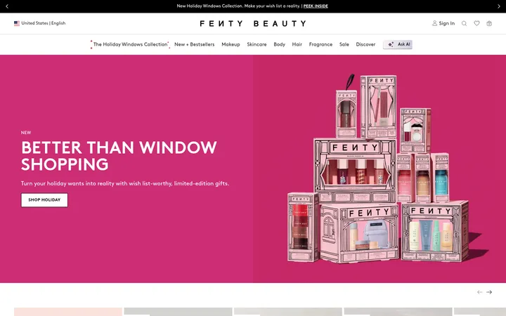
North star · Keep the interface quiet and product-first, reserving expressive typography and saturated color for image-led campaign moments.
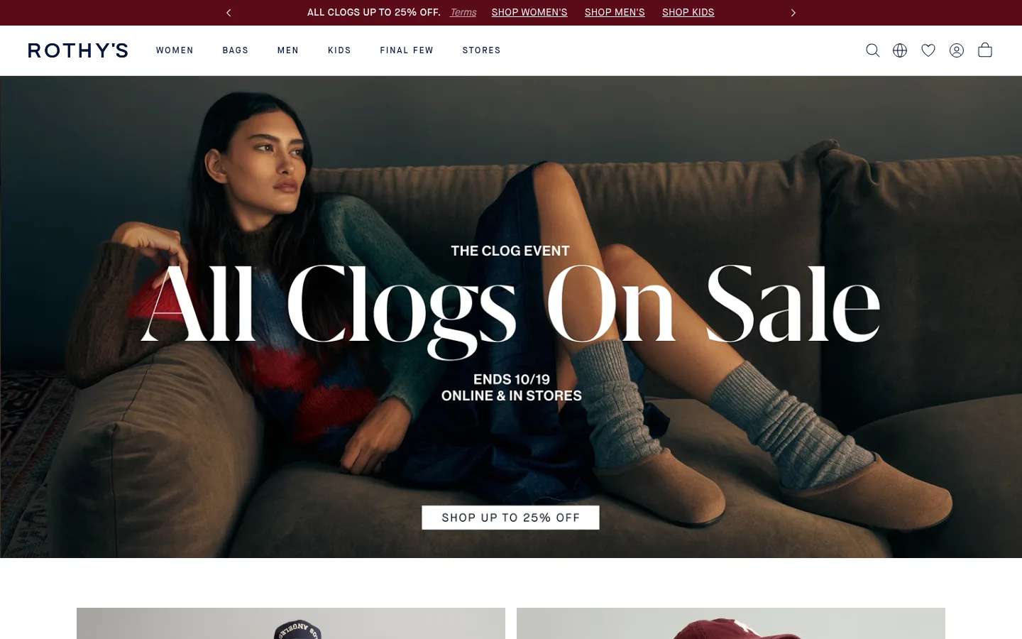
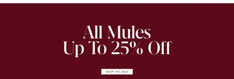
The page contrasts a predominantly white canvas with richly colored campaign photography, letting imagery supply most of the visual drama. Midnight navy (#03143b) anchors navigation, headings, and product information; a deep burgundy (#5a0a18) appears as a promotional band rather than a general interface color. Maison Neue provides the clean, compact interface voice, with tracked uppercase button labels and nav text. Grifo S Light brings high-contrast editorial character to oversized campaign headlines. The hero uses full-bleed photography with centered white messaging and a simple white CTA. Below it, generous white space separates paired campaign tiles, a horizontal product rail, category imagery, and a product-led feature. Thin light-gray rules and almost no elevation keep the UI flat, while consistent image-led modules make browsing feel visual and calm.
Navigation, body copy, links, captions, and button labels
Aa 设计
Maison Neue Medium
网络字体 · 字重 400 / 500 / 100 · 占比 22%
免费替代:Inter
Primary campaign heading and uppercase eyebrow
Aa 设计
Grifo S Light
网络字体 · 字重 300 · 占比 2%
免费替代:Cormorant Garamond
Editorial campaign and section headlines
角色
示例
字号
字重
行高
字距
一级标题
Primary campaign headline, large and editorial over hero imagery.
The quick brown fox 敏捷的狐狸
24px
400
1.15
0.119em
二级标题
Light serif headings for featured campaign and product sections.
The quick brown fox 敏捷的狐狸
20px
300
1.6
0
正文
Product names, descriptions, and supporting shopping copy.
The quick brown fox 敏捷的狐狸
14px
400
1.43
0.036em
辅助文字
Small product labels, prices, and image captions.
The quick brown fox 敏捷的狐狸
13px
400
1.38
0.038em
按钮
Tracked uppercase labels on compact shopping CTAs.
The quick brown fox 敏捷的狐狸
16px
400
1
0.125em
导航
Compact primary navigation and category links.
The quick brown fox 敏捷的狐狸
13px
400
1.38
0.038em
链接
Shop links beneath campaign tiles and product listings.
The quick brown fox 敏捷的狐狸
14px
400
1.43
0.036em
眉题
Small uppercase campaign and collection labels.
The quick brown fox 敏捷的狐狸
12px
400
1.33
0.167em
间距与布局
基准单位 8px · 密度:适中
80px版块间距
24px元素间距
—卡片内边距
1360px内容最大宽度
3px
4px
5px
8px
10px
12px
16px
24px
28px
32px
40px
72px
80px
The page uses a wide desktop canvas capped at the measured 1360px maximum width, with full-bleed campaign media breaking beyond the content grid. Its sequence alternates image-led hero, paired tiles, a horizontal product rail, another paired campaign block, a promotional color band, a featured collection, and four category tiles. Section spacing is generous, with a comfortable density and clear separation between modules. Product and category grids align images cleanly; text is mostly centered for campaign moments and restrained around commerce details.
圆角与层次
没有测到阴影:页面是扁平的,层次靠底色和描边区分。
The interface is largely flat: measured styles show no shadows and no established radius scale. Thin light-gray rules provide occasional separation, while white space and changes in image or section background define hierarchy. Dark campaign media and the burgundy promotion band create layering through contrast rather than card elevation.
组件
下面的预览按实测的按钮、输入框、徽标、卡片样式重建(字体用替代字体)。
Announcement bar
A slim burgundy promotion strip above the white header, with compact links, terms text, and directional controls.
Primary navigation
White horizontal header with the wordmark, category links, and simple utility icons; labels use small Maison Neue sans text.
Campaign hero
Full-bleed lifestyle media with centered white eyebrow and serif headline, supporting text, and a white rectangular CTA.
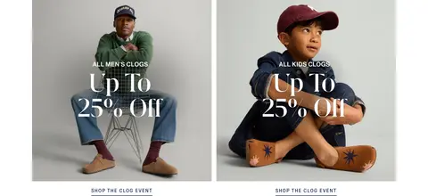
Paired campaign tiles
Two adjacent product or lifestyle images with centered overlay copy and understated shop links beneath.
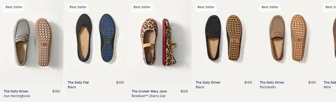
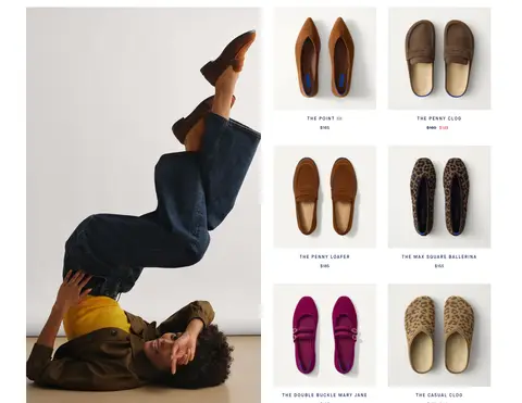
Product rail
Horizontally browsable product images with small labels and prices; keep text compact and navy.
Collection feature
A large lifestyle image paired with smaller product tiles, a short collection heading, and a shop link.
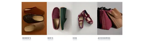
Category image navigation
Four image tiles for women, men, kids, and accessories, each paired with a small underlined category link.
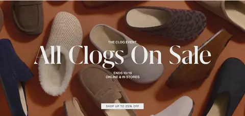
Imagery · Photography is the dominant visual language: lifestyle models wearing shoes, styled product still lifes, and close product views. The opening campaign uses cinematic, full-width video or imagery with dark tonal contrast and centered overlay copy. Other blocks use paired or tiled product photographs on pale backgrounds. Images retain natural textures and warm, varied color; illustrations and 3D are not a defining feature.
Use editorial serif headlines for campaign moments.
Let full-bleed photography carry the hero impact.
Reserve burgundy for promotions and select accents.
Keep product names and prices compact and legible.
✕ 不该做
Do not add decorative shadows or heavy card framing.
Do not use burgundy as the default interface background.
Do not let utility navigation compete with campaign imagery.
Do not replace product photography with illustrations.
Do not crowd the page with dense promotional copy.
Do not apply oversized serif typography to every label.
给 AI 的提示词
想快速出一个同风格的新页面,把这段话连同 DESIGN.md 一起发给 AI。
Build a fashion-commerce page using Rothy’s editorial visual language. Use Gallery White (#ffffff) as the main canvas and Midnight Ink (#03143b) for navigation, headings, and product text. Keep Quiet Silver (#dcdbdd) hairlines subtle, and use Soft Porcelain (#f9f8f7) only for gentle section variation. Reserve Claret (#5a0a18) for a promotional strip or special sale moment; use Muted Graphite (#5d5d5d) for secondary text. Pair a clean Maison Neue-like sans interface with light, expressive serif campaign headlines. Create an image-led hero, paired campaign tiles, a product rail, and category image links. Keep spacing generous, imagery natural and tactile, controls simple, and elevation minimal. Prioritize calm shopping clarity over decorative UI.