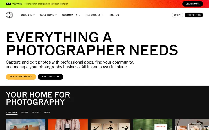
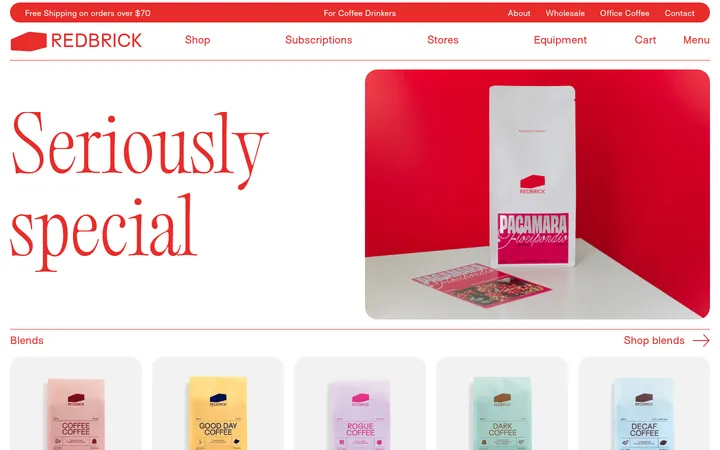
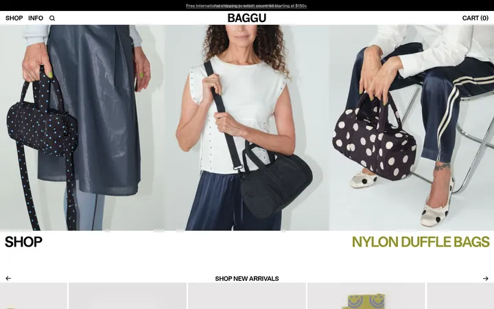
North star · Let large, expressive product imagery and FoundersGrotesk typography lead, while keeping the interface flat, pale, and uncluttered.
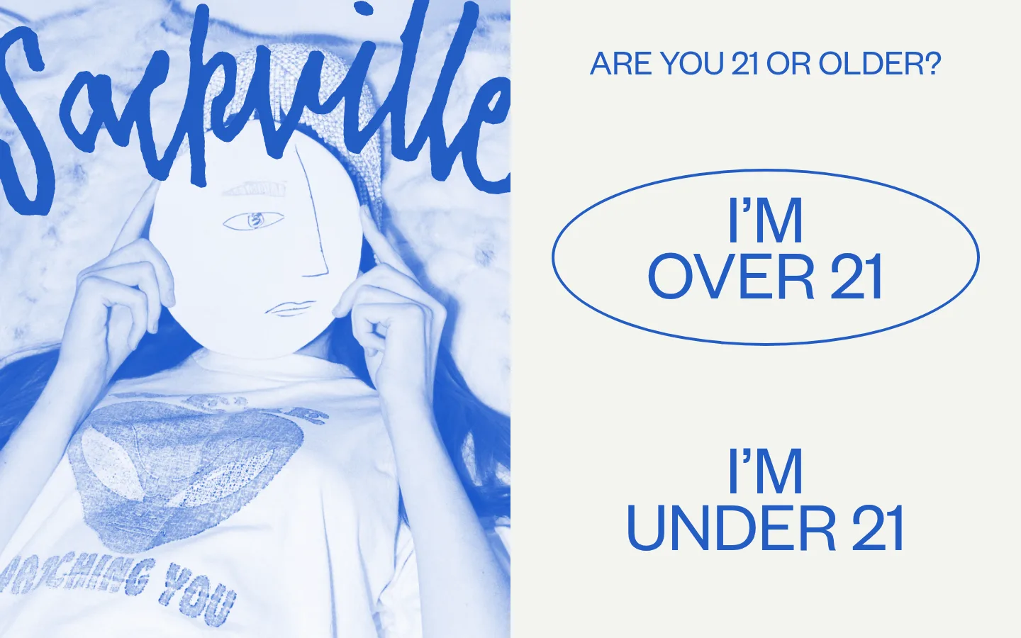
The page is grounded in a warm pale canvas (#f3f4ee), which lets colorful campaign imagery and product photography carry most of the visual energy. Ink-dark text (#231f20) keeps product names, prices, and navigation legible, while Sackville blue (#245dc5) appears prominently in the age-gate screen and as a crisp outline accent. A vivid red-orange section (#f52302) is reserved for a featured product block, rather than used as a general interface color. FoundersGrotesk drives nearly all typography: oversized uppercase headlines contrast with comparatively small product details and generously led body text. A very small amount of TimesNow SemiLight adds a softer serif note. The layout alternates full-bleed product and campaign images with restrained product grids, keeping the page image-led while allowing broad pale intervals to reset the eye. Product cards are flat and minimally framed; thin borders and occasional outlined controls provide structure without heavy shadows.
Primary display, headings, navigation, links, body copy, and product information.
Aa 设计
TimesNow SemiLight
网络字体 · 字重 400 · 占比 5%
免费替代:Cormorant Garamond
Sparse serif contrast in secondary product or editorial details.
角色
示例
字号
字重
行高
字距
特大标题
Oversized campaign or hero display lettering.
Sackville & Co.
129.5px
400
0.8
0
一级标题
Large uppercase age-gate and primary headline text.
Sackville & Co.
99px
400
0.8
0
二级标题
Prominent product feature and editorial section headings.
Sackville & Co.
85px
400
0.94
0
三级标题
Uppercase collection or feature headings.
Sackville & Co.
72px
400
1
0
四级标题
Secondary feature titles and large product names.
Sackville & Co.
60.5px
400
0.8
0
正文
Supporting copy and product descriptions.
The quick brown fox 敏捷的狐狸
16px
400
2.19
0
导航
Large uppercase navigation labels, especially in expanded navigation.
Sackville & Co.
38px
400
1.15
0
链接
Uppercase calls to action and prominent product links.
The quick brown fox 敏捷的狐狸
23px
400
1
0
间距与布局
基准单位 2px · 密度:适中
60px版块间距
2px元素间距
—卡片内边距
1354px内容最大宽度
1px
2px
5px
6px
9px
10px
19px
20px
21px
22px
26px
40px
43px
58px
60px
64px
The measured page content reaches a maximum width of 1354px, with comfortable density and a measured 60px section gap. Most featured sections are single-column and image-led, often using full-bleed media; catalog sections switch to centered product grids of three or four columns. Headings and product details generally align to the start, while one merchandise grid centers its text. Broad pale intervals give the long scroll a relaxed, gallery-like cadence.
圆角与层次
按钮 · 9999px
没有测到阴影:页面是扁平的,层次靠底色和描边区分。
The interface is largely flat, with no measured shadows or gradient treatments. Image blocks and colored section bands provide depth and contrast instead of card elevation. Thin rules and outlined controls do the limited structural work; product cards remain visually open, with text placed directly below the imagery.
组件
下面的预览按实测的按钮、输入框、徽标、卡片样式重建(字体用替代字体)。
Age gate
Split-screen entry panel with a blue-toned campaign image and a pale canvas area. The over-21 option is a large blue outlined oval; the under-21 option is unframed.
Featured product panel
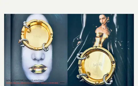
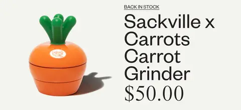
Large image-led product feature with product title and price set in oversized, dark sans-serif type against the pale canvas.
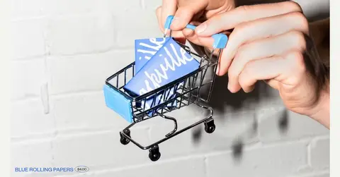
Campaign media block
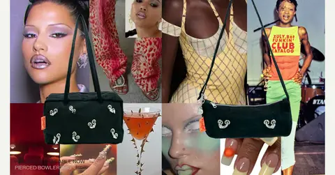
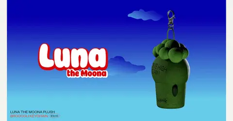
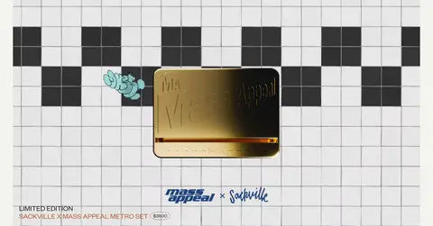
Full-width still-image or video panel showing product collaborations and lifestyle campaigns, with minimal surrounding interface decoration.
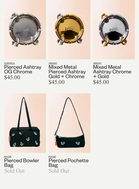
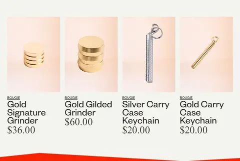
Product grid card
Flat product image over a light peach field, followed by a small uppercase descriptor, dark product title, and price.
Collection grid
Multi-column product listing with compact image tiles, straightforward labels, and ample pale space around the grid.
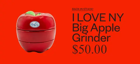
Color-block feature
Featured product content sits within a saturated red-orange section, creating a deliberate contrast with the otherwise pale page.
Imagery · Photography dominates: polished close-ups of metal accessories, lifestyle and fashion campaign collages, product stills, and collaboration imagery. Large campaign panels are often full-bleed or nearly full-width; catalog items sit on soft peach backdrops. Two full-width video sections interrupt the still-image sequence. Saturated hues inside product graphics and campaign imagery belong to the media, not necessarily to the interface palette.
Use Gallery White (#f3f4ee) as the main page canvas.
Let product photography occupy large, uninterrupted areas.
Use FoundersGrotesk-style sans typography for most content.
Set prominent campaign headlines in oversized uppercase type where appropriate.
Keep catalog cards flat with concise labels and prices.
Reserve Sackville Blue (#245dc5) for crisp brand accents and outlines.
Use strong color blocks selectively for featured products.
✕ 不该做
Don't add drop shadows to product cards.
Don't turn every section into a boxed card.
Don't use saturated accent colors as the default page background.
Don't crowd large campaign imagery with extra interface controls.
Don't make product metadata compete with the product title.
Don't mistake colors inside campaign artwork for global UI colors.
给 AI 的提示词
想快速出一个同风格的新页面,把这段话连同 DESIGN.md 一起发给 AI。
Build a new ecommerce page in Sackville & Co.’s image-led editorial style. Use Gallery White (#f3f4ee) as the broad canvas, Soft Ink (#231f20) for core copy and product names, and Sackville Blue (#245dc5) for selective brand outlines or accents. Keep the interface flat and let oversized campaign photography, product images, and occasional video define the rhythm. Use a FoundersGrotesk-like sans serif with bold scale changes: expressive uppercase feature headings, then compact product labels and clear prices. Alternate expansive single-product storytelling with tidy multi-column product grids, leaving generous pale intervals between sections. Peach Blush (#ffc6a6) can support product-image fields; reserve Signal Vermilion (#f52302) for a single intentional feature band. Avoid card shadows, heavy borders, and generic dense storefront chrome.