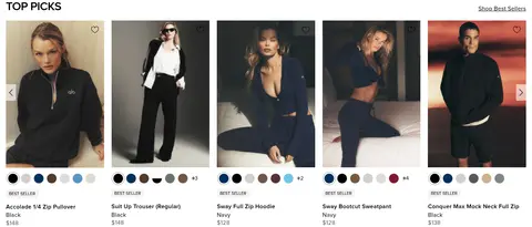
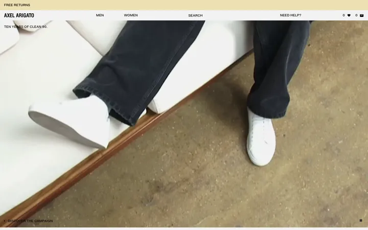
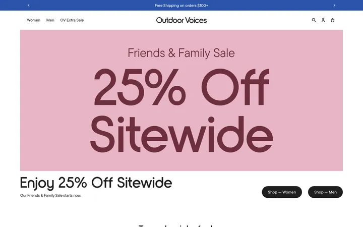
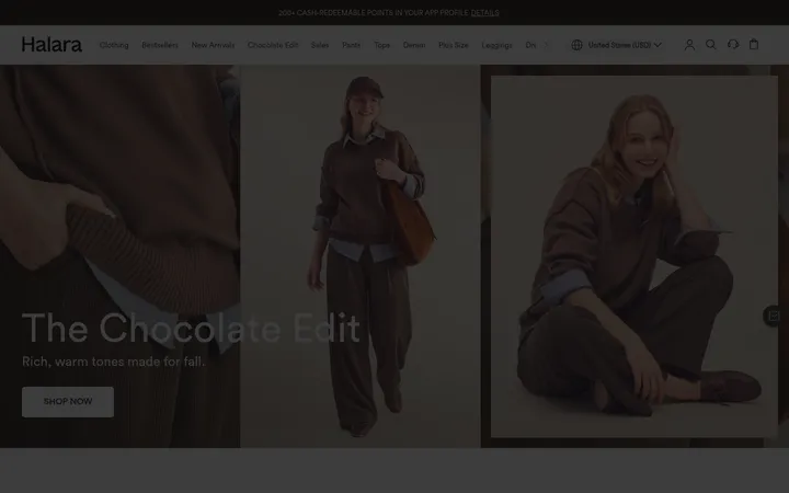
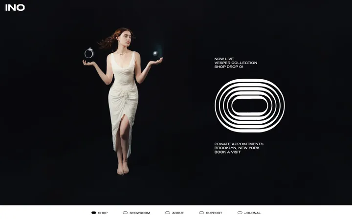
North star · Keep the interface quiet and monochrome so full-bleed lifestyle photography and tightly curated product grids carry the visual energy.
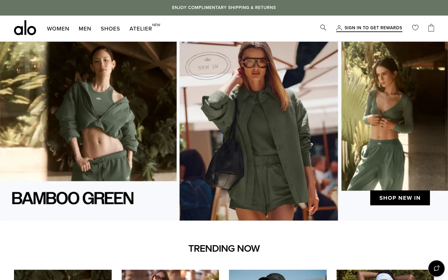
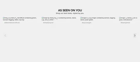
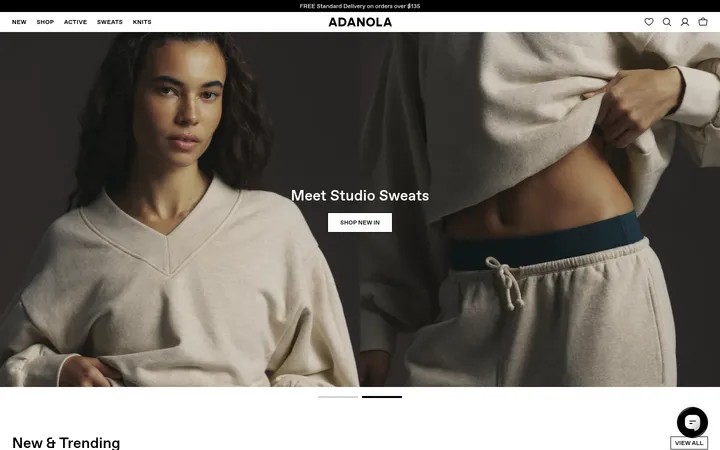
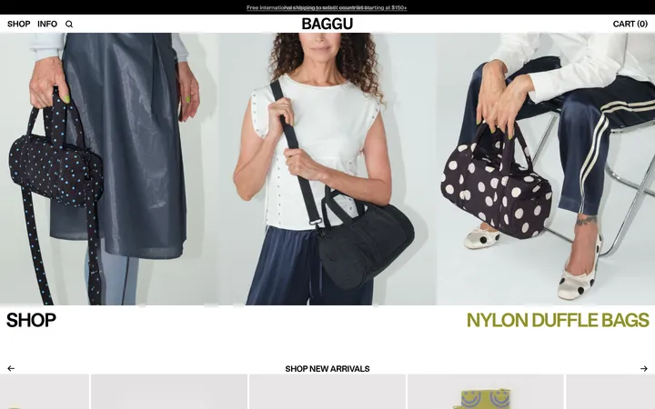
The visual system keeps the interface nearly monochrome: white is the dominant canvas, black carries navigation, headings, product details and primary calls to action, while pale gray distinguishes selected lower-page bands and fine boundaries. Color accents such as navy, blue, yellow and green are sparse in the measured interface and read primarily as merchandising cues, not a competing brand palette. Proxima Nova is used throughout, with uppercase navigation and buttons gaining emphasis through tracking and heavier weights; headings remain clean and unornamented. The page alternates full-bleed campaign photography with centered editorial headings, horizontal category imagery and a dense product carousel. Product cards rely on photography, compact labels, price text and small color swatches. Generous white intervals separate major campaigns, while grid areas tighten the pace. The overall effect depends on crisp contrast and image-led storytelling rather than decorative interface effects.
Site-wide type for navigation, headings, product information, links, buttons, captions, and footer content.
角色
示例
字号
字重
行高
字距
一级标题
Campaign and primary page headlines, kept clean and unornamented.
Alo Yoga
32px
400
1.1
0
正文
Supporting copy, product details, and general section text.
The quick brown fox 敏捷的狐狸
16px
600
1.4
0.022em
辅助文字
Compact product labels, small descriptions, and supporting metadata.
The quick brown fox 敏捷的狐狸
14px
400
1.4
0.022em
按钮
Primary shopping calls to action; heavy, uppercase, tracked text.
The quick brown fox 敏捷的狐狸
18px
900
1
0.083em
导航
Uppercase category navigation with moderate tracking.
The quick brown fox 敏捷的狐狸
18px
500
normal
0.05em
链接
Product names, shopping links, and footer destinations.
The quick brown fox 敏捷的狐狸
16px
400
1.4
0.022em
眉题
Uppercase introductory labels above campaign or section copy.
The quick brown fox 敏捷的狐狸
18px
500
1.1
0.05em
间距与布局
基准单位 1px · 密度:适中
70px版块间距
2px元素间距
12px卡片内边距
1300px内容最大宽度
2px
4px
5px
8px
9px
10px
12px
15px
16px
20px
24px
30px
32px
70px
The page uses a wide desktop storefront with full-bleed campaign imagery alongside centered content and multi-column merchandising grids. The measured maximum page width is 1300px, with a comfortable density and recurring section gaps of 70px. Hero campaigns stretch across the viewport; product and category sections use four- to twelve-column structures, with visible cards arranged in tighter horizontal runs. Headings alternate between centered editorial placement and left-aligned merchandising labels. Preserve generous white intervals between major campaigns, then tighten spacing within product cards and category rows.
圆角与层次
按钮 · 50%
sm · other
The storefront is mostly flat, with white canvas and occasional pale-gray bands providing section changes. Fine borders define quiet control and card details; strong contrast comes from black text and filled CTA buttons rather than shadows. Reserve the measured soft shadow for isolated floating interface elements, not product cards or campaign blocks.
组件
下面的预览按实测的按钮、输入框、徽标、卡片样式重建(字体用替代字体)。
Announcement bar
A narrow sage-green strip above the white header, carrying centered, uppercase shipping-and-returns copy.
Storefront navigation
White horizontal header with black wordmark, uppercase category links, and compact search, account, favorite, and bag icons.
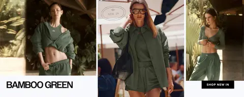
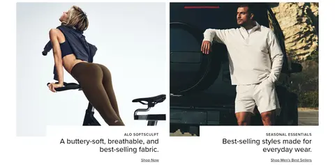
Campaign hero
Large image-led campaign assembled from adjacent photographs, with a strong black uppercase campaign label and a black SHOP NEW IN button.
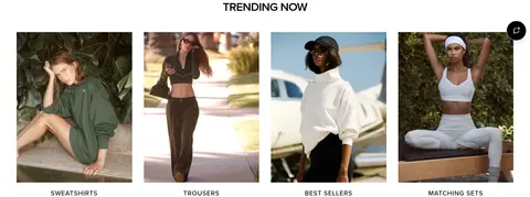
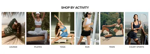
Category tiles
A horizontal photographic grid with short uppercase category links beneath each image, surrounded by generous white space.
Product cards
Compact product photography, BEST SELLER badge, product name, color and price details, plus small color-selection swatches.
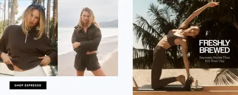
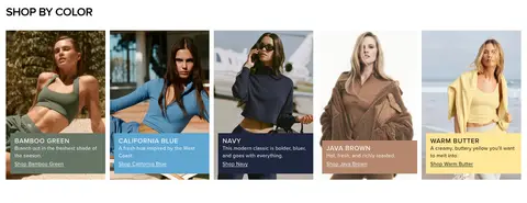
Shop-by-color cards
Seasonal color stories pair a model image with a colored caption area, a brief description, and a shopping link.
Footer
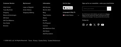
Dense black footer with grouped white links, app and newsletter areas, social icons, and small legal links.
Imagery · Lifestyle photography dominates: models wear athletic apparel in natural, studio, and street settings. Campaign imagery is often full-width or arranged as adjacent panels; product and category imagery sits in clear card grids. Keep the photography warm and editorial, with natural environments and garments providing the strongest color. There is no defining illustration or 3D treatment; measured seasonal hues should not be mistaken for interface palette.
Keep headings, navigation, and primary controls black.
Let editorial apparel photography lead each campaign.
Alternate full-width imagery with restrained card grids.
Use uppercase, tracked text for navigation and key CTAs.
Keep seasonal colors limited to product stories and swatches.
✕ 不该做
Do not add a bright, persistent interface color.
Do not decorate the page with gradients or heavy shadows.
Do not crowd campaign imagery with excess copy.
Do not turn the layout into a dense dashboard.
Do not use seasonal card colors as global brand surfaces.
Do not replace the clean sans-serif typography with a display serif.
给 AI 的提示词
想快速出一个同风格的新页面,把这段话连同 DESIGN.md 一起发给 AI。
Build a fashion storefront page in Alo Yoga’s restrained editorial style. Use Gallery White (#ffffff) as the main canvas and Studio Ink (#000000) for navigation, headings, product copy, footer, and primary CTA buttons. Set text in a clean Proxima Nova–like sans serif, using uppercase tracked navigation and bold uppercase CTA labels. Structure the page with a full-width photographic campaign, spacious editorial section breaks, and compact product or category grids. Let lifestyle photography supply most of the color; use Bamboo Sage (#677566), Deep Navy (#01305c), Coastal Blue (#5993c1), or Butter Light (#ffe699) only as localized seasonal merchandising cues. Use Soft Fog (#f0f0f0) for occasional muted section bands. Favor thin boundaries and flat surfaces over shadows. Keep product labels and secondary links compact and legible.