North star · Let warm, expansive architectural photography lead, and keep the interface quiet, spacious, and sharply contrasted against cream and deep brown.
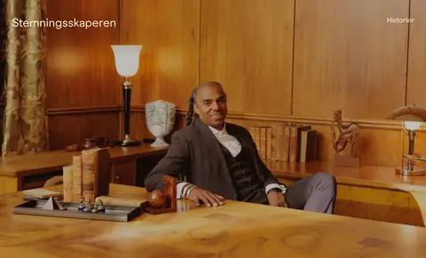
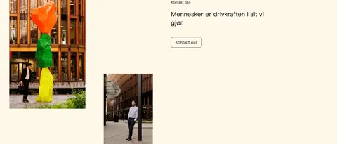
The visual identity is built around a warm, restrained contrast: Gallery Cream (#fff8e9) forms the main reading canvas, while deep Espresso (#2f2116) anchors immersive media bands and the footer. Photography often supplies its own earthy browns and changing seasonal colours; those image tones are content, not extra interface colours. ModernEra is used throughout in regular weights, with clean, unforced line breaks and no conspicuous tracking or all-caps treatment. The page alternates full-bleed video or imagery with quiet cream sections containing loosely balanced, asymmetric photo pairs and editorial content. Generous open space makes each project image feel considered rather than packed into a conventional card grid. Pale Peach (#ffebd0) carries text and outlined controls on dark imagery; muted Gold (#fee197) is reserved for navigation and fine interface accents. Hairlines and outlined controls stay subtle, while the photography supplies depth and atmosphere.
Site-wide typeface for navigation, headings, body copy, captions, and controls.
角色
示例
字号
字重
行高
字距
一级标题
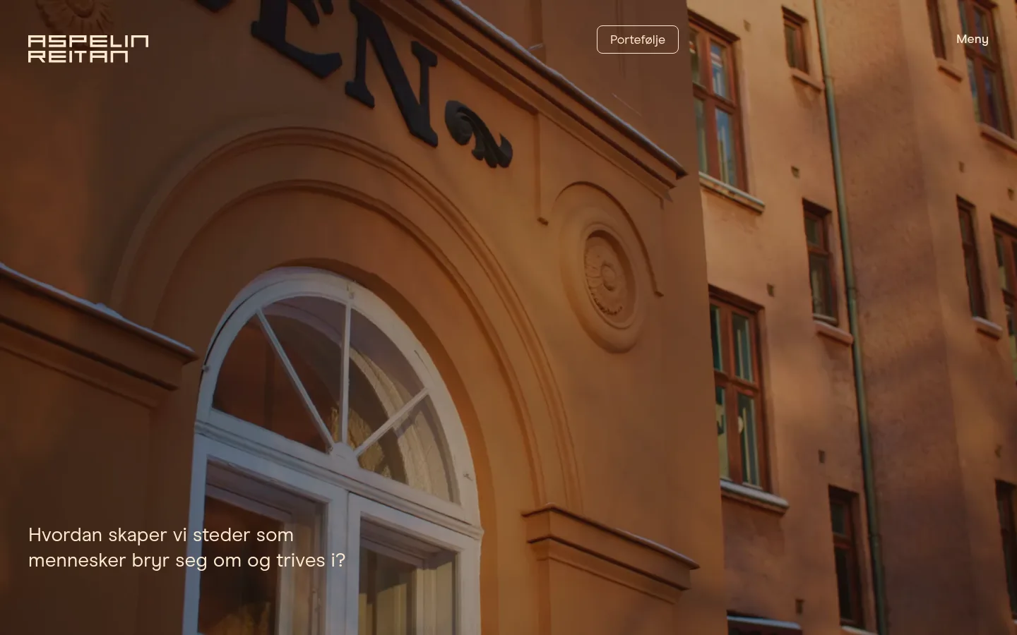
Lead statement over full-bleed hero imagery.
Aspelin Reitan
40px
400
1.2
0
二级标题
Section titles and prominent editorial headings.
Aspelin Reitan
28px
400
1.29
0
三级标题
Secondary story and content headings.
The quick brown fox 敏捷的狐狸
24px
400
1.17
0
正文
Project descriptions, statements, and general editorial copy.
The quick brown fox 敏捷的狐狸
18px
400
1.22
0
辅助文字
Project labels, metadata, and compact supporting text.
The quick brown fox 敏捷的狐狸
16px
400
1.25
0
按钮
Outlined portfolio and contact controls.
The quick brown fox 敏捷的狐狸
18px
500
1.22
0
导航
Prominent menu and navigation labels.
Aspelin Reitan
28px
400
1.29
0
间距与布局
基准单位 4px · 密度:适中
40px版块间距
20px元素间距
—卡片内边距
1360px内容最大宽度
8px
11px
12px
16px
18px
20px
24px
25px
40px
45px
50px
55px
60px
64px
100px
120px
The desktop layout uses a measured 1360px maximum content width, with broad margins and a comfortable density. Full-bleed media sections alternate with cream content bands. Project features use two columns with visibly asymmetric image sizes and alignment rather than a uniform card grid. Editorial content also sits in an open two-column arrangement. The section rhythm is spacious and varied, with measured gaps of 40px between sections and 20px between elements. Keep text aligned to the start and let images occupy generous, uninterrupted areas.
圆角与层次
按钮 · 8px
没有测到阴影:页面是扁平的,层次靠底色和描边区分。
The interface is mostly flat: no measured shadows or gradients. Separate content through alternating cream and deep-brown section backgrounds, image edges, and generous whitespace. Controls use fine outlined borders rather than filled buttons; the measured button radius is 8px, while navigation and text links remain unboxed.
组件
下面的预览按实测的按钮、输入框、徽标、卡片样式重建(字体用替代字体)。
Overlay header
Place the logo at the left of the hero, an outlined Portefølje control near the center, and a simple Meny label at the right; light text sits over photography.
Portfolio outline button
Use pale text and a 1px #ffebd0 outline on dark media, with an 8px radius and measured 18px ModernEra text.
Project image pair
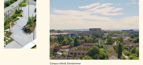
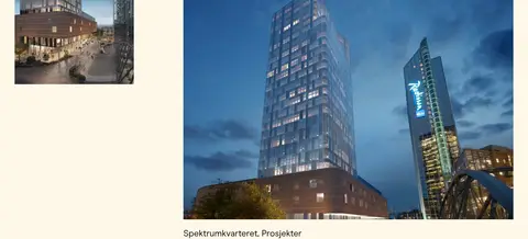
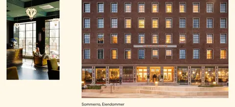
Arrange two photographs asymmetrically in a cream feature band; one image is substantially larger, with a compact project label beneath.
Full-bleed story panel
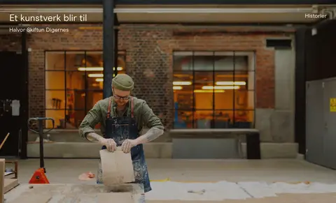
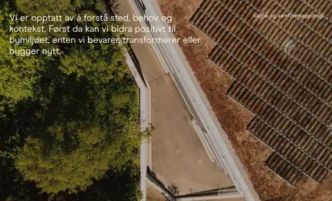
Use a broad photographic or video surface on #2f2116, overlaying restrained pale text and a small category label.
Editorial content feed
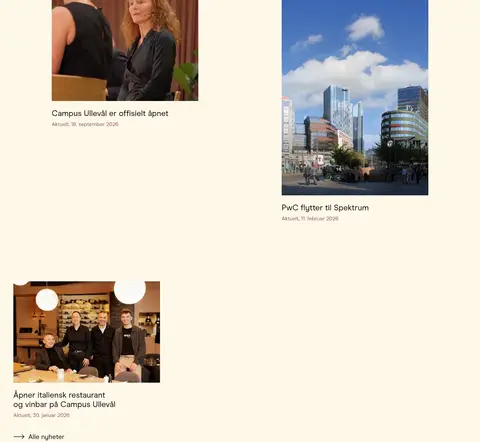
Show article imagery, titles, and dates in a roomy two-column arrangement on #fff8e9, with text kept visually secondary to the photos.
Contact button
Set black text and a 1px black outline on the cream surface, using the measured 8px radius and 18px type.
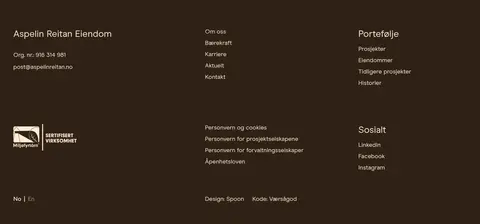
Dark footer
Group company details, portfolio links, legal links, and social links into open columns over the deep-brown surface.
Imagery · Use real architectural, urban, and people photography as the primary visual material, with video-like full-bleed hero and story panels. Images are large, naturalistic, and often warm-toned, showing buildings, public spaces, interiors, and human activity. Preserve the original photo colour and use a restrained dark overlay where light text must remain legible. Supporting project images vary in size and crop within paired layouts; there are no illustrative or 3D-led motifs.
Alternate cream sections with deep-brown media bands.
Let architectural photography dominate the composition.
Use asymmetric image pairs instead of uniform card grids.
Keep text aligned to the start and give it room to breathe.
Use pale peach text on dark surfaces and black text on cream.
Keep controls outlined and visually restrained.
✕ 不该做
Do not add gradients or decorative shadows.
Do not introduce saturated interface colours beyond the measured palette.
Do not put every image inside a uniform bordered card.
Do not use heavy, condensed, or all-caps typography.
Do not let captions compete with the primary imagery.
Do not treat colours visible only in photographs as UI tokens.
给 AI 的提示词
想快速出一个同风格的新页面,把这段话连同 DESIGN.md 一起发给 AI。
Build a new page in Aspelin Reitan’s restrained, editorial real-estate style. Use Gallery Cream (#fff8e9) for the main content canvas and Deep Espresso (#2f2116) for dark footer or immersive media sections. Treat architectural photography as the hero: large, natural images with minimal interface chrome and carefully legible overlays. Use ModernEra throughout, or a close sans-serif substitute, with regular-weight text and natural casing. Organize project content in spacious, asymmetric two-column image pairs rather than boxed cards. Use Pale Peach (#ffebd0) for text and outlines on dark areas, Muted Gold (#fee197) for limited navigation accents, and black (#000000) for text and outlines on cream. Keep controls outlined, sections generously spaced, and the overall page flat, calm, and image-led.