North star · Let expansive white space and restrained type frame vivid, place-based imagery rather than compete with it.
The page uses a clear alternation between white editorial sections and dark, media-led bands. Black and near-black establish the opening and investment-map section, while white canvas gives headings, explanatory copy, and metrics room to breathe. Forest green and deep blue appear as distinctive project surfaces; the burnt orange is a selective highlight within project work rather than a dominant page-wide accent. Proxima Nova carries the interface in light, large headings and practical, regular-weight body text; Lora is a minor secondary voice. The layout favors broad content regions, strong left alignment, and image cards with subtly rounded corners. Thin pale-gray rules divide lists and content rows without adding visual weight. Photography ranges from architecture and landscapes to people and project imagery, while illustrated project panels use restrained geometric marks. The overall effect is calm, spacious, and grounded in place.
Primary headings, body copy, navigation, labels, and links.
Aa 设计
Lora
网络字体 · 字重 400 · 占比 3%
免费替代:Lora
Minor secondary typographic voice; not prominent in the visible page.
角色
示例
字号
字重
行高
字距
特大标题
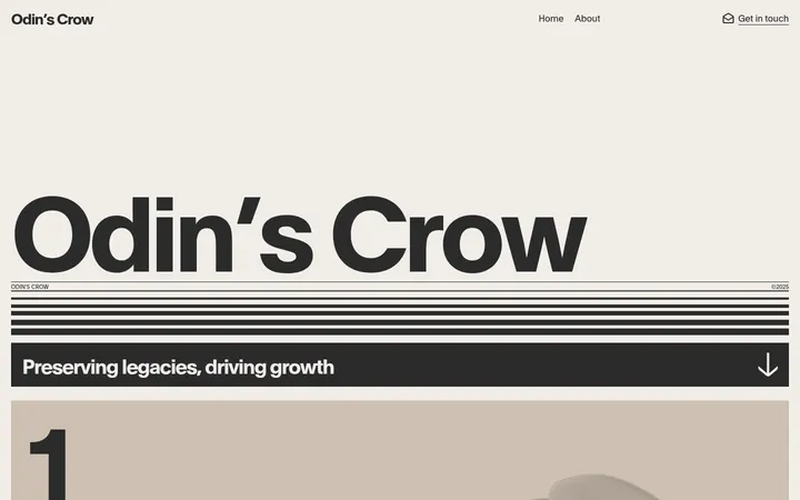
Oversized hero wordmark or high-impact display lettering.
Aker
168px
300
1
0
一级标题
Primary hero or major page statement.
Aker
80px
300
0.8
0
二级标题
Large section headings such as What we do and Our work.
Aker
62px
300
0.95
-0.025em
三级标题
Subsection headings and prominent project titles.
Aker
36px
400
1.1
-0.02em
四级标题
Smaller section or card headings.
Aker
30px
400
1.2
-0.02em
正文
Paragraphs, descriptions, navigation, and standard links.
The quick brown fox 敏捷的狐狸
16px
400
1.3
0
辅助文字
Compact labels, metadata, and image captions.
The quick brown fox 敏捷的狐狸
14.5px
400
1.5
0
间距与布局
基准单位 2px · 密度:适中
64px版块间距
16px元素间距
—卡片内边距
1396px内容最大宽度
2px
4px
6px
8px
10px
13px
14px
16px
22px
24px
32px
48px
64px
Build a broad, centered composition with a measured maximum content width of 1396px. The page moves between a dark full-width opening, white editorial sections, another dark investment band, and white project and metrics areas. Align headings and copy to the left, using image cards and content rows to create varied, asymmetrical groupings. Section spacing is generous, with comfortable separation between elements. Fine horizontal rules organize lists and repeated content; avoid dense grids or tightly packed blocks.
圆角与层次
按钮 · 9999px
卡片 · 3px
图片 · 8px
链接 · 8px
没有测到阴影:页面是扁平的,层次靠底色和描边区分。
The interface is predominantly flat: no measured shadows define its components. Pale-gray hairlines separate lists and content groups, while images and solid-color panels provide depth through contrast rather than elevation. Keep layering restrained, using dark gradients or overlays only where text must sit over media.
组件
下面的预览按实测的按钮、输入框、徽标、卡片样式重建(字体用替代字体)。
Hero and navigation
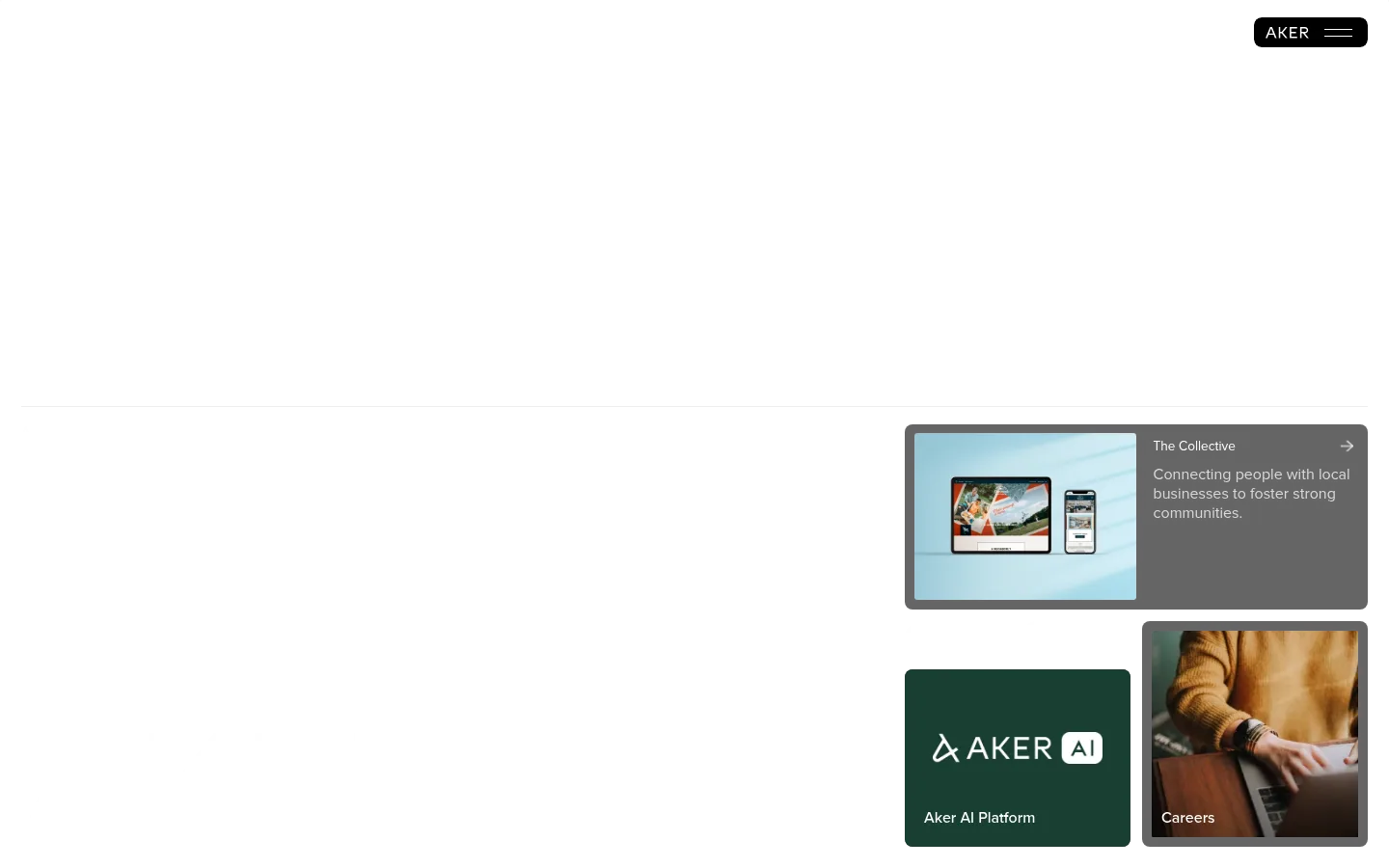
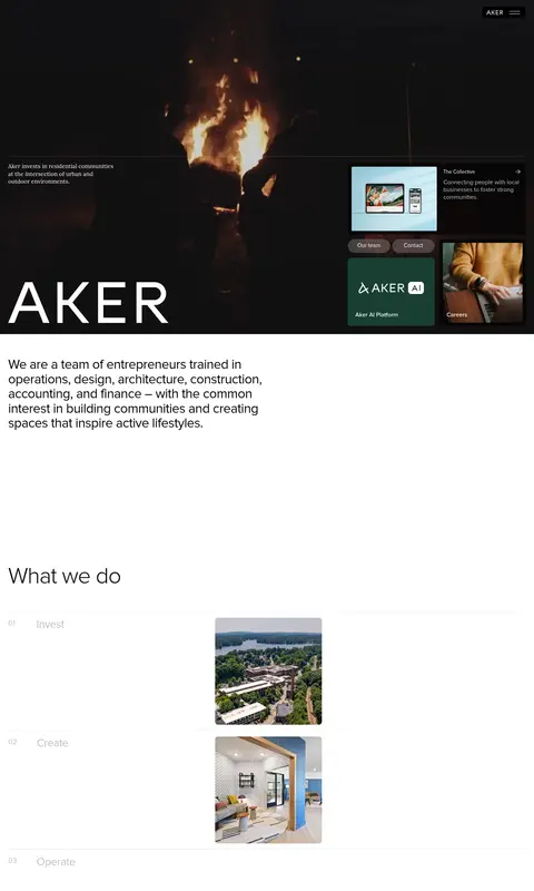
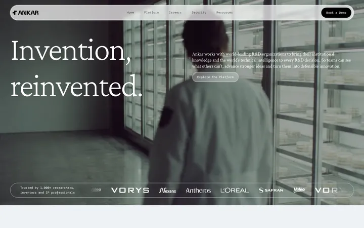
A dark, media-led opening pairs the Aker wordmark and brief positioning copy with compact top-right menu controls and project tiles.
Editorial introduction
A short left-aligned paragraph sits alone on white with substantial surrounding whitespace.
What we do list
Three numbered investment, creation, and operations rows use pale rules and supporting project imagery.
Project cards
Large media panels use restrained rounded corners, geometric artwork or photography, and concise titles and descriptions.
Investment map
A near-black full-width section presents the investment heading and a map graphic with subdued labels.
Metric display
Large, light-weight figures are arranged with ample whitespace and an intentionally staggered alignment.
Contact cards
Two broad closing cards pair investment or collaboration prompts with a light neutral surface or landscape photography.
Imagery · Use atmospheric, place-based photography of architecture, landscapes, interiors, and people. Give major images broad, clean frames, with gently rounded corners on media cards. Project showcase panels can use simple geometric line illustrations on solid green, blue-green, or orange surfaces. The opening is cinematic and dark, with imagery integrated into the hero rather than presented as a conventional bright banner.
Use white editorial space to create contrast with dark feature bands.
Keep major headings light in weight and visually prominent.
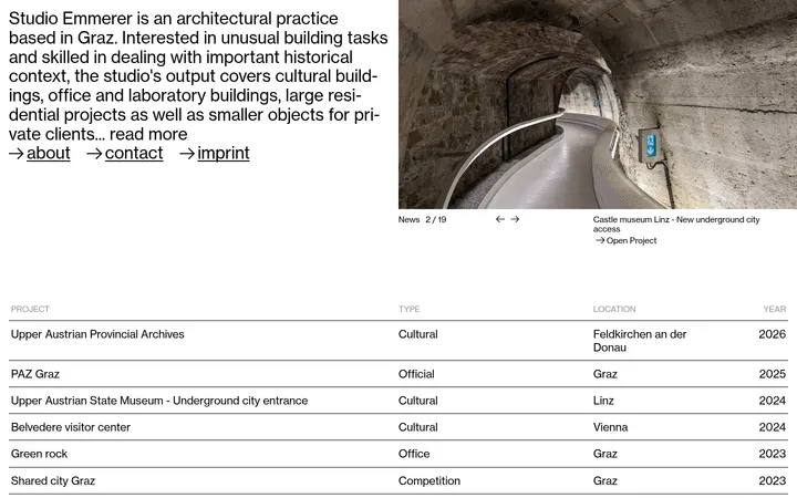
Use fine pale-gray rules to structure repeated rows.
Choose place-specific architecture, landscape, and community photography.
Reserve forest green, deep teal, and orange for project surfaces and selective accents.
Give metrics and project imagery generous breathing room.
✕ 不该做
Do not make the entire page uniformly dark or uniformly colorful.
Do not introduce bright gradients as a dominant brand treatment.
Do not crowd the page with dense copy or compact card grids.
Do not add heavy shadows or thick borders to otherwise flat components.
Do not use orange as a page-wide CTA color.
Do not center every heading and content block.
给 AI 的提示词
想快速出一个同风格的新页面,把这段话连同 DESIGN.md 一起发给 AI。
Create a new Aker-style investment company page with a calm editorial rhythm. Use Gallery White (#ffffff) as the main canvas, Pure Ink (#000000) for text, and Charcoal Slate (#1c1c1c) or Deep Night (#070707) for selective dark bands. Apply Forest Field (#193f32), Deep Teal (#002934), and Kiln Orange (#b75928) mainly to project imagery and restrained accents. Set headings in a light Proxima Nova–like sans serif and body copy in a clear regular sans serif. Use a wide content region, left-aligned editorial blocks, generous whitespace, fine Soft Divider (#e5e4e4) rules, broad photographic cards, and spacious metric layouts. Favor architecture, landscape, and community imagery; keep surfaces flat, corners subtly rounded, and decoration minimal.