North star · Let the bright yellow-green canvas make the first impression, then use restrained typography, clear borders, and alternating calm surfaces to keep every section easy to scan.
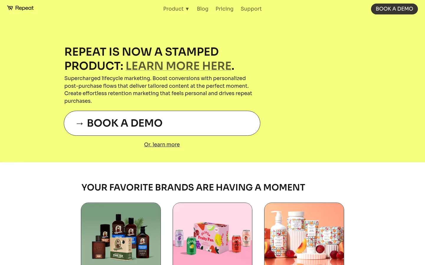
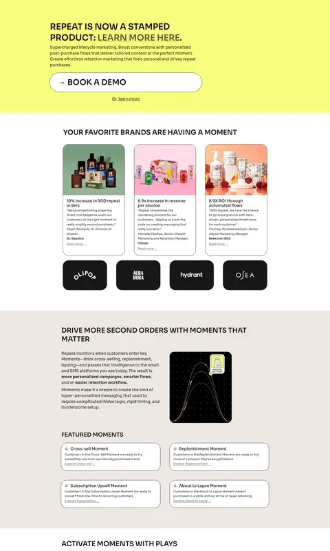
The page’s visual identity is anchored by a bright yellow-green canvas, used for the opening hero and a later closing call to action. Near-black text and hairline borders keep the saturated background legible and give cards a crisp, outlined character. White content bands alternate with warm beige feature sections, creating clear transitions without decorative gradients. Sora is used throughout: headings are bold, uppercase, and compact, while body copy remains small and conversational. The centered navigation and narrower content column give the page a calm structure; section contents often align to the left, with product visuals set beside explanatory copy. Customer product photography adds varied color inside rounded cards, while product diagrams and screenshots illustrate the platform. Spacing stays compact within sections but leaves distinct breathing room between major bands. The result is energetic and approachable, yet grounded in strong typography, plain surfaces, and simple borders.
All page typography, from navigation and body copy to headings and calls to action.
角色
示例
字号
字重
行高
字距
一级标题
Hero announcement headline, set uppercase and semibold.
Repeat
36.5px
600
1.3
0
二级标题
Major section headings, set uppercase and semibold.
Repeat
34px
600
0.75
0
三级标题
Subsection headings and feature group titles.
Repeat
29.5px
600
1.3
0
四级标题
Smaller card or feature headings.
The quick brown fox 敏捷的狐狸
24.5px
600
1.3
0
正文
Compact explanatory copy, testimonials, and article summaries.
The quick brown fox 敏捷的狐狸
13px
400
1.6
0
导航
Primary navigation labels across the header.
The quick brown fox 敏捷的狐狸
17px
400
normal
0
链接
Text links in navigation, cards, and secondary actions.
The quick brown fox 敏捷的狐狸
17px
400
normal
0
间距与布局
基准单位 2px · 密度:紧凑
34px版块间距
4px元素间距
—卡片内边距
908px内容最大宽度
1px
2px
3px
4px
8px
9px
12px
15px
16px
17px
34px
40px
96px
A centered, constrained content area sits within full-width color bands; the measured page maximum is 908px. The header spreads brand, navigation, and a demo action across the viewport. The hero uses a left-aligned text block, while later sections alternate between centered card groups and copy-plus-visual feature layouts. Sections follow a compact rhythm, with clear white and beige breaks. Keep card grids tidy and content readable rather than filling every available area.
圆角与层次
卡片 · 25px
图片 · 3px
徽标 · 9999px
导航 · 8px
sm · card
md · footer
The design relies on flat color bands, near-black outlines, and rounded card edges rather than prominent shadows. Cards feel defined by their borders and surface contrast. Keep layering restrained; the measured card shadow is extremely subtle and should not compete with the thin outlines.
组件
下面的预览按实测的按钮、输入框、徽标、卡片样式重建(字体用替代字体)。
Site navigation
A simple header places the Repeat mark on the left, Product, Blog, Pricing, and Support links near the center, and a dark pill-shaped demo action on the right.
Hero demo CTA
A broad white button with a near-black outline, pill-shaped ends, an arrow, and large uppercase demo text sits beneath the hero copy.
Customer story cards
Outlined, generously rounded cards combine colorful product photography with a result-led headline, concise supporting copy, and a small Read more link.
Feature panels
White or warm-beige section bands pair a compact uppercase heading and explanatory copy with product imagery, diagrams, or screenshots.
Featured content cards
Small rounded cards organize moment or play examples with near-black outlines, compact copy, and occasional pale lavender or blue badges.
Closing CTA band
A second lime full-width panel repeats the demo invitation and a smaller secondary text link before the dark footer.
Footer
A near-black closing band contains the brand mark, compact policy and blog links, social icons, and a small copyright line.
Imagery · Customer-story cards use product photography with colorful packaging, cropped inside softly rounded frames. Product sections pair concise copy with diagrams, interface screenshots, or explanatory graphics. Blog cards use article imagery and previews. Let these images retain their own colors; they are supporting content, not a replacement for the lime, white, beige, and ink brand palette.
Use Moment Lime (#f5ff7d) for the hero and closing CTA bands.
Set headings in uppercase, semibold Sora.
Alternate white and Warm Oat (#ede7e2) content sections.
Use Near-Black Ink (#171717) for text and crisp card outlines.
Keep explanatory copy concise and left-aligned.
Use real product imagery within rounded, outlined cards.
✕ 不该做
Do not introduce unmeasured brand colors.
Do not add gradients or ornamental background effects.
Do not use heavy shadows to separate cards.
Do not make body copy compete with the section headings.
Do not stretch content edge to edge inside the main column.
Do not treat colorful product photos as core brand colors.
给 AI 的提示词
想快速出一个同风格的新页面,把这段话连同 DESIGN.md 一起发给 AI。
Build a new page in Repeat’s visual style: energetic but uncluttered, with Sora typography and a clear content hierarchy. Use Moment Lime (#f5ff7d) for a prominent opening band and, when appropriate, a closing CTA. Set titles in uppercase semibold and supporting copy in smaller, regular-weight text. Use Gallery White (#ffffff) for primary content areas, Warm Oat (#ede7e2) for alternating feature bands, and Near-Black Ink (#171717) for text and fine borders. Keep the main content centered within a constrained column, with clear section breaks and compact, scannable layouts. Pair explanatory text with product imagery or screenshots. Give cards rounded corners and visible outlines; keep shadows very subtle. Use a large white pill-shaped demo button with dark text and an arrow, and keep secondary links simple.