North star · Keep the interface grounded in dark olive, and reserve vivid lime for the few actions and ideas that must stand out.
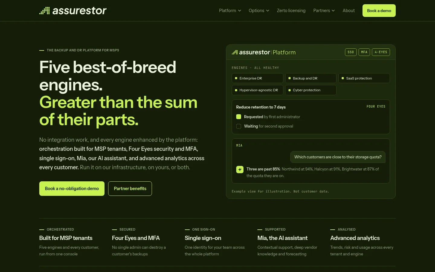
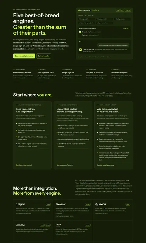
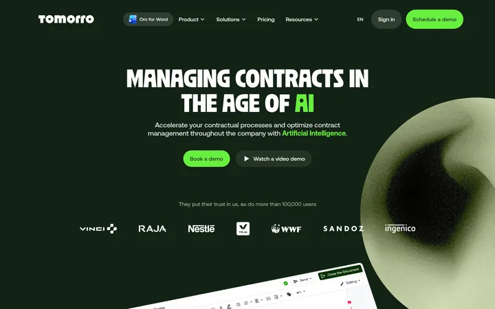
The homepage uses a near-black olive canvas (#141d08) across nearly the entire page, with slightly lighter forest-olive panels (#1c280c) separating cards and product information. Pale warm text (#ecf2e0) carries headings and essential copy; muted sage (#95a67a) handles navigation, secondary descriptions, and fine print. Acid lime (#c6f24e) is a deliberate signal for emphasized headline phrases, links, badges, and primary actions rather than a broad background colour. Assurestor Display gives headings a compact, confident shape, while Assurestor Text keeps dense explanatory content readable. A centered, constrained content area alternates left-aligned section introductions with structured grids, comparison tables, and paired product panels. The hero balances a large text column with a detailed platform mockup; throughout the page, thin olive borders and restrained corner rounding define modules without adding shadow-heavy depth. Generous section separation offsets the otherwise information-rich layout.
Body copy, navigation, links, buttons, captions, and eyebrow labels.
Aa 设计
Assurestor Display
网络字体 · 字重 600 · 占比 13%
免费替代:Space Grotesk
Display headlines and section headings.
Aa 设计
JetBrains Mono Variable
网络字体 · 字重 400 · 占比 2%
免费替代:JetBrains Mono
Compact technical badges and code-like labels.
角色
示例
字号
字重
行高
字距
特大标题
Oversized hero statement and prominent headline moments.
Assurestor
56px
600
1.03
-0.02em
一级标题
Primary hero or page-level heading.
Assurestor
44px
600
1.08
-0.02em
二级标题
Section titles such as feature and comparison introductions.
The quick brown fox 敏捷的狐狸
22px
600
1.2
-0.02em
三级标题
Card titles and subordinate feature headings.
The quick brown fox 敏捷的狐狸
19px
600
1.6
-0.02em
正文
Paragraphs, feature descriptions, and explanatory copy.
The quick brown fox 敏捷的狐狸
15px
400
1.6
0
辅助文字
Supporting notes, fine print, and compact secondary descriptions.
The quick brown fox 敏捷的狐狸
14.5px
400
1.6
0
按钮
Primary and outlined CTA labels.
The quick brown fox 敏捷的狐狸
15px
600
1.6
0
导航
Header and footer navigation links.
The quick brown fox 敏捷的狐狸
15px
400
1.6
0
链接
Inline actions and highlighted text links.
The quick brown fox 敏捷的狐狸
15px
600
1.6
0
眉题
Uppercase section labels and compact contextual lead-ins.
The quick brown fox 敏捷的狐狸
11px
600
1.6
0.06em
代码
Technical status badges and compact system labels.
const style = 1;
10.5px
400
1.6
0.06em
间距与布局
基准单位 2px · 密度:适中
48px版块间距
8px元素间距
—卡片内边距
1180px内容最大宽度
3px
4px
6px
8px
9px
10px
11px
12px
14px
16px
18px
20px
22px
24px
26px
28px
The page sits within a centered content frame measured at a maximum width of 1180px, with left-aligned headings and structured columns. The hero pairs its text and CTAs with a large product-interface mockup, then gives way to five compact capability points. Long-form sections alternate two-column introductions with card grids, comparison tables, and paired panels. A comfortable density and pronounced section gaps keep extensive content navigable; use the measured spacing rhythm rather than introducing arbitrary gaps.
圆角与层次
按钮 · 8px
卡片 · 14px
徽标 · 5px
没有测到阴影:页面是扁平的,层次靠底色和描边区分。
The design is mostly flat: no measured shadow system and no gradient treatment. Separate content with thin olive borders, dark panel fills, and restrained rounded corners. The larger cards use a 14px radius, buttons 8px, and badges 5px; avoid pronounced floating layers.
组件
下面的预览按实测的按钮、输入框、徽标、卡片样式重建(字体用替代字体)。
Primary CTA
Lime-filled button with Deep Olive text, semibold Assurestor Text, and an 8px radius; used for demo booking.
Secondary CTA
Transparent dark button with a 1px Electric Lime outline, lime semibold label, and 8px radius.
Feature card
Forest Panel card with a 1px Moss Hairline border, 14px radius, and warm light text; groups explanatory content.
Technical badge
Compact monospaced uppercase label in Electric Lime with a subtle olive outline and a 5px radius.
Comparison table
Dense, aligned rows and columns use dark olive surfaces, fine borders, and lime to identify the Assurestor column.
Product UI panel
Dashboard-style illustration presented inside a dark bordered frame, with small status tiles and restrained lime indicators.
Inline link
Semibold Electric Lime text on the dark canvas, visually distinct without a button fill.
Imagery · There is no prominent photography or full-bleed media. The hero’s main visual is a detailed product UI illustration: a bordered dashboard with small capability tiles, security status, and an assistant conversation. Reuse crisp interface mockups, simple icons, and diagrams as supporting visuals; keep them within the olive palette and frame them as product evidence, not decorative stock imagery.
Reserve Electric Lime (#c6f24e) for CTAs, links, and key emphasis.
Set headings in a compact, semibold display sans.
Use Forest Panel (#1c280c) to distinguish grouped content.
Define cards and tables with fine Moss Hairline (#33461a) borders.
Keep explanatory copy Warm Chalk or Sage Signal for clear hierarchy.
✕ 不该做
Do not turn the page into a bright, white interface.
Do not use lime as a large section background except for a standout CTA band.
Do not add decorative gradients or heavy shadows.
Do not replace the product-focused interface mockups with stock photography.
Do not make every piece of copy equally bright or prominent.
Do not use oversized rounded cards where the design calls for flat bordered rows.
给 AI 的提示词
想快速出一个同风格的新页面,把这段话连同 DESIGN.md 一起发给 AI。
Build a new Assurestor-style page with a dark, technical SaaS visual system. Use Deep Olive (#141d08) for the canvas, Forest Panel (#1c280c) for grouped content, Warm Chalk (#ecf2e0) for primary text, and Sage Signal (#95a67a) for secondary copy and navigation. Treat Electric Lime (#c6f24e) as a scarce signal for primary actions, links, and selected headline phrases. Use a confident display sans for headings and a clean sans for readable body copy; reserve monospaced type for compact technical labels. Keep content centered in a constrained frame, use left-aligned introductions, and organize dense information into bordered cards, tables, and product UI panels. Favor thin Moss Hairline (#33461a) borders over shadows, comfortable section separation, and restrained radii. Avoid generic stock imagery and decorative gradients.