8returns以高对比的SaaS视觉呈现退货自动化,在深青黑、白色和浅灰内容区之间切换。产品界面图像、克制的圆角控件与荧光绿行动按钮,让复杂的运营工具显得清晰易用。
North star · Use deep teal-black as the narrative canvas, reserving white space and lime accents to make product proof and primary actions unmistakable.
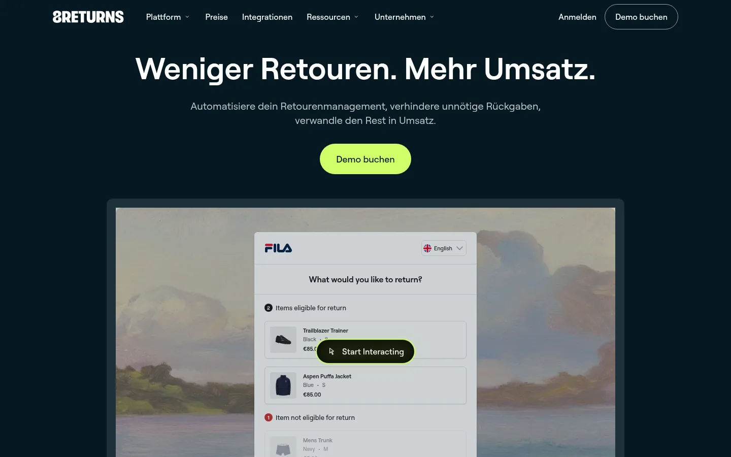
The visual system is anchored by deep teal-black (#051923), which carries the hero, process story, and brand narrative; bright white sections provide a deliberate reset, while pale gray (#eef0f2) marks integrations and resources. Lime (#cfff69) is a high-visibility action color rather than a broad background treatment. Roobert is used consistently: large, weighty centered headlines contrast with quieter muted body copy, and navigation remains compact. The hero centers its message and CTA above a large returns-portal preview, establishing the product immediately. Below, content alternates broad full-width bands with aligned feature columns and card groups. Generous section separation keeps the long page legible. Interface captures and customer campaign imagery supply visual texture, while the UI itself stays relatively flat: rounded cards, thin dividers, and selective shadows rather than pervasive decoration.
配色 点色块复制色值。用途说明来自对页面的实测位置(背景、文字、描边、按钮)与截图判读。
品牌色
Harbor Teal
#004853
Deep teal card surfaces and the core brand color, including teal gradients and feature highlights.
Midnight Teal
#051923
Main dark canvas, dark-section headings, navigation text, and dark button backgrounds.
Abyss Teal
#00363e
Deep endpoint of the teal radial gradient and supporting dark visual surfaces.
Lagoon Teal
#006670
Bright center tone in the radial teal gradient; not a dominant standalone section color.
强调色
Electric Lime
#cfff69
Primary demo and pricing CTAs, plus occasional emphasis against dark teal.
Illustration Blue
#19587e
Limited blue gradient color; appears as a supporting visual tone, not a primary CTA.
表层色
Cloud Gray
#eef0f2
Pale-gray section bands for integrations, resources, and supporting cards.
Portal Blue Gray
#c8d4e0
Background inside the returns-portal mock-up; treat as interface imagery, not a site-wide surface.
Mockup Steel
#a1afba
Secondary tones within product or interface imagery, rather than core page chrome.
中性色
Gallery White
#ffffff
Canvas for feature, testimonial, and closing areas; also headings and high-contrast text on dark surfaces.
Slate Rule
#1e3039
Fine card borders and understated dividers, especially on dark interfaces.
Footer Black
#000000
Distinct black footer surface, separating dense site navigation from the page body.
Mist Text
#cdd1d3
Muted supporting text on dark backgrounds.
Sea Glass
#b2c8cb
Subdued secondary copy and small supporting text on dark teal.
Graphite Copy
#2c393f
Secondary dark copy on light surfaces and interface text.
Charcoal Copy
#525252
Occasional subdued body text on light sections.
功能色
Alert Red
#d03636
Small red status badge in product-interface imagery, not a primary brand accent.
文字 背景 对比度 WCAG #051923 Midnight Teal#ffffff Gallery White17.95:1 AAA #051923 Midnight Teal#004853 Harbor Teal1.75:1 不达标 #051923 Midnight Teal#00363e Abyss Teal1.37:1 不达标 #ffffff Gallery White#004853 Harbor Teal10.23:1 AAA #ffffff Gallery White#051923 Midnight Teal17.95:1 AAA #ffffff Gallery White#00363e Abyss Teal13.15:1 AAA
字体 字号阶梯:Major Third(比例约 1.289,正文 18px)。示例用免费替代字体渲染,数值为实测。
Aa 设计
roobert 网络字体 · 字重 500 / 400 / 600 / 700 · 占比 100%
免费替代:Inter
All site typography, including display headings, body copy, navigation, buttons, and captions.
角色 示例 字号 字重 行高 字距 特大标题 Large brand and campaign statements, especially prominent closing or visual moments.
8returns
64px 600 1.25 0 一级标题 Primary hero headline, centered and emphatic.
8returns
56px 600 1.07 0 二级标题 Major section headings across feature, customer, and resource blocks.
8returns
48px 600 1.16 0 三级标题 Feature-card and subsection titles.
The quick brown fox 敏捷的狐狸
26px 600 1.23 0 四级标题 Smaller card or supporting content headings.
The quick brown fox 敏捷的狐狸
22px 600 1.27 0 正文 Hero supporting copy and primary explanatory paragraphs.
The quick brown fox 敏捷的狐狸
18px 500 1.38 0 辅助文字 Muted descriptions, labels, and compact supporting content.
The quick brown fox 敏捷的狐狸
16px 400 1.63 0 按钮 CTA labels and pill-shaped action controls.
The quick brown fox 敏捷的狐狸
16px 500 1.5 0 导航 Compact main navigation and footer navigation.
The quick brown fox 敏捷的狐狸
16px 500 1.5 0
间距与布局 基准单位 8px · 密度:宽松
96px 版块间距
4px 元素间距
32px 卡片内边距
1200px 内容最大宽度
3px
4px
6px
8px
10px
12px
16px
20px
24px
32px
40px
48px
64px
96px
The page uses a spacious, centered composition with a measured maximum content width of 1200px. Hero content is centered above a wide product preview; subsequent sections alternate full-width dark, white, and pale-gray bands. Feature areas use three-column groupings or two-column splits, while testimonial and resource content form card rows. Heading alignment shifts from centered in the hero and feature story to left-aligned in later editorial blocks. Section rhythm is generous, with clear gaps between major bands and restrained density within each band.
圆角与层次 xl · card
hairline · other
sm · card
inset · other
Most content is flat, with section color and spacing doing the structural work. Cards use rounded corners and occasional subtle shadows; dark sections may use faint borders to separate columns. Reserve pronounced layering for framed product previews or interactive UI elements, and avoid adding shadows to every card.
组件 下面的预览按实测的按钮、输入框、徽标、卡片样式重建(字体用替代字体)。
Primary CTA Pill-shaped lime button with dark text; use for demo booking and pricing actions, with generous horizontal padding.
Dark CTA Dark teal pill with white label for secondary actions such as automation-related navigation.
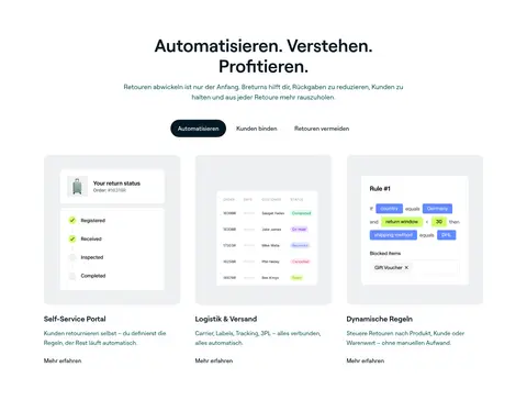
Feature card Rounded card grouping an interface image, a concise heading, and explanatory copy; keep card treatment restrained.
Product preview Large rectangular portal capture centered below the hero CTA, framed against the dark canvas.
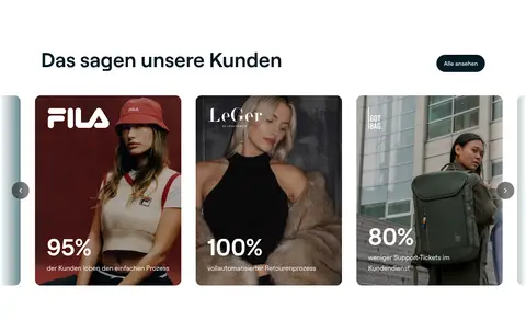
Testimonial carousel card Photographic customer card with an overlaid brand mark and large percentage proof point.
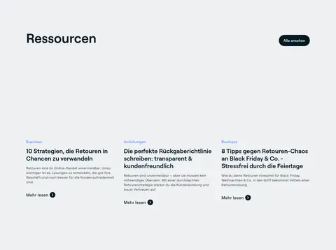
Resource card Editorial card on pale gray with a small category label, bold title, compact summary, and read-more link.
Imagery · The hero uses a large framed capture of the returns portal, with a real-world landscape visible behind the UI. Feature panels show compact interface screens and operational diagrams; customer proof uses photographic campaign cards. Images are rectangular and cleanly cropped, usually contained within cards rather than bleeding across the page. Keep mock-up colors subordinate to the dark teal, white, and lime brand palette.
页面版块 共 9 个版块,按页面从上到下排列,每个都标了类型、布局和交互套路。
该做与不该做 ✓ 该做 Anchor key narrative sections in Midnight Teal (#051923). Use Electric Lime (#cfff69) selectively for primary actions. Alternate dark sections with white or Cloud Gray (#eef0f2) bands. Show the actual product interface early and at generous scale. Keep Roobert-style typography clean and mostly sentence case. Use spacious section breaks and orderly card columns. ✕ 不该做 Do not turn lime into a full-page background color. Do not flatten every section into the same dark surface. Do not use decorative gradients as the main content treatment. Do not add heavy shadows to every card. Do not let interface mock-up colors redefine the brand palette. Do not crowd the hero with extra navigation or copy. 给 AI 的提示词 想快速出一个同风格的新页面,把这段话连同 DESIGN.md 一起发给 AI。
复制 Build a new SaaS page using a spacious, high-contrast 8returns visual language. Use Midnight Teal (#051923) for the main narrative canvas, Gallery White (#ffffff) for clean content resets, and Cloud Gray (#eef0f2) for secondary section bands. Reserve Electric Lime (#cfff69) for prominent pill-shaped primary actions. Set all text in a Roobert-like sans serif, with large centered section headlines and compact muted supporting copy. Keep content within a measured 1200px maximum width, using broad section bands, clear vertical rhythm, and simple two- or three-column groupings. Lead with a concise message and a large, framed product UI preview. Use restrained borders and shadows; let real interface imagery and customer photography provide texture without overpowering the palette.
DESIGN.md Tailwind v4 CSS 变量 Design Tokens
---
title: "8returns design system"
variant: extended
source: https://www.8returns.com/
captured_at: 2026-10-12
theme: light
industry: saas
generator: Design DNA (https://four.wiralomi.com/style/8returns-com)
ai_generated: true
ai_label: "本文件由 AI 辅助生成:数值取自公开网页的实测样式,命名、用途说明与建议为模型解读。商标归原所有者。 / AI-assisted content"
---
# 8returns · Design System
> Deep teal, sharp lime, and calm product clarity.
**Theme:** light · **Industry:** saas · **Source:** https://www.8returns.com/ · **Captured:** 2026-10-12 (1440×900 desktop)
_AI-assisted content: values are measured from the public page at capture time; names, roles and guidance are model-written interpretations. Trademarks belong to their owners._
8returns presents returns automation through a high-contrast SaaS identity, alternating near-black teal with clean white and pale-gray sections. Product interface imagery, restrained rounded controls, and lime calls to action make a complex operational product feel approachable.
## North star
Use deep teal-black as the narrative canvas, reserving white space and lime accents to make product proof and primary actions unmistakable.
## Overview
The visual system is anchored by deep teal-black (## Colors
| Name | Hex | Token | Group | Role |
|---|---|---|---|---|
| Gallery White | ` | `--color-gallery-white` | neutral | Canvas for feature, testimonial, and closing areas; also headings and high-contrast text on dark surfaces. |
| Electric Lime | ` | `--color-electric-lime` | accent | Primary demo and pricing CTAs, plus occasional emphasis against dark teal. |
| Harbor Teal | ` | `--color-harbor-teal` | brand | Deep teal card surfaces and the core brand color, including teal gradients and feature highlights. |
| Midnight Teal | ` | `--color-midnight-teal` | brand | Main dark canvas, dark-section headings, navigation text, and dark button backgrounds. |
| Abyss Teal | ` | `--color-abyss-teal` | brand | Deep endpoint of the teal radial gradient and supporting dark visual surfaces. |
| Slate Rule | ` | `--color-slate-rule` | neutral | Fine card borders and understated dividers, especially on dark interfaces. |
| Cloud Gray | ` | `--color-cloud-gray` | surface | Pale-gray section bands for integrations, resources, and supporting cards. |
| Footer Black | ` | `--color-footer-black` | neutral | Distinct black footer surface, separating dense site navigation from the page body. |
| Mist Text | ` | `--color-mist-text` | neutral | Muted supporting text on dark backgrounds. |
| Sea Glass | ` | `--color-sea-glass` | neutral | Subdued secondary copy and small supporting text on dark teal. |
| Lagoon Teal | ` | `--color-lagoon-teal` | brand | Bright center tone in the radial teal gradient; not a dominant standalone section color. |
| Alert Red | ` | `--color-alert-red` | semantic | Small red status badge in product-interface imagery, not a primary brand accent. |
| Graphite Copy | ` | `--color-graphite-copy` | neutral | Secondary dark copy on light surfaces and interface text. |
| Charcoal Copy | ` | `--color-charcoal-copy` | neutral | Occasional subdued body text on light sections. |
| Portal Blue Gray | ` | `--color-portal-blue-gray` | surface | Background inside the returns-portal mock-up; treat as interface imagery, not a site-wide surface. |
| Mockup Steel | ` | `--color-mockup-steel` | surface | Secondary tones within product or interface imagery, rather than core page chrome. |
| Illustration Blue | ` | `--color-illustration-blue` | accent | Limited blue gradient color; appears as a supporting visual tone, not a primary CTA. |
### Semantic aliases
`--color-canvas` → ` (Gallery White) · `--color-surface` → ` (Harbor Teal) · `--color-surface-2` → ` (Midnight Teal) · `--color-surface-3` → ` (Abyss Teal) · `--color-surface-4` → ` (Cloud Gray) · `--color-text` → ` (Midnight Teal) · `--color-text-muted` → ` (Gallery White) · `--color-text-subtle` → ` (Mist Text) · `--color-border` → ` (Slate Rule) · `--color-accent` → ` (Harbor Teal) · `--color-accent-2` → ` (Lagoon Teal) · `--color-accent-3` → ` (Illustration Blue)
### Contrast (WCAG 2.x)
| Text | Background | Ratio | Level |
|---|---|---|---|
| ` | ` | 17.95:1 | AAA |
| ` | ` | 1.75:1 | fail |
| ` | ` | 1.37:1 | fail |
| ` | ` | 10.23:1 | AAA |
| ` | ` | 17.95:1 | AAA |
| ` | ` | 13.15:1 | AAA |
| ` | ` | 1.54:1 | fail |
| ` | ` | 6.66:1 | AA |
| ` | ` | 11.67:1 | AAA |
| ` | ` | 8.55:1 | AAA |
### Gradients
- `radial-gradient(80% 80%, rgb(0, 102, 112) 0%, rgb(0, 72, 83) 50%, rgb(0, 56, 64) 100%)`
- `radial-gradient(circle, rgba(98, 137, 255, 0.25) 0%, rgba(98, 137, 255, 0) 70%)`
- `linear-gradient(to right in oklab, rgb(255, 255, 255) 0%, rgba(0, 0, 0, 0) 100%)`
- `linear-gradient(to left in oklab, rgb(255, 255, 255) 0%, rgba(0, 0, 0, 0) 100%)`
## Typography
| Family | Token | Source | Weights | Role | Free substitute |
|---|---|---|---|---|---|
| roobert | `--font-body` | webfont | 500, 400, 600, 700 | All site typography, including display headings, body copy, navigation, buttons, and captions. | Inter |
- **roobert:** Use clean sans-serif forms with mostly medium-to-semibold weights; headlines are large and sentence case, with no conspicuous tracking.
### Type scale — Major Third (ratio ≈ 1.289, base 18px)
| Role | Size | Weight | Line height | Letter spacing | Case | Family | Used for |
|---|---|---|---|---|---|---|---|
| display | 64px | 600 | 1.25 | 0 | — | roobert | Large brand and campaign statements, especially prominent closing or visual moments. |
| h1 | 56px | 600 | 1.07 | 0 | — | roobert | Primary hero headline, centered and emphatic. |
| h2 | 48px | 600 | 1.16 | 0 | — | roobert | Major section headings across feature, customer, and resource blocks. |
| h3 | 26px | 600 | 1.23 | 0 | — | roobert | Feature-card and subsection titles. |
| h4 | 22px | 600 | 1.27 | 0 | — | roobert | Smaller card or supporting content headings. |
| body | 18px | 500 | 1.38 | 0 | — | roobert | Hero supporting copy and primary explanatory paragraphs. |
| caption | 16px | 400 | 1.63 | 0 | — | roobert | Muted descriptions, labels, and compact supporting content. |
| button | 16px | 500 | 1.5 | 0 | — | roobert | CTA labels and pill-shaped action controls. |
| nav | 16px | 500 | 1.5 | 0 | — | roobert | Compact main navigation and footer navigation. |
## Spacing & layout
- Base unit **8px**, density **spacious**.
- Scale (most used values): 3, 4, 6, 8, 10, 12, 16, 20, 24, 32, 40, 48, 64, 96 px.
- Section rhythm 96px · element gap 4px · card padding 32px · max content width 1200px.
The page uses a spacious, centered composition with a measured maximum content width of 1200px. Hero content is centered above a wide product preview; subsequent sections alternate full-width dark, white, and pale-gray bands. Feature areas use three-column groupings or two-column splits, while testimonial and resource content form card rows. Heading alignment shifts from centered in the hero and feature story to left-aligned in later editorial blocks. Section rhythm is generous, with clear gaps between major bands and restrained density within each band.
## Shape & elevation
- Radius: button `9999px` · card `16px` · media `50%` · badge `50%` · link `16px` · xs `4px` · sm `6px` · md `12px` · lg `16px` · xl `24px` · 2xl `32px` · pill `9999px`
- Shadow `xl` (card): `rgba(0, 0, 0, 0) 0px 0px 0px 0px, rgba(0, 0, 0, 0) 0px 0px 0px 0px, rgba(0, 0, 0, 0) 0px 0px 0px 0px, rgba(0, 0, 0, 0) 0px 0px 0px 0px, rgba(0, 0, 0, 0.25) 0px 25px 50px -12px`
- Shadow `hairline` (other): `rgba(0, 0, 0, 0) 0px 0px 0px 0px, rgba(0, 0, 0, 0) 0px 0px 0px 0px, rgba(0, 0, 0, 0) 0px 0px 0px 0px, rgba(0, 0, 0, 0) 0px 0px 0px 0px, rgba(0, 0, 0, 0.07) 0px 1px 2px 0px`
- Shadow `sm` (card): `rgba(0, 0, 0, 0) 0px 0px 0px 0px, rgba(0, 0, 0, 0) 0px 0px 0px 0px, rgba(0, 0, 0, 0) 0px 0px 0px 0px, rgba(0, 0, 0, 0) 0px 0px 0px 0px, rgba(0, 0, 0, 0.1) 0px 1px 3px 0px, rgba(0, 0, 0, 0.06) 0px 1px `
- Shadow `inset` (other): `rgba(0, 0, 0, 0.4) 0px 4px 24px 0px, rgba(207, 255, 105, 0.4) 0px 0px 0px 3px, rgba(255, 255, 255, 0.1) 0px 1px 0px 0px inset`
- Shadow `inset-2` (card): `rgba(0, 0, 0, 0.3) 0px 8px 32px 0px, rgba(0, 0, 0, 0.2) 0px 2px 8px 0px, rgba(255, 255, 255, 0.15) 0px 1px 0px 0px inset`
- Shadow `inset-3` (card): `rgba(255, 255, 255, 0.3) 0px 2px 4px 0px inset, rgba(0, 0, 0, 0.1) 0px -2px 4px 0px inset, rgba(0, 0, 0, 0.3) 0px 4px 16px 0px`
- Motion: standard transition `0.2s cubic-bezier(0.4, 0, 0.2, 1)` on interactive elements.
Most content is flat, with section color and spacing doing the structural work. Cards use rounded corners and occasional subtle shadows; dark sections may use faint borders to separate columns. Reserve pronounced layering for framed product previews or interactive UI elements, and avoid adding shadows to every card.
## Imagery
The hero uses a large framed capture of the returns portal, with a real-world landscape visible behind the UI. Feature panels show compact interface screens and operational diagrams; customer proof uses photographic campaign cards. Images are rectangular and cleanly cropped, usually contained within cards rather than bleeding across the page. Keep mock-up colors subordinate to the dark teal, white, and lime brand palette.
## Components
### Primary CTA
Pill-shaped lime button with dark text; use for demo booking and pricing actions, with generous horizontal padding.
### Dark CTA
Dark teal pill with white label for secondary actions such as automation-related navigation.
### Feature card
Rounded card grouping an interface image, a concise heading, and explanatory copy; keep card treatment restrained.
### Product preview
Large rectangular portal capture centered below the hero CTA, framed against the dark canvas.
### Testimonial carousel card
Photographic customer card with an overlaid brand mark and large percentage proof point.
### Resource card
Editorial card on pale gray with a small category label, bold title, compact summary, and read-more link.
### Measured component styles
- **Primary button** (“Demo buchen”): background ## Do
- Anchor key narrative sections in Midnight Teal (## Don't
- Do not turn lime into a full-page background color.
- Do not flatten every section into the same dark surface.
- Do not use decorative gradients as the main content treatment.
- Do not add heavy shadows to every card.
- Do not let interface mock-up colors redefine the brand palette.
- Do not crowd the hero with extra navigation or copy.
## Agent prompt
Build a new SaaS page using a spacious, high-contrast 8returns visual language. Use Midnight Teal (## Page sections (top to bottom)
| # | Type | Layout | UX patterns | UI patterns |
|---|---|---|---|---|
| 1 | hero | Centered headline and copy above lime CTA and a wide portal preview on a dark canvas. | primary demo action, interactive product preview | dark hero band, centered headline, lime pill CTA, framed product capture |
| 2 | feature-grid | White section with centered introduction, category controls, and three feature columns. | feature categories, learn-more links | white band, three-column cards, interface thumbnails |
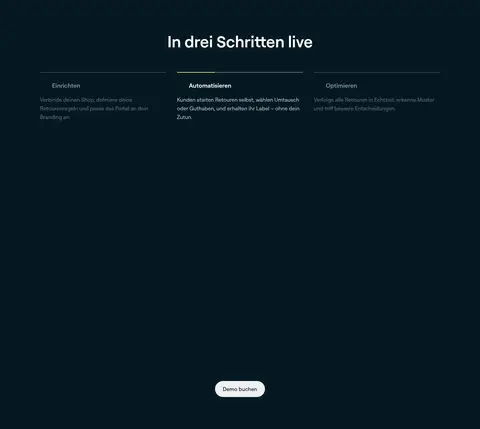
| 3 | how-it-works | Dark full-width band with a centered title, three process columns, and a lower CTA. | three-step explanation, demo action | dark canvas, numbered process columns, subtle dividers |
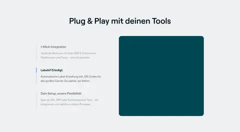
| 4 | integrations | Pale-gray band with centered title and a two-column feature-and-media arrangement. | integration reassurance, feature selection | gray surface, split layout, stacked feature copy |
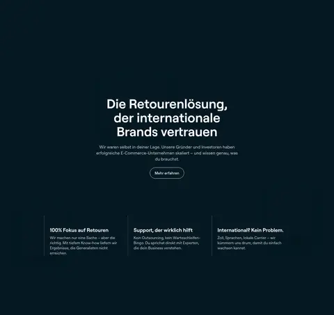
| 5 | feature-split | Dark full-width brand story with a centered message and three lower proof columns. | brand credibility, support reassurance | dark band, centered statement, three-column proof points |
| 6 | testimonials | White section with a left-aligned heading and horizontal photographic testimonial cards. | customer proof, carousel navigation | photo cards, large percentage metrics, carousel arrows |
| 7 | content-feed | Pale-gray editorial band with heading and three aligned article cards. | browse resources, read-more links | gray band, category labels, editorial card row |
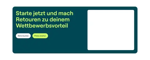
| 8 | cta | White section containing a rounded teal split panel with copy, two CTAs, and a visual area. | book a demo, view pricing | teal promotional panel, lime headline, paired pill buttons |
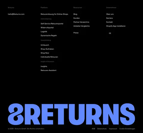
| 9 | footer | Black footer with four link columns and oversized blue 8returns wordmark near the bottom. | multi-category navigation, contact access | black canvas, four-column link groups, oversized brand mark |
## Source CSS custom properties (selected)
```css
--omr-text-on-blush: