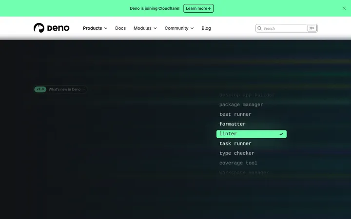
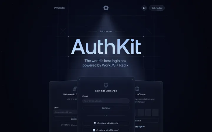
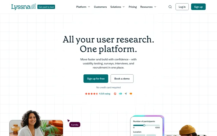
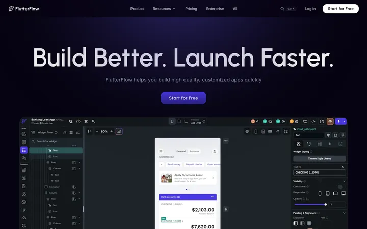
North star · Keep the canvas quiet and near-black, then use mint sparingly to direct attention through a precise, developer-first layout.
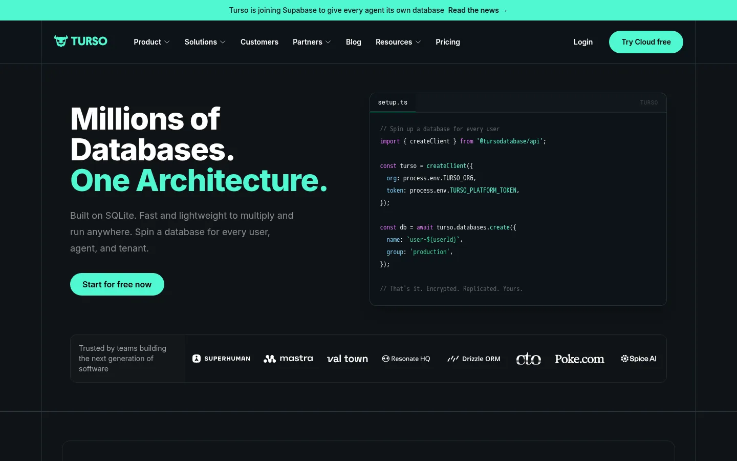
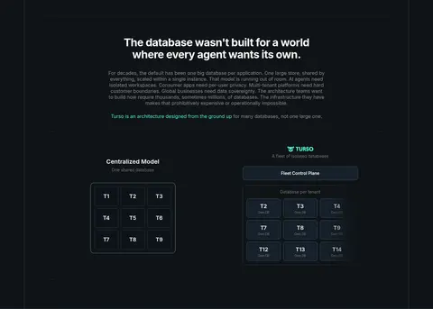
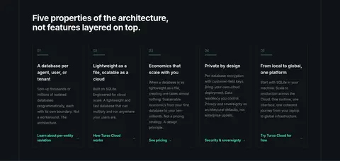
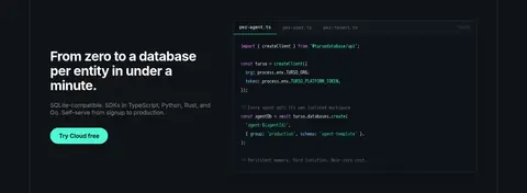
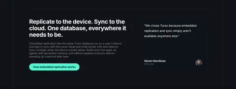
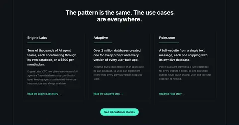
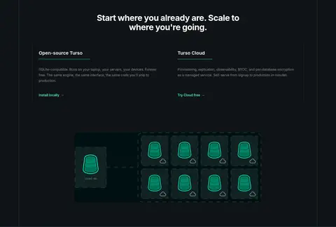
The page is anchored by a near-black blue-gray canvas, with subtle boundary lines dividing the central content frame into long, orderly sections. Vivid mint marks the primary action, selected headline text, inline links, and small interface details; white headings provide contrast while muted gray carries explanatory copy. Inter is the dominant voice: compact navigation and body text support oversized, tightly tracked hero typography. Monospace appears in code samples and small technical labels, reinforcing the developer context without taking over the page. Layouts alternate between centered statements, two-column product explanations, and card grids. Fine borders rather than heavy shadows define most panels, diagrams, and cards. The imagery is primarily interface-led: code windows, database diagrams, and a stylized growth illustration sit against the dark canvas. Generous gaps between section bands give dense technical content room to breathe.
配色
点色块复制色值。用途说明来自对页面的实测位置(背景、文字、描边、按钮)与截图判读。
品牌色
强调色
表层色
中性色
功能色
页面底色 · Midnight Slate主文字 · Clear White次要文字 · Soft Graphite弱文字 · Dim Ash描边 · Quiet Outline强调 · Signal Mint强调 2 · Open Source Violet强调 3 · Emerald Signal
Headings, navigation, body copy, buttons, and links
Aa 设计
monospace
系统字体 · 字重 400 · 占比 9%
免费替代:IBM Plex Mono
Code examples and compact technical captions
角色
示例
字号
字重
行高
字距
特大标题
Oversized hero statement with tight tracking.
Turso
60px
800
1
-0.025em
一级标题
Primary section headlines and large statements.
Turso
36px
700
1.11
-0.025em
二级标题
Card headings and secondary section titles.
The quick brown fox 敏捷的狐狸
20px
600
1.4
0
三级标题
Feature titles and smaller content-group headings.
The quick brown fox 敏捷的狐狸
18px
600
1.56
0
正文
Explanatory paragraphs and descriptive card text.
The quick brown fox 敏捷的狐狸
14px
400
1.71
0
辅助文字
Compact monospace labels and technical captions.
The quick brown fox 敏捷的狐狸
13px
400
1.85
0
按钮
Primary and secondary call-to-action labels.
The quick brown fox 敏捷的狐狸
16px
600
normal
0
导航
Top navigation labels.
The quick brown fox 敏捷的狐狸
14px
600
1.43
0
链接
Inline and card-level action links.
The quick brown fox 敏捷的狐狸
14px
600
1.43
0
代码
Code samples and technical snippets.
const style = 1;
13px
400
1.85
0
间距与布局
基准单位 4px · 密度:适中
56px版块间距
6px元素间距
—卡片内边距
1280px内容最大宽度
4px
6px
8px
10px
12px
16px
20px
24px
28px
32px
36px
40px
48px
56px
Use a centered content frame with a measured maximum width of 1280px, framed by fine vertical edges. The hero begins with a two-column composition: large copy opposite a code window, followed by a compact customer logo strip. Later bands alternate centered introductions, multi-column feature cards, and split product or enterprise presentations. Section spacing follows a measured 56px rhythm; keep local groupings comfortable rather than crowded. Most sections share the same dark ground, with horizontal hairlines marking transitions.
圆角与层次
按钮 · 9999px
卡片 · 16px
图片 · 50%
徽标 · 9999px
导航 · 9999px
lg · card
The interface is mostly flat: restrained dark surfaces and thin borders establish card edges and section divisions. Rounded cards and code panels provide grouping without pronounced shadow. Where a card shadow is used, keep it subtle and low-contrast so it does not compete with mint actions or bright typography.
组件
下面的预览按实测的按钮、输入框、徽标、卡片样式重建(字体用替代字体)。
Announcement strip
A narrow mint band across the top with centered dark announcement copy and a news link.
Primary CTA
Pill-shaped Signal Mint (#4ff8d2) button with black semibold Inter text; use for free-start and cloud actions.
Code window
Dark bordered panel containing monospace code, restrained syntax color, and a compact tab-like header.
Feature card
Dark card with a fine #1e2a32 outline, rounded corners, white heading, muted description, and mint link.
Badge
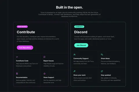
Small uppercase pill; Signal Mint for community and Open Source Violet for the open-source label.
Customer strip
A bordered horizontal band pairing a brief trust statement with a row of customer wordmarks.
Footer link columns
Compact multi-column navigation on the dark canvas, using muted labels and restrained bright brand details.
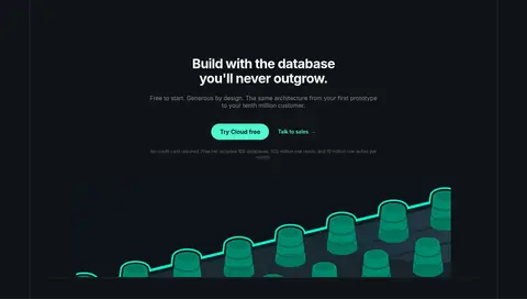
Imagery · Avoid relying on photography. The page uses code-window mockups, database architecture diagrams, simple interface graphics, and a stylized mint growth illustration. Keep technical visuals contained within bordered panels and use the same dark surfaces as the surrounding layout. Let the mint accents and small colored diagram elements carry visual emphasis; reserve illustration-like color variation for those visuals rather than expanding the general palette.
Reserve #4ff8d2 for primary actions and selective emphasis.
Set headings and navigation in Inter.
Use monospace only for code and technical captions.
Separate cards and section bands with fine dark borders.
Alternate split layouts with centered content groups.
✕ 不该做
Do not introduce bright section backgrounds.
Do not use mint as a large page-wide fill.
Do not turn every card into a raised, shadow-heavy panel.
Do not use decorative photography in place of product visuals.
Do not crowd the technical content or remove section breaks.
Do not treat violet as a second primary action color.
给 AI 的提示词
想快速出一个同风格的新页面,把这段话连同 DESIGN.md 一起发给 AI。
Build a new developer-focused page in Turso’s visual language. Use Midnight Slate (#101317) as the main canvas, Clear White (#ffffff) for strong headings, and Soft Graphite (#878a8c) for supporting copy. Apply Signal Mint (#4ff8d2) selectively to primary pill buttons, links, and small highlights; use Open Source Violet (#d946ef) only for an occasional community or open-source action. Set the interface in Inter, with monospace code panels and labels. Center content within the measured 1280px maximum width. Create clear section bands with fine Quiet Outline (#1e2a32) borders, alternating split product layouts and compact card grids. Keep the page flat and technical, with minimal shadow and interface-led visuals such as code, diagrams, or database mockups. Maintain comfortable section spacing and strong alignment.