North star · Use deep green and oversized condensed headlines as the frame, then reserve electric lime for the single most important action or emphasis.
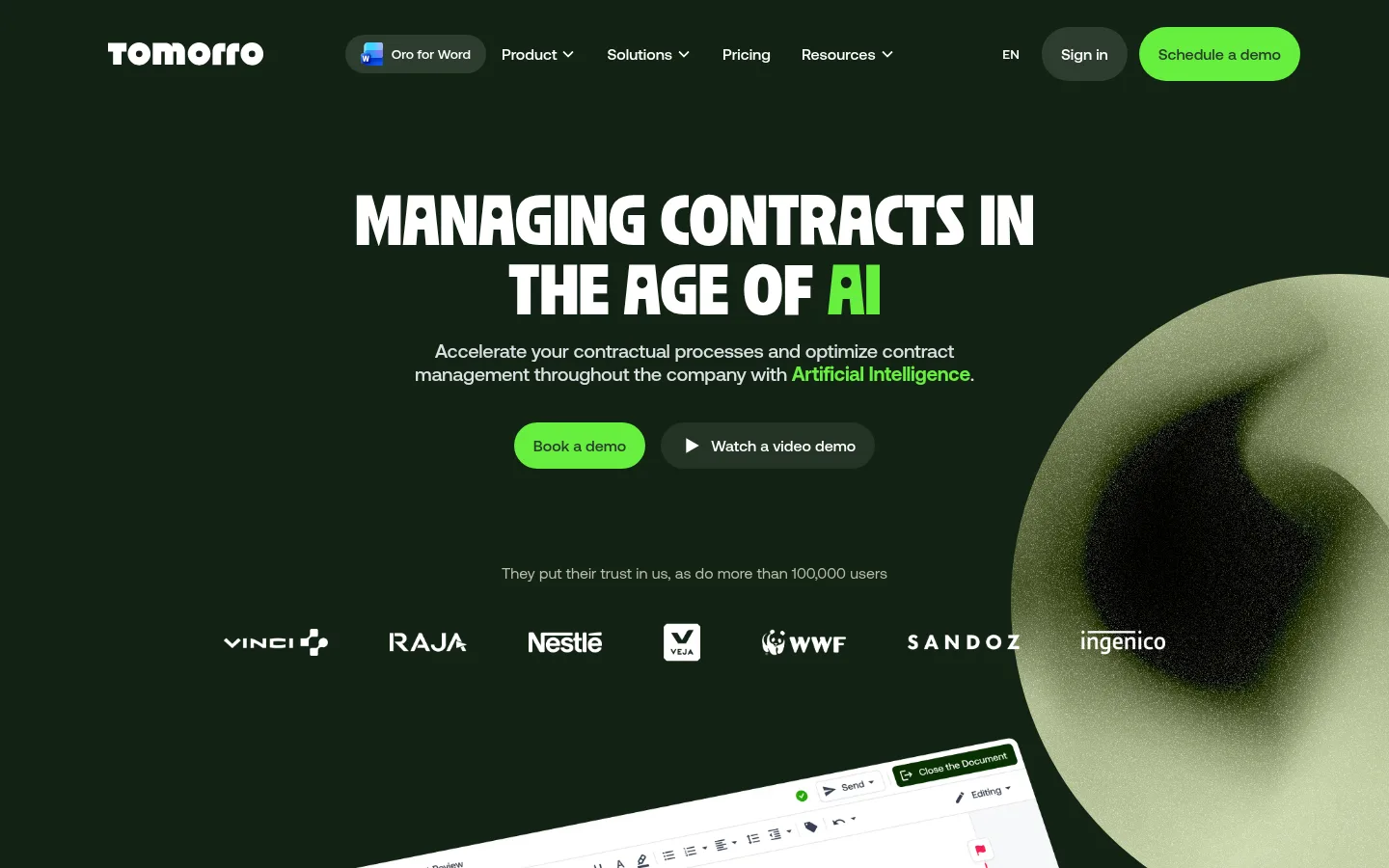
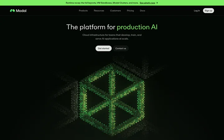
The visual strategy opens on a deep green (#122314) canvas, with a centered, uppercase display headline and a concentrated lime (#68ef3f) highlight that draws attention to AI and the primary demo action. The rest of the page alternates between white editorial sections and dark, atmospheric product storytelling, with black video moments creating deliberate contrast. Ozik gives display headings their compact, poster-like impact; Aeonik carries navigation, body copy, and interface labels with a clean, practical tone. Instrument Serif appears sparingly for more editorial subheads. Wide section bands and generous open areas frame product screenshots, while cards and pill-shaped controls soften the otherwise bold typography. Imagery mixes abstract green 3D forms, UI captures, team photography, and a cinematic announcement video. Lime is a functional signal for CTAs and select emphasis, not a general fill colour; muted green-gray text and pale surfaces keep supporting content legible.
Navigation, body copy, buttons, links, and product-interface labels.
Aa 设计
Ozik
网络字体 · 字重 700 · 占比 8%
免费替代:Anton
Large display and hero headlines, including uppercase campaign-style section titles.
Aa 设计
Instrument Serif
网络字体 · 字重 400 · 占比 4%
免费替代:Instrument Serif
Occasional editorial subhead or narrative title.
角色
示例
字号
字重
行高
字距
特大标题
Oversized uppercase campaign headings and high-impact statements.
Tomorro
80px
700
0.9
-0.01em
一级标题
Hero title and major uppercase section headings.
Tomorro
56px
700
0.86
-0.014em
二级标题
Primary section headings and feature-story titles.
Tomorro
40px
500
1.1
-0.012em
三级标题
Editorial or narrative subheads, used sparingly.
Tomorro
32px
400
1.5
0
四级标题
Feature-card and content-block headings.
The quick brown fox 敏捷的狐狸
24px
500
1.33
-0.012em
正文
Paragraphs, descriptions, and explanatory product copy.
The quick brown fox 敏捷的狐狸
16px
400
1.5
0
辅助文字
Small labels, footnotes, and supporting metadata.
The quick brown fox 敏捷的狐狸
12px
400
1.67
0
导航
Header navigation and menu labels.
The quick brown fox 敏捷的狐狸
16px
500
1.5
0
链接
Text links and secondary actions.
The quick brown fox 敏捷的狐狸
16px
500
1.5
-0.001em
间距与布局
基准单位 8px · 密度:紧凑
40px版块间距
8px元素间距
40px卡片内边距
1360px内容最大宽度
4px
7px
8px
12px
16px
20px
24px
32px
40px
64px
80px
128px
A broad, centered page uses a measured maximum width of 1360px and a compact density within individual modules, while keeping major section bands spacious. The hero is centered and media-led, followed by alternating full-width light and dark zones. Feature narratives often align to the start and use two-column arrangements; proof points use three columns, and customer or security content shifts to asymmetric grids. The measured section gap is 40px, with an 8px base unit and 40px card padding. Preserve large breathing spaces around display titles.
圆角与层次
按钮 · 9999px
卡片 · 9999px
导航 · 9999px
链接 · 9999px
lg · section
The design relies more on contrasting section backgrounds and layered media than on conventional drop shadows. Product cards sit on differentiated dark or pale surfaces, with rounded corners and occasional thin sage borders. A measured lime-tinted large glow appears around a section; reserve it for cinematic emphasis rather than routine card elevation.
组件
下面的预览按实测的按钮、输入框、徽标、卡片样式重建(字体用替代字体)。
Primary demo CTA
Bright lime pill button with dark green text, medium-weight Aeonik, and compact horizontal padding; use as the clearest action.
Secondary video CTA
Dark green rounded pill with white text and a play symbol, placed beside the primary demo action.
Header navigation
Light text or dark text according to the section surface, set in Aeonik; product links are grouped between the logo and account/demo actions.
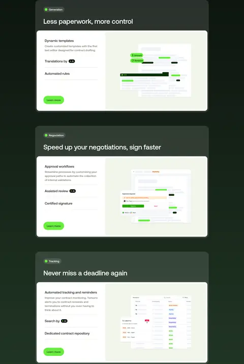
Feature card
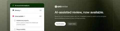
Rounded dark or pale card that combines a concise title, supporting copy, product capture, and a low-emphasis learn-more action.
Product showcase
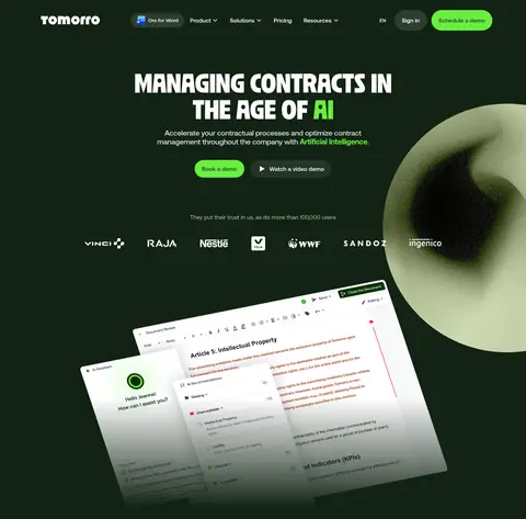
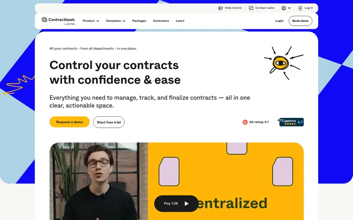
Large contract-management UI capture, sometimes tilted or layered over the hero background to make the software tangible.
Security tiles
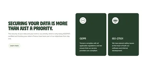
Paired green cards for GDPR and ISO information, using small certification marks, concise headings, and supporting copy.
Customer story panel
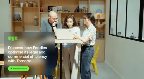
Wide photography-led testimonial with a dark translucent text panel and a lime action control.
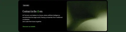
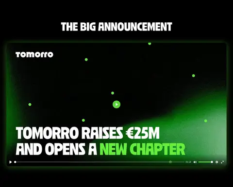
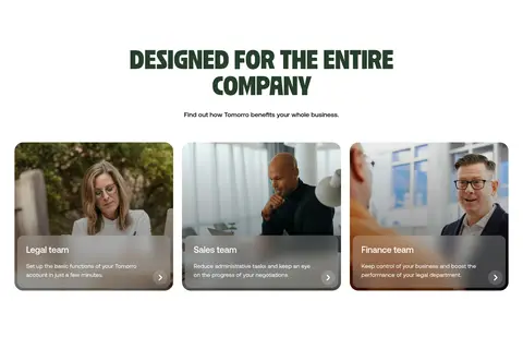
Imagery · The page combines abstract, grainy green 3D forms with tilted contract-interface captures, product UI screenshots, customer photography, and an embedded announcement video. Abstract hero imagery is oversized and partially cropped to create depth, while UI is presented as legible product evidence. Customer photographs remain rectangular and candid. Keep image treatments context-specific: atmospheric gradients and dark overlays for brand storytelling, restrained framing for interfaces.
Set display headlines in bold uppercase condensed type.
Keep lime for primary actions and selective AI emphasis.
Alternate white editorial areas with dark product-story bands.
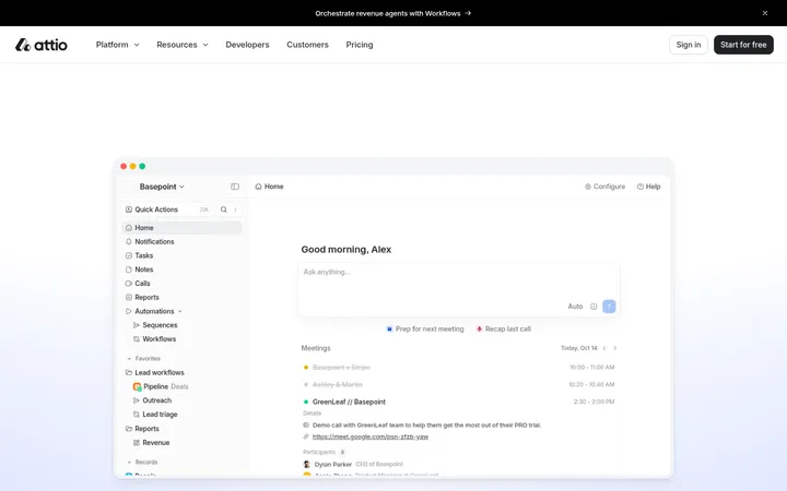
Use real-looking product UI as evidence of the software.
Keep navigation and body copy clean and readable.
Give large headlines clear breathing room.
✕ 不该做
Do not turn every surface lime.
Do not use generic gradients as a substitute for the dark-green palette.
Do not apply condensed display type to paragraphs.
Do not flatten the page into one continuous background color.
Do not make product cards look like floating dashboard widgets without context.
Do not crowd section headlines with nearby controls.
Do not treat image-only gray tones as core brand colors.
给 AI 的提示词
想快速出一个同风格的新页面,把这段话连同 DESIGN.md 一起发给 AI。
Build a new SaaS page in Tomorro's visual language. Use Forest Canvas (#122314) for the opening hero and selected dark story bands, with Gallery White (#ffffff) for editorial content. Set high-impact headlines in a bold condensed uppercase display face, and use a clean sans-serif for navigation, body copy, and controls. Make Signal Lime (#68ef3f) the reserved action color, paired with Canopy Green (#273f2b) text; keep secondary copy muted with Sage Mist (#b7bda5) on dark backgrounds. Alternate wide section bands, generous title breathing room, and compact feature modules. Show product UI clearly, mixing it with atmospheric abstract imagery only where appropriate. Use rounded pill actions and cards, subtle sage hairlines, and avoid decorative shadows except for restrained cinematic glow.