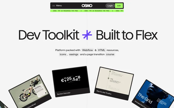
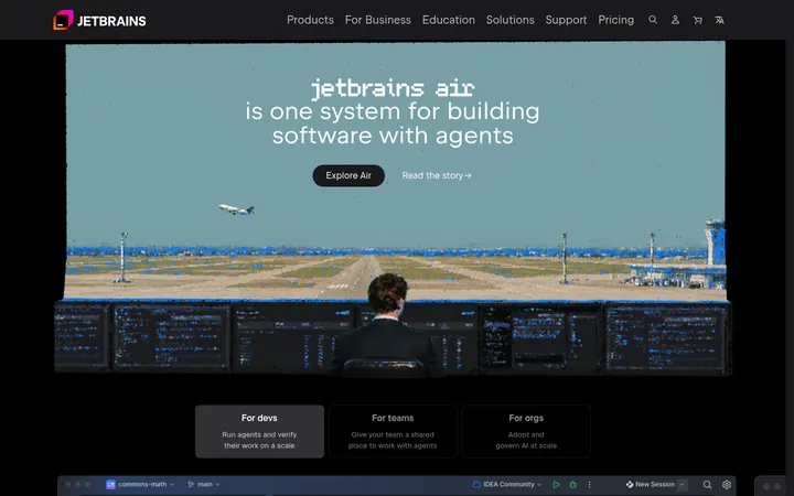
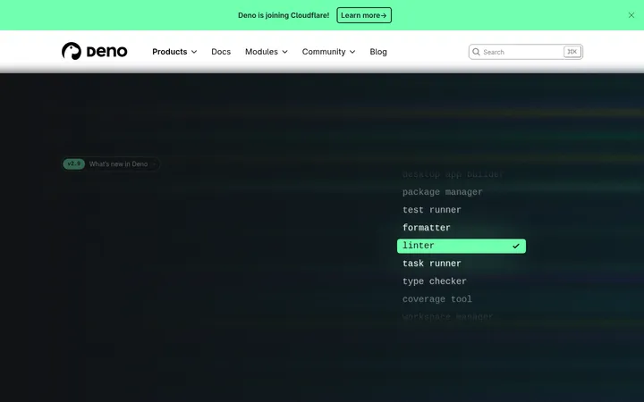
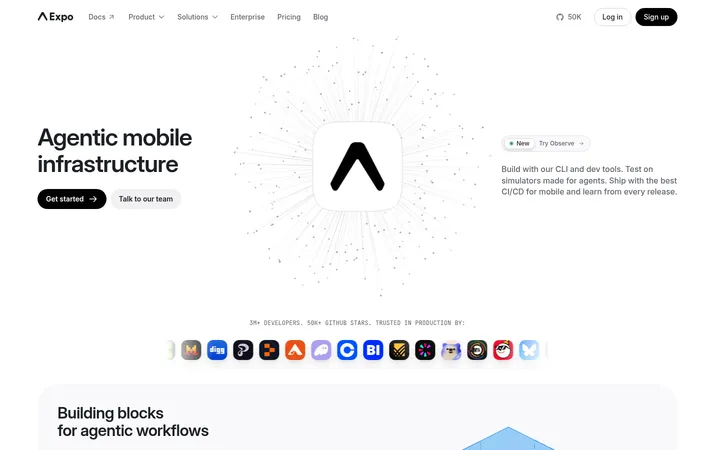
North star · Keep the page grounded in near-black, and reserve vivid gradients and bright accents for moments that explain or invite action.
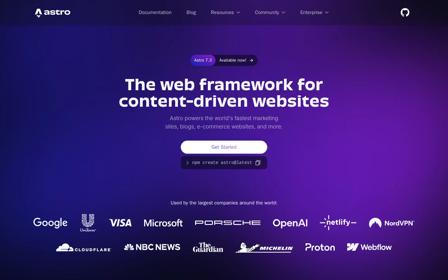
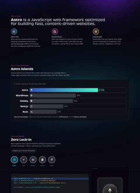
The page pairs a near-black canvas (#060913) with restrained dark card surfaces, letting its expansive purple-blue hero gradient carry the first impression. White and cool pale text establish a clear reading hierarchy; muted gray supports navigation, captions, and secondary copy. Cyan and mint appear as selective signals in code samples, charts, and interface details rather than as broad page fills. Oversized, bold display headings use Obviously, while light sans-serif body copy keeps dense technical explanations approachable. The layout begins with a centered, high-impact hero and logo rows, then shifts to left-aligned feature explanations and dark bordered cards. Product screenshots, code panels, theme previews, and sponsor logos supply visual variety without abandoning the dark system. Compact spacing and repeated card groupings support a long, information-rich page; rounded controls and subtle hairlines define interaction boundaries without prominent shadows.
配色
点色块复制色值。用途说明来自对页面的实测位置(背景、文字、描边、按钮)与截图判读。
品牌色
强调色
表层色
中性色
功能色
页面底色 · Midnight Canvas表层 · Deep Panel表层 2 · Ocean Slate表层 3 · Black Plum表层 4 · Editor Charcoal主文字 · Bright White次要文字 · Moonlit Gray描边 · Slate Hairline强调 · Ocean Slate强调 2 · Electric Cyan强调 3 · Mint Signal
Body copy, navigation, buttons, and everyday interface text.
Aa 设计
ui-monospace
系统字体 · 字重 400 / 300 · 占比 8%
免费替代:IBM Plex Mono
Captions, code snippets, terminal commands, and technical labels.
Aa 设计
Obviously
网络字体 · 字重 700 / 300 · 占比 6%
免费替代:Space Grotesk
Display headings, including the hero and section titles.
Aa 设计
Inter
网络字体 · 字重 200 / 400 · 占比 3%
免费替代:Inter
Small supporting share of interface and text styles.
角色
示例
字号
字重
行高
字距
一级标题
Centered hero statement introducing Astro’s content-driven web framework.
Astro
48px
700
1.1
0
二级标题
Large section-level headings, with a light display treatment.
Astro
36px
300
1.11
0
三级标题
Feature and content-card titles.
Astro
30px
700
1.2
0
四级标题
Compact card or subsection headings.
The quick brown fox 敏捷的狐狸
20px
700
1.4
0
正文
Explanatory feature copy, descriptions, and general content.
The quick brown fox 敏捷的狐狸
16px
300
1.5
0
辅助文字
Small technical notes, labels, and interface captions.
The quick brown fox 敏捷的狐狸
13.5px
400
1.65
0
按钮
Primary actions and utility controls.
The quick brown fox 敏捷的狐狸
16px
400
1.5
0
导航
Header navigation and secondary navigation.
The quick brown fox 敏捷的狐狸
16px
300
1.5
0
链接
Emphasized links within cards and content.
The quick brown fox 敏捷的狐狸
16px
600
1.5
0
代码
Terminal commands and code-editor examples.
const style = 1;
13.5px
400
1.65
0
间距与布局
基准单位 8px · 密度:紧凑
32px版块间距
8px元素间距
—卡片内边距
1216px内容最大宽度
2px
3px
4px
8px
12px
16px
20px
22px
24px
32px
Use a centered, wide content frame capped by the measured 1216px page maximum. The hero is centered, spacious, and visually distinct; below it, content shifts between aligned feature introductions, multi-column card grids, media demonstrations, and centered CTA or sponsor areas. Keep the long-page rhythm compact but clearly sectioned, with an 8px base spacing unit and measured 32px section gap. Dark full-width bands remain continuous, while cards and media create local structure.
圆角与层次
按钮 · 9999px
输入框 · 8px
卡片 · 16px
图片 · 12px
链接 · 12px
sm · nav
sm · card
sm · card
The interface is mostly flat: dark surfaces, thin gray borders, and contrast do more work than shadows. Separate cards from the canvas with subtle hairlines and rounded corners; use modest layering for code and product mockups. Avoid conspicuous drop shadows or glossy, floating panels.
组件
下面的预览按实测的按钮、输入框、徽标、卡片样式重建(字体用替代字体)。
Hero actions
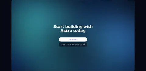
A centered white pill-shaped Get Started action sits above a dark command strip. Use high contrast and make the copyable npm command feel like a compact terminal element.
Navigation
Place the Astro mark at the left, muted lightweight links across the header, and a compact community or GitHub icon at the right.
Feature cards
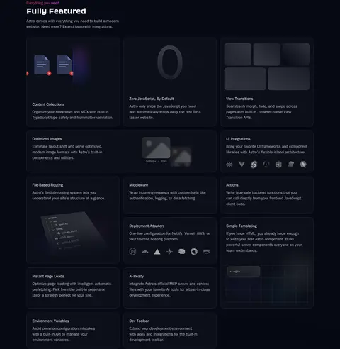
Use #0c0f19 panels with a 1px #20232d outline and rounded corners for concise feature descriptions and product capabilities.
Code and product demo
Combine charcoal editor or terminal panels with an adjacent product preview, using cyan selectively for interface emphasis.
Performance comparison
Show labeled framework rows and horizontal bars inside a dark bordered card, with brighter cyan-to-mint emphasis for Astro.
Theme gallery
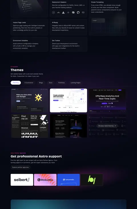
Present website previews as a compact image grid with category filters and dark framing; keep colorful preview art inside its own tiles.
Sponsor grid
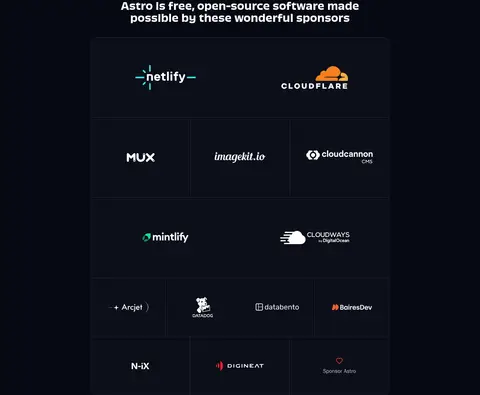
Arrange sponsor marks in a structured, dark grid with thin separators and generous logo visibility.
Imagery · Favor interface imagery over lifestyle photography: code editors, terminal commands, charts, product previews, theme thumbnails, and sponsor logos. Frame demos in dark, subtly bordered panels with softly rounded corners. The hero’s purple-blue gradient is atmospheric backdrop rather than a photo. Keep illustration and UI color variation contained within the showcased product or logo artwork.
Reserve vivid purple-blue gradients for prominent visual moments.
Use #0c0f19 cards with #20232d hairline borders.
Set display headings in a bold, distinctive sans-serif.
Use monospace styling for code and terminal commands.
Keep cyan and mint accents selective and functional.
Balance dense feature content with clear section breaks.
✕ 不该做
Do not replace the dark canvas with a light page background.
Do not spread gradients across every card or section.
Do not use bright accents for long passages of body copy.
Do not rely on heavy shadows to separate content.
Do not make product imagery brighter than the page’s core hierarchy.
Do not use oversized all-caps labels or generic marketing decoration.
给 AI 的提示词
想快速出一个同风格的新页面,把这段话连同 DESIGN.md 一起发给 AI。
Build a developer-tools page using Astro’s dark, technical visual language. Use Midnight Canvas (#060913) as the foundation, Cool Porcelain (#f2f6fa) and Bright White (#ffffff) for readable foregrounds, and Moonlit Gray (#bfc1c9) for secondary copy. Give content panels Deep Panel (#0c0f19) surfaces with Slate Hairline (#20232d) borders. Apply purple-blue gradients sparingly to a hero or featured visual; reserve Electric Cyan (#61dafb) and Mint Signal (#4bf3c8) for meaningful UI emphasis. Use a distinctive bold sans-serif for headings, lightweight sans-serif body text, and monospace for commands and technical labels. Structure the page with a centered hero, modular feature cards, dark-framed product examples, and clear section transitions. Keep shadows understated and controls rounded.