North star · Keep the interface almost white and spacious, using indigo typography and a single softly elevated code example to anchor the page.
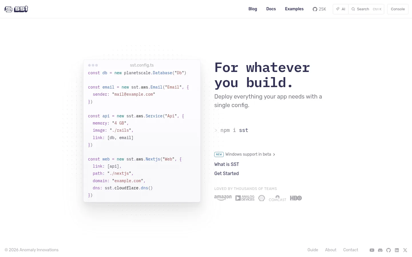
The visual strategy is deliberately quiet: a white canvas dominates, with pale gray-violet borders and soft near-white code-card tones adding just enough structure. Deep indigo provides the main contrast for navigation, headings, and links, while the hero’s code syntax introduces muted purple, blue, and red accents. These syntax colors belong to the code presentation rather than functioning as broad interface fills. IBM Plex Mono gives the headline and technical content a distinctly developer-oriented voice; Rubik Variable keeps navigation and supporting interface text approachable. The page uses a compact horizontal header above a spacious, centered two-column hero: a softly elevated code sample sits beside a left-aligned message and practical links. A subtle dotted backdrop and faint gradient give the demo dimension without competing with its content. Small customer marks and understated footer links complete the first viewport without adding visual weight.
Hero headline and code-oriented content, including body and code roles.
Aa 设计
Rubik Variable
网络字体 · 字重 400 / 500 / 600 · 占比 42%
免费替代:Rubik
Navigation, supporting interface text, links, labels, and buttons.
角色
示例
字号
字重
行高
字距
一级标题
Large two-line hero headline.
SST
48px
600
1.1
-0.021em
二级标题
Supporting hero statement and section-level copy.
The quick brown fox 敏捷的狐狸
20px
400
1.5
0
三级标题
Compact technical or code-preview headings.
The quick brown fox 敏捷的狐狸
18px
400
1.8
0
正文
Code-oriented explanatory and supporting text.
The quick brown fox 敏捷的狐狸
14px
400
1.8
0
辅助文字
Small uppercase customer and category labels.
The quick brown fox 敏捷的狐狸
13px
400
1.8
0.038em
按钮
Compact utility controls in the header.
The quick brown fox 敏捷的狐狸
13px
400
normal
0
导航
Header links and compact navigation labels.
The quick brown fox 敏捷的狐狸
14px
500
normal
0
链接
Hero actions and prominent text links.
The quick brown fox 敏捷的狐狸
16px
400
normal
0
眉题
Small uppercase labels above supporting content.
The quick brown fox 敏捷的狐狸
13px
400
1.8
0.038em
代码
Syntax-highlighted infrastructure configuration.
const style = 1;
14px
400
1.8
0
间距与布局
基准单位 2px · 密度:适中
72px版块间距
24px元素间距
—卡片内边距
858px内容最大宽度
1px
3px
5px
6px
7px
8px
10px
12px
13px
14px
15px
16px
24px
31px
32px
40px
A slim horizontal navigation spans the top, with the logo left and links plus utility controls aligned right. The hero sits in a centered two-column composition within the measured 858px page width: a code card on the left and a left-aligned message and actions on the right. Generous whitespace separates the header, hero, and viewport edges; content density remains comfortable. Customer marks sit below the hero links, while footer details hug the lower corners. Keep the first screen open rather than filling the canvas with extra sections.
圆角与层次
按钮 · 4px
卡片 · 8px
徽标 · 4px
导航 · 4px
xl · card
The page is mostly flat, with pale hairline borders defining header controls and the code-card edge. The code preview is the main raised layer, using a very soft, diffuse shadow rather than strong contrast. Keep the dotted backdrop and gradient subtle; avoid stacking cards or adding heavy outlines.
组件
下面的预览按实测的按钮、输入框、徽标、卡片样式重建(字体用替代字体)。
Header navigation
A compact top bar with the SST mark at left and links, community count, AI control, search, and Console control at right.
Code preview
A softly elevated, rounded configuration card with a small file label and syntax-colored infrastructure code.
Hero message
A large indigo monospace headline with muted supporting copy, a compact install command, and stacked text links.
Announcement badge
A small outlined teal NEW badge paired with a brief release note.
Customer proof
A low-contrast uppercase label followed by a row of small customer logos.
Footer
Muted copyright text at the lower left and compact utility links with social icons at the lower right.
Imagery · There is no photography or video. The principal visual is a framed, syntax-highlighted configuration sample, treated as a product preview rather than decorative illustration. A faint dotted field and restrained gradient sit behind it, with the code card softly separated from the white page. Small, muted customer logos provide a quiet proof point beneath the text.
Reserve Rubik for navigation and interface controls.
Make code the primary visual demonstration.
Keep syntax accents inside technical content.
Use pale borders and soft elevation.
Preserve generous whitespace around the hero.
✕ 不该做
Do not introduce large saturated background bands.
Do not turn syntax colors into broad UI accents.
Do not crowd the header with oversized controls.
Do not use photography as a substitute for the code preview.
Do not add heavy shadows or thick borders.
Do not center-align the hero message.
给 AI 的提示词
想快速出一个同风格的新页面,把这段话连同 DESIGN.md 一起发给 AI。
Build a new page in SST’s restrained developer-tool style. Use Gallery White (#ffffff) as the dominant canvas, Midnight Indigo (#303055) for the main heading and links, and Lavender Hairline (#e8e8f2) for delicate control borders. Pair IBM Plex Mono for technical emphasis with Rubik for navigation and interface text. Use a slim horizontal header, then a spacious, centered two-column hero with a code-preview card beside left-aligned copy and practical actions. Give the code card subtle elevation and a faint dotted or pale gradient backdrop; keep Syntax Violet (#8844ae), Syntax Cobalt (#3b61b0), and Syntax Clay (#984e4d) confined to code tokens. Maintain generous whitespace, muted supporting copy, a small customer-proof row, and a quiet footer. Avoid large color panels, dense decoration, and heavy shadows.