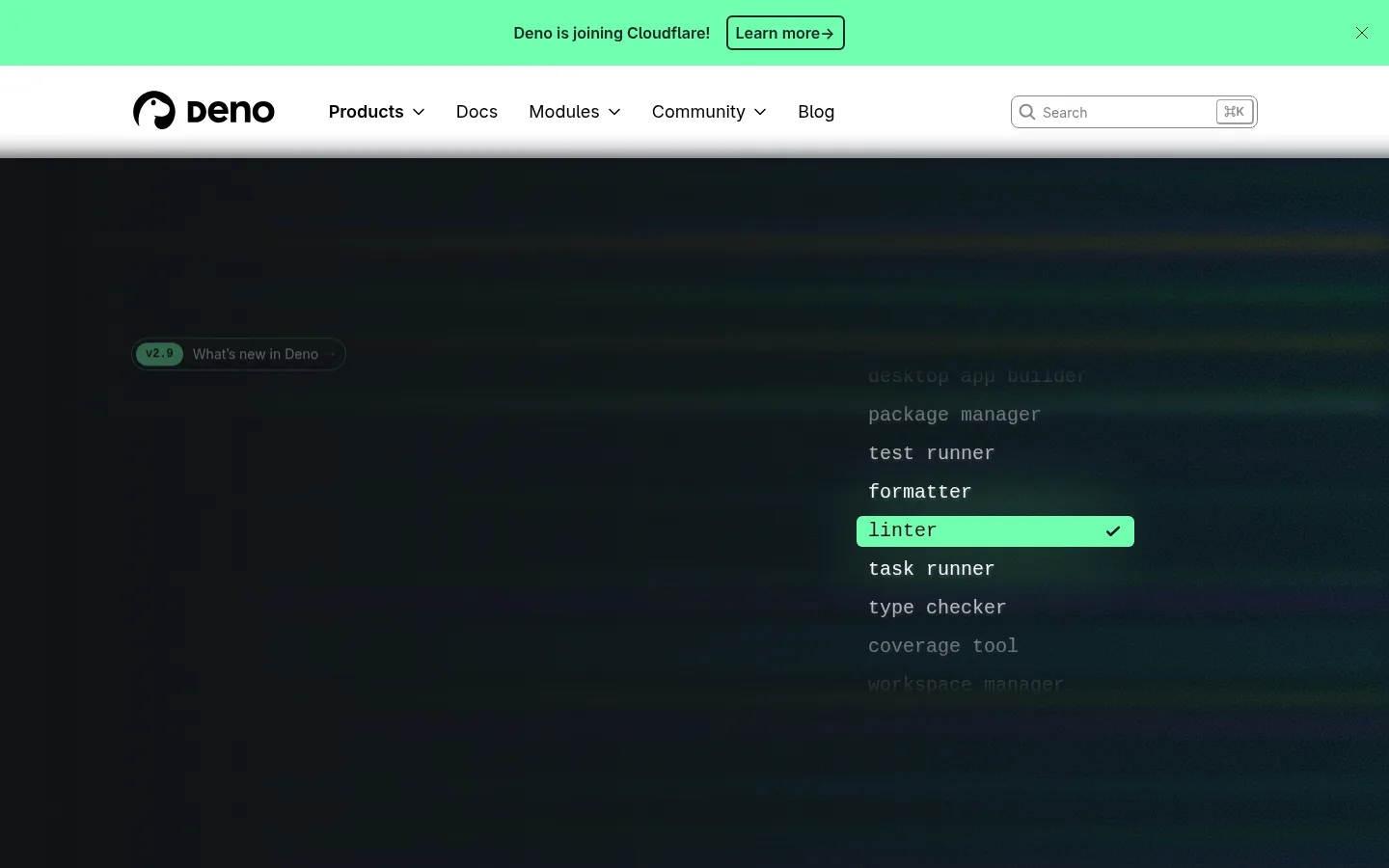
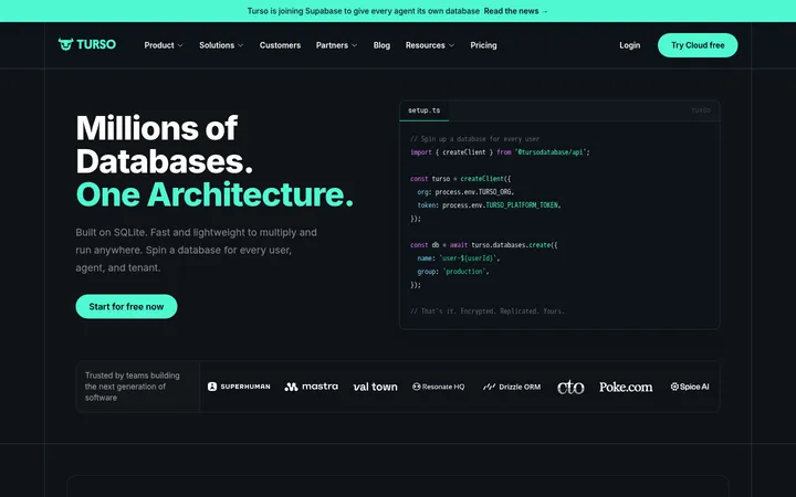
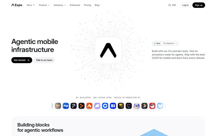
North star · Keep the page calm and spacious, then use mint green to highlight the one action or technical detail that matters in each section.
The page establishes its identity through a sharp contrast between bright white content areas and a nearly black, atmospheric hero. Mint green (#70ffaf) is the signature signal: it marks the top announcement, selected items in the hero animation, version badges, and primary pill CTAs. Neutral white and pale blue-gray sections give the long feature narrative room to breathe, while deep charcoal bands reserve visual weight for runtime and security content. Inter handles prominent headings and explanatory copy, with compact Menlo code and terminal elements reinforcing the developer context; Recursive appears sparingly in link treatments. The layout alternates centered command-line demonstrations with two-column feature splits and broad visual panels. Product imagery is mostly interface mockups, code windows, benchmark cards, and diagrams rather than photography. Fine borders and restrained shadows define cards without making the page feel heavy.
Display headings, body copy, navigation, and most interface text.
Aa 设计
Menlo
系统字体 · 字重 400 / 500 / 700 · 占比 37%
免费替代:Roboto Mono
Terminal commands, code samples, compact technical labels, and selected links.
Aa 设计
Recursive
网络字体 · 字重 400 · 占比 5%
免费替代:Inter
Occasional link styling and small brand-adjacent text.
角色
示例
字号
字重
行高
字距
特大标题
Oversized hero and major promotional headlines.
Deno
72px
700
1.1
-0.025em
一级标题
Primary page title and top-level section heading.
Deno
44px
700
1.1
-0.025em
二级标题
Feature-section headlines and key explanatory blocks.
Deno
36px
700
1.1
-0.025em
正文
Feature descriptions and supporting paragraphs.
The quick brown fox 敏捷的狐狸
18px
400
1.56
0
辅助文字
Small annotations and explanatory interface copy.
The quick brown fox 敏捷的狐狸
16px
400
1.5
0
按钮
Compact action labels and command-like controls.
The quick brown fox 敏捷的狐狸
14px
400
1.43
0
链接
Inline navigation and technical resource links.
The quick brown fox 敏捷的狐狸
16px
400
1.5
0
代码
Code snippets, terminal content, and command demonstrations.
const style = 1;
20px
500
1.4
0
间距与布局
基准单位 4px · 密度:宽松
144px版块间距
16px元素间距
32px卡片内边距
1280px内容最大宽度
2px
3px
4px
6px
8px
10px
12px
16px
24px
32px
56px
64px
128px
144px
The measured page uses a spacious, wide content frame with a reported maximum width of 1280px. It opens with a full-width announcement and navigation above a full-bleed dark hero, then alternates centered install demonstrations, two-column feature splits, pale blue comparison bands, and dark security content. Headings often align left within feature rows, while showcase and benchmark areas center their content. Large section gaps and restrained content density separate ideas; cards and code windows sit within the grid rather than crowding the page.
圆角与层次
按钮 · 9999px
输入框 · 8px
卡片 · 6px
图片 · 50%
徽标 · 4px
导航 · 50%
链接 · 8px
md · card, media
sm · button, nav
hairline · card
hairline · card
Most sections remain flat, with white cards separated from their surroundings by thin cool-gray borders. Code and interface panels gain restrained, soft shadows to suggest layered windows without heavy depth. Dark sections use tonal differences between background and cards rather than pronounced elevation; pill buttons and badges rely on color and shape for emphasis.
组件
下面的预览按实测的按钮、输入框、徽标、卡片样式重建(字体用替代字体)。
Announcement bar
Full-width Deno Mint (#70ffaf) strip with centered update copy, an outlined learn-more control, and a quiet dismiss affordance.
Primary CTA
Compact pill-shaped button, usually filled with Deno Mint (#70ffaf) and paired with dark text and a small directional icon.
Terminal panel
Dark command window with compact monospace content, a narrow header or tab row, and a copy control.
Feature card
White or Mist Surface (#f8f9fc) panel with a Cool Hairline (#e5eaea) border, rounded corners, and restrained shadow.
Technical badge
Small monospace badge using charcoal or deep green surfaces, mint text, and a fine green border for security flags.
Feature split
Alternating two-column feature row pairing a concise heading and copy with a code, package, or interface illustration.
Imagery · Visuals are primarily developer-product representations: code editors, terminal panels, package diagrams, benchmark comparisons, and interface cards. The hero uses a dark atmospheric backdrop with subdued colored light and an animated-looking list of runtime capabilities. Mockups are framed as floating panels with subtle borders or shadows. Photography is not a defining brand element; keep illustrations and UI demonstrations precise, legible, and product-led.
Use Deno Mint (#70ffaf) for the announcement and primary actions.
Give the hero a deep, nearly black background.
Keep feature sections spacious and easy to scan.
Use Inter for headings and explanatory copy.
Use monospace styling for code and terminal content.
Alternate text-and-visual feature splits down the page.
✕ 不该做
Do not turn pale blue into a saturated brand color.
Do not use shadows as the main way to define every section.
Do not crowd the layout with dense feature cards.
Do not use photography as a substitute for product UI visuals.
Do not apply mint indiscriminately to long text passages.
Do not use decorative all-caps headings.
给 AI 的提示词
想快速出一个同风格的新页面,把这段话连同 DESIGN.md 一起发给 AI。
Build a developer-focused page that follows Deno’s calm, spacious visual language. Use Gallery White (#ffffff) as the main content canvas and Night Canvas (#0b0d11) for a dramatic hero or important inverse section. Reserve Deno Mint (#70ffaf) for primary actions, status highlights, and small active states. Use Inter for clear, bold headings and body copy; use a monospace face such as Menlo for terminals, code samples, and technical labels. Organize content in a wide, centered frame with alternating feature splits, centered demos, and occasional Cloud Tint (#ecf3fd) bands. Represent the product through crisp interface mockups and code panels rather than stock photography. Define cards with Cool Hairline (#e5eaea) borders and restrained shadows. Keep hierarchy simple, alignment deliberate, and whitespace generous.