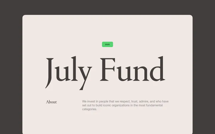
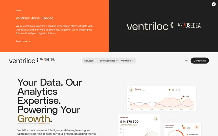
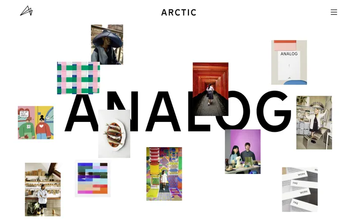
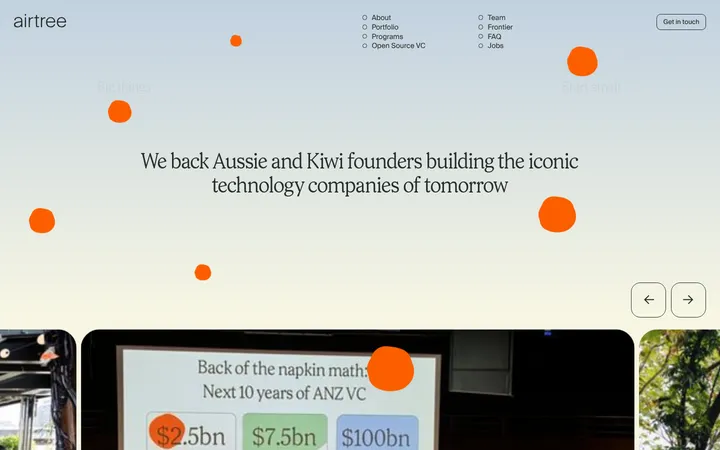
North star · Let a near-black, spacious editorial canvas carry oversized pale headlines, with vivid blue reserved for meaningful emphasis and abstract detail.
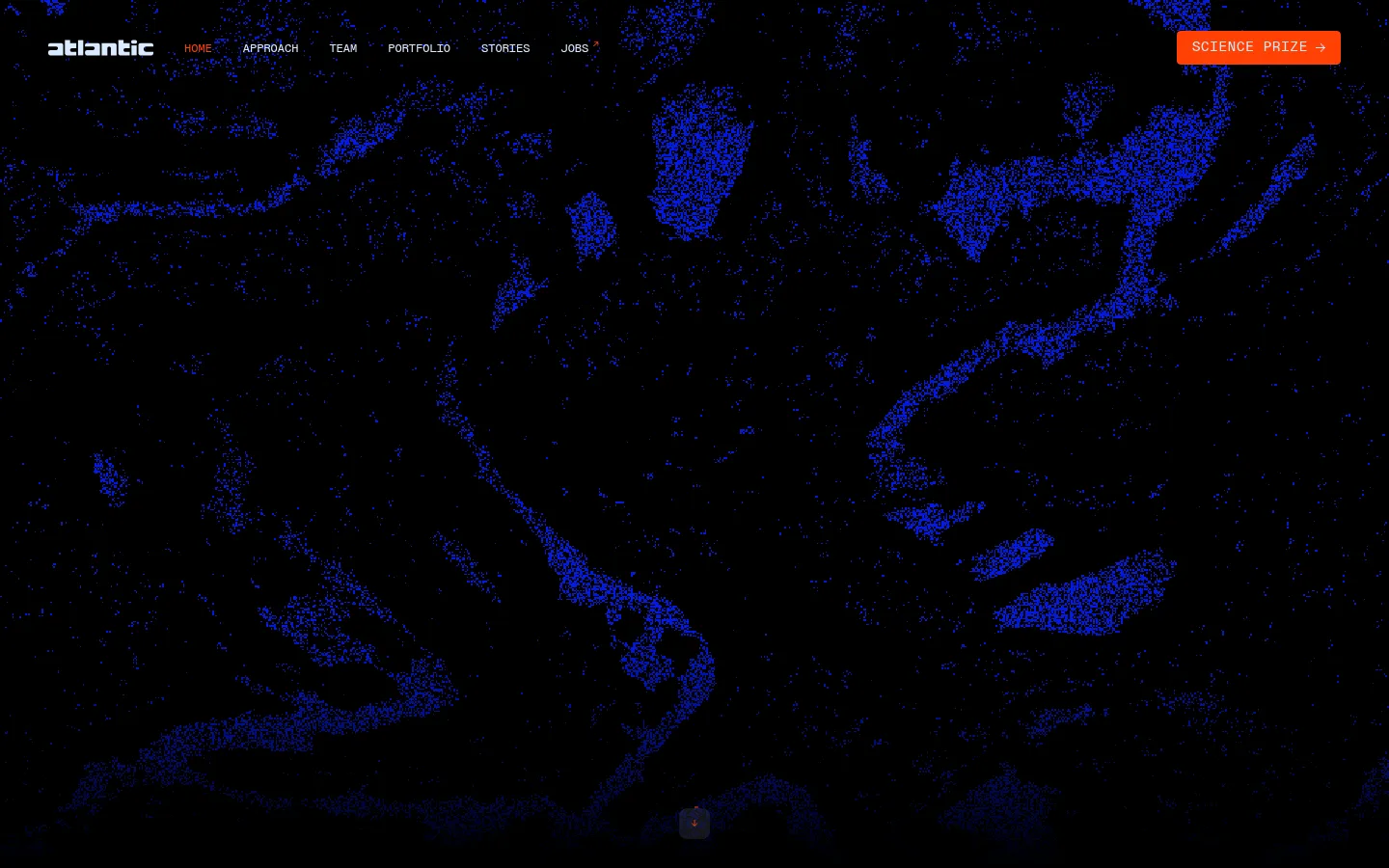
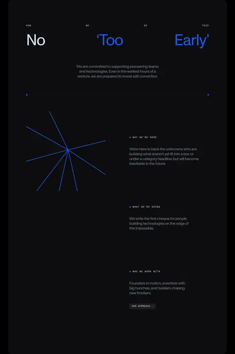
The page is built on a near-black canvas, with subtle charcoal section surfaces preserving contrast without dividing the experience into bright panels. Pale blue-white text carries navigation, headings, and links; saturated blue marks selected words, small graphic details, and atmospheric artwork. Orange appears only as a small prize CTA in the screenshot, not as a core measured palette color. Monument provides the large, clean, light-weight editorial headlines, while Mono sets compact uppercase labels, navigation, and supporting metadata with conspicuous tracking. Layout shifts between open headline-led bands and structured grids: company marks, founder portraits, approach statements, and three-column updates. Generous vertical gaps make the long page feel deliberate rather than dense. Photography is used for founders and news, while abstract blue particle imagery and line motifs create a distinctive visual frame. Borders are restrained hairlines; cards stay mostly flat, with subtle charcoal surfaces and minimal corner rounding.
配色
点色块复制色值。用途说明来自对页面的实测位置(背景、文字、描边、按钮)与截图判读。
品牌色
强调色
表层色
中性色
功能色
页面底色 · Abyss Black表层 · Coal Panel表层 2 · Graphite Slate主文字 · Glacier Text次要文字 · Clouded Steel弱文字 · Slate Caption描边 · Iron Hairline强调 · Signal Blue
文字
背景
对比度
WCAG
#d8eaff Glacier Text
#000000 Abyss Black
17.13:1
AAA
#d8eaff Glacier Text
#0d0d0f Coal Panel
15.84:1
AAA
#d8eaff Glacier Text
#2b2f33 Graphite Slate
11:1
AAA
#727b87 Clouded Steel
#000000 Abyss Black
4.9:1
AA
#727b87 Clouded Steel
#0d0d0f Coal Panel
4.53:1
AA
#727b87 Clouded Steel
#2b2f33 Graphite Slate
3.15:1
AA-large
字体
字号阶梯:Custom(比例约 1.9,正文 14px)。示例用免费替代字体渲染,数值为实测。
Aa 设计
Monument
网络字体 · 字重 400 · 占比 81%
免费替代:Space Grotesk
Display and editorial headlines, plus selected link and button text.
Aa 设计
Mono
网络字体 · 字重 400 · 占比 19%
免费替代:IBM Plex Mono
Navigation, eyebrows, body labels, captions, and code-like metadata.
角色
示例
字号
字重
行高
字距
特大标题
Oversized hero or section display headlines.
Atlantic
96px
400
1
-0.03em
一级标题
Primary large editorial headings and statement-led sections.
Atlantic
64px
400
1.06
-0.03em
二级标题
Secondary section headings and supporting editorial titles.
The quick brown fox 敏捷的狐狸
24px
400
1.24
-0.03em
正文
Uppercase, tracked copy and compact supporting text.
The quick brown fox 敏捷的狐狸
14px
400
1
0.16em
辅助文字
Small uppercase metadata, dates, and image captions.
The quick brown fox 敏捷的狐狸
10px
400
1
0.16em
导航
Compact uppercase primary navigation labels.
The quick brown fox 敏捷的狐狸
12px
400
1.5
0
眉题
Tracked uppercase section labels above headings.
The quick brown fox 敏捷的狐狸
14px
400
1
0.16em
代码
Technical-looking uppercase labels and metadata.
const style = 1;
14px
400
1
0.16em
间距与布局
基准单位 4px · 密度:宽松
50px版块间距
32px元素间距
—卡片内边距
1340px内容最大宽度
4px
8px
10px
12px
16px
20px
24px
30px
32px
50px
100px
150px
The measured content max width is 1340px, with a spacious density and a section gap of 50px. Sections alternate between full-width, open black canvases and contained multi-column compositions: a four-column portfolio area, testimonial cards, a three-column approach section, and a three-column news feed. Large headings and short labels anchor otherwise sparse layouts. Use flexible columns and generous vertical separation to retain the long-scroll pacing; keep alignment deliberate, with text often starting at the left and selected headline compositions stretching across the page.
圆角与层次
导航 · 4px
链接 · 4px
没有测到阴影:页面是扁平的,层次靠底色和描边区分。
The page reads as mostly flat, without measured shadows. Separate content through black-to-charcoal surface changes, delicate gray hairlines, and spacing rather than stacked card effects. The approach area is a subtly distinct dark panel; small corner rounding is present on selected navigation and link elements, not as a broad card language.
组件
下面的预览按实测的按钮、输入框、徽标、卡片样式重建(字体用替代字体)。
Primary navigation
Compact uppercase Mono labels in pale blue-white sit directly on the dark canvas; keep the navigation visually light and unobtrusive.
Prize CTA
A compact top-right science prize control is visually distinct in the screenshot; its orange appearance is an isolated screenshot detail, not a measured brand palette color.
Portfolio grid
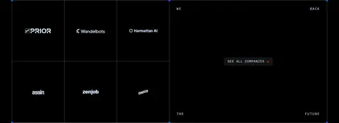
Company marks sit in a four-column content area with restrained divisions, giving the logos room to read against black.
Founder testimonials
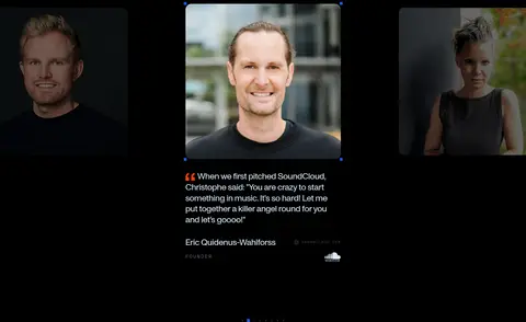
Portrait-led quotes use a carousel-like presentation with founder attribution and compact supporting labels.
Approach panel
A charcoal section combines a large statement with stacked investment principles and a small outbound link.
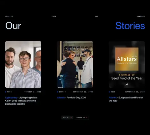
News cards
A three-column content feed pairs editorial images with compact uppercase category and date metadata, then linked headlines.
Footer contact
A spacious two-column contact area combines a large heading, contact and social links, address, and legal navigation.
Imagery · The hero uses full-bleed abstract blue particle imagery against black, creating a science-forward atmosphere rather than a literal product scene. Founder testimonials use portrait photography, while news cards use event and editorial images. Small blue starburst and line motifs recur as graphic accents. Keep image treatments dark, high-contrast, and integrated into the canvas; avoid adding decorative imagery where content is already strong.
Set headlines in Monument or a close geometric sans.
Use Mono for uppercase navigation and metadata.
Reserve #1f58f2 for selective emphasis and graphic accents.
Build section changes with spacing and subtle dark surfaces.
Give portraits and editorial images room to breathe.
✕ 不该做
Do not brighten the overall page with large light panels.
Do not use blue as a full-page background.
Do not make every text element uppercase.
Do not add heavy shadows or layered card effects.
Do not crowd sections with dense copy or tight spacing.
Do not treat incidental orange artwork as a measured brand color.
给 AI 的提示词
想快速出一个同风格的新页面,把这段话连同 DESIGN.md 一起发给 AI。
Build a new page in Atlantic’s visual style: use #000000 Abyss Black as the dominant canvas, #d8eaff Glacier Text for primary typography, and #1f58f2 Signal Blue sparingly for emphasis, small markers, and abstract graphic details. Use #0d0d0f Coal Panel for an occasional subdued section surface. Pair a Monument-like geometric sans for large, light editorial headlines with an IBM Plex Mono-like face for compact uppercase navigation, eyebrows, and metadata. Keep layouts spacious and modular, shifting between open statement sections and carefully aligned grids. Use restrained hairlines, minimal rounding, and no heavy shadows. Introduce founder or editorial photography with dark, integrated treatment, and use abstract particle or line artwork selectively. Maintain a calm, high-contrast rhythm; never let decoration compete with the content.