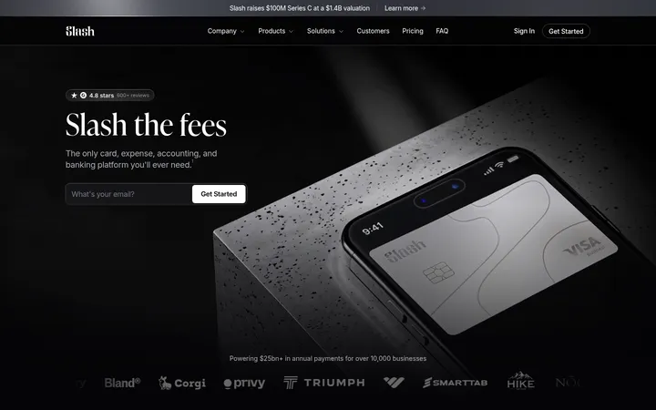
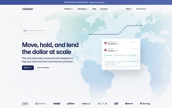
North star · Let near-black space and oversized, light typography frame credible product imagery, reserving coral for the clearest action.
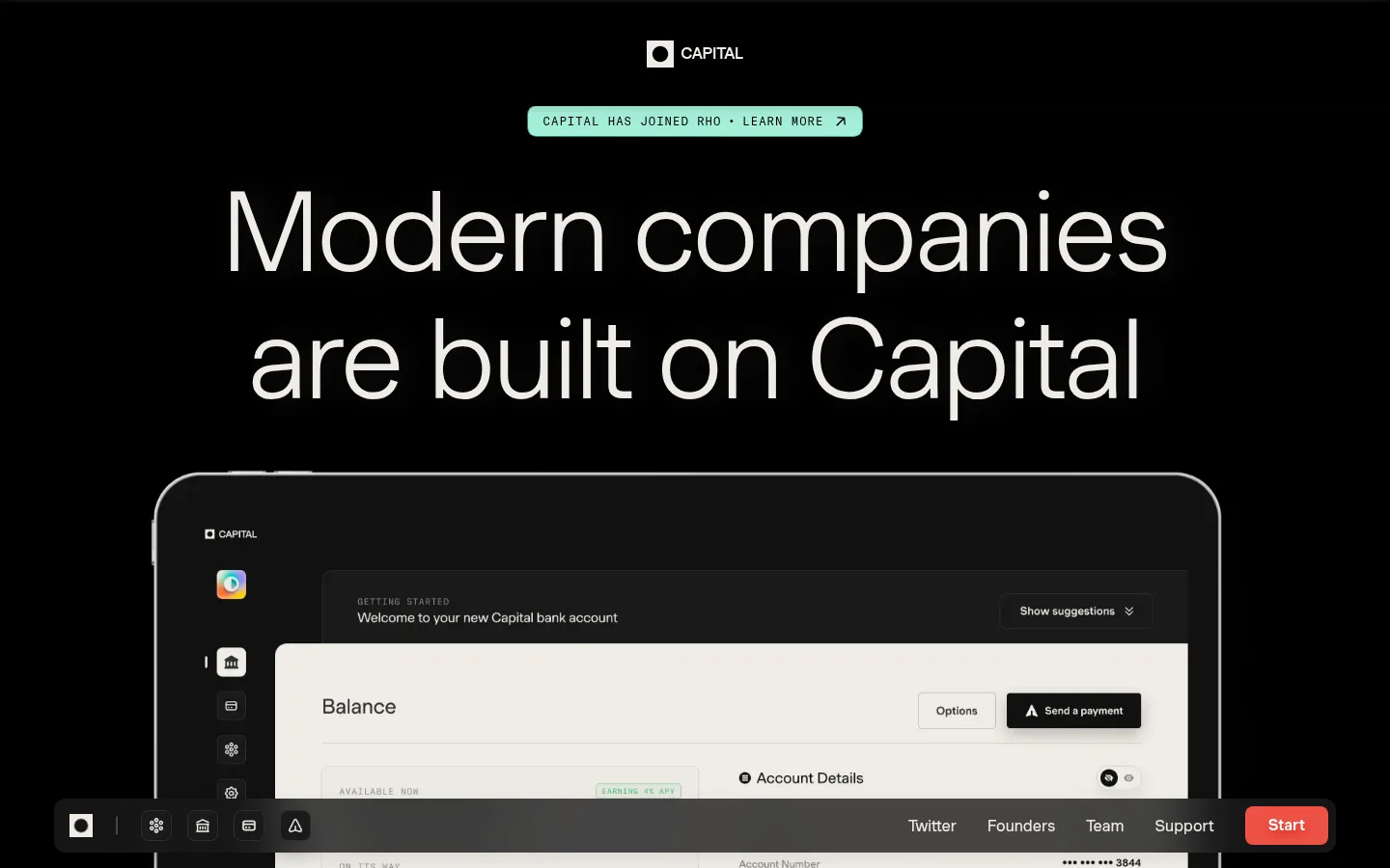
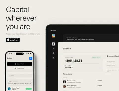
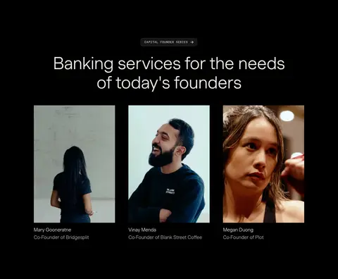
The visual strategy is built on contrast: near-black (#000000) and deep charcoal (#040503) carry most sections, while warm ivory (#efece6) handles the main display text and a full-width mobile-and-web feature band. Headlines are exceptionally large, light-weight Muoto, centered in the opening hero and used with generous line breaks; smaller supporting copy stays muted. GT America Mono appears in compact uppercase eyebrow labels, giving announcements and section markers a technical counterpoint. Layout alternates between broad, immersive product imagery and comparatively quiet black space. Interface screenshots and founder portraits are presented as evidence rather than decoration. The coral-red accent (#ed5145) is reserved for the primary Start action, keeping the call to action distinct without introducing a competing palette. Subtle charcoal borders separate controls, while cards and interface mockups create most of the page’s depth.
Display headings, body copy, navigation, links, and buttons.
Aa 设计
GT America Mono
网络字体 · 字重 400 · 占比 12%
免费替代:Space Mono
Eyebrows and compact code-like labels.
角色
示例
字号
字重
行高
字距
特大标题
Oversized homepage statement and other leading display moments.
Capital
115px
300
1.15
-0.02em
一级标题
Primary hero headline.
Capital
90px
300
1.15
-0.01em
二级标题
Major section headings, including founder stories.
Capital
72px
300
1.15
-0.01em
三级标题
Feature-level headings such as Raise and Invest.
Capital
32px
300
1.4
-0.01em
正文
Supporting product and service descriptions.
The quick brown fox 敏捷的狐狸
20px
300
1.4
0
辅助文字
Fine-print captions and image or testimonial details.
The quick brown fox 敏捷的狐狸
12px
400
normal
0
按钮
Primary Start action and other prominent controls.
The quick brown fox 敏捷的狐狸
16px
500
1.5
0
链接
Navigation, founder names, and supporting text links.
The quick brown fox 敏捷的狐狸
16px
400
normal
0
眉题
Uppercase announcement and section labels.
The quick brown fox 敏捷的狐狸
12px
400
1.6
0.08em
代码
Compact monospace labels used as technical microcopy.
const style = 1;
12px
400
1.6
0.08em
间距与布局
基准单位 8px · 密度:适中
64px版块间距
16px元素间距
—卡片内边距
1120px内容最大宽度
4px
5px
6px
7px
8px
10px
12px
16px
20px
24px
32px
40px
64px
68px
80px
90px
The page uses a centered composition with a measured maximum content width of 1120px and comfortable density. The hero aligns its headline centrally above an expansive product mockup; later content shifts into two-column product sections and a three-column founder feature. Long black section bands are separated by a full-bleed ivory product-access section. Section spacing is generous, with a measured 64px section gap and 16px element gap. Use whitespace to pace the scroll rather than adding extra dividers or dense grids.
圆角与层次
按钮 · 8px
卡片 · 16px
链接 · 8px
md · button
md · link
md · nav
inset · link
The overall page is mostly flat: large background fields and whitespace do the structural work. Hairline graphite borders define select controls, while measured medium shadows appear on navigation and buttons. Product mockups supply the strongest depth through layered interface panels and device framing; cards use softly rounded corners rather than prominent outlines.
组件
下面的预览按实测的按钮、输入框、徽标、卡片样式重建(字体用替代字体)。
Primary Start action
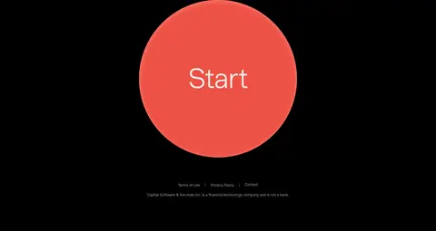
Coral #ed5145 button with white text, Muoto medium 16px, and an 8px radius; keep it visually unmistakable.
Announcement pill
Compact uppercase announcement above the hero headline, set in tracked monospace and styled as a small high-contrast label.
Hero product mockup
Large desktop banking interface framed in a dark device-like shell, with bright ivory UI panels layered over darker interface surfaces.
Founder switcher
FOUNDERS and INVESTORS controls use uppercase labels, pill-shaped outlines, and a light border for the selected state.
Founder story cards
Three portrait-led testimonial items in a row, each with a compact name and role caption beneath the image.
Mobile and web feature band
Full-width Warm Ivory section that pairs concise access messaging with app and desktop product visuals.
Footer Start CTA
Large circular coral Start treatment anchors the sparse dark footer above compact legal and company disclosure text.
Imagery · Product UI is shown in large, cropped device and desktop mockups, with dark frames and ivory interface areas providing contrast against the black canvas. The mobile-and-web section places interface imagery across a bright ivory field. Founder content uses rectangular photographic portraits with restrained captions. Keep imagery documentary and product-specific; avoid decorative illustration or invented gradients.
Keep the primary canvas near-black and uninterrupted.
Use Warm Ivory for display text and the dedicated product-access band.
Set display headlines in a light-weight sans with generous line breaks.
Reserve tracked monospace for small uppercase labels.
Make product interfaces and founder portraits the main evidence.
Use coral only for clear actions and selective emphasis.
✕ 不该做
Do not add unmeasured colors or decorative gradients.
Do not fill black sections with unnecessary cards or dividers.
Do not make supporting copy compete with the display headline.
Do not use monospace for long-form body text.
Do not turn interface mockups into generic abstract illustrations.
Do not distribute coral across every link or heading.
给 AI 的提示词
想快速出一个同风格的新页面,把这段话连同 DESIGN.md 一起发给 AI。
Build a new fintech page in Capital’s visual style. Use Carbon Canvas (#000000) for the main dark sections and Deep Charcoal (#040503) for subtle dark surfaces; use Warm Ivory (#efece6) for prominent text and a deliberate light product band. Set headlines in a light, modern sans such as DM Sans, with very large scale and clear line breaks; use Space Mono sparingly for tracked uppercase eyebrow labels. Keep the composition spacious and centered within the measured 1120px maximum width, then use focused two- or three-column content where useful. Show real product UI and candid, rectangular founder photography as proof. Use Graphite Rule (#302f2f) for restrained borders and Signal Coral (#ed5145) only for primary actions. Keep the page flat overall, with depth limited to interface layering and subtle control shadows.