North star · Keep the warm editorial canvas and candid founder imagery spacious, using dark ink and bright yellow only for clear contrast and action.
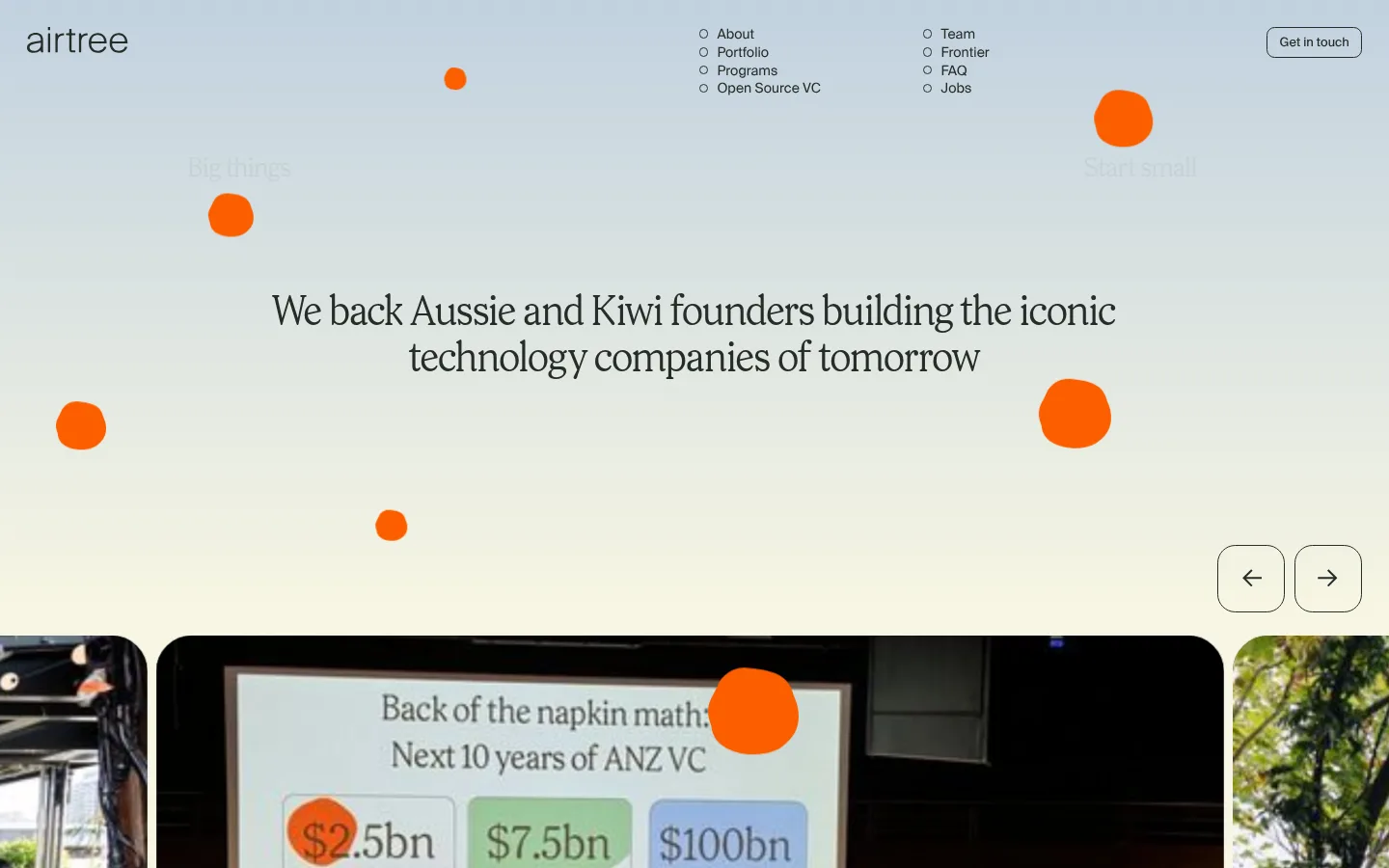
The page is built around a pale, warm canvas that keeps the experience open and lets photographs carry much of the colour. A dark green-black anchors navigation text, fine rules, and the full-bleed footer; a vivid yellow is reserved for small subscription and program actions. The hero introduces a soft sky-to-cream atmosphere and a centered, serif-like display message, while small orange decorative forms add a playful signal rather than setting the core palette. Prody supplies expressive display typography; Suisseintl keeps navigation, body copy, labels, and section headings practical and restrained. Large photography cards have generous rounded corners and usually place compact white captions over image gradients. The page moves through a carousel, partner marks, metrics, resource cards, programs, and a testimonial, with thin dividers and ample breathing room. Most sections stay flat and unshadowed; the dark footer closes the page with compact columns and oversized brand lettering.
Navigation, body copy, section headings, card copy, and testimonial text.
Aa 设计
Suisseintl Book
网络字体 · 字重 400 · 占比 3%
免费替代:Inter
Captions, small labels, and compact button and form text.
角色
示例
字号
字重
行高
字距
特大标题
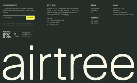
Oversized expressive lettering, including the large Airtree footer wordmark.
Airtree
131px
400
1
0
一级标题
Primary hero statement about backing founders.
Airtree
42px
400
1.15
0
二级标题
Major section titles and prominent testimonial copy.
Airtree
33px
400
1.15
0
三级标题
Supporting feature and program titles.
Airtree
28px
400
1.15
0
正文
Introductory descriptions, explanatory copy, and card text.
The quick brown fox 敏捷的狐狸
18.5px
400
1.15
0
辅助文字
Image captions, dates, and compact supporting labels.
The quick brown fox 敏捷的狐狸
13px
400
1
0
导航
Header navigation links and small menu labels.
The quick brown fox 敏捷的狐狸
14px
400
1
0
间距与布局
基准单位 1px · 密度:紧凑
37px版块间距
9px元素间距
—卡片内边距
1384px内容最大宽度
8px
9px
12px
15px
19px
28px
37px
75px
Use a broad centered canvas with a measured maximum width of 1384px and a compact overall density softened by generous section breathing room. The header distributes the wordmark, two slim navigation lists, and an outlined contact action. Content alternates between full-width bands and multi-column groupings: gallery and testimonial carousels, a logo strip, three prominent metrics, resource cards, and paired program cards. Keep section boundaries understated with hairlines and align text consistently within each block.
圆角与层次
按钮 · 8px
输入框 · 8px
卡片 · 37px
导航 · 50%
链接 · 19px
没有测到阴影:页面是扁平的,层次靠底色和描边区分。
The measured system has no shadows, so keep most content flat against the warm canvas. Use fine dark borders for outlined controls and section dividers, and rounded clipping for photo cards. Create depth through image cropping, dark caption fades, and the contrast of the dark footer rather than stacked panels or drop shadows.
组件
下面的预览按实测的按钮、输入框、徽标、卡片样式重建(字体用替代字体)。
Header navigation
Place the Airtree wordmark at left, compact link lists near the center, and a small outlined Get in touch control at right.
Hero and image carousel
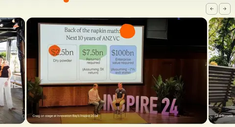
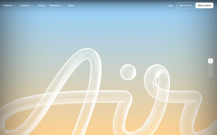
Center a prominent editorial statement over a pale atmospheric background; follow it with wide rounded event photography and simple outlined arrow controls.
Partner logo strip
Show partner-company marks in a quiet horizontal row on the light canvas, with ample surrounding whitespace.
Metrics block
Introduce Airtree with a short explanatory line, a subtle horizontal rule, and three large typographic proof points.
Resource cards
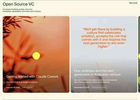
Present open-source guides as rounded photographic cards with lower-edge titles, dates, and restrained caption details.
Program cards
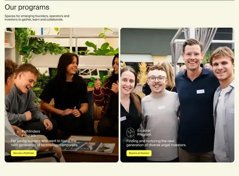
Pair community photography with a short program name, concise audience description, and a small Signal Lemon action.
Newsletter footer
Switch to Forest Ink for compact information columns, bordered email fields, a Signal Lemon Subscribe button, and oversized cream wordmark lettering.
Imagery · Prioritize candid event, founder, and community photography over polished product renders. Use large horizontal images in rounded cards, with compact white captions placed near the lower edge and a dark fade only where text needs contrast. The top carousel gives images room to dominate; program cards pair photography with short overlaid descriptions and clear actions. Decorative hero shapes are secondary accents, not substitutes for real photography.
Keep Forest Ink for text, navigation, rules, and the footer.
Reserve Signal Lemon for small, unmistakable actions.
Choose authentic founder and community photographs.
Use rounded image cards with restrained caption overlays.
Maintain generous pauses between distinct content sections.
✕ 不该做
Do not introduce extra interface colours beyond the measured palette.
Do not make the yellow accent a large page background.
Do not add drop shadows to cards or buttons.
Do not crowd the hero with dense navigation or copy.
Do not replace community photography with generic product mockups.
Do not make every section a bordered or elevated panel.
给 AI 的提示词
想快速出一个同风格的新页面,把这段话连同 DESIGN.md 一起发给 AI。
Build a new Airtree-style page with a spacious, warm editorial feel. Use Linen Cream (#f7f6e3) as the primary canvas and Forest Ink (#262d29) for typography, navigation, hairlines, and any dark closing band. Keep Signal Lemon (#ffff48) for compact calls to action; treat Shadow Black (#000000) only as a subtle image-caption gradient. Set display messages in an expressive editorial face and use a clean Suisseintl-like sans serif for navigation, body, and labels. Organize content into clear, broad sections with restrained dividers, large candid founder or community photographs, rounded image cards, and compact captions. Use simple outlined controls, flat surfaces without shadows, and generous visual pauses. Make the page feel human and grounded rather than like a generic financial-services dashboard.