North star · Keep the interface quiet and spacious, using cinematic media and deep ink contrast as punctuation rather than decoration.
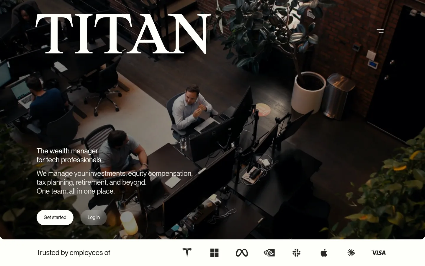
The page builds its identity from a warm off-white canvas (#fdfefa), deep brown-black text (#12100e), and quiet gray supporting tones. The palette stays deliberately restrained: pale backgrounds carry most content, while near-black bands create a few strong pauses and video overlays use dark gradients for legible white copy. Neue Montreal is used throughout in a regular weight, giving headings and body copy a consistent, contemporary voice rather than a formal finance look. The hero is an immersive full-bleed workplace video with a large wordmark, compact copy, and contrasting pill-shaped actions. Below it, the page moves between open light sections, concise statistics, image-led modules, and dark feature bands. Spacious section rhythm keeps the long homepage calm; cards use fine borders rather than heavy shadows. Photography and video supply human context, while colorful resource imagery remains supporting content rather than defining the brand palette.
All measured headings, body copy, buttons, and links.
角色
示例
字号
字重
行高
字距
一级标题
Primary hero statement over the full-bleed video.
Titan
48px
400
1.38
0
二级标题
Major section headings and prominent editorial statements.
Titan
28px
400
1.38
0
三级标题
Feature, testimonial, or content-card headings.
The quick brown fox 敏捷的狐狸
24px
400
1.25
0
四级标题
Smaller module headings and FAQ question titles.
The quick brown fox 敏捷的狐狸
20px
400
1.25
0
正文
Introductory descriptions, explanatory copy, and standard page text.
The quick brown fox 敏捷的狐狸
16px
400
1.5
0
辅助文字
Fine print, image notes, and supporting labels.
The quick brown fox 敏捷的狐狸
12px
400
1.5
0
按钮
Text inside primary and secondary action controls.
The quick brown fox 敏捷的狐狸
16px
400
1.25
0
链接
Navigation and inline calls to action.
The quick brown fox 敏捷的狐狸
16px
400
1.25
0
间距与布局
基准单位 8px · 密度:宽松
112px版块间距
8px元素间距
62px卡片内边距
1192px内容最大宽度
8px
12px
16px
24px
32px
40px
48px
50px
80px
96px
112px
124px
148px
168px
The page uses a broad centered content frame measured at 1192px maximum width, with sections that alternate between contained layouts and full-bleed media or dark bands. The hero is a two-part composition: oversized brand lettering above compact copy and actions over video. Subsequent content uses open left-aligned statements, a four-column statistics row, and modular image cards. The measured density is spacious, with a 112px section rhythm and generous internal separation. Center alignment appears selectively for testimonials and FAQ framing.
圆角与层次
按钮 · 9999px
卡片 · 16px
图片 · 16px
链接 · 9999px
没有测到阴影:页面是扁平的,层次靠底色和描边区分。
The interface is mostly flat, with no measured shadow system. Pale cards rely on a fine #e2e2de outline and a 16px radius rather than lift. Dark bands and video overlays create depth through tonal contrast and layered media, while pill-shaped actions provide the main compact component contrast.
组件
下面的预览按实测的按钮、输入框、徽标、卡片样式重建(字体用替代字体)。
Hero video
Full-bleed workplace footage with a dark gradient treatment, oversized white wordmark, compact copy, and contrasting rounded actions.
Primary action
Pill-shaped button using a dark fill and light text, with measured 16px type and compact horizontal padding.
Secondary action
Pill-shaped text link that contrasts against its context, including the white Log in action in the dark hero.
Statistics row
Four-column proof-point layout with prominent figures and smaller muted explanatory labels.
Feature card
Pale card with a #e2e2de hairline, 16px radius, and generous measured internal padding.
Dark feature band
Full-width #12100e section that separates content and supports light text or media-led feature storytelling.
FAQ rows
Open, stacked questions on the light canvas, with large question text and simple icon controls.
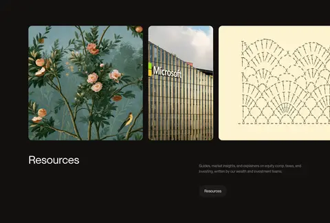
Imagery · Workplace video anchors the hero and a later full-bleed media section, treated with dark overlays where copy sits over footage. Supporting imagery mixes people, office details, and editorial resource thumbnails; rounded image cards provide a softer edge against the clean canvas. Small diagram-like illustrations and colorful thumbnails belong to content modules, not the core brand palette.
Reserve deep dark bands for meaningful section breaks.
Use Neue Montreal or a close neutral sans-serif throughout.
Let workplace video carry the hero's emotional context.
Keep copy concise and use statistics as proof points.
Prefer fine borders and whitespace over card shadows.
✕ 不该做
Do not introduce a bright accent palette.
Do not make every section dark or image-heavy.
Do not use decorative gradients away from media overlays.
Do not crowd the generous section spacing.
Do not use heavy shadows to simulate depth.
Do not let resource-image colors redefine the interface.
给 AI 的提示词
想快速出一个同风格的新页面,把这段话连同 DESIGN.md 一起发给 AI。
Build a new Titan-style fintech page with a calm, editorial rhythm. Use Gallery White (#fdfefa) for the main canvas, Deep Ink (#12100e) for primary text and occasional full-width dark bands, and Quiet Ash (#878784) for supporting copy. Set all text in a neutral sans-serif close to Neue Montreal, using regular weights and sentence case. Keep the content frame broad and centered, but allow hero media and selected section bands to bleed to the viewport edges. Start with cinematic workplace video, a clear headline, concise supporting text, and pill-shaped actions. Organize proof points and feature cards with generous whitespace; use fine Soft Hairline (#e2e2de) borders and avoid shadows. Treat colorful editorial images as content, not brand colors. Maintain a composed, human financial-services tone.