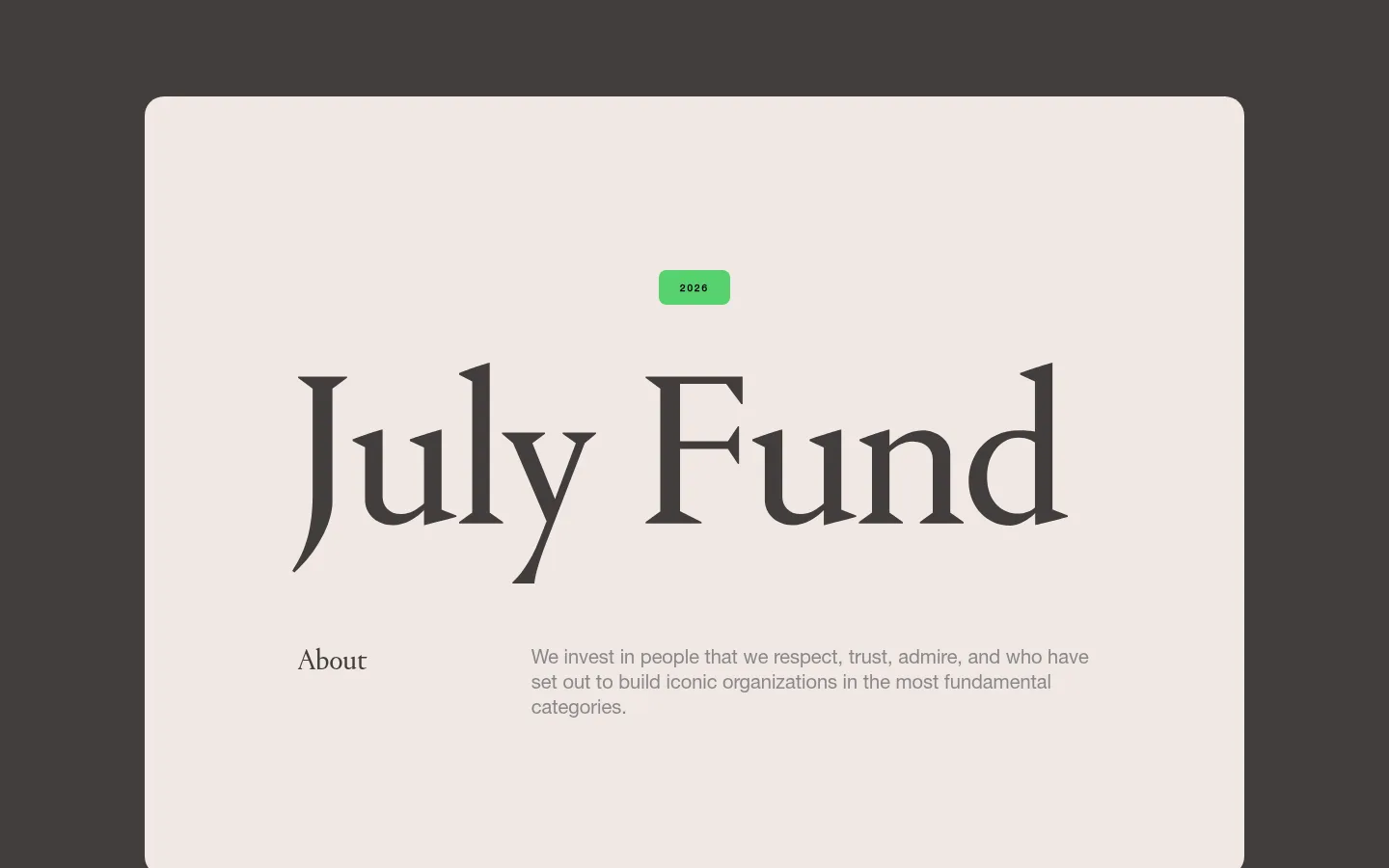
July Fund以暖调炭灰背景搭配奶油色大版面和醒目的衬线标题,呈现克制而鲜明的编辑风格。页面留白充足,让投资理念、精选研究内容和联系信息都显得从容清晰。
North star · Use expansive cream editorial panels against a warm charcoal field, and let typography and empty space carry the page.
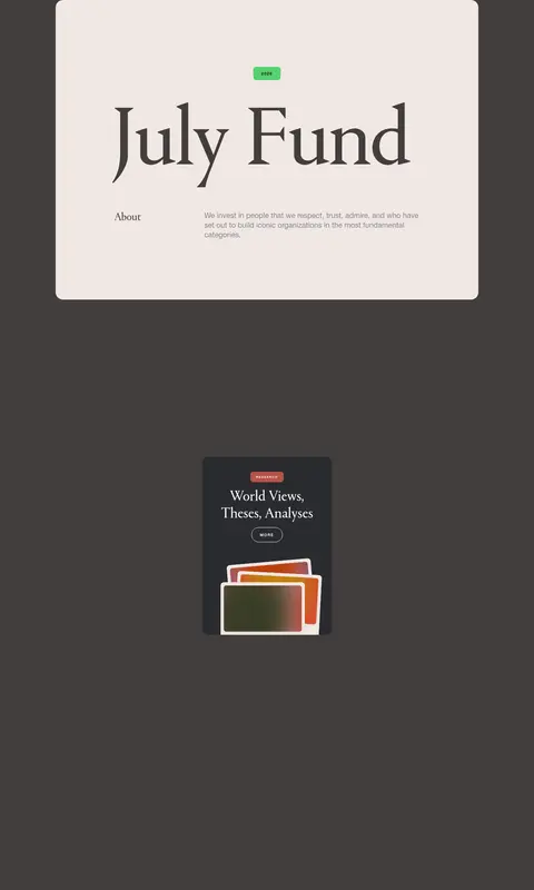
The visual system is built around a warm charcoal canvas (#433e3c) and broad cream panels (#f0e7e4), creating a soft, high-contrast frame rather than a conventional bright corporate page. The opening panel centers an oversized Portrait wordmark, with a compact green year marker and a restrained two-column introduction below. Portrait supplies the distinctive editorial display voice; Helvetica Neue keeps body copy, utility labels, and repeated outlined pill links direct and legible. The overall composition is sparse and deliberately tall, with large intervals between the introductory panel, a compact research feature, and the footer. Small media cards introduce darker surfaces and vivid gradients, but these are accents within content artwork, not the dominant page palette. Repeated thin outlines, rounded corners, and understated text colors preserve a quiet, confident tone without relying on shadows or decorative UI.
Body copy, utility text, labels, and compact repeated links
Aa 设计
Portrait
网络字体 · 字重 400 · 占比 18%
免费替代:Cormorant Garamond
Large brand wordmark and editorial display headings
角色
示例
字号
字重
行高
字距
一级标题
Oversized editorial wordmark and primary page headline
July Fund
40px
400
normal
0
二级标题
Major editorial section headings
July Fund
35px
400
normal
0
三级标题
Research and news feature headlines
July Fund
34px
400
normal
0
四级标题
Smaller content headings and footer section labels
July Fund
30px
400
normal
0
正文
Introductory copy, article excerpts, and supporting descriptions
The quick brown fox 敏捷的狐狸
15px
400
1.15
0
辅助文字
Compact uppercase metadata and content labels
The quick brown fox 敏捷的狐狸
10px
700
normal
0.2em
眉题
Small uppercase markers such as the year badge
The quick brown fox 敏捷的狐狸
10px
700
normal
0.2em
间距与布局
基准单位 2px · 密度:宽松
100px版块间距
20px元素间距
80px卡片内边距
834px内容最大宽度
5px
9px
16px
20px
22px
25px
30px
40px
45px
60px
A single long page sits on a full-width charcoal canvas. The content uses a measured maximum width of 834px, with two-column alignment in the introductory panel and centered display typography. Large cream panels anchor the opening and footer, while a small research feature is isolated amid substantial vertical whitespace. The measured section rhythm is spacious, with a 100px section gap and 20px element gap; avoid compressing the page into a dense grid. Text alignment is primarily centered for headings, with supporting copy aligned as a separate column.
圆角与层次
按钮 · 9999px
卡片 · 12px
图片 · 12px
没有测到阴影:页面是扁平的,层次靠底色和描边区分。
The interface is largely flat, with no measured shadows. Cream panels are distinguished from the canvas by strong tonal contrast and rounded corners; the research feature uses a dark card surface. Outlined pill links rely on thin borders rather than filled button treatments, and artwork supplies the limited sense of layering.
组件
下面的预览按实测的按钮、输入框、徽标、卡片样式重建(字体用替代字体)。
Intro panel
Large cream rounded panel on the charcoal canvas; centers the green year marker and oversized Portrait wordmark above a two-column About and thesis row.
Year marker
Small bright-green rounded badge with compact bold uppercase numerals, used as a restrained focal accent.
Editorial wordmark
Very large, regular-weight Portrait serif treatment centered in the opening panel.
Outlined pill link
Uppercase bold Helvetica Neue label inside a transparent pill with a thin border; measured examples use cream, white, or charcoal text and borders.
Research card
Dark content card with an uppercase category label, serif title, compact outlined action, and layered colorful artwork.
Footer panel
Cream rounded panel against the charcoal page, organizing office addresses, local times, contact links, legal links, and a small year accent.
Imagery · Imagery is sparse relative to the page height. A compact research card includes layered, colorful rectangular artwork; the gradients and bright tones are contained within this illustration rather than spread across the interface. The measured page also includes images and video elsewhere in the long content, but the visible identity remains the cream-and-charcoal frame. Keep media contained and let generous surrounding space preserve focus.
Set display headings in a distinctive regular serif.
Reserve bright green for small markers and accents.
Use tracked uppercase labels for compact metadata.
Give content generous vertical breathing room.
✕ 不该做
Do not turn the page into a dense dashboard.
Do not use gradients as broad page backgrounds.
Do not fill pill links with heavy button color.
Do not add shadows where flat contrast is enough.
Do not let illustrative colors redefine the palette.
Do not replace editorial serif display type with generic sans.
给 AI 的提示词
想快速出一个同风格的新页面,把这段话连同 DESIGN.md 一起发给 AI。
Build a new editorial page in the July Fund visual style. Use Warm Charcoal (#433e3c) as the expansive canvas and Soft Cream (#f0e7e4) for large, rounded content panels. Set the main display voice in a regular, expressive serif similar to Portrait; use a clean Helvetica Neue-like sans for body copy, metadata, and controls. Keep the layout sparse and centered, with a measured content width near 834px, clear two-column text groupings where appropriate, and generous vertical pauses. Use Signal Green (#56d270) only for small markers. Render links as transparent outlined pills with compact uppercase labels. Keep dark cards restrained, and confine Powder Blue (#bfd6f9) and Marigold (#f0cc6f) to occasional artwork. Favor flat surfaces, fine borders, and deliberate typography over decoration.