North star · Keep the page spacious and white, using precise dark typography and Atlassian blue for the primary action while containing vivid color in product media.
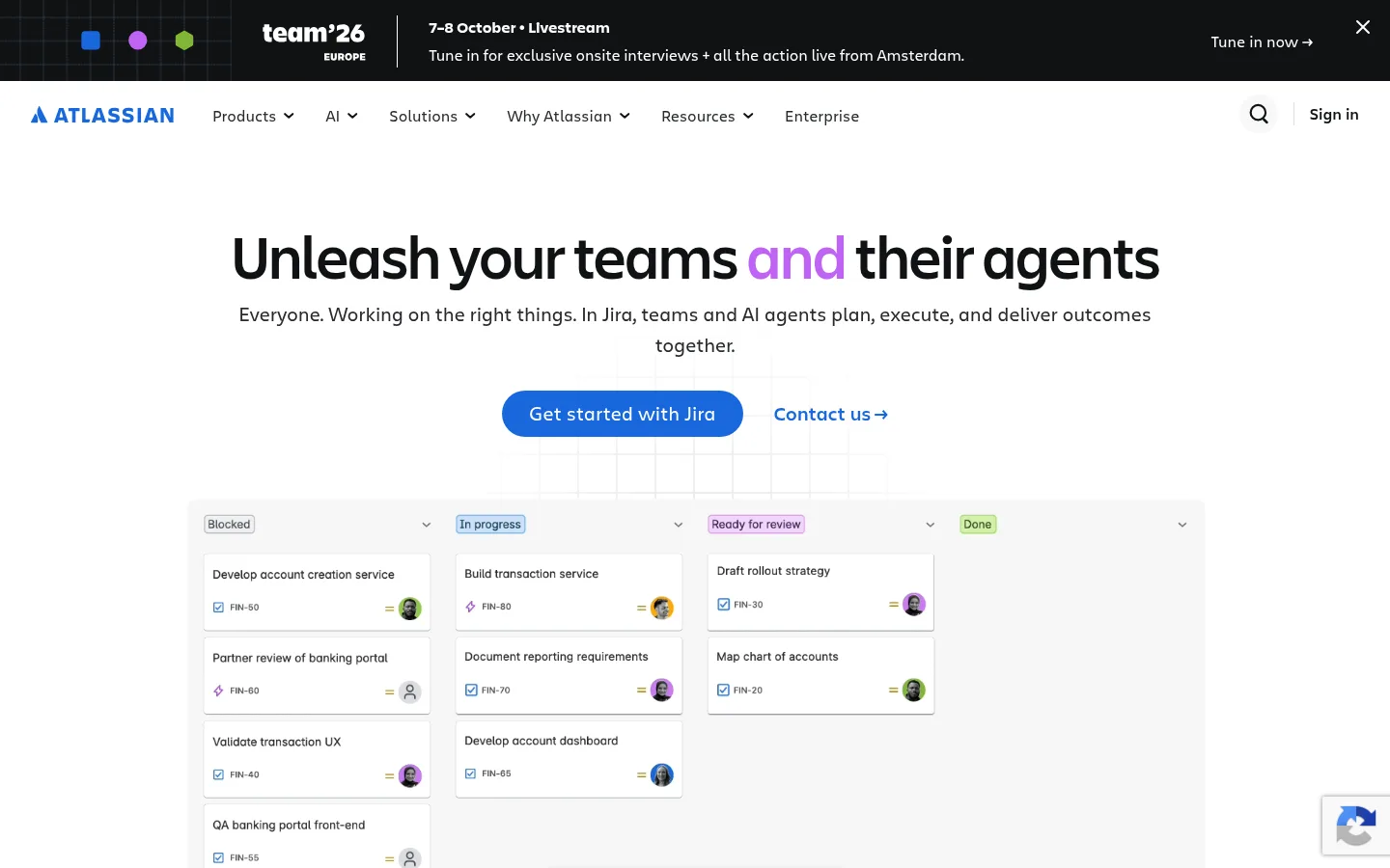
The visual strategy is built around a white canvas, dark readable text, and a restrained use of Atlassian blue. The first viewport centers a large, tightly tracked headline and concise supporting copy above a pill-shaped blue primary CTA, with a quieter text link beside it. Navigation stays compact and horizontal, while the hero gives its product-board visual room to breathe. Further down, the page alternates open white sections, product-focused split layouts, colorful editorial cards, and a dramatic near-black Teamwork Graph feature. Charlie Display gives headings a distinctive, compact presence; Charlie Text keeps navigation and body copy approachable. Product screenshots, photography, and diagrams carry much of the color, so secondary greens, purples, and oranges should stay contained within their media or content cards rather than spreading across the page. Hairline borders and subtle shadows clarify controls and UI previews without making the overall page feel elevated or dense.
Navigation, body copy, buttons, and supporting interface text.
Aa 设计
Charlie Display
网络字体 · 字重 500 / 700 / 400 / 600 · 占比 30%
免费替代:Manrope
Hero and section headings, display text, and compact eyebrow labels.
角色
示例
字号
字重
行高
字距
特大标题
Large promotional headline treatment in the hero.
Atlassian
64px
500
1.04
-0.02em
一级标题
Primary page headline and lead section title.
Atlassian
48px
500
1.16
-0.02em
二级标题
Major section headings, including the AI innovations block.
Atlassian
40px
500
1.2
-0.01em
三级标题
Feature and product-story headings.
Atlassian
32px
500
1.1
-0.01em
四级标题
Card and smaller feature headings.
The quick brown fox 敏捷的狐狸
24px
500
1.24
0
正文
Supporting paragraphs and product descriptions.
The quick brown fox 敏捷的狐狸
16px
400
1.56
-0.01em
辅助文字
Compact metadata and small supporting labels.
The quick brown fox 敏捷的狐狸
12px
400
1.17
0
按钮
Primary CTA and prominent action labels.
The quick brown fox 敏捷的狐狸
18px
500
1.44
0
导航
Top navigation links and menu labels.
The quick brown fox 敏捷的狐狸
16px
400
1
0
眉题
Uppercase category and content-type labels.
The quick brown fox 敏捷的狐狸
12px
500
1.3
0.067em
间距与布局
基准单位 8px · 密度:紧凑
32px版块间距
8px元素间距
24px卡片内边距
—内容最大宽度
1px
2px
4px
6px
8px
10px
16px
20px
24px
32px
136px
The homepage uses a full-width canvas with centered hero content and a compact horizontal navigation band. The hero headline and copy align centrally, with the primary action directly beneath and a broad product-board preview below. Later sections shift between centered introductions, split text-and-media feature rows, multi-column editorial cards, and a full-bleed dark feature. Use generous section separation and compact internal UI details; the measured data gives no fixed page maximum width, so preserve the broad, open composition rather than imposing an arbitrary narrow container.
圆角与层次
按钮 · 9999px
图片 · 50%
导航 · 3px
hairline · nav
sm · other
The page is predominantly flat, with white sections separated through whitespace rather than heavy shadows. Borders are fine and pale; product-board previews and card content can use restrained separation to remain legible. Rounded pill buttons stand out through color, not depth. Keep the dark announcement band and feature block grounded, with visual layering supplied mainly by imagery and interface mockups.
组件
下面的预览按实测的按钮、输入框、徽标、卡片样式重建(字体用替代字体)。
Announcement banner
Full-width near-black event strip with compact white copy, small graphic accents, and a right-aligned text link.
Primary navigation
White horizontal bar with Atlassian branding, product and resource menus, search, and sign-in; use dark muted labels and subtle dividers.
Hero CTA
Bright blue pill-shaped Jira action with white text, paired with a quieter blue text link.
Workflow preview
Wide, pale product-board mockup showing columns, status labels, cards, and small avatars beneath the hero actions.
Collection tabs
Compact pill-like selector for teamwork, strategy, service, software, and product; use a dark active state against a light neutral track.
Editorial card carousel
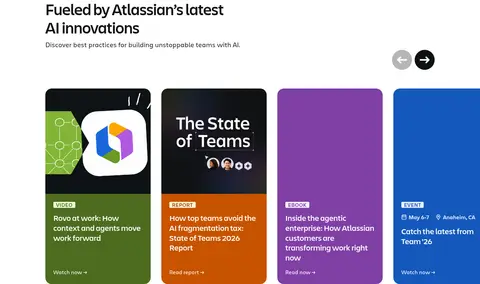
A row of vivid content cards for video, reports, e-books, and events, each with a category label and concise link.
Dark graph feature
Full-width near-black feature section with a connected workflow graph, colorful nodes, people imagery, and supporting text.
Imagery · Mix product-interface previews, team photography, and illustrative diagrams. The hero uses a wide workflow board on a pale field, while feature imagery is framed in split layouts and colorful cards. Keep screenshots crisp and mostly rectangular; reserve vivid green, blue, purple, and orange for media cards. The dark graph feature uses connected nodes and portraits as a high-contrast visual centerpiece.
Use Atlassian Blue #1868db for the primary CTA and key links.
Set display headings in a distinctive, tightly tracked sans-serif.
Center hero content above a broad product preview.
Use restrained dividers and let whitespace separate sections.
Keep vivid card colors within editorial and product media.
✕ 不该做
Do not turn the page into a dark-first interface.
Do not use colorful card hues as broad section backgrounds.
Do not add heavy shadows to otherwise flat components.
Do not crowd navigation or hero copy with extra decoration.
Do not make secondary links compete with the primary CTA.
Do not invent fixed container dimensions absent from the measurements.
给 AI 的提示词
想快速出一个同风格的新页面,把这段话连同 DESIGN.md 一起发给 AI。
Build a new page in Atlassian’s clean, product-led visual style. Start with a Gallery White #ffffff canvas, compact horizontal navigation, and a centered hero with a bold Charlie Display-like headline, concise supporting copy, a pill-shaped Atlassian Blue #1868db primary action, and a quieter text link. Use Graphite Text #292a2e for body copy and Atlassian Ink #101214 for strong headings or deliberate dark feature bands. Favor open section spacing, split product-and-copy layouts, crisp interface previews, and modular content cards. Use Soft Divider #dddee1 sparingly. Keep Rovo Green #4c6b1f, Event Blue #1558bc, Editorial Violet #803fa5, and Report Orange #c75300 inside relevant media cards. Maintain flat surfaces, restrained borders, and minimal shadow; do not invent measurements or add decorative gradients.