North star · Keep the espresso canvas dominant, let light typography breathe, and use aquamarine as a precise functional signal.
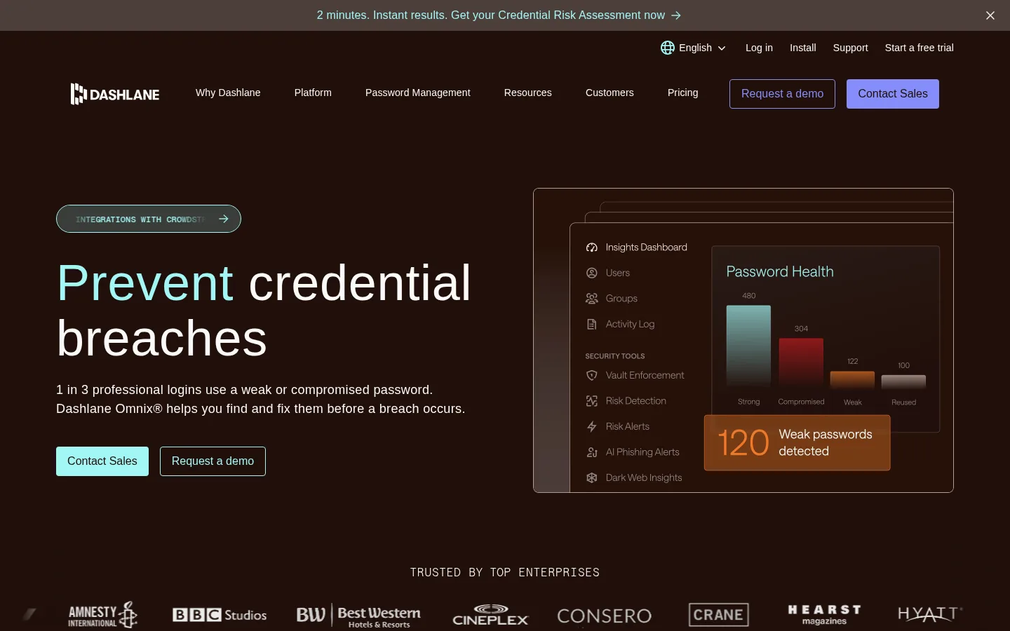
The page is anchored by an espresso-brown canvas (#200f0a), giving the entire long-form homepage a warm, distinctive darkness rather than a neutral black. Cream-white text (#fcfaf9) carries headlines and body copy, while aquamarine (#a2f6f5) marks primary actions, selected words, and editorial links. Indigo accents appear in some buttons and product-interface details; they support the palette rather than replace its teal signature. Saans is used in light weights for large, calm headlines and readable copy, with SaansMono reserved for uppercase eyebrow labels and compact utility text. The opening hero uses a left-aligned message opposite a framed product dashboard. Across the page, the layout alternates broad text-led sections with bordered product panels, metric cards, testimonials, and a closing CTA. Thin warm borders and restrained corner rounding define components without heavy shadows. Generous gaps keep the dense enterprise content composed and scannable.
Display and interface sans for headlines, body copy, navigation, buttons, and links.
Aa 设计
SaansMono
网络字体 · 字重 300 / 500 / 400 · 占比 10%
免费替代:IBM Plex Mono
Monospaced eyebrow labels and compact uppercase utility or code-like text.
角色
示例
字号
字重
行高
字距
特大标题
Oversized hero or campaign display headlines.
Dashlane
100px
300
1.1
0.01em
一级标题
Primary page and hero headline.
Dashlane
72px
300
1.1
0.01em
二级标题
Major section headings and feature introductions.
Dashlane
56px
300
1.1
0.01em
三级标题
Subsection and product-feature headings.
Dashlane
48px
300
1.1
0.01em
四级标题
Compact card or supporting section headings.
Dashlane
28px
300
1.2
0.01em
正文
Main explanatory copy and customer-story text.
The quick brown fox 敏捷的狐狸
18px
300
1.5
0.02em
辅助文字
Small supporting labels and footnotes.
The quick brown fox 敏捷的狐狸
14px
300
1.5
0.01em
按钮
CTA labels, set plainly without uppercase styling.
The quick brown fox 敏捷的狐狸
14px
300
1.5
0.01em
导航
Header links and compact navigation actions.
The quick brown fox 敏捷的狐狸
14px
300
1.5
0.01em
链接
Inline links and editorial calls to action.
The quick brown fox 敏捷的狐狸
18px
300
1.5
0.02em
眉题
Uppercase monospaced section labels and category markers.
The quick brown fox 敏捷的狐狸
16px
300
1.1
0.06em
代码
Compact uppercase technical or utility labels.
const style = 1;
12px
500
1.1
0.01em
间距与布局
基准单位 4px · 密度:适中
80px版块间距
8px元素间距
59px卡片内边距
1280px内容最大宽度
4px
6px
8px
12px
16px
20px
32px
40px
64px
80px
The measured content uses a wide page frame capped at 1280px, with a comfortable density and a base spacing unit of 4px. The hero is a two-column split: copy and actions on the left, product media on the right. Subsequent sections vary among full-width headings, three-up metrics, tabbed product panels, feature rows, and split customer-story or compliance layouts. Major sections have generous vertical separation, while cards use more compact internal spacing. Align section copy consistently to a clear grid; alternate centered product introductions with left-aligned editorial blocks.
圆角与层次
按钮 · 4px
卡片 · 8px
图片 · 8px
导航 · 50%
链接 · 4px
没有测到阴影:页面是扁平的,层次靠底色和描边区分。
The interface favors flat surfaces over shadow. Thin warm-beige borders outline testimonial cards, statistic cards, and product panels; small corner radii soften their edges. Product mockups gain depth through stacked frames and translucent UI layers, while dark plum panels distinguish selected testimonials from the espresso canvas.
组件
下面的预览按实测的按钮、输入框、徽标、卡片样式重建(字体用替代字体)。
Announcement strip
A narrow top message band with centered compact copy, an inline arrow, and a close control.
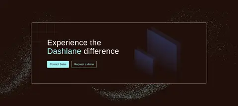
Primary CTA
Aquamarine fill (#a2f6f5), dark text (#1d0e09), modest 4px radius, and compact horizontal padding.
Secondary CTA
Transparent dark fill with an aquamarine outline and aquamarine label; paired with the filled action.
Metric cards
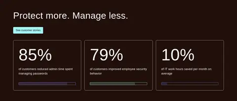
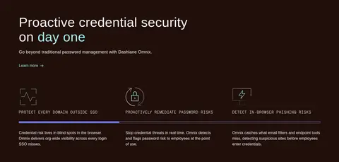
Three outlined cards show large cream-white percentages, short explanatory copy, and a slim colored indicator.
Product showcase panel
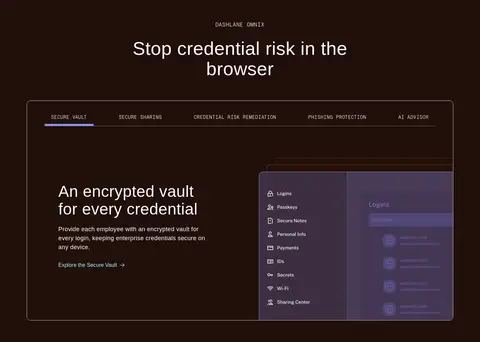
A large warm-hairline outlined frame combines mono tabs, explanatory copy, and layered product UI.
Testimonial cards
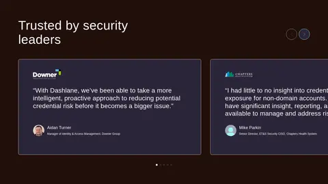
Dark plum panels with a warm border, prominent quotation text, and compact customer attribution.
Inline text link
Aquamarine link text with a subtle arrow or directional cue, used beneath explanatory copy.
Imagery · The hero features a dark product dashboard visualization framed like a browser or application window, with charts, overlays, and interface layers. Further down, product UI mockups sit in outlined panels, while the customer story uses a rectangular airport photograph. Trust logos and certification marks appear as supporting evidence. Keep imagery dark-adapted and neatly framed; vivid warning colors or interface hues belong inside product mockups, not the global brand palette.
Use aquamarine for clear actions and selective emphasis.
Set large headings in light-weight sans serif.
Reserve the mono face for uppercase eyebrows.
Frame product UI with thin warm borders.
Give major sections generous breathing room.
✕ 不该做
Do not turn the page into a pure-black interface.
Do not use indigo as the primary CTA color throughout.
Do not add heavy shadows to otherwise flat components.
Do not set every heading in uppercase.
Do not make product mockup colors the brand-wide palette.
Do not crowd the long page with uniformly dense sections.
给 AI 的提示词
想快速出一个同风格的新页面,把这段话连同 DESIGN.md 一起发给 AI。
Build a new enterprise security page in Dashlane's visual style. Use Espresso Canvas (#200f0a) as the dominant background, Starlight Cream (#fcfaf9) for clear type, and Aquamarine Signal (#a2f6f5) for primary actions, selected words, and links. Keep Indigo Flash (#858df9) as a minor secondary accent. Use a light sans-serif similar to Saans for headlines and body, with a monospaced uppercase eyebrow style. Compose broad sections on a comfortable grid: split hero with product UI, concise proof points, framed feature panels, customer evidence, and a final CTA. Use thin Warm Hairline (#e3ccc0) borders, restrained rounding, and flat surfaces; reserve Plum Panel (#2b2538) for select cards. Make the interface feel spacious, legible, and product-led rather than decorative.