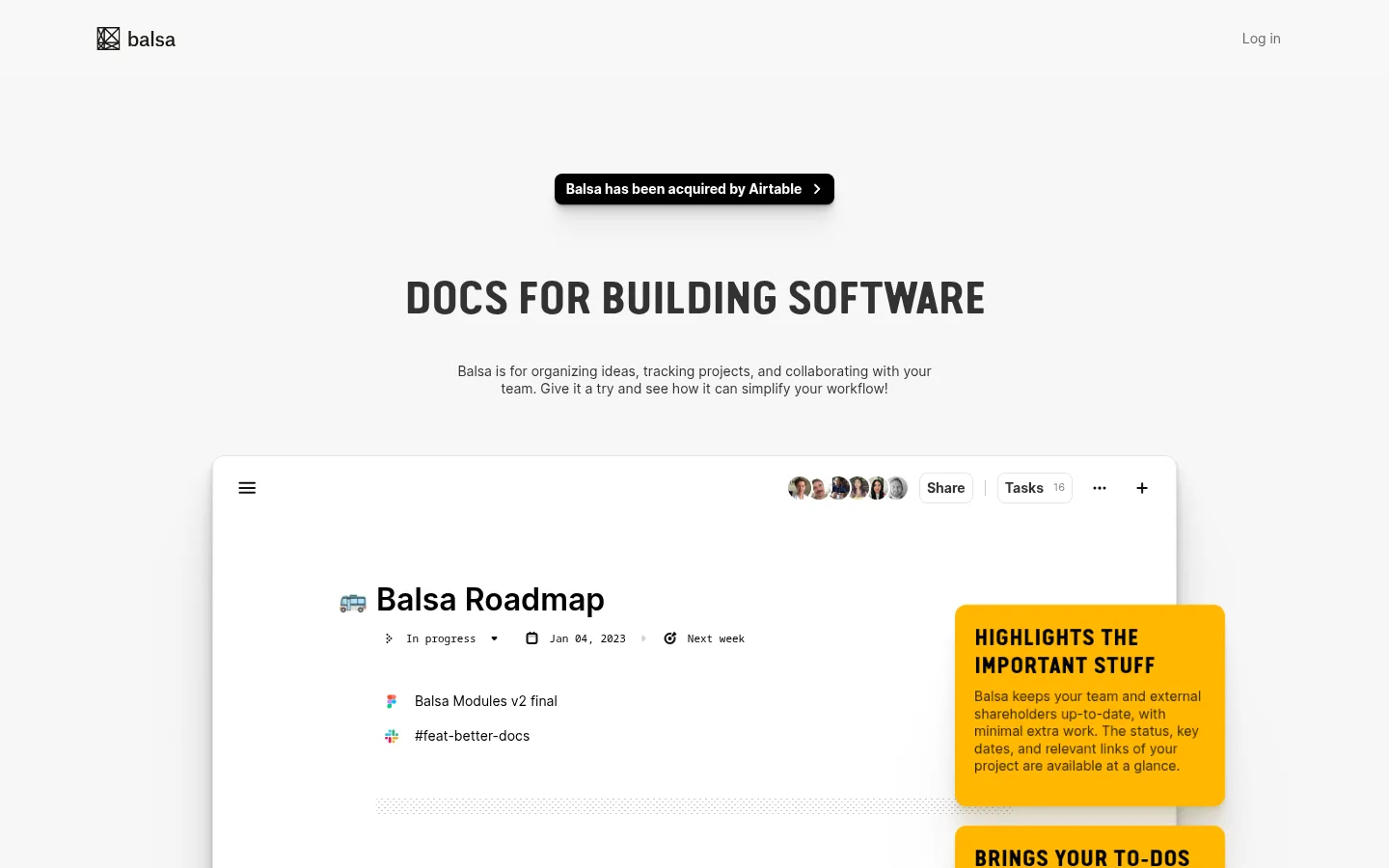
North star · Let oversized product interfaces tell the story against a quiet canvas, using condensed uppercase headings and yellow only for focused feature annotations.
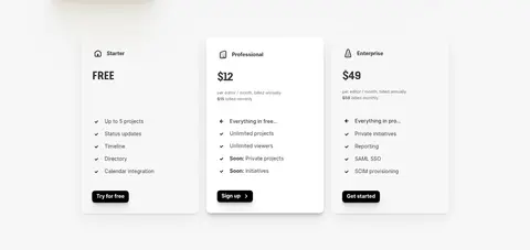
The page uses a soft light-gray canvas (#f7f7f7) as a calm surround for white product surfaces, with black and charcoal text carrying most of the information. Saturated yellow (#ffb700) is reserved for explanatory callouts inside the product showcase, so it reads as annotation rather than a site-wide background or primary CTA color. Typography supplies the strongest brand signature: uppercase, tightly tracked condensed display headings contrast with small, neutral Inter body copy. The layout is centered and deliberately spacious, letting large screenshots of the software dominate the long scroll. Mockups are layered with floating feature notes to connect interface details to benefits. Pricing sits in three compact cards; a restrained closing CTA and footer finish the page without introducing a new visual theme. Keep decorative color and graphic effects subordinate to the product, and preserve the contrast between the quiet canvas and assertive headline typography.
配色
点色块复制色值。用途说明来自对页面的实测位置(背景、文字、描边、按钮)与截图判读。
强调色
表层色
中性色
功能色
页面底色 · Soft Canvas表层 · Paper Surface表层 2 · Mockup Gray主文字 · Hard Ink次要文字 · Quiet Gray弱文字 · Deep Umber强调 · Note Violet强调 2 · Signal Yellow强调 3 · Link Navy
Body copy, descriptions, and compact interface text
Aa 设计
Inter-Bold
系统字体 · 字重 700 · 占比 5%
免费替代:Inter
Bold supporting headings and emphasis
Aa 设计
Van Condensed Pro Bold
网络字体 · 字重 400 · 占比 4%
免费替代:Oswald
Display headings and uppercase section labels
角色
示例
字号
字重
行高
字距
一级标题
Large uppercase condensed headline introducing the product.
Balsa
48px
400
1.5
-0.031em
二级标题
Uppercase condensed labels for secondary section headings.
The quick brown fox 敏捷的狐狸
24px
400
1.2
0
三级标题
Bold Inter headings for product and pricing-card content.
The quick brown fox 敏捷的狐狸
18px
700
1.2
0
正文
Compact Inter paragraphs and descriptions throughout the page.
The quick brown fox 敏捷的狐狸
14px
400
1.43
0
辅助文字
Small supporting labels and fine-print details.
The quick brown fox 敏捷的狐狸
11px
400
1.18
0
代码
Monospaced treatment for technical or code-like interface text.
const style = 1;
11px
400
1.2
0
间距与布局
基准单位 4px · 密度:紧凑
40px版块间距
10px元素间距
23px卡片内边距
1088px内容最大宽度
4px
8px
10px
12px
16px
20px
30px
40px
100px
Use a centered single-column page on a #f7f7f7 canvas, with a measured maximum content width of 1088px. Keep the header quiet, then center the hero headline and supporting copy above a large, vertically stacked product showcase. Allow screenshots and floating feature annotations to form the main composition. Follow with three aligned pricing cards and a centered closing CTA. The measured spacing scale runs from 4px to 100px, with a 40px section gap and compact 10px element gap; preserve generous section breathing room.
圆角与层次
按钮 · 8px
卡片 · 12px
图片 · 50%
链接 · 8px
hairline · other
lg · button
lg · card
xl · card
Keep the page itself flat and light, using subtle shadows to lift large white interface mockups and pricing cards from the canvas. Feature annotations float above screenshots and use rounded corners. Avoid strong decorative borders; depth comes mainly from restrained shadow and overlapping surfaces.
组件
下面的预览按实测的按钮、输入框、徽标、卡片样式重建(字体用替代字体)。
Announcement pill
A compact black announcement element near the hero, with white copy, rounded corners, and a soft shadow.
Hero heading
Centered uppercase condensed display type, followed by a short, centered Inter description.
Product showcase
Large white software-interface mockups stacked down the page, with interface content and lightly elevated edges.
Feature callout
Rounded yellow annotation cards positioned over mockups, using dark uppercase headings and compact explanatory copy.
Pricing cards
Three side-by-side tiers on the light canvas; emphasize plan name, price, concise feature list, and a dark action.
Closing CTA
Centered uppercase prompt, a short supporting sentence, and a compact dark signup action above the footer.
Imagery · The visual centerpiece is product-interface imagery rather than photography, illustration, or 3D. Show large, white document and roadmap mockups with legible interface details, then layer small, bright yellow annotation cards near relevant areas. Screenshots sit on the neutral canvas with subtle shadows and ample surrounding whitespace. Use realistic product content as visual texture, but keep its small details secondary to the overall interface silhouette.
Use the light-gray canvas as the continuous page background.
Make the software interface the main visual subject.
Set display headlines in uppercase condensed type.
Keep body copy compact and neutral.
Reserve yellow for focused feature annotations.
Use subtle shadows to separate white mockups from the canvas.
✕ 不该做
Do not turn the page into a brightly colored gradient composition.
Do not use yellow as a full-page background.
Do not let decorative visuals overpower the product screenshots.
Do not use oversized body copy or dense text blocks.
Do not add heavy borders around every card or section.
Do not treat colors found only in mockup content as dominant brand colors.
给 AI 的提示词
想快速出一个同风格的新页面,把这段话连同 DESIGN.md 一起发给 AI。
Build a new Balsa-style SaaS page with a quiet #f7f7f7 Soft Canvas and clean #ffffff Paper Surface panels. Use #000000 Hard Ink and #313131 Charcoal Type for strong text, with Inter for compact copy and an Oswald-like condensed alternative for uppercase display headlines. Keep the composition centered and spacious: a restrained header, a clear hero, and large stacked product-interface mockups. Float rounded #ffb700 Signal Yellow annotations over relevant interface areas; keep this accent local rather than spreading it across the page. Use subtle shadows for mockups and cards, not heavy borders. Finish with a compact three-tier pricing area and a simple centered CTA. Prioritize legibility, product detail, and a calm contrast between the page canvas and bold typography.