North star · Let black space and warm, precise typography carry the page; use imagery and accents sparingly.
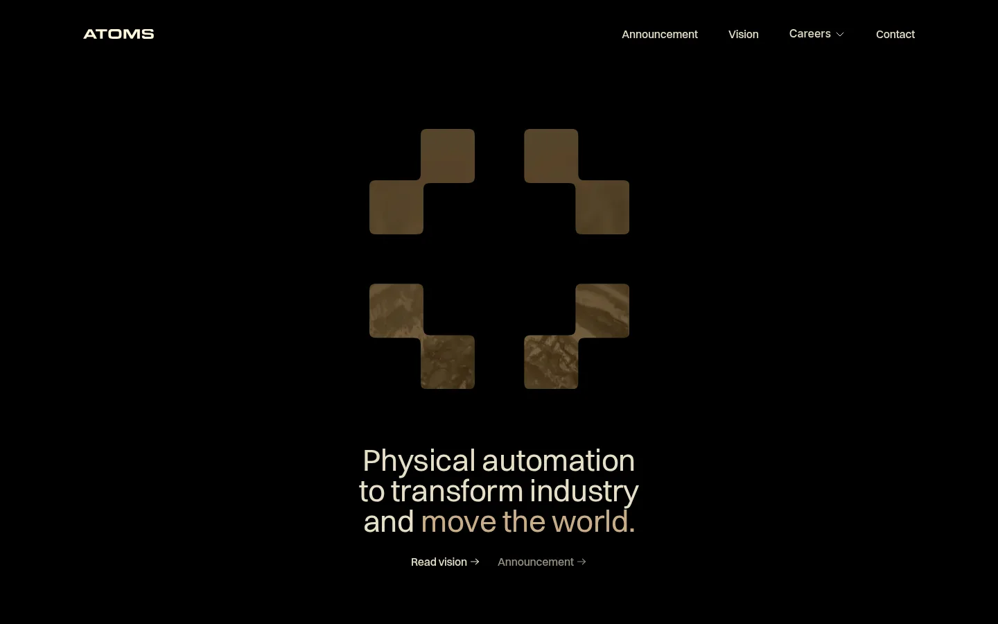
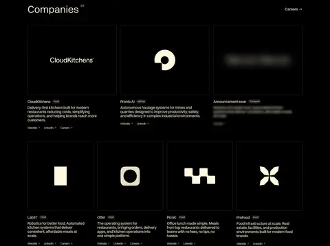
The page is built on a nearly uninterrupted black canvas (#000000), which gives the wordmark, navigation, and content a quiet, high-contrast presence. Warm ivory (#e6dfc7) carries the primary text, including the hero statement and company names; muted bronze (#c8ad86) is a restrained accent rather than a broad surface colour. Switzer supplies a clean sans-serif voice, with compact navigation and captions balancing a larger, softly tracked hero statement. The opening composition centers a geometric mark above the mission copy, leaving generous black space around both. Below, the Companies section shifts to a practical modular grid: thin outlines distinguish dark cards without introducing bright panels. Portfolio marks and imagery retain subdued earthy tones, while brief descriptions and small links keep attention on each company. The overall strategy is deliberately sparse and monumental: scale comes from empty space, alignment, and the oversized footer wordmark, not decorative effects.
Primary face for navigation, headings, body copy, and captions.
角色
示例
字号
字重
行高
字距
一级标题
Centered, multi-line homepage mission statement.
Atoms
44px
400
1
-0.008em
正文
Company descriptions and supporting page copy.
The quick brown fox 敏捷的狐狸
16px
500
1.13
-0.016em
辅助文字
Compact metadata, company labels, and small footer details.
The quick brown fox 敏捷的狐狸
12px
400
1
-0.042em
导航
Top navigation links and utility menu labels.
The quick brown fox 敏捷的狐狸
16px
500
1.13
-0.016em
间距与布局
基准单位 4px · 密度:适中
80px版块间距
2px元素间距
—卡片内边距
1200px内容最大宽度
2px
4px
6px
8px
10px
16px
20px
24px
60px
80px
The homepage uses a centered hero beneath a slim, widely spread navigation row. The measured page maximum width is 1200px, while the hero and company heading align centrally. The portfolio becomes a dense, multi-column grid of dark cards, with later rows accommodating individual company marks. Section spacing feels generous above the fold and more compact within the portfolio. A large footer wordmark anchors the bottom, separated from the grid by a fine horizontal rule.
圆角与层次
没有测到阴影:页面是扁平的,层次靠底色和描边区分。
The page is essentially flat: the black canvas remains continuous, with no visible shadows or raised panels. Thin, low-contrast card outlines and a footer divider provide structure. Rounded corners are confined to the geometric mark and should not become a general card treatment.
组件
下面的预览按实测的按钮、输入框、徽标、卡片样式重建(字体用替代字体)。
Top navigation
Wordmark at the left and compact Announcement, Vision, Careers, and Contact links aligned at the right.
Hero mark
A centered geometric arrangement of rounded square forms with subdued bronze, earthy imagery.
Hero statement
A centered, three-line mission statement in warm ivory, followed by understated text links.
Company portfolio cards
Dark, thinly outlined cards combining company marks, short descriptions, and small supporting links.
Portfolio heading
Centered section label with a small company count and a separate Careers link.
Oversized footer wordmark
Large warm-toned ATOMS lettering above a thin rule and compact footer navigation.
Imagery · The hero uses a geometric mark made from rounded, square-like forms; its earthy, textured appearance contrasts with the flat black canvas. Portfolio cards mix wordmarks, abstract symbols, and subdued image treatments. Keep media contained within its dark card, with restrained contrast and no bright framing. The screenshots show brand and company imagery, not a conventional product-photography system.
Reserve bronze for restrained accents and earthy media.
Center the hero mark and mission statement.
Use subtle outlines to define portfolio cards.
Leave generous negative space around major content.
✕ 不该做
Do not introduce bright section backgrounds.
Do not use colorful gradients or glowing effects.
Do not turn cards into elevated, shadowed panels.
Do not crowd the hero with supporting copy.
Do not use oversized decorative icons throughout.
Do not treat link blue from crawler noise as a brand color.
给 AI 的提示词
想快速出一个同风格的新页面,把这段话连同 DESIGN.md 一起发给 AI。
Build a new page in the Atoms visual style: use Industrial Black (#000000) as the dominant canvas, Warm Ivory (#e6dfc7) for primary text, and Muted Bronze (#c8ad86) only as a restrained accent. Use Switzer or a close sans-serif substitute such as Inter, with compact navigation, clean sentence-case headings, and concise copy. Place a slim navigation row above a spacious, centered hero with a geometric mark, a short multi-line statement, and understated text links. Organize supporting content into modular dark cards separated by fine, low-contrast outlines rather than shadows. Keep imagery subdued and earthy, and reserve generous empty space around major sections. Finish with a fine divider and a strongly scaled wordmark. Avoid bright panels, decorative gradients, and heavy elevation.