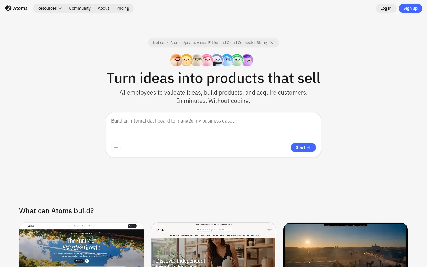
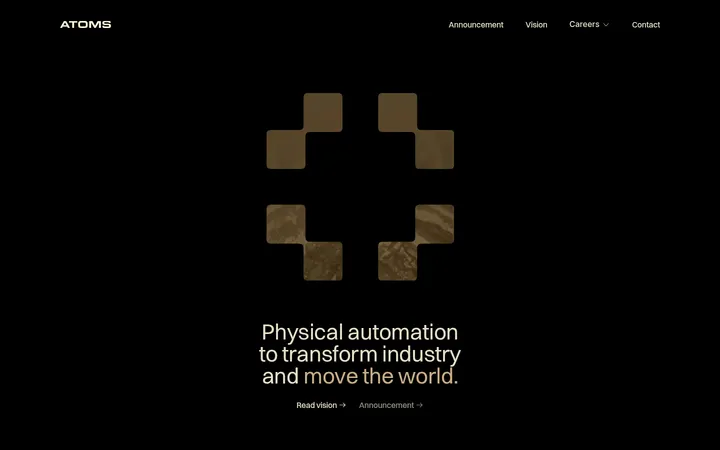
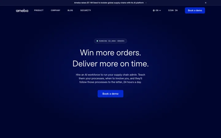
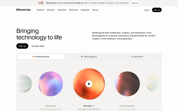
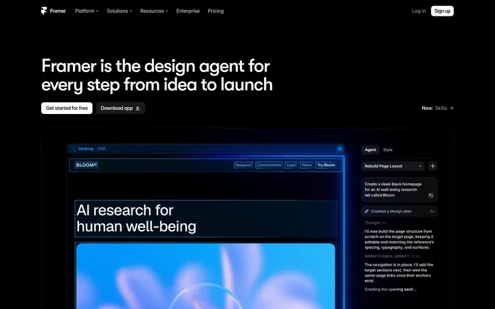
Atoms以克制的浅色界面搭配醒目的蓝色按钮,并用丰富的产品案例展示AI建站能力。圆角卡片、居中主标题和产品视觉,让复杂工具显得直观易用。
North star · Keep the interface quiet and spacious, and let product imagery and focused blue actions carry the emphasis.
The page is built on alternating white and soft gray bands, with near-black headings and muted gray copy keeping attention on the product rather than decorative chrome. Signal blue is reserved for primary actions, selected badges, and small interface accents; it is not used as a broad page background. IBM Plex Sans carries the main hierarchy, from large centered hero text to compact card labels, while IBM Plex Serif appears sparingly in caption-like details. The hero uses centered messaging and a large prompt composer; below it, a three-column showcase and image-led proof sections introduce visual variety without changing the restrained palette. Generous whitespace and broad section bands separate the long page. Cards use fine borders, rounded corners, and soft shadows, while screenshots, videos, and agent illustrations supply most of the colour and texture.
配色 点色块复制色值。用途说明来自对页面的实测位置(背景、文字、描边、按钮)与截图判读。
品牌色
Signal Blue
#4267ff
Primary CTA buttons, selected badges, and small interface highlights.
强调色
Slate Blue
#427fa5
Appears in a measured gradient within visual material; not a core page-wide UI colour.
Pale Sand
#f1eed6
Warm endpoint of a measured product-visual gradient, not a defining interface surface.
Bright Periwinkle
#5393fa
Small accent within cards; subordinate to the primary Signal Blue.
表层色
Gallery White
#ffffff
Primary canvas and white card surfaces, including the trust and pricing sections.
Cloud Gray
#f6f6f6
Recurring section bands behind the hero, showcase, AI team, and testimonial areas.
中性色
Soft Graphite
#3d3d3d
Muted body copy and secondary text across the light interface.
Quiet Divider
#e8e8e8
Fine card and component borders that separate white surfaces without strong contrast.
Near-Black Ink
#181818
Headings and prominent text, with crisp contrast against white and gray surfaces.
Caption Gray
#7a7a7a
Low-emphasis supporting text and small labels.
Mist Border
#d9d9d9
Occasional card or media edge, secondary to the common Quiet Divider.
功能色
Illustration Black
#000000
Mostly tied to measured media gradients and product visuals rather than the main text system.
文字 背景 对比度 WCAG #181818 Near-Black Ink#ffffff Gallery White17.76:1 AAA #181818 Near-Black Ink#f6f6f6 Cloud Gray16.43:1 AAA #3d3d3d Soft Graphite#ffffff Gallery White10.86:1 AAA #3d3d3d Soft Graphite#f6f6f6 Cloud Gray10.05:1 AAA #4267ff Signal Blue#ffffff Gallery White4.55:1 AA #4267ff Signal Blue#f6f6f6 Cloud Gray4.21:1 AA-large
字体 字号阶梯:Major Third(比例约 1.285,正文 16px)。示例用免费替代字体渲染,数值为实测。
Aa 设计
IBM Plex Sans 网络字体 · 字重 400 / 600 / 500 · 占比 96%
免费替代:Inter
Primary typeface for headings, body copy, buttons, navigation, and interface labels.
Aa 设计
IBM Plex Serif 网络字体 · 字重 400 / 600 / 500 · 占比 4%
免费替代:Source Serif 4
Sparse serif caption and editorial-style supporting text.
角色 示例 字号 字重 行高 字距 特大标题 Large display emphasis for prominent headline moments.
Atoms
56px 400 1 0 一级标题 Hero headline and major section titles.
Atoms
48px 500 1.17 0 二级标题 Section headings and prominent card headings.
The quick brown fox 敏捷的狐狸
24px 600 1.33 0 三级标题 Subsection titles and feature headings.
The quick brown fox 敏捷的狐狸
22px 500 1.36 0 四级标题 Compact supporting headings within content blocks.
The quick brown fox 敏捷的狐狸
20px 400 1.4 0 正文 Paragraphs, descriptive copy, and standard interface text.
The quick brown fox 敏捷的狐狸
16px 400 1.5 0 辅助文字 Small editorial or image captions.
The quick brown fox 敏捷的狐狸
14px 400 normal 0 按钮 CTA labels and other compact button text.
The quick brown fox 敏捷的狐狸
14px 500 1.57 0 代码 Technical or code-like snippets, if shown.
const style = 1;
16px 400 1.5 0
间距与布局 基准单位 8px · 密度:适中
80px 版块间距
16px 元素间距
24px 卡片内边距
1312px 内容最大宽度
2px
4px
8px
12px
16px
20px
24px
32px
64px
80px
The measured content uses a maximum width of 1312px, with centered hero content and mostly left-aligned section titles. Showcase material forms a three-column grid; later feature and proof areas alternate split layouts, image-led panels, and full-width bands. The page maintains a comfortable density and substantial vertical separation between major sections. The measured spacing system is based on an 8px unit, with a 16px element gap, 24px card padding, and an 80px section gap. Use whitespace to define rhythm, not decorative dividers.
圆角与层次 lg · card
sm · other
sm · card
md · card
Cards rely on thin pale borders and restrained, soft shadows rather than heavy depth. The measured card radius is 24px, with white card surfaces against white or gray bands. Buttons and badges are pill-shaped; reserve stronger layering for floating media or product previews and keep ordinary content panels visually calm.
组件 下面的预览按实测的按钮、输入框、徽标、卡片样式重建(字体用替代字体)。
Primary CTA Signal Blue (#4267ff) fill, white label, pill silhouette, and compact medium-weight IBM Plex Sans text.
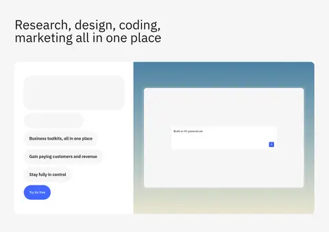
Hero prompt composer Large white rounded input panel with muted prompt hint, a small add affordance, and a blue Start action.
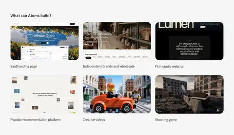
Showcase tile Product preview media in a rounded frame with a short label; arrange the examples in a three-column grid.
Proof card White card with a subtle #e8e8e8 border, generous internal padding, and restrained soft shadow.
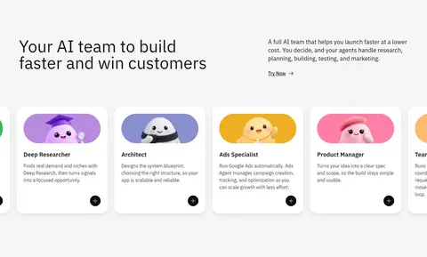
Agent card Compact white role card combining a colourful agent illustration, role name, short copy, and a small action control.
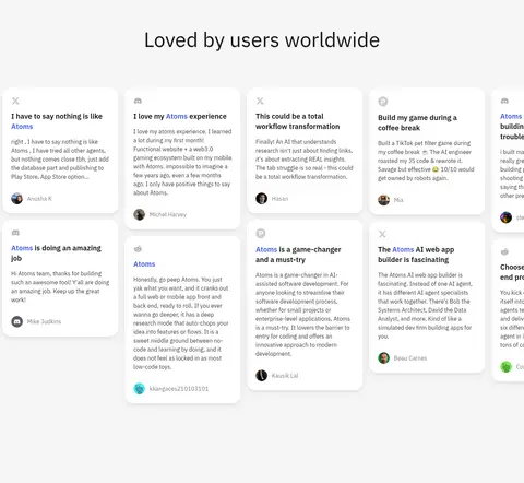
Testimonial card Light review panel with a short quote, attribution, and small profile image, presented in a multi-column flowing set.
Section band Full-width white or #f6f6f6 background that groups related content and creates page rhythm.
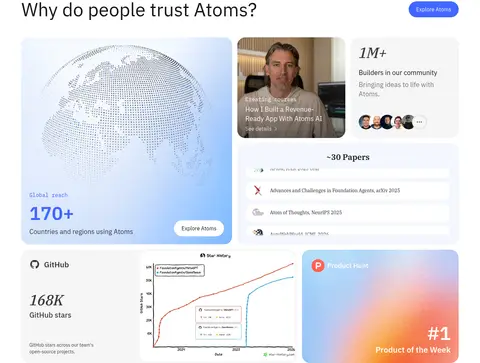
Imagery · Product screenshots, website previews, video tiles, logos, and AI-agent character art make up the visual story. Keep media inside rounded frames and use broad, clean crops; let the imagery introduce colour while the surrounding interface remains neutral. Proof panels include maps, metrics, testimonials, and example apps. Some media carries gradients or dark scenes, but these are content-specific visuals rather than a reason to tint the page canvas.
页面版块 共 9 个版块,按页面从上到下排列,每个都标了类型、布局和交互套路。
首页
首屏 产品创作主视觉
Centered hero on a soft gray band, with notice, headline, supporting copy, agent avatars, and a wide prompt composer.
图集 建站案例展示
Left-aligned heading above a three-column grid of media previews and concise labels on a soft gray band.
数据亮点 信任与成果
White, wide proof section combining a large reach panel, founder story, community figures, research, and product recognition.
品牌墙 品牌信任标识
Centered trust caption with a horizontal row of partner and organization logos on white.
团队 AI团队介绍
Soft gray two-column intro followed by a horizontally arranged set of illustrated AI role cards.
图文交替 功能与产品展示
Long feature area with alternating text and product interface media, organized into spacious two-column compositions.
用户评价 用户成功故事
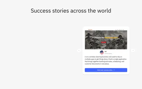
Centered heading and testimonial feature card within a soft gray band, with navigation affordances around the media-led story.
用户评价 全球用户评价
Centered heading above a multi-column field of compact white testimonial cards on a soft gray background.
价格方案 套餐与定价
White pricing area with centered title, billing-period selector, and a two-column set of plan cards.
该做与不该做 ✓ 该做 Use #f6f6f6 and #ffffff as the primary alternating section surfaces. Reserve #4267ff for primary actions and small high-priority accents. Use IBM Plex Sans for the main interface hierarchy. Keep hero messaging centered and section content clearly grouped. Present examples and proof in rounded media or card frames. Use whitespace instead of heavy separators to mark section changes. ✕ 不该做 Do not turn the page into a dark or saturated canvas. Do not use blue as a large background field. Do not crowd the hero with competing text or decoration. Do not apply strong shadows to every element. Do not treat illustration-only gradient colours as core brand colours. Do not mix in decorative display type or all-caps labels without a clear need. 给 AI 的提示词 想快速出一个同风格的新页面,把这段话连同 DESIGN.md 一起发给 AI。
复制 Build a new Atoms-style AI product page with a calm light canvas. Use Gallery White (#ffffff) and Cloud Gray (#f6f6f6) for alternating sections, Near-Black Ink (#181818) for headings, and Soft Graphite (#3d3d3d) for supporting copy. Reserve Signal Blue (#4267ff) for primary pill-shaped actions and small selected accents. Set the interface in IBM Plex Sans, with sparse IBM Plex Serif captions. Start with a centered message and prompt-composer panel, then use rounded product previews, proof cards, and image-led feature sections. Keep the layout spacious, align section content consistently, and use fine borders and soft shadows only to separate cards. Let screenshots and illustrations supply colour; do not turn their gradients into page-wide styling.
DESIGN.md Tailwind v4 CSS 变量 Design Tokens
---
title: "Atoms design system"
variant: extended
source: https://atoms.dev/
captured_at: 2026-10-12
theme: light
industry: ai
generator: Design DNA (https://four.wiralomi.com/style/atoms-dev)
ai_generated: true
ai_label: "本文件由 AI 辅助生成:数值取自公开网页的实测样式,命名、用途说明与建议为模型解读。商标归原所有者。 / AI-assisted content"
---
# Atoms · Design System
> A quiet canvas, punctuated by confident blue
**Theme:** light · **Industry:** ai · **Source:** https://atoms.dev/ · **Captured:** 2026-10-12 (1440×900 desktop)
_AI-assisted content: values are measured from the public page at capture time; names, roles and guidance are model-written interpretations. Trademarks belong to their owners._
Atoms pairs a restrained, pale interface with vivid blue calls to action and an expansive showcase of AI-built products. Rounded cards, centered messaging, and product imagery make a complex tool feel approachable.
## North star
Keep the interface quiet and spacious, and let product imagery and focused blue actions carry the emphasis.
## Overview
The page is built on alternating white and soft gray bands, with near-black headings and muted gray copy keeping attention on the product rather than decorative chrome. Signal blue is reserved for primary actions, selected badges, and small interface accents; it is not used as a broad page background. IBM Plex Sans carries the main hierarchy, from large centered hero text to compact card labels, while IBM Plex Serif appears sparingly in caption-like details. The hero uses centered messaging and a large prompt composer; below it, a three-column showcase and image-led proof sections introduce visual variety without changing the restrained palette. Generous whitespace and broad section bands separate the long page. Cards use fine borders, rounded corners, and soft shadows, while screenshots, videos, and agent illustrations supply most of the colour and texture.
## Colors
| Name | Hex | Token | Group | Role |
|---|---|---|---|---|
| Gallery White | ` | `--color-gallery-white` | surface | Primary canvas and white card surfaces, including the trust and pricing sections. |
| Soft Graphite | ` | `--color-soft-graphite` | neutral | Muted body copy and secondary text across the light interface. |
| Cloud Gray | ` | `--color-cloud-gray` | surface | Recurring section bands behind the hero, showcase, AI team, and testimonial areas. |
| Signal Blue | ` | `--color-signal-blue` | brand | Primary CTA buttons, selected badges, and small interface highlights. |
| Quiet Divider | ` | `--color-quiet-divider` | neutral | Fine card and component borders that separate white surfaces without strong contrast. |
| Near-Black Ink | ` | `--color-near-black-ink` | neutral | Headings and prominent text, with crisp contrast against white and gray surfaces. |
| Slate Blue | ` | `--color-slate-blue` | accent | Appears in a measured gradient within visual material; not a core page-wide UI colour. |
| Pale Sand | ` | `--color-pale-sand` | accent | Warm endpoint of a measured product-visual gradient, not a defining interface surface. |
| Illustration Black | ` | `--color-illustration-black` | semantic | Mostly tied to measured media gradients and product visuals rather than the main text system. |
| Caption Gray | ` | `--color-caption-gray` | neutral | Low-emphasis supporting text and small labels. |
| Bright Periwinkle | ` | `--color-bright-periwinkle` | accent | Small accent within cards; subordinate to the primary Signal Blue. |
| Mist Border | ` | `--color-mist-border` | neutral | Occasional card or media edge, secondary to the common Quiet Divider. |
### Semantic aliases
`--color-canvas` → ` (Gallery White) · `--color-surface` → ` (Cloud Gray) · `--color-text` → ` (Near-Black Ink) · `--color-text-muted` → ` (Soft Graphite) · `--color-border` → ` (Quiet Divider) · `--color-accent` → ` (Signal Blue) · `--color-accent-2` → ` (Slate Blue) · `--color-accent-3` → ` (Bright Periwinkle) · `--color-on-accent` → ` (Gallery White)
### Contrast (WCAG 2.x)
| Text | Background | Ratio | Level |
|---|---|---|---|
| ` | ` | 17.76:1 | AAA |
| ` | ` | 16.43:1 | AAA |
| ` | ` | 10.86:1 | AAA |
| ` | ` | 10.05:1 | AAA |
| ` | ` | 4.55:1 | AA |
| ` | ` | 4.21:1 | AA-large |
### Gradients
- `linear-gradient(rgb(66, 127, 165), rgb(241, 238, 214))`
- `linear-gradient(rgba(0, 0, 0, 0) 22.273%, rgb(0, 0, 0) 165.91%)`
## Typography
| Family | Token | Source | Weights | Role | Free substitute |
|---|---|---|---|---|---|
| IBM Plex Sans | `--font-body` | webfont | 400, 600, 500 | Primary typeface for headings, body copy, buttons, navigation, and interface labels. | Inter |
| IBM Plex Serif | `--font-ibm-plex-serif` | webfont | 400, 600, 500 | Sparse serif caption and editorial-style supporting text. | Source Serif 4 |
- **IBM Plex Sans:** Use regular through semibold weights; sentence case, clean forms, and no decorative tracking.
- **IBM Plex Serif:** Keep to small caption-like details; it is a restrained contrast to the sans-led interface.
### Type scale — Major Third (ratio ≈ 1.285, base 16px)
| Role | Size | Weight | Line height | Letter spacing | Case | Family | Used for |
|---|---|---|---|---|---|---|---|
| display | 56px | 400 | 1 | 0 | — | IBM Plex Sans | Large display emphasis for prominent headline moments. |
| h1 | 48px | 500 | 1.17 | 0 | — | IBM Plex Sans | Hero headline and major section titles. |
| h2 | 24px | 600 | 1.33 | 0 | — | IBM Plex Sans | Section headings and prominent card headings. |
| h3 | 22px | 500 | 1.36 | 0 | — | IBM Plex Sans | Subsection titles and feature headings. |
| h4 | 20px | 400 | 1.4 | 0 | — | IBM Plex Sans | Compact supporting headings within content blocks. |
| body | 16px | 400 | 1.5 | 0 | — | IBM Plex Sans | Paragraphs, descriptive copy, and standard interface text. |
| caption | 14px | 400 | normal | 0 | — | IBM Plex Serif | Small editorial or image captions. |
| button | 14px | 500 | 1.57 | 0 | — | IBM Plex Sans | CTA labels and other compact button text. |
| code | 16px | 400 | 1.5 | 0 | — | IBM Plex Mono | Technical or code-like snippets, if shown. |
## Spacing & layout
- Base unit **8px**, density **comfortable**.
- Scale (most used values): 2, 4, 8, 12, 16, 20, 24, 32, 64, 80 px.
- Section rhythm 80px · element gap 16px · card padding 24px · max content width 1312px.
The measured content uses a maximum width of 1312px, with centered hero content and mostly left-aligned section titles. Showcase material forms a three-column grid; later feature and proof areas alternate split layouts, image-led panels, and full-width bands. The page maintains a comfortable density and substantial vertical separation between major sections. The measured spacing system is based on an 8px unit, with a 16px element gap, 24px card padding, and an 80px section gap. Use whitespace to define rhythm, not decorative dividers.
## Shape & elevation
- Radius: button `9999px` · card `24px` · media `50%` · badge `9999px` · link `16px` · xs `12px` · sm `16px` · md `24px` · lg `32px` · pill `9999px`
- Shadow `lg` (card): `rgba(12, 12, 12, 0.08) 0px 8px 24px -4px, rgba(12, 12, 12, 0.04) 0px 4px 4px 0px`
- Shadow `sm` (other): `rgba(12, 12, 12, 0.04) 0px 1px 4px 0px`
- Shadow `sm-2` (card): `rgba(12, 12, 12, 0.08) 0px 1px 4px 0px`
- Shadow `md` (card): `rgba(12, 12, 12, 0.08) 0px 4px 8px -1px, rgba(12, 12, 12, 0.04) 0px 4px 4px -1px`
- Shadow `sm-3` (other): `rgba(12, 12, 12, 0.08) 0px 1px 4px 0px, rgba(12, 12, 12, 0.04) 0px 1px 4px 0px`
- Motion: standard transition `0.16s ease` on interactive elements.
Cards rely on thin pale borders and restrained, soft shadows rather than heavy depth. The measured card radius is 24px, with white card surfaces against white or gray bands. Buttons and badges are pill-shaped; reserve stronger layering for floating media or product previews and keep ordinary content panels visually calm.
## Imagery
Product screenshots, website previews, video tiles, logos, and AI-agent character art make up the visual story. Keep media inside rounded frames and use broad, clean crops; let the imagery introduce colour while the surrounding interface remains neutral. Proof panels include maps, metrics, testimonials, and example apps. Some media carries gradients or dark scenes, but these are content-specific visuals rather than a reason to tint the page canvas.
## Components
### Primary CTA
Signal Blue (### Hero prompt composer
Large white rounded input panel with muted prompt hint, a small add affordance, and a blue Start action.
### Showcase tile
Product preview media in a rounded frame with a short label; arrange the examples in a three-column grid.
### Proof card
White card with a subtle ### Agent card
Compact white role card combining a colourful agent illustration, role name, short copy, and a small action control.
### Testimonial card
Light review panel with a short quote, attribution, and small profile image, presented in a multi-column flowing set.
### Section band
Full-width white or ### Measured component styles
- **Primary button** (“Sign up”): background ## Do
- Use ## Don't
- Do not turn the page into a dark or saturated canvas.
- Do not use blue as a large background field.
- Do not crowd the hero with competing text or decoration.
- Do not apply strong shadows to every element.
- Do not treat illustration-only gradient colours as core brand colours.
- Do not mix in decorative display type or all-caps labels without a clear need.
## Agent prompt
Build a new Atoms-style AI product page with a calm light canvas. Use Gallery White (## Page sections (top to bottom)
| # | Type | Layout | UX patterns | UI patterns |
|---|---|---|---|---|
| 1 | hero | Centered hero on a soft gray band, with notice, headline, supporting copy, agent avatars, and a wide prompt composer. | Prompt-to-start composer, Primary start action, Announcement notice | Centered hierarchy, Pill CTA, Soft rounded input panel |
| 2 | gallery | Left-aligned heading above a three-column grid of media previews and concise labels on a soft gray band. | Browse example types, Preview-first discovery | Three-column tiles, Rounded media frames, Short captions |
| 3 | stats | White, wide proof section combining a large reach panel, founder story, community figures, research, and product recognition. | Explore proof, Review milestones, Browse research links | Asymmetric card collage, Metric panels, Media-led proof |
| 4 | logo-cloud | Centered trust caption with a horizontal row of partner and organization logos on white. | Recognize familiar organizations | Compact logo row, Low-emphasis caption |
| 5 | team | Soft gray two-column intro followed by a horizontally arranged set of illustrated AI role cards. | Scan AI roles, Open a role for details | Split heading and copy, Illustrated role cards, Small circular action |
| 6 | feature-split | Long feature area with alternating text and product interface media, organized into spacious two-column compositions. | Explore capabilities, Try the product, Review live app examples | Alternating feature layouts, Large interface screenshots, Rounded media panels |
| 7 | testimonials | Centered heading and testimonial feature card within a soft gray band, with navigation affordances around the media-led story. | Browse customer stories, Carousel navigation, Read outcome narrative | Centered section title, Featured review card, Rounded case-study preview |
| 8 | testimonials | Centered heading above a multi-column field of compact white testimonial cards on a soft gray background. | Scan user reviews, Compare independent experiences | Card-based review grid, Small avatars, Soft card elevation |
| 9 | pricing | White pricing area with centered title, billing-period selector, and a two-column set of plan cards. | Switch billing period, Compare plans, Choose a plan | Centered pricing heading, Segmented billing control, Plan cards with CTA |
## Source CSS custom properties (selected)
```css
--sidebar-motion-duration-expand: .82s;
--sidebar-motion-duration-collapse: .46s;
--color-bg-base-default: