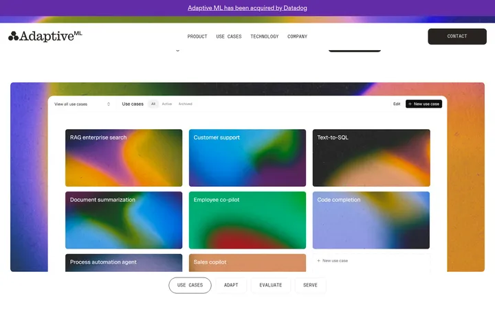
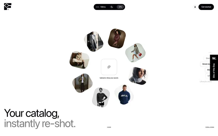
North star · Keep the page quiet and continuous: use the mineral canvas as the ground, serif-led editorial hierarchy, and dark product panels only where they clarify the system.
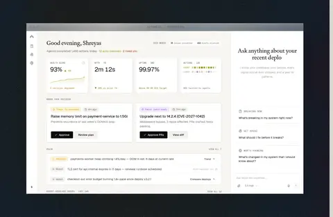
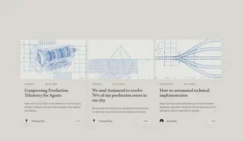
The page is anchored by a warm, mineral gray canvas, #d7d7d0, repeated across most sections so the experience feels continuous rather than card-heavy. Near-black #1a1614 carries headlines, links, and primary actions; muted brown-grays handle supporting copy, while fine #c4c3bd rules define diagrams and content boundaries. Test Signifier serif gives large headlines and editorial links a distinctive, measured voice, balanced by Geist for practical interface text and Geist Mono for small uppercase labels. The layout alternates two-column explanatory passages with expansive single-column pauses and technical illustrations. Product screens sit within dark, full-bleed bands, creating contrast without changing the overall restrained palette. Soft, pill-shaped navigation and CTA controls are among the few strongly rounded elements; most content blocks remain square-edged and open. Spacing is generous and comfortable, allowing diagrams, product UI, and copy to read as parts of one system.
配色
点色块复制色值。用途说明来自对页面的实测位置(背景、文字、描边、按钮)与截图判读。
品牌色
强调色
表层色
中性色
功能色
页面底色 · Mineral Canvas表层 · Night Panel表层 2 · Pale Surface表层 3 · Porcelain Card表层 4 · Deep Slate主文字 · Soft Ink次要文字 · Warm Graphite弱文字 · Ash Copy描边 · Stone Hairline
Body copy, navigation, buttons, captions, and general interface text.
Aa 设计
Test Signifier
网络字体 · 字重 400 · 占比 34%
免费替代:Instrument Serif
Editorial headlines and prominent text links.
Aa 设计
Geist Mono
网络字体 · 字重 400 · 占比 9%
免费替代:Space Mono
Eyebrows, small technical labels, and code-like metadata.
角色
示例
字号
字重
行高
字距
一级标题
Hero headline, set as a large editorial statement.
Antimetal
54px
400
1.1
-0.037em
二级标题
Major section headlines, including the stack and FAQ introductions.
Antimetal
50px
400
1
0
三级标题
Feature and vision statements within the narrative sections.
Antimetal
48px
400
1.1
-0.021em
四级标题
Smaller supporting editorial headings.
Antimetal
36px
400
1.1
0
正文
Long-form explanatory copy and prominent supporting text.
The quick brown fox 敏捷的狐狸
20px
400
1.5
0
辅助文字
Compact supporting notes and secondary descriptions.
The quick brown fox 敏捷的狐狸
14px
400
1.5
0
按钮
CTA labels in pill-shaped action controls.
The quick brown fox 敏捷的狐狸
14px
500
1.5
0
导航
Header and navigation link labels.
The quick brown fox 敏捷的狐狸
14px
500
1.5
0
链接
Large editorial text links.
The quick brown fox 敏捷的狐狸
24px
400
1.2
0
眉题
Small uppercase section numbers and category labels.
The quick brown fox 敏捷的狐狸
10px
400
normal
0.1em
代码
Compact uppercase technical or metadata labels.
const style = 1;
10px
400
normal
0.1em
间距与布局
基准单位 4px · 密度:适中
80px版块间距
8px元素间距
32px卡片内边距
—内容最大宽度
1px
4px
5px
6px
8px
9px
10px
12px
13px
14px
16px
20px
24px
25px
30px
32px
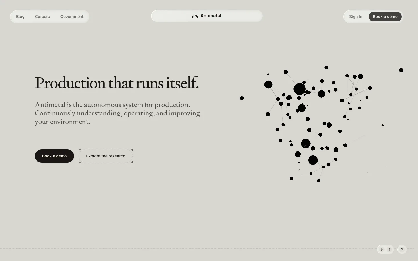
Use a wide, open page with content aligned to consistent left and right margins; measured data does not establish a fixed maximum width. The hero balances text on the left with a network visualization on the right. Subsequent sections alternate two-column explanations with broad single-column pauses, diagrams, and media bands. Maintain generous section gaps and a comfortable density. Align section headings to the start, and use columns for comparison or explanatory pairings rather than dense card grids.
圆角与层次
按钮 · 9999px
徽标 · 4px
导航 · 9999px
inset · nav
inset · other
md · badge
xl · card
Most surfaces are flat against the canvas, with thin gray hairlines doing the work of separation. Cards and diagrams remain largely square-edged, while navigation and CTAs use pill forms. Subtle inset and soft shadows appear on navigation or small interface details; reserve deeper layering for product cards and media rather than adding shadows throughout.
组件
下面的预览按实测的按钮、输入框、徽标、卡片样式重建(字体用替代字体)。
Floating navigation
A light, translucent-looking pill group places secondary links at left, the brand mark centrally, and sign-in plus a dark CTA at right.
Primary CTA
Use a near-black pill with Soft Cream text; the measured button uses Geist at 14px and medium weight.
Editorial text link
Prominent links use Test Signifier in Soft Ink; smaller research links can use Geist.
Technical diagram
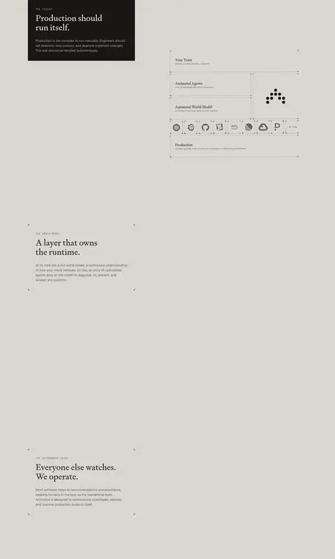
Use fine Stone Hairline outlines, compact mono labels, and sparse nodes or labeled system layers on the canvas.
Dark product band
Set product screenshots within a broad Night Panel or Deep Slate region for clear contrast with the light page.
FAQ row
Present questions as restrained text rows with thin separators and a compact plus affordance, avoiding heavy card framing.
Imagery · The visual system favors technical visualizations over lifestyle photography: the hero uses a black-node network diagram, while the narrative includes labeled diagrams and product-layer schematics. Large product screenshots appear inside dark, wide media bands, with the interface itself kept pale and legible. Treat imagery as evidence of the system, with restrained framing and minimal decorative effects; illustration-specific colors should not redefine the page palette.
Keep the mineral canvas continuous across content sections.
Use serif headlines to establish the editorial hierarchy.
Reserve near-black fills for primary actions and dark media bands.
Separate content with fine, low-contrast hairlines.
Use mono uppercase labels as small technical signposts.
Pair explanatory copy with diagrams or product evidence.
✕ 不该做
Do not introduce bright accent colors as page-wide decoration.
Do not turn every section into a bordered card.
Do not add dense grids where the page uses open space.
Do not use rounded corners on every content block.
Do not let product mock-up colors replace the measured brand palette.
Do not use oversized shadows to create generic SaaS-card depth.
给 AI 的提示词
想快速出一个同风格的新页面,把这段话连同 DESIGN.md 一起发给 AI。
Build a new Antimetal page with the same quiet, editorial technical character. Use Mineral Canvas (#d7d7d0) as the continuous page ground, Soft Ink (#1a1614) for headings, links, and primary actions, and Warm Graphite (#524f4c) or Ash Copy (#66635f) for supporting text. Set headlines in a restrained literary serif similar to Test Signifier; use a clean sans like Geist for body and controls, and tracked mono labels sparingly. Favor open two-column explanations, generous pauses, fine Stone Hairline (#c4c3bd) rules, and product diagrams that explain system behavior. Use Night Panel (#090d13) or Deep Slate (#0d1418) only for product media bands. Keep cards mostly flat and square-edged; reserve pill shapes for navigation and CTAs. Avoid decorative gradients and bright, unmeasured accents.