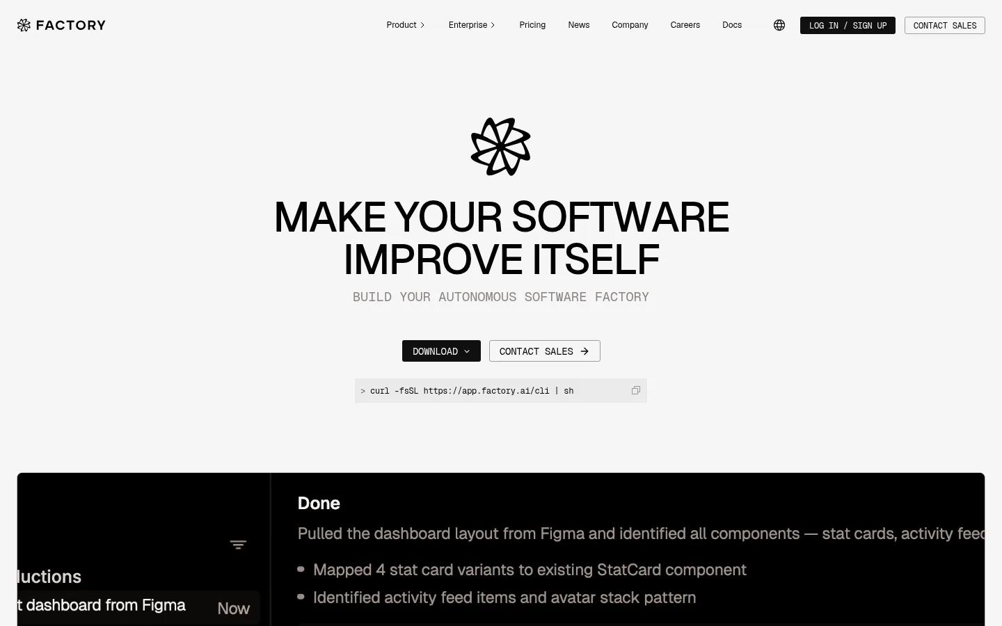
North star · Keep the page quiet and light, using precise typography, thin borders, and dark product media to make the software itself the visual focus.
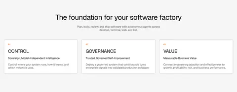
The page uses a near-white canvas (#f5f5f5) as a continuous backdrop, letting black typography and dark product media create the strongest contrast. The opening is deliberately sparse: a centered mark, uppercase display headline, muted monospace-like supporting line, compact actions, and a command snippet lead into a wide dark software demo. Geist carries the interface throughout, with tightly tracked uppercase display text and quieter, smaller labels; Geist Mono marks technical content. Most sections remain on the same light ground, while pale gray panels, white cards, and fine warm-gray borders distinguish content without introducing strong color bands. Product screenshots and customer marks provide visual evidence rather than decorative imagery. A restrained three-column principles area and modular feature grids give the long page structure; generous blank space around key transitions keeps its compact UI details legible. The footer reverses to near-black.
Primary display, headings, navigation, body copy, links, and controls.
Aa 设计
Geist Mono
网络字体 · 字重 400 · 占比 6%
免费替代:IBM Plex Mono
Technical snippets and compact code-style labels.
角色
示例
字号
字重
行高
字距
特大标题
Large uppercase hero slogan and prominent display messaging.
Factory
60.5px
500
1
-0.04em
一级标题
Primary section headline and major page-level statements.
Factory
44px
400
1.12
-0.025em
二级标题
Secondary section headings and key content-group titles.
Factory
36px
400
1
-0.02em
三级标题
Feature, case study, or subsection headings.
Factory
32px
400
1.1
-0.035em
四级标题
Smaller card and nested content headings.
Factory
28px
400
1
-0.02em
正文
Standard product, feature, and explanatory copy.
The quick brown fox 敏捷的狐狸
16px
400
1.2
0
辅助文字
Compact labels and supporting metadata.
The quick brown fox 敏捷的狐狸
14px
400
1
0
导航
Small primary navigation labels.
The quick brown fox 敏捷的狐狸
12px
400
1
0
链接
Secondary calls to action and text links.
The quick brown fox 敏捷的狐狸
14px
400
1.43
0
代码
Uppercase technical labels and command-style snippets.
const style = 1;
12px
400
1
-0.02em
间距与布局
基准单位 8px · 密度:紧凑
40px版块间距
8px元素间距
—卡片内边距
1392px内容最大宽度
4px
8px
12px
14px
16px
19px
20px
24px
36px
40px
48px
80px
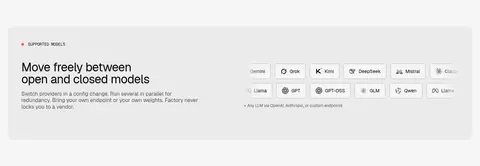
The page is a long, mostly single-column sequence contained within a measured maximum width of 1392px. Navigation spans the top; the hero centers its content, while subsequent sections switch between centered introductions, three-column principles, multi-column feature cards, and two-column case-study or enterprise layouts. A 12-column grid appears in the supported-models area. Section gaps are measured at 40px, with compact element spacing and notably generous blank transitions. Keep alignment purposeful and content density higher within cards than between sections.
圆角与层次
按钮 · 3px
卡片 · 6px
导航 · 3px
没有测到阴影:页面是扁平的,层次靠底色和描边区分。
The interface is largely flat, with no measured shadow system. Separate white cards from the light canvas using fine warm-gray borders and modest rounded corners; dark demo media forms its own strong plane. Use subtle surface changes rather than layered floating panels, and keep component edges crisp.
组件
下面的预览按实测的按钮、输入框、徽标、卡片样式重建(字体用替代字体)。
Top navigation
A slim horizontal header on the light canvas, with the Factory mark at left and compact dark links and outlined sales action at right.
Hero actions
Centered download and contact-sales controls beneath the headline; compact rectangular buttons use restrained outlines or dark fills.
Command snippet
A small, pale code-style strip under the hero actions, set apart from the headline and using monospace technical text.
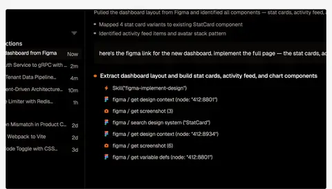
Product demo
A wide, near-black software demonstration panel with dense interface content, contrasting sharply against the open gray canvas.
Principles cards
Three aligned white cards for Control, Governance, and Value, with fine #b8b3b0 borders and compact explanatory copy.
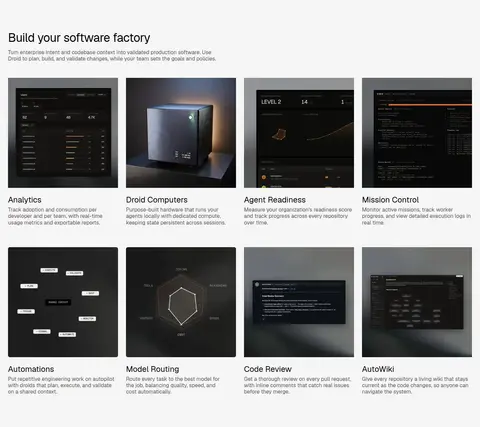
Feature cards
A multi-column collection of dark product screenshots, short titles, and muted explanatory text on the light page.
Footer
A dark, three-column link area with the brand mark and compact legal and social details.
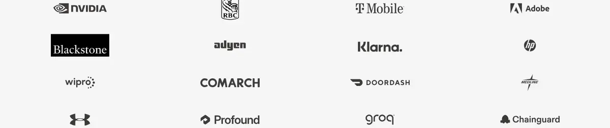
Imagery · Use real product-interface imagery as the main visual proof: dark screenshots, dashboard panels, and a wide in-page demo video. Feature tiles pair interface captures with concise descriptions; customer logos sit together in a restrained grid. The CTA uses a dark image treatment. Keep imagery rectangular and contained, with minimal ornament; do not mistake interface screenshot colors for the site-wide palette.
Keep the main canvas near-white and visually quiet.
Use near-black for prominent headings and product demonstrations.
Use Geist for interface and editorial text.
Reserve Geist Mono for technical snippets.
Separate cards with fine measured gray borders.
Let product screenshots provide the strongest dark areas.
Use restrained, compact controls and labels.
✕ 不该做
Do not add vivid accent colors absent from the defining page treatment.
Do not apply gradients as a general page background.
Do not add decorative shadows or floating-card effects.
Do not make every section a dark band.
Do not enlarge navigation or metadata into prominent display text.
Do not treat colors inside product mockups as global brand colors.
给 AI 的提示词
想快速出一个同风格的新页面,把这段话连同 DESIGN.md 一起发给 AI。
Build a new page in Factory’s restrained, technical visual style. Use Factory Mist (#f5f5f5) as the main canvas, Carbon Ink (#020202) for headings and navigation, and Warm Graphite (#5c5855) for secondary copy. Set interface and editorial typography in Geist, with Geist Mono for code-like details. Keep the layout within the measured 1392px maximum width; combine centered introductions with orderly grids and generous separation between sections. Use white cards with fine Soft Pewter (#b8b3b0) borders, and reserve Deep Console (#0d0d0d) or Soot Brown (#1f1d1c) for product media and select inverse surfaces. Favor real interface captures over decorative illustrations. Keep controls compact, corners subtly rounded, and elevation flat. Avoid unsupported colors, shadows, and excessive dark section backgrounds.