North star · Let bold, readable editorial type and useful product imagery lead, using bright CTA color against calm, spacious section bands.
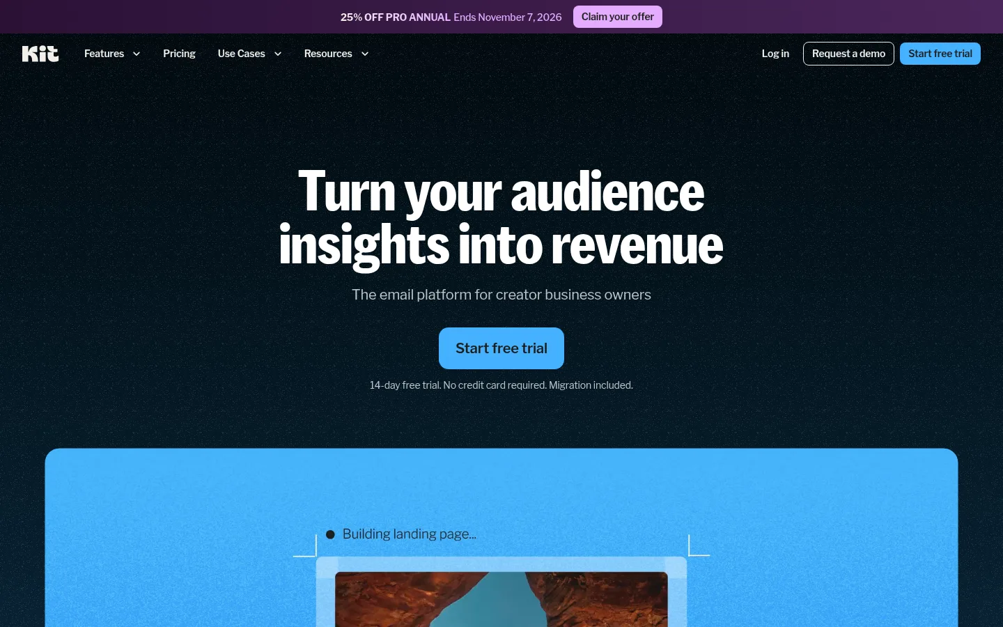
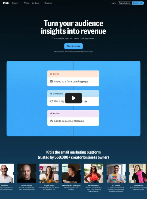
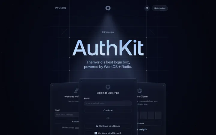
The homepage opens on a deep, near-black blue field with a compact navigation bar, centered oversized headline, muted supporting copy, and a vivid blue primary CTA. A wide, rounded product preview anchors the hero and leads into creator portraits, making the platform feel tangible and community-led. Below, white sections use strong left-aligned headings and alternating product imagery to keep feature stories readable without heavy decoration. Warm cream and peach bands break up the long scroll, while occasional green, coral, and lavender buttons mark secondary actions or promotional moments. KitSansFont gives display headings a compact, distinctive voice; Libre Franklin carries navigation, body copy, and UI labels. The layout moves between two-column feature splits, image-led cards, wide testimonial media, and a dense footer. Rounded corners and fine warm-gray borders define cards, while restrained elevation lets imagery and color blocks do most of the visual work.
Navigation, body copy, UI labels, buttons, links, and smaller headings.
Aa 设计
KitSansFont
网络字体 · 字重 500 · 占比 3%
免费替代:DM Sans
Display headlines and primary section headings.
角色
示例
字号
字重
行高
字距
特大标题
Oversized centered hero headline.
Kit
80px
500
0.95
0
一级标题
Primary page or major feature headline.
Kit
56px
500
1
0
二级标题
Feature-section and large editorial headings.
Kit
40px
500
1.25
0
三级标题
Card titles and emphasized subheadings.
The quick brown fox 敏捷的狐狸
24px
700
1.25
-0.007em
四级标题
Compact feature titles and FAQ labels.
The quick brown fox 敏捷的狐狸
20px
600
1
-0.007em
正文
Feature descriptions, supporting copy, and FAQ answers.
The quick brown fox 敏捷的狐狸
16px
400
1.5
-0.01em
辅助文字
Small image captions, notes, and metadata.
The quick brown fox 敏捷的狐狸
12px
400
1.5
-0.013em
导航
Top navigation links and footer navigation.
The quick brown fox 敏捷的狐狸
14px
400
1.43
-0.011em
链接
Inline links and emphasized secondary actions.
The quick brown fox 敏捷的狐狸
16px
600
1.5
-0.01em
间距与布局
基准单位 4px · 密度:适中
32px版块间距
16px元素间距
—卡片内边距
1312px内容最大宽度
1px
4px
6px
8px
12px
16px
20px
24px
28px
32px
80px
The page uses a broad centered canvas with a measured maximum width of 1312px, comfortable density, and generous section spacing. The first viewport centers the hero content above a wide media panel; below it, content alternates between two-column feature splits, full-width imagery, and multi-card rows. Headings usually align to the start of their content block, with centered alignment reserved for testimonials and FAQ framing. Warm background bands distinguish selected content groups. The footer shifts to a dark, multi-column link layout.
圆角与层次
按钮 · 14px
卡片 · 12px
导航 · 12px
链接 · 8px
没有测到阴影:页面是扁平的,层次靠底色和描边区分。
The measured system is largely flat, with no recorded box shadows. Cards use white surfaces or subtle warm-gray hairline borders and rounded corners; larger media panels and photo cards rely on image contrast and dark overlays for separation. Use layered UI mockups sparingly, keeping borders and surface contrast more prominent than shadow.
组件
下面的预览按实测的按钮、输入框、徽标、卡片样式重建(字体用替代字体)。
Primary CTA
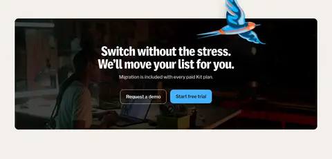
Signal Blue (#44b1ff) button with Soft Ink text; the main trial action uses a broad, rounded treatment, with compact variants elsewhere.
Offer CTA
Lilac (#e4acff) promotional action with dark text, used in the announcement strip.
Feature split
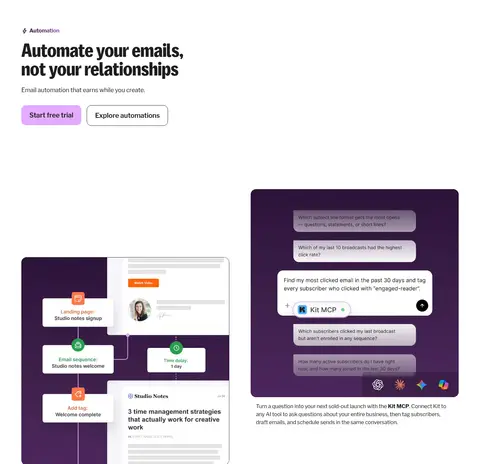
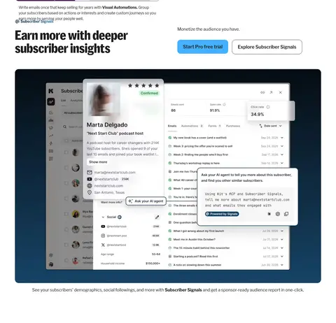
Start-aligned headline and supporting copy paired with a product screenshot or media preview; alternate text and image placement across sections.
Product card
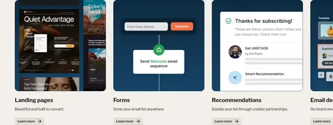
White or transparent card with a Quiet Sand (#eae5dc) outline, rounded corners, dark copy, image, and a compact Learn more link.
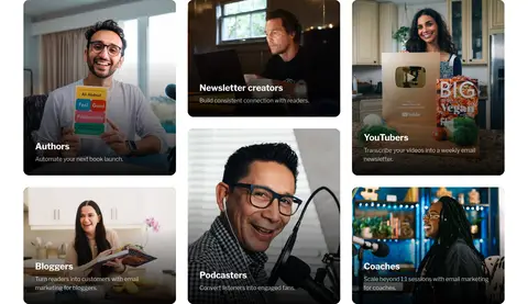
Creator media tile
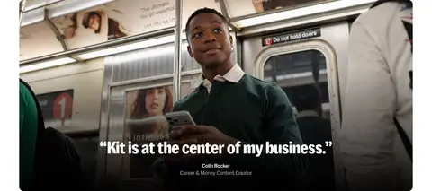
Rounded photograph or video frame with a restrained dark overlay and readable white title or testimonial copy.
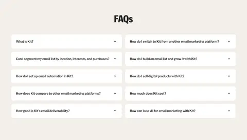
FAQ row
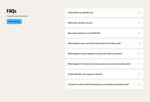
White rounded accordion row on Warm Linen (#f2efe9), with a concise question and small disclosure icon.
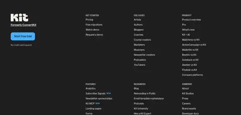
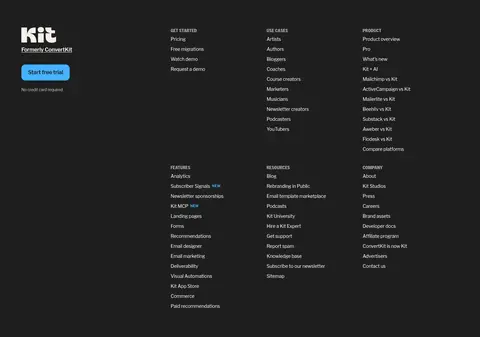
Footer navigation
Soft Ink (#1e1e1e) surface with white brand mark, muted small labels, and grouped link columns.
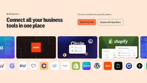
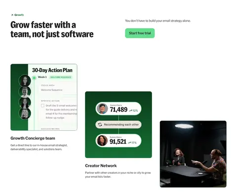
Imagery · Use creator portraits, lifestyle photography, and real-looking product interface screenshots as the main visual material. Frame media in broad rounded rectangles or cards, often paired with concise captions. Hero and testimonial imagery can span much of the content width; product UI previews sit against saturated blue or dark backgrounds. Dark overlays support readable text on photography. Bright colors inside app logos, dashboards, and mockups are illustrative details rather than the core brand palette.
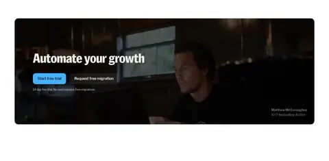
Use a cinematic dark opening with strong white headline contrast.
Make the primary action Signal Blue (#44b1ff) with dark text.
Keep display headlines compact, prominent, and sentence case.
Alternate white content with Warm Linen (#f2efe9) and Peach Studio (#ffe7d6) bands.
Show authentic creator imagery and legible product UI previews.
Use Quiet Sand (#eae5dc) borders instead of pronounced shadows.
✕ 不该做
Do not make every section dark or visually heavy.
Do not replace the creator photography with generic abstract decoration.
Do not use gradients as the default surface treatment.
Do not use oversized all-caps headings or dense body paragraphs.
Do not add heavy drop shadows to cards or buttons.
Do not treat colors inside app mockups as additional core brand colors.
给 AI 的提示词
想快速出一个同风格的新页面,把这段话连同 DESIGN.md 一起发给 AI。
Build a new marketing page in Kit’s creator-first visual style. Start with a deep, near-black hero using Midnight Tide (#020a0f), Soft Ink (#1e1e1e), and crisp white text; center a compact display headline, supporting copy, and a Signal Blue (#44b1ff) primary CTA above a wide product preview. Use KitSansFont or a close substitute for display headings and Libre Franklin or Inter for body and interface text. Structure the rest as spacious white feature splits, product-image cards, and creator photography, with occasional Warm Linen (#f2efe9) and Peach Studio (#ffe7d6) bands. Keep borders subtle in Quiet Sand (#eae5dc), corners rounded, and shadows minimal. Use lilac, coral, or mint only for limited secondary actions. Maintain readable start-aligned copy and finish with a dark, grouped-link footer.