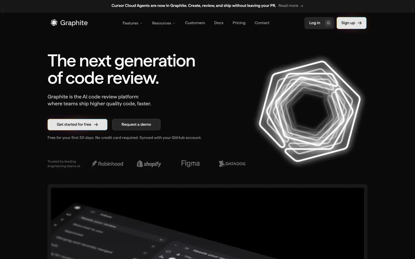
North star · Keep the page nearly black and restrained, letting crisp typography and framed product interfaces provide the contrast and detail.
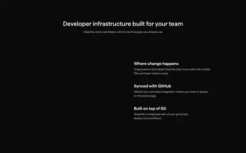
Graphite builds a distinctly dark interface around a #0a0a0a canvas, keeping the page visually quiet so the product UI can carry the detail. Near-white headings and muted gray supporting copy establish a clear reading hierarchy; warm orange and yellow and vivid blue are occasional accents, not broad page fills. Matter sans-serif type stays unembellished, with a large, tightly tracked hero heading and compact navigation and action labels. The layout uses a centered content area, split hero composition, and carefully aligned product media, followed by customer cards and feature panels. Product screenshots and video introduce denser contrast and color inside bounded frames, while the surrounding sections remain dark and spacious. Thin gray borders distinguish cards and controls without turning the page into a stack of heavy shadows. Consistent dark surfaces, measured section spacing, and crisp light CTAs keep the long homepage coherent and conversion-focused.
配色
点色块复制色值。用途说明来自对页面的实测位置(背景、文字、描边、按钮)与截图判读。
品牌色
强调色
表层色
中性色
功能色
页面底色 · Graphite Black表层 · Panel Charcoal主文字 · Soft White次要文字 · Quiet Gray弱文字 · Pale Gray描边 · Warm Amber强调 · Signal Orange强调 2 · Warm Amber强调 3 · Electric Blue
Site-wide interface and marketing type, from navigation and body copy to display headings and buttons.
角色
示例
字号
字重
行高
字距
特大标题
Oversized hero headline with close tracking and compact line height.
Graphite
60px
500
1
-0.025em
一级标题
Main section headings and prominent product-story titles.
Graphite
36px
500
1.11
0
二级标题
Feature group and secondary section headings.
The quick brown fox 敏捷的狐狸
24px
600
1.17
0
三级标题
Feature-card and product detail headings.
The quick brown fox 敏捷的狐狸
20px
500
1.4
0
正文
Supporting paragraphs and product descriptions.
The quick brown fox 敏捷的狐狸
16px
400
1.5
0
辅助文字
Small annotations and secondary metadata.
The quick brown fox 敏捷的狐狸
14px
500
1.43
0
按钮
CTA and compact interface action labels.
The quick brown fox 敏捷的狐狸
14px
500
1.43
0
导航
Header navigation labels.
The quick brown fox 敏捷的狐狸
14px
500
1.43
0
链接
Inline feature, documentation, and customer-story links.
The quick brown fox 敏捷的狐狸
16px
400
1.25
0
间距与布局
基准单位 8px · 密度:紧凑
32px版块间距
8px元素间距
—卡片内边距
1120px内容最大宽度
1px
2px
3px
4px
8px
12px
14px
16px
24px
32px
48px
50px
Use a centered content area with a measured maximum width of 1120px and a compact, 12-column-capable layout. The hero balances left-aligned copy and actions with right-side visual media, then anchors a wide product video below. Customer proof and feature panels use grid-like groupings; later split sections alternate text and interface imagery. Keep section rhythm consistent with the measured 32px section gap and 8px base unit, but preserve the screenshot’s generous dark breathing room around major blocks. Footer columns align cleanly, with left-aligned labels and links.
圆角与层次
按钮 · 8px
卡片 · 8px
图片 · 10px
导航 · 8px
链接 · 9999px
sm · other
inset · card
sm · button, text
md · other, media
The page is mostly flat: dark surfaces and hairline borders do most of the separation. Cards use subtle inset depth rather than prominent floating shadows. Use the measured 8px button and card radii, with modest layering for framed media, product panels, and the video play affordance.
组件
下面的预览按实测的按钮、输入框、徽标、卡片样式重建(字体用替代字体)。
Header navigation
Compact horizontal header on the dark canvas with the Graphite mark, light navigation links, muted secondary links, and contrasting login and signup actions.
Hero CTA pair
A light #e5e5e5 primary action with #171717 text sits beside a #262626 demo action with a #404040 border; both use measured 8px corners.
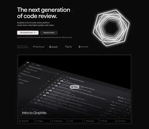
Product video frame
Wide dark product preview inside a subtle outlined frame, with a centered play affordance and a short feature strip beneath.
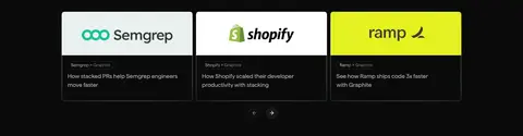
Customer proof cards
Compact, bordered story cards combine customer identity and concise outcome copy on dark surfaces.
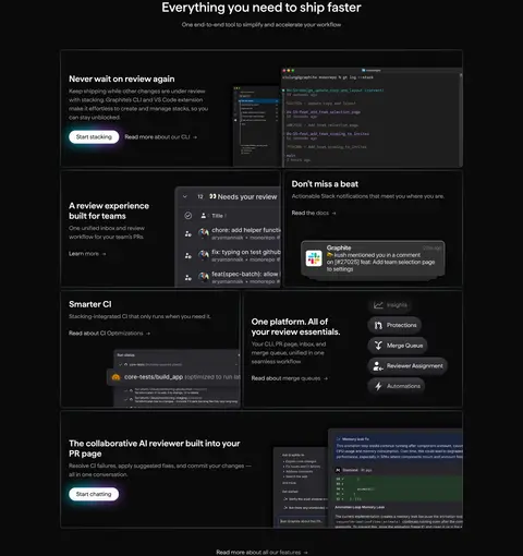
Feature panels
Dark, lightly outlined panels mix concise copy with dense product UI imagery; alternate copy and screenshots across the feature sequence.
Footer link columns
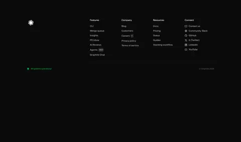
Grouped feature, company, and resource links sit above a fine divider, with muted labels and restrained decorative color details.
Imagery · Prioritize framed product interfaces: code review pages, pull request views, notifications, and feature UI. The hero includes a glowing outlined geometric mark and a wide, dark product video with an overlaid play control. Keep media crisp but subdued, with borders separating it from the canvas; screenshots can carry more color and density than the surrounding page. Customer logos appear as compact proof points, not standalone photography.
Use #fafafa for primary headings and readable key text.
Reserve gray text for supporting information and navigation.
Make product screenshots the densest visual elements.
Separate dark cards with subtle borders, not heavy shadows.
Use the measured 8px button and card corners.
Keep CTA contrast clear and labels compact.
✕ 不该做
Do not turn accent colors into large section backgrounds.
Do not use bright white backgrounds for whole content sections.
Do not crowd the hero with extra decorative elements.
Do not let screenshots overwhelm their surrounding copy.
Do not add strong shadows to every card.
Do not introduce oversized, all-caps interface labels.
给 AI 的提示词
想快速出一个同风格的新页面,把这段话连同 DESIGN.md 一起发给 AI。
Build a new Graphite-style developer SaaS page on a #0a0a0a Graphite Black canvas. Use Matter or a close sans-serif substitute such as Inter, with #fafafa Soft White headings and restrained #a1a1a1 Quiet Gray supporting text. Keep the layout centered within the measured 1120px maximum width, using a clean hero split, compact navigation, and product screenshots in framed dark panels. Use #171717 Panel Charcoal and #262626 Border Charcoal for controls and surfaces; keep borders subtle. Make the primary CTA light with dark text, and reserve #ff8833 Signal Orange, #ffb931 Warm Amber, and #1061ff Electric Blue for small accents. Favor generous breathing room, concise copy, measured 8px card and button corners, and crisp interface detail. Avoid bright full-width bands and decorative clutter.