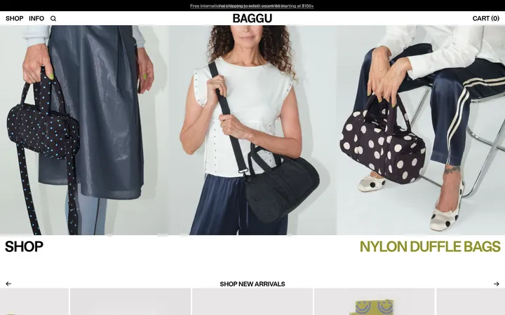
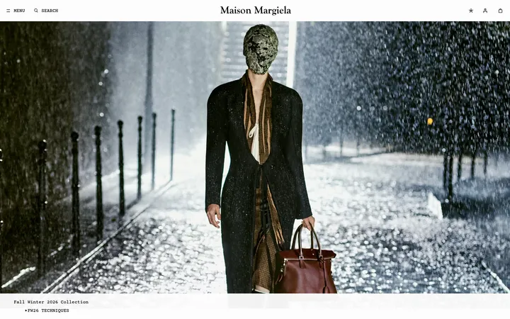
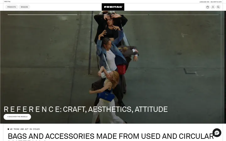
North star · Keep the interface quiet and tightly typeset so full-bleed campaign photography and product imagery remain the focus.
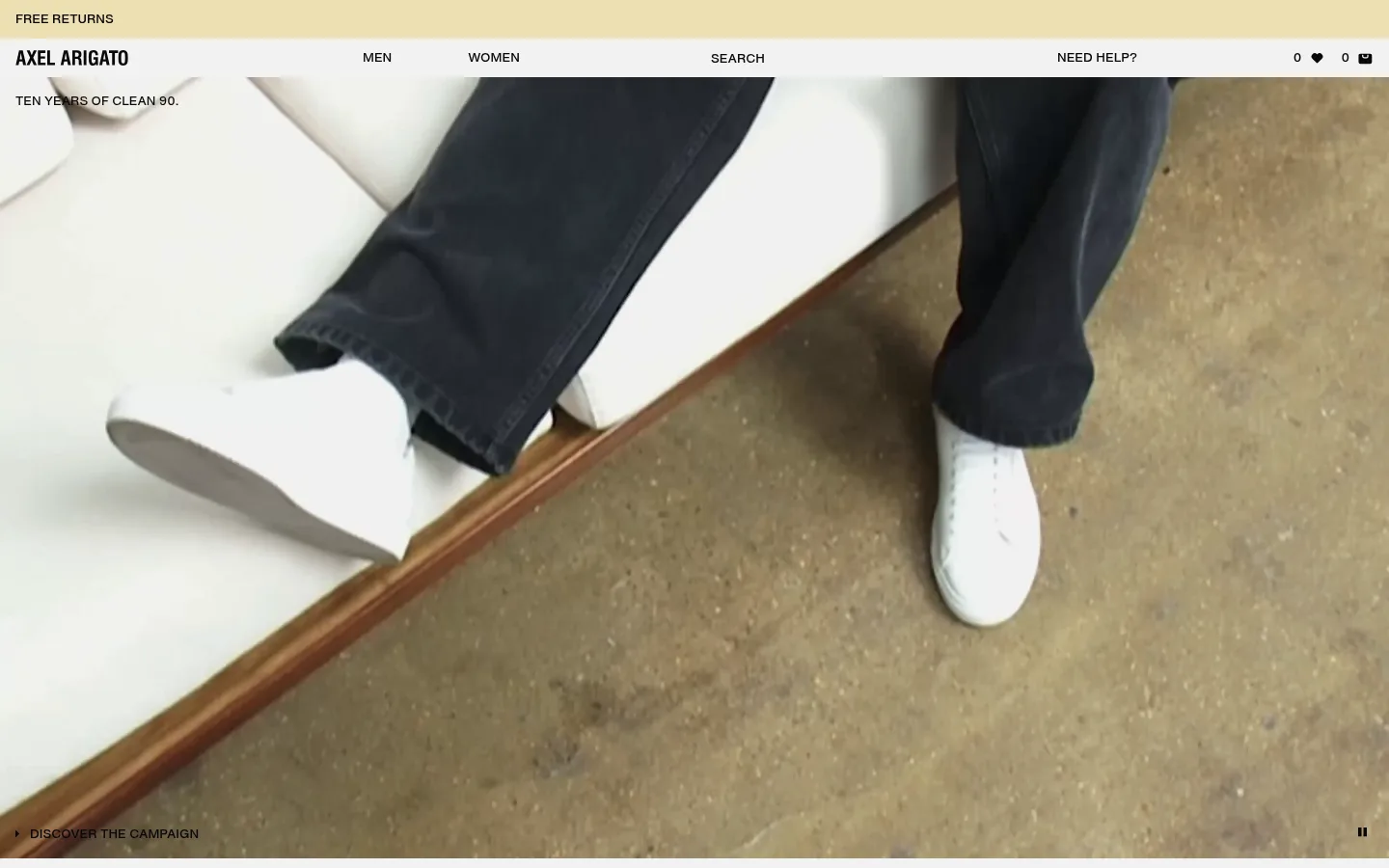
The homepage relies on a quiet neutral frame so campaign imagery and product photography provide nearly all of its visual character. Gallery White (#ffffff) forms the main section surface, while Soft Canvas (#f3f3f3) appears in the page canvas and interface details. Ink (#000000) carries the logo, headlines, and primary text; Near Black (#090909) supports secondary navigation and utility labels. Hairline Gray (#e9e9e9) separates content without introducing heavy panels. HelveticaNowVar is used throughout in compact, mostly uppercase interface copy, with regular mixed-case navigation. The layout alternates a full-bleed campaign hero, horizontal product displays, and paired editorial images. Broad image areas contrast with tightly set product names, prices, and controls. The visual hierarchy stays flat and direct: no prominent shadows or rounded-card language, just photography, whitespace, and precise alignment.
Site-wide interface type for navigation, body copy, captions, buttons, and links.
角色
示例
字号
字重
行高
字距
正文
Compact uppercase supporting copy and page-level information.
The quick brown fox 敏捷的狐狸
13px
520
1.5
0
辅助文字
Small uppercase labels accompanying images and product details.
The quick brown fox 敏捷的狐狸
11px
520
1.5
0
按钮
Uppercase calls to action and carousel controls.
The quick brown fox 敏捷的狐狸
13px
520
1.5
0
导航
Primary and utility navigation, commonly in mixed case.
The quick brown fox 敏捷的狐狸
13px
520
1.5
0
链接
Uppercase editorial and shopping links.
The quick brown fox 敏捷的狐狸
13px
520
1.5
0
间距与布局
基准单位 8px · 密度:适中
50px版块间距
8px元素间距
—卡片内边距
1408px内容最大宽度
8px
12px
16px
20px
24px
The page uses a wide desktop canvas with a measured maximum content width of 1408px. A compact header sits above a full-bleed campaign hero. Below, the rhythm alternates product carousels, two-column campaign features, and a wider editorial card group before a utility-heavy footer. Product sections are structured as broad multi-column displays; paired editorial sections use two columns. Comfortable spacing and large image areas keep the page airy despite dense product controls and labels.
圆角与层次
没有测到阴影:页面是扁平的,层次靠底色和描边区分。
The interface is predominantly flat, with white section surfaces and no measured shadow system. Fine gray rules provide the main separation between sections and controls. Avoid rounded cards or elevated containers; hierarchy comes from image scale, whitespace, alignment, and black type. Any colors visible in campaign photography should remain image content rather than interface tokens.
组件
下面的预览按实测的按钮、输入框、徽标、卡片样式重建(字体用替代字体)。
Utility and primary navigation
A slim top area combines the free-returns announcement with brand, category, search, help, and shopping utilities. Use black or near-black text on a light surface.
Campaign hero
A full-bleed campaign image or video leads the page, with a small uppercase campaign label and a discreet discovery link or playback control.
Product carousel
Horizontal product displays pair large product images with compact category, name, and USD price details plus previous/next controls.
Editorial split
Two-column campaign blocks combine fashion imagery with short uppercase messaging and direct shopping links for men and women.
Editorial card group
A multi-column set of image-led community and seasonal stories uses concise titles, short copy, and discovery links.
Newsletter and contact footer
A compact footer groups contact channels, store locations, newsletter signup, and supporting links on a light background.
Imagery · Photography and video are the visual centerpiece: the opening campaign fills the viewport with a close, candid fashion scene, while later sections mix campaign portraits and product imagery. Images use editorial framing and natural-looking environments rather than isolated decorative illustrations. Product photography is arranged in carousels, with image color and styling allowed to vary; the palette remains restrained in the interface, not imposed as a filter on the imagery.
Use white and soft gray as the quiet interface foundation.
Reserve black and near-black for navigation, copy, and controls.
Let campaign photography occupy expansive, high-impact areas.
Set interface labels in compact Helvetica-like uppercase type.
Keep product names and prices close to their images.
Use hairline separators instead of heavy panels.
Preserve clear spacing between editorial and shopping sections.
✕ 不该做
Do not add bright interface accent colors absent from the measured palette.
Do not place prominent shadows behind product cards.
Do not use rounded, app-like card treatments.
Do not let interface decoration compete with campaign imagery.
Do not enlarge navigation into oversized display typography.
Do not treat colors sampled from photographs as brand tokens.
给 AI 的提示词
想快速出一个同风格的新页面,把这段话连同 DESIGN.md 一起发给 AI。
Build a new fashion storefront page in the AXEL ARIGATO visual style. Keep the interface quiet: use Gallery White (#ffffff) for broad section surfaces, Soft Canvas (#f3f3f3) for light canvas details, Ink (#000000) for primary text, Near Black (#090909) for secondary utilities, and Hairline Gray (#e9e9e9) for subtle separators. Use a compact HelveticaNowVar-like sans serif, with uppercase labels and restrained weights. Structure the page around a large editorial campaign image, product carousels, paired image-led stories, and a concise footer. Favor wide imagery, clean alignment, comfortable whitespace, and direct product metadata. Keep cards flat and square-edged; do not add shadows, decorative gradients, or colors sampled from photos to interface elements.