ELEGOO 首页以明亮的产品视觉和清晰的商品分区为主,界面用黑色文字与蓝色强调色保持简洁。页面从大型活动主视觉引导用户逐步浏览新品、品类、售后服务,最后以深色页脚收尾。
North star · Let vivid, full-width product imagery attract attention while a calm light canvas, crisp typography, and blue actions keep shopping paths obvious.
The page uses a light storefront canvas, with broad pale-gray section bands keeping the long homepage visually continuous. Black headings and body text provide strong contrast; saturated blue marks primary actions, links, small badges, and selected graphic accents. A violet-to-blue gradient is reserved for the repeated printer-finder strip rather than used as a general background treatment. Plus Jakarta Sans carries the interface throughout: heavy, tightly tracked headings contrast with regular, compact body copy and small utility labels. The opening campaign is full-bleed and image-led, while the rest of the page settles into rounded product cards, split product showcases, category tiles, and compact service panels. Product photography and rendered machines supply most of the color and texture, so the interface itself stays restrained. Spacing is comfortable and sections are clearly separated, with a black footer acting as a decisive visual endpoint.
配色 点色块复制色值。用途说明来自对页面的实测位置(背景、文字、描边、按钮)与截图判读。
品牌色
Signal Blue
#0035ff
Primary blue CTA fill, key links, and select interface accents.
强调色
Electric Blue
#1b49ff
Blue end of the printer-finder gradient and occasional link or graphic accent.
Violet Glow
#b06bff
Violet end of the printer-finder gradient; not a dominant interface fill.
表层色
Gallery White
#ffffff
Card and drawer surfaces, white text over dark or image-led areas, and inverse CTA fills.
Soft Fog
#f5f5f5
Main page and section background, providing a quiet base around colorful product imagery.
Mist Gray
#f0f0f0
Minor pale supporting surfaces and subtle interface separation.
中性色
Carbon Ink
#000000
Main text and headings, dark footer background, and dark product-card text.
Graphite Gray
#474747
Muted supporting text and secondary link text on light surfaces.
Gradient Slate
#5f5f5f
Intermediate tone detected in gradients; not a defining flat interface color.
Divider Gray
#dedede
Fine borders and separators around controls or understated interface elements.
Slate Ink
#2c2d2e
Secondary near-black text and heading fragments.
Heading Ink
#1a1c1d
Heading color token for dark, high-contrast text.
Quiet Gray
#b2b2b2
Low-emphasis links and secondary text, particularly against dark sections.
功能色
Badge Blue
#1862f5
Small blue cart-count badge and minor label accents.
Control Gray
#545454
Measured border tone on select controls and outlined buttons.
Input Charcoal
#272727
Dark outline around the email field and other measured input treatment.
文字 背景 对比度 WCAG #000000 Carbon Ink#ffffff Gallery White21:1 AAA #000000 Carbon Ink#f5f5f5 Soft Fog19.26:1 AAA #ffffff Gallery White#f5f5f5 Soft Fog1.09:1 不达标 #ffffff Gallery White#000000 Carbon Ink21:1 AAA #474747 Graphite Gray#ffffff Gallery White9.29:1 AAA #474747 Graphite Gray#f5f5f5 Soft Fog8.52:1 AAA
字体 字号阶梯:Augmented Fourth(比例约 1.377,正文 15px)。示例用免费替代字体渲染,数值为实测。
Aa 设计
Plus Jakarta Sans 网络字体 · 字重 400 / 800 / 700 / 600 / 500 · 占比 100%
免费替代:Manrope
Site-wide headings, body copy, navigation, product labels, and buttons.
角色 示例 字号 字重 行高 字距 一级标题 Large hero campaign headline.
ELEGOO
54px 800 1.15 -0.02em 二级标题 Major section headings such as New Releases.
ELEGOO
42px 800 1.19 -0.02em 三级标题 Product and category feature headings.
ELEGOO
40px 800 1.2 0 四级标题 Secondary feature headings and supporting promotional titles.
ELEGOO
34px 800 1.6 -0.02em 正文 Product descriptions, support copy, and general storefront text.
The quick brown fox 敏捷的狐狸
15px 400 1.6 0 辅助文字 Compact labels, badges, and image or card details.
The quick brown fox 敏捷的狐狸
12px 400 1.6 0 按钮 Primary and secondary CTA labels.
The quick brown fox 敏捷的狐狸
14px 600 1.6 0 链接 Utility navigation and small product or support links.
The quick brown fox 敏捷的狐狸
12px 400 1.6 0
间距与布局 基准单位 4px · 密度:适中
80px 版块间距
24px 元素间距
— 卡片内边距
1280px 内容最大宽度
3px
4px
5px
6px
8px
10px
12px
15px
16px
20px
24px
25px
30px
32px
48px
64px
A comfortable long-scroll storefront, with a measured 1280px page maximum and repeated section breaks. The opening campaign is full-bleed, followed by modular product cards, two-column showcases, image tiles, and compact multi-column support and footer areas. Headings alternate centered and left-aligned according to block purpose. A 4px base spacing system and 80px desktop section rhythm create breathing room; product and service cards keep content dense but scannable. The footer switches to a five-column dark layout.
圆角与层次 The interface is mostly flat: pale section backgrounds, white cards, and restrained outlines separate content without heavy shadows. Rounded card and media edges soften the product grid. Full-bleed campaign imagery and occasional gradient bands add depth through composition and color, while the black footer creates the strongest layered contrast.
组件 下面的预览按实测的按钮、输入框、徽标、卡片样式重建(字体用替代字体)。
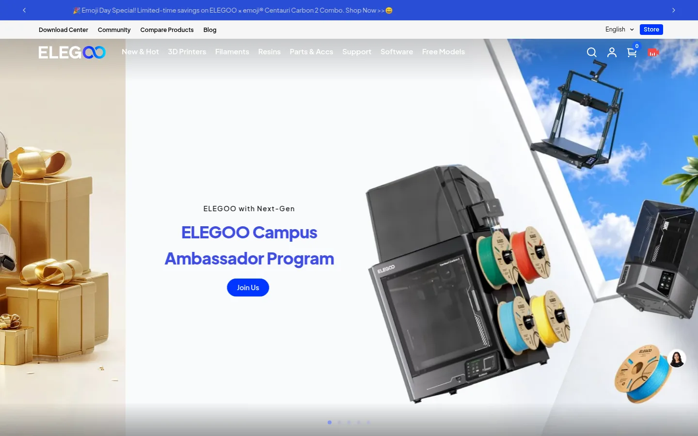
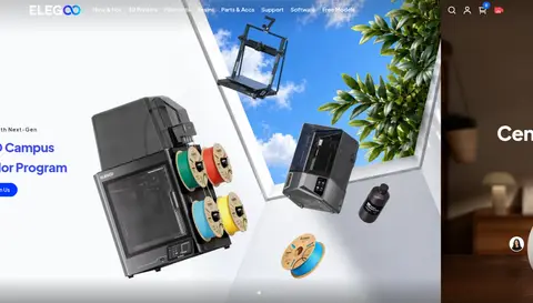
Campaign hero Full-width promotional image carousel with centered campaign copy, white navigation over imagery, and a compact blue pill CTA.
Primary CTA Signal Blue (#0035ff) fill, white semibold 14px Plus Jakarta Sans label, and measured pill-shaped rounding.
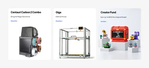
Product card White card with rounded corners, product image, dark title, and compact supporting copy or link.
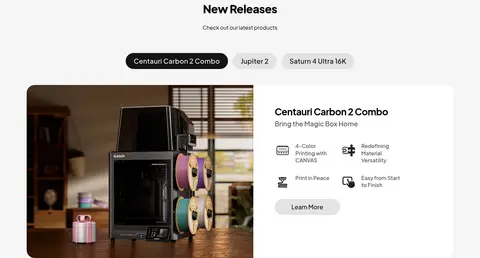
Product showcase Split image-and-copy presentation with a large machine photograph, feature callouts, and a rounded secondary action.
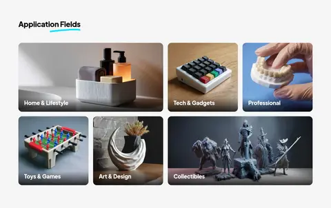
Category tile Rounded lifestyle or application image with a white category label overlaid near the lower edge.
Printer finder strip Repeated full-width violet-to-blue gradient banner with search icon, bold white prompt, and dark comparison button.
Email subscription Footer newsletter form with compact email input, dark theme, and adjacent submit control.
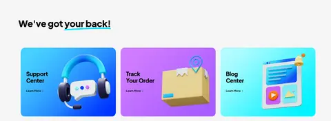
Imagery · Large promotional banners and product photography dominate the first impression. Printer renders, filament, finished prints, and use-case scenes appear in white-backed product cards and cropped image tiles. The visuals are bright and polished, with color mainly supplied by product shots and campaign artwork rather than interface decoration. Support cards use vivid illustrated imagery; award marks appear as a compact logo strip.
页面版块 共 11 个版块,按页面从上到下排列,每个都标了类型、布局和交互套路。
该做与不该做 ✓ 该做 Keep the page canvas light and product imagery prominent. Use #0035ff for primary shopping actions and important links. Set headings in heavy Plus Jakarta Sans with restrained negative tracking. Use rounded white cards to group products and support links. Give campaign sections room for wide, immersive photography. Reserve the violet-to-blue gradient for a focused promotional strip. ✕ 不该做 Do not make every section a saturated color block. Do not let interface colors compete with product photography. Do not use thin, low-contrast text for important headings. Do not replace product imagery with generic decorative illustrations. Do not apply the gradient indiscriminately across cards or navigation. Do not add heavy shadows to an otherwise flat card system. 给 AI 的提示词 想快速出一个同风格的新页面,把这段话连同 DESIGN.md 一起发给 AI。
复制 Build a new ELEGOO-style storefront page with a calm #f5f5f5 canvas, white product cards (#ffffff), and crisp dark typography (#000000). Use Plus Jakarta Sans throughout, with bold, tightly tracked section headings and compact regular supporting copy. Make product photography the visual focus: use wide campaign imagery, rounded product tiles, and clear image-and-copy showcases. Apply Signal Blue (#0035ff) to primary pill-shaped CTAs and key links; keep muted copy in Graphite Gray (#474747). Use the Violet Glow (#b06bff) to Electric Blue (#1b49ff) gradient sparingly for a standout finder or promotional strip. Keep borders subtle, spacing comfortable, and card layouts modular. Finish with a distinct black (#000000) multi-column footer and restrained white text.
DESIGN.md Tailwind v4 CSS 变量 Design Tokens
---
title: "ELEGOO design system"
variant: extended
source: https://www.elegoo.com/
captured_at: 2026-10-12
theme: light
industry: consumer-electronics
generator: Design DNA (https://four.wiralomi.com/style/elegoo-com)
ai_generated: true
ai_label: "本文件由 AI 辅助生成:数值取自公开网页的实测样式,命名、用途说明与建议为模型解读。商标归原所有者。 / AI-assisted content"
---
# ELEGOO · Design System
> Practical maker tech, presented with bright clarity
**Theme:** light · **Industry:** consumer-electronics · **Source:** https://www.elegoo.com/ · **Captured:** 2026-10-12 (1440×900 desktop)
_AI-assisted content: values are measured from the public page at capture time; names, roles and guidance are model-written interpretations. Trademarks belong to their owners._
ELEGOO’s homepage pairs a bright, image-led storefront with clear product groupings and a restrained black-and-blue interface. Large campaign imagery leads into product discovery, category browsing, customer support, and a contrasting dark footer.
## North star
Let vivid, full-width product imagery attract attention while a calm light canvas, crisp typography, and blue actions keep shopping paths obvious.
## Overview
The page uses a light storefront canvas, with broad pale-gray section bands keeping the long homepage visually continuous. Black headings and body text provide strong contrast; saturated blue marks primary actions, links, small badges, and selected graphic accents. A violet-to-blue gradient is reserved for the repeated printer-finder strip rather than used as a general background treatment. Plus Jakarta Sans carries the interface throughout: heavy, tightly tracked headings contrast with regular, compact body copy and small utility labels. The opening campaign is full-bleed and image-led, while the rest of the page settles into rounded product cards, split product showcases, category tiles, and compact service panels. Product photography and rendered machines supply most of the color and texture, so the interface itself stays restrained. Spacing is comfortable and sections are clearly separated, with a black footer acting as a decisive visual endpoint.
## Colors
| Name | Hex | Token | Group | Role |
|---|---|---|---|---|
| Gallery White | ` | `--color-gallery-white` | surface | Card and drawer surfaces, white text over dark or image-led areas, and inverse CTA fills. |
| Signal Blue | ` | `--color-signal-blue` | brand | Primary blue CTA fill, key links, and select interface accents. |
| Carbon Ink | ` | `--color-carbon-ink` | neutral | Main text and headings, dark footer background, and dark product-card text. |
| Soft Fog | ` | `--color-soft-fog` | surface | Main page and section background, providing a quiet base around colorful product imagery. |
| Electric Blue | ` | `--color-electric-blue` | accent | Blue end of the printer-finder gradient and occasional link or graphic accent. |
| Graphite Gray | ` | `--color-graphite-gray` | neutral | Muted supporting text and secondary link text on light surfaces. |
| Violet Glow | ` | `--color-violet-glow` | accent | Violet end of the printer-finder gradient; not a dominant interface fill. |
| Badge Blue | ` | `--color-badge-blue` | semantic | Small blue cart-count badge and minor label accents. |
| Gradient Slate | ` | `--color-gradient-slate` | neutral | Intermediate tone detected in gradients; not a defining flat interface color. |
| Divider Gray | ` | `--color-divider-gray` | neutral | Fine borders and separators around controls or understated interface elements. |
| Control Gray | ` | `--color-control-gray` | semantic | Measured border tone on select controls and outlined buttons. |
| Input Charcoal | ` | `--color-input-charcoal` | semantic | Dark outline around the email field and other measured input treatment. |
| Mist Gray | ` | `--color-mist-gray` | surface | Minor pale supporting surfaces and subtle interface separation. |
| Slate Ink | ` | `--color-slate-ink` | neutral | Secondary near-black text and heading fragments. |
| Heading Ink | ` | `--color-heading-ink` | neutral | Heading color token for dark, high-contrast text. |
| Quiet Gray | ` | `--color-quiet-gray` | neutral | Low-emphasis links and secondary text, particularly against dark sections. |
### Semantic aliases
`--color-canvas` → ` (Gallery White) · `--color-surface` → ` (Soft Fog) · `--color-surface-2` → ` (Carbon Ink) · `--color-text` → ` (Carbon Ink) · `--color-text-muted` → ` (Gallery White) · `--color-text-subtle` → ` (Graphite Gray) · `--color-border` → ` (Control Gray) · `--color-accent` → ` (Signal Blue) · `--color-accent-2` → ` (Electric Blue) · `--color-accent-3` → ` (Violet Glow) · `--color-on-accent` → ` (Gallery White)
### Contrast (WCAG 2.x)
| Text | Background | Ratio | Level |
|---|---|---|---|
| ` | ` | 21:1 | AAA |
| ` | ` | 19.26:1 | AAA |
| ` | ` | 1.09:1 | fail |
| ` | ` | 21:1 | AAA |
| ` | ` | 9.29:1 | AAA |
| ` | ` | 8.52:1 | AAA |
| ` | ` | 2.26:1 | fail |
| ` | ` | 7.11:1 | AAA |
| ` | ` | 6.52:1 | AA |
| ` | ` | 2.95:1 | fail |
### Gradients
- `linear-gradient(90deg, rgb(176, 107, 255), rgb(27, 73, 255) 99.79%)`
- `linear-gradient(rgba(0, 0, 0, 0), rgba(0, 0, 0, 0.6))`
## Typography
| Family | Token | Source | Weights | Role | Free substitute |
|---|---|---|---|---|---|
| Plus Jakarta Sans | `--font-body` | webfont | 400, 800, 700, 600, 500 | Site-wide headings, body copy, navigation, product labels, and buttons. | Manrope |
- **Plus Jakarta Sans:** Headings are heavy, often 800 weight with slight negative tracking; body and utility text stay regular and compact. No uppercase transformation habit.
### Type scale — Augmented Fourth (ratio ≈ 1.377, base 15px)
| Role | Size | Weight | Line height | Letter spacing | Case | Family | Used for |
|---|---|---|---|---|---|---|---|
| h1 | 54px | 800 | 1.15 | -0.02em | — | Plus Jakarta Sans | Large hero campaign headline. |
| h2 | 42px | 800 | 1.19 | -0.02em | — | Plus Jakarta Sans | Major section headings such as New Releases. |
| h3 | 40px | 800 | 1.2 | 0 | — | Plus Jakarta Sans | Product and category feature headings. |
| h4 | 34px | 800 | 1.6 | -0.02em | — | Plus Jakarta Sans | Secondary feature headings and supporting promotional titles. |
| body | 15px | 400 | 1.6 | 0 | — | Plus Jakarta Sans | Product descriptions, support copy, and general storefront text. |
| caption | 12px | 400 | 1.6 | 0 | — | Plus Jakarta Sans | Compact labels, badges, and image or card details. |
| button | 14px | 600 | 1.6 | 0 | — | Plus Jakarta Sans | Primary and secondary CTA labels. |
| link | 12px | 400 | 1.6 | 0 | — | Plus Jakarta Sans | Utility navigation and small product or support links. |
OpenType features in use: `"kern"` .
## Spacing & layout
- Base unit **4px**, density **comfortable**.
- Scale (most used values): 3, 4, 5, 6, 8, 10, 12, 15, 16, 20, 24, 25, 30, 32, 48, 64 px.
- Section rhythm 80px · element gap 24px · card padding — · max content width 1280px.
A comfortable long-scroll storefront, with a measured 1280px page maximum and repeated section breaks. The opening campaign is full-bleed, followed by modular product cards, two-column showcases, image tiles, and compact multi-column support and footer areas. Headings alternate centered and left-aligned according to block purpose. A 4px base spacing system and 80px desktop section rhythm create breathing room; product and service cards keep content dense but scannable. The footer switches to a five-column dark layout.
## Shape & elevation
- Radius: button `9999px` · input `8px` · card `16px` · media `16px` · badge `50%` · link `16px` · xs `2px` · sm `8px` · md `16px` · pill `9999px`
- Shadow `md` (other): `rgba(0, 0, 0, 0.06) 0px 0px 16.667px 0px`
- Motion: standard transition `0.25s cubic-bezier(0.104, 0.204, 0.492, 1)` on interactive elements.
The interface is mostly flat: pale section backgrounds, white cards, and restrained outlines separate content without heavy shadows. Rounded card and media edges soften the product grid. Full-bleed campaign imagery and occasional gradient bands add depth through composition and color, while the black footer creates the strongest layered contrast.
## Imagery
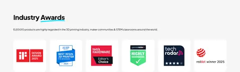
Large promotional banners and product photography dominate the first impression. Printer renders, filament, finished prints, and use-case scenes appear in white-backed product cards and cropped image tiles. The visuals are bright and polished, with color mainly supplied by product shots and campaign artwork rather than interface decoration. Support cards use vivid illustrated imagery; award marks appear as a compact logo strip.
## Components
### Campaign hero
Full-width promotional image carousel with centered campaign copy, white navigation over imagery, and a compact blue pill CTA.
### Primary CTA
Signal Blue (### Product card
White card with rounded corners, product image, dark title, and compact supporting copy or link.
### Product showcase
Split image-and-copy presentation with a large machine photograph, feature callouts, and a rounded secondary action.
### Category tile
Rounded lifestyle or application image with a white category label overlaid near the lower edge.
### Printer finder strip
Repeated full-width violet-to-blue gradient banner with search icon, bold white prompt, and dark comparison button.
### Email subscription
Footer newsletter form with compact email input, dark theme, and adjacent submit control.
### Measured component styles
- **Primary button** (“Join Us”): background ## Do
- Keep the page canvas light and product imagery prominent.
- Use ## Don't
- Do not make every section a saturated color block.
- Do not let interface colors compete with product photography.
- Do not use thin, low-contrast text for important headings.
- Do not replace product imagery with generic decorative illustrations.
- Do not apply the gradient indiscriminately across cards or navigation.
- Do not add heavy shadows to an otherwise flat card system.
## Agent prompt
Build a new ELEGOO-style storefront page with a calm ## Page sections (top to bottom)
| # | Type | Layout | UX patterns | UI patterns |
|---|---|---|---|---|
| 1 | hero | Full-bleed campaign carousel with overlaid navigation and centered copy. | Campaign carousel, Primary CTA, Slide indicators | Full-width imagery, White overlay navigation, Blue pill button |
| 2 | feature-grid | Three promotional image cards arranged in a single horizontal row. | Shop links, Campaign discovery | Rounded cards, Image-led promotions, Compact titles |
| 3 | product-showcase | Centered section title above tabs and a wide split product feature. | Product tabs, Learn-more action | Split image and copy, Rounded media, Feature callouts |
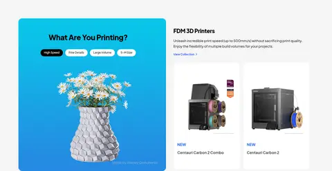
| 4 | product-grid | Two-column feature area pairing a vivid print theme panel with product cards. | Category switching, Product browsing | Image-led category panel, Product cards, Compact links |
| 5 | gallery | Six image tiles in an asymmetrical three-column mosaic. | Browse by use case | Rounded photographic tiles, Overlay labels |
| 6 | cta | Repeated horizontal gradient finder banner with search prompt and button. | Compare products, Guided selection | Violet-to-blue gradient, Search icon, Dark pill button |
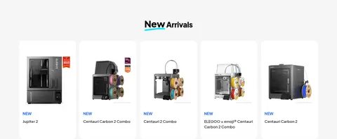
| 7 | product-grid | Centered heading over a single-row grid of product cards. | Browse new arrivals, Open product detail | White cards, Product renders, New labels |
| 8 | logo-cloud | Left-aligned heading and intro above a horizontal awards-logo row. | Trust building | Compact logo tiles, White card backgrounds |
| 9 | feature-grid | Left-aligned heading above three wide illustrated support cards. | Support discovery, Order tracking, Blog access | Bright illustrated cards, Rounded corners, Learn-more links |
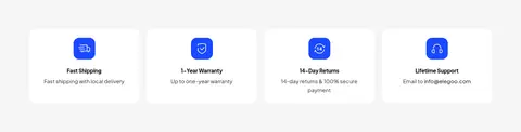
| 10 | feature-grid | Four compact service assurances aligned in a horizontal row. | Reassurance, Payment confidence | Small blue icons, White cards, Compact captions |
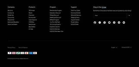
| 11 | footer | Black full-width footer with five information columns and a lower utility bar. | Email subscription, Footer navigation, Locale selection | Black background, White and muted links, Email field |
## Source CSS custom properties (selected)
```css
--bg-body: