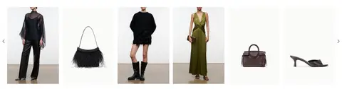
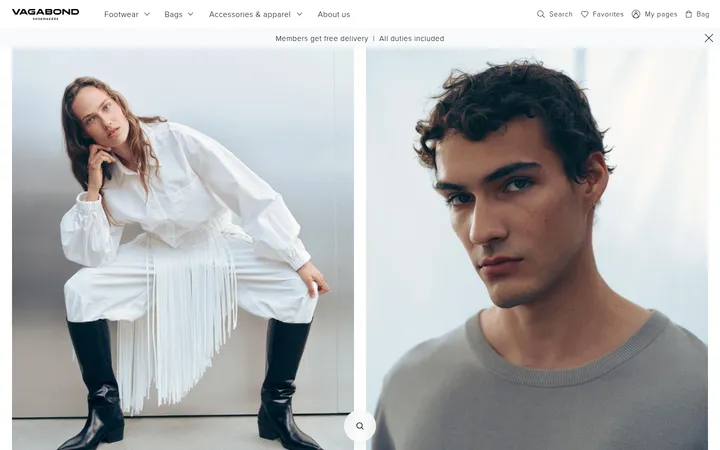
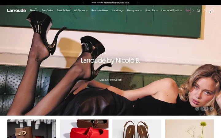
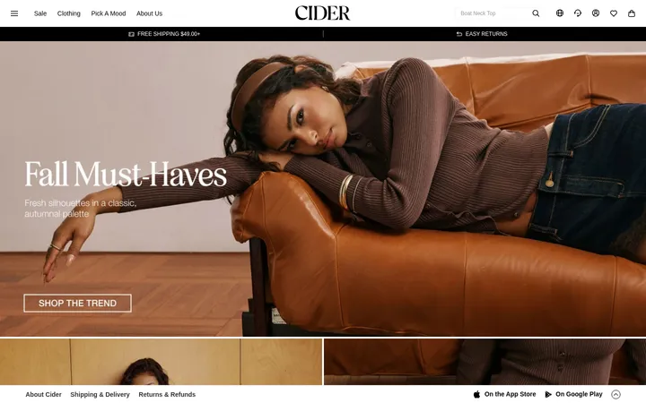
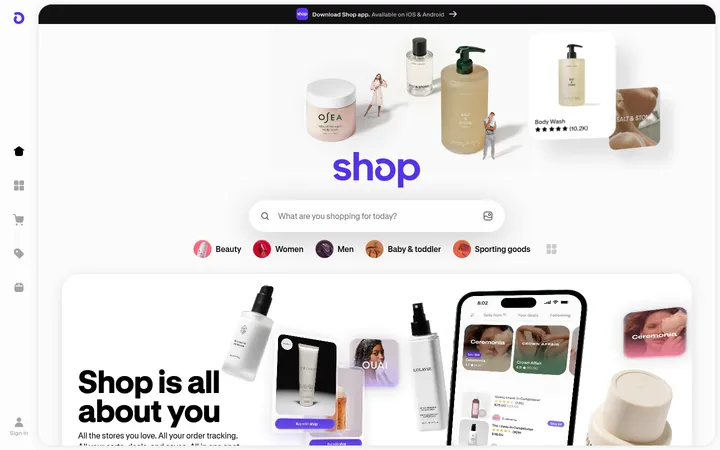
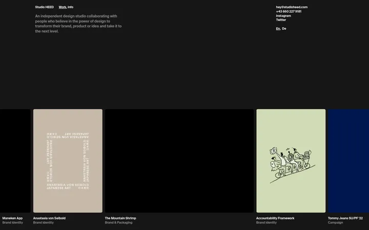
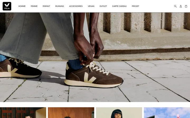
North star · Keep the interface quiet and neutral, letting large, carefully composed fashion photography carry the page’s color and personality.
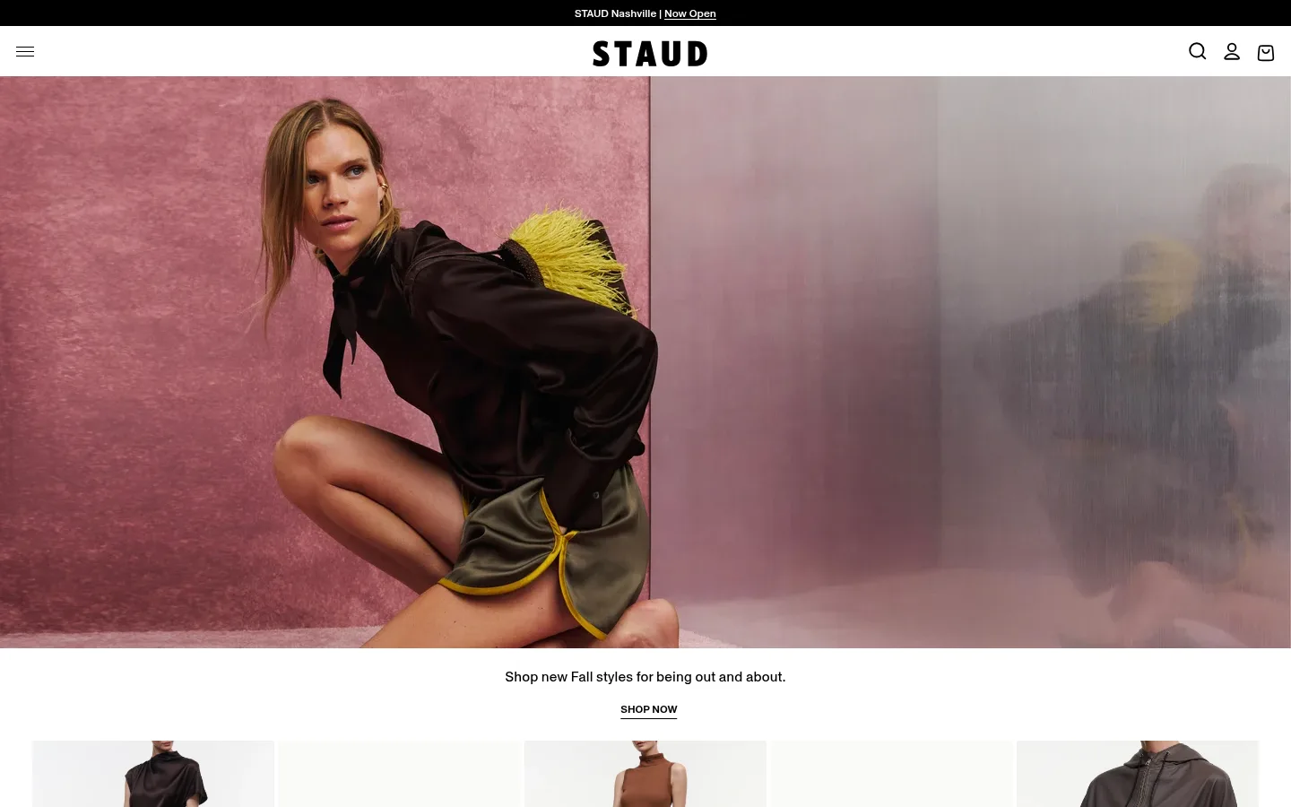
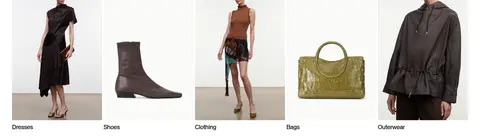
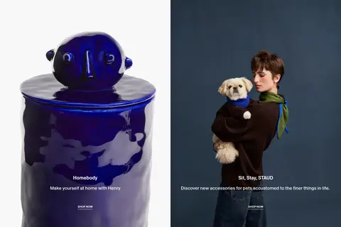
The page uses a quiet neutral framework so the campaign photography supplies most of the visual character. White is the main canvas for the compact header, hero caption, category links, and shopping content; black anchors the announcement strip, wordmark, icons, and text. A pale gray surface distinguishes the footer. Photography is edge-to-edge in the opening hero, then organized into five category tiles and balanced two-column campaign panels; image colors remain editorial content rather than extra interface colors. Antique Legacy carries most headings, body copy, and links in a measured, medium-weight voice, while Poppins is reserved for small navigation labels and announcement details. Centered hero copy and clean, generous white intervals give way to denser product browsing and a multi-column footer. Components stay mostly flat, with understated controls and pill-like CTA shapes rather than decorative effects.
Primary display and interface type for headings, body, links, captions, and buttons.
角色
示例
字号
字重
行高
字距
一级标题
Primary campaign headline or featured editorial title.
The quick brown fox 敏捷的狐狸
25.5px
500
1.17
0
二级标题
Secondary campaign headings and section titles.
The quick brown fox 敏捷的狐狸
20px
500
1.5
0
正文
Campaign descriptions and standard supporting copy.
The quick brown fox 敏捷的狐狸
16px
500
1.5
0
辅助文字
Small uppercase utility labels and secondary details.
The quick brown fox 敏捷的狐狸
12px
450
1.43
0
按钮
Compact shopping actions such as SHOP NOW.
The quick brown fox 敏捷的狐狸
12px
500
1.25
0
导航
Small header and utility navigation labels.
The quick brown fox 敏捷的狐狸
12px
450
1.42
0
链接
Category names, campaign links, and footer destinations.
The quick brown fox 敏捷的狐狸
16px
500
1.5
0
间距与布局
基准单位 4px · 密度:适中
60px版块间距
12px元素间距
—卡片内边距
1368px内容最大宽度
1px
3px
4px
5px
6px
8px
10px
12px
16px
24px
32px
36px
The desktop page spans a measured maximum width of 1368px, with a full-bleed hero followed by a centered campaign caption. A five-column category row leads into two balanced editorial panels, then a dense product rail and four-column footer. The measured base spacing unit is 4px; the section gap is 60px and element gap is 12px. Keep the top navigation compact, preserve generous white space around editorial content, and allow product browsing and footer links to feel more information-dense.
圆角与层次
按钮 · 9999px
链接 · 9999px
没有测到阴影:页面是扁平的,层次靠底色和描边区分。
The page is predominantly flat: no measured shadows or gradients define the interface, and the palette reports no border color. Establish hierarchy with image scale, white space, and background changes rather than cards floating above the canvas. Use pill-shaped CTA treatments where appropriate, while navigation and footer links remain visually light.
组件
下面的预览按实测的按钮、输入框、徽标、卡片样式重建(字体用替代字体)。
Announcement strip
A slim black band above the white header, with centered small Poppins text and a linked store update.
Store header
White horizontal header with a centered STAUD wordmark, menu control at left, and search, account, and bag icons at right.
Campaign hero
Full-bleed fashion image followed by a centered short message and an understated SHOP NOW action.
Category tiles
Five side-by-side image links for Dresses, Shoes, Clothing, Bags, and Outerwear, each with a concise label.
Editorial campaign panels
Two balanced image-led panels with centered headline, short supporting copy, and a shopping CTA.
Product rail
Dense horizontal product browsing area with image cards, purchase controls, and directional navigation.
Footer
Four-column utility area on #f7f7f7 for company, contact, shop, and newsletter content, with small links.
Imagery · Use high-quality fashion and lifestyle photography as the dominant visual material, with full-width campaign framing in the hero and clean, consistently cropped imagery for category tiles. Editorial panels pair image and copy, with copy centered over the photography where shown. Product thumbnails should remain legible in a horizontal rail. Rich pinks, burgundies, dark blues, and garment colors belong to the photographs, not to the measured interface palette.
Let fashion photography provide the strongest color.
Keep the header compact and the wordmark centered.
Build category browsing from image-led links.
Use centered copy over editorial campaign imagery.
Keep buttons and utility text understated.
✕ 不该做
Do not introduce unmeasured interface colors.
Do not add decorative gradients or shadows.
Do not let controls compete with campaign imagery.
Do not turn every section into a bordered card.
Do not make navigation labels oversized.
Do not use photographic hues as interface tokens.
给 AI 的提示词
想快速出一个同风格的新页面,把这段话连同 DESIGN.md 一起发给 AI。
Build a new fashion-commerce page in STAUD’s restrained editorial style. Use Gallery White (#ffffff) as the main canvas, Runway Ink (#000000) for text and key controls, and Soft Gallery (#f7f7f7) for a quiet footer surface. Place a compact header above a large, edge-to-edge fashion image; follow it with centered campaign copy, image-led category links, and balanced editorial panels. Use Antique Legacy or a close free serif substitute for most content, with Poppins for compact utility navigation. Keep typography medium-weight and clean, with small uppercase captions and concise CTA labels. Preserve generous white intervals around campaign content, then allow product browsing and footer links to become denser. Avoid added interface colors, gradients, heavy borders, and ornamental shadows; let photography carry the expressive color.