North star · Let high-impact fashion photography lead, while keeping the interface quiet, monochrome, and generously spaced.
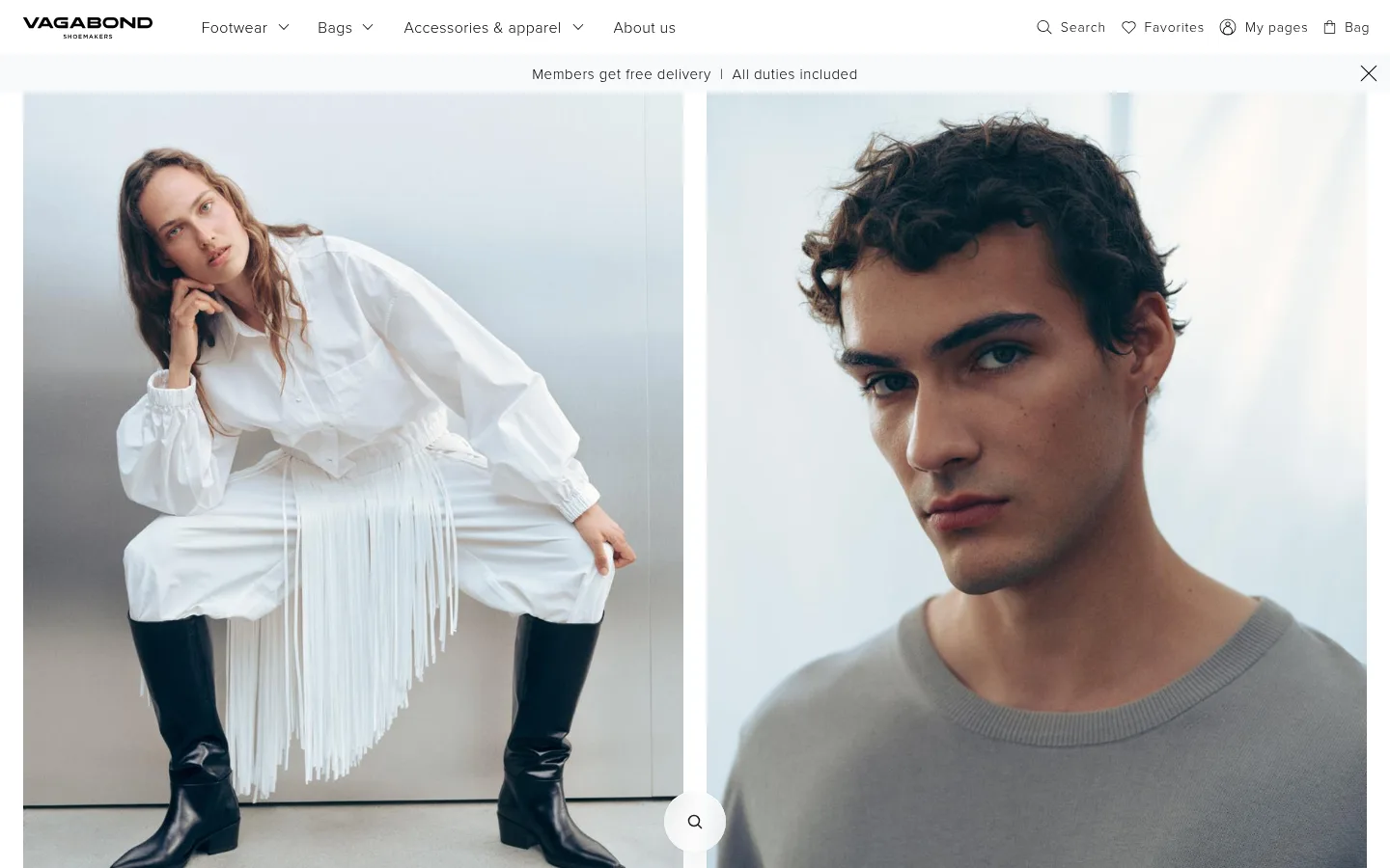
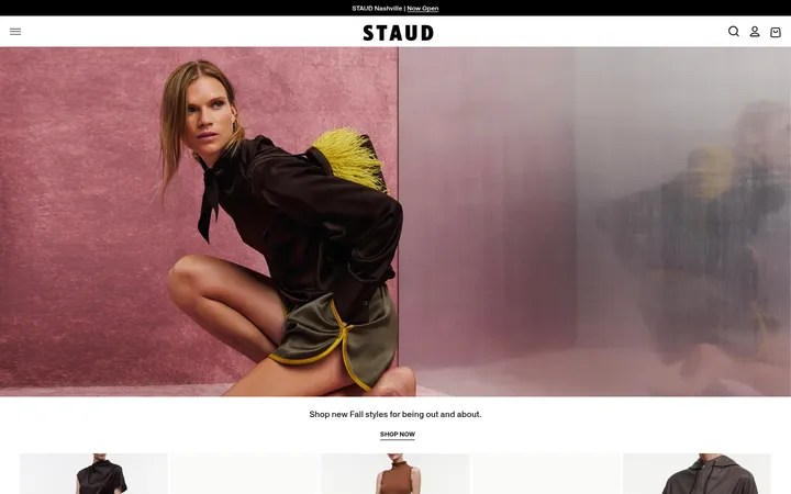
The visual identity is restrained and editorial: black text and navigation sit against white and near-white surfaces, while pale gray provides a cool canvas for product cards. Colorful image pixels belong chiefly to campaign and product photography, not the interface palette. Proxima Nova is used throughout, with light weights and subtle, relatively open tracking for navigation and body copy; headings gain distinction through measured weight and scale rather than decorative styling. The page begins with a broad split campaign image, then alternates centered brand storytelling, craft imagery, edition-led product photography, and smaller collection tiles. Generous whitespace separates these blocks, giving the photography room to carry the mood. Footer columns return to a practical, compact information hierarchy. Borders are fine and pale, controls are quiet, and the overall treatment stays flat, with no prominent decorative shadows.
Site-wide typography for navigation, headings, body copy, links, captions, and buttons.
角色
示例
字号
字重
行高
字距
一级标题
Primary page or campaign heading, when present.
Vagabond
32px
600
1.3
0.019em
二级标题
Section headings for editorial and collection content.
The quick brown fox 敏捷的狐狸
24px
300
1.3
0.05em
三级标题
Supporting subheadings within content blocks.
The quick brown fox 敏捷的狐狸
20px
300
1.5
0.03em
正文
Brand storytelling and descriptive paragraph copy.
The quick brown fox 敏捷的狐狸
16px
300
1.5
0.038em
辅助文字
Small labels beneath campaign and collection imagery.
The quick brown fox 敏捷的狐狸
14px
300
1.29
0.057em
按钮
Quiet account, locale, and action controls.
The quick brown fox 敏捷的狐狸
16px
300
1.5
0.038em
导航
Main category navigation and utility navigation.
The quick brown fox 敏捷的狐狸
16px
300
1.5
0.025em
链接
Editorial calls to action and collection links.
The quick brown fox 敏捷的狐狸
18px
300
1.56
0.022em
间距与布局
基准单位 4px · 密度:适中
48px版块间距
4px元素间距
—卡片内边距
1392px内容最大宽度
2px
4px
6px
7px
8px
12px
15px
16px
20px
24px
32px
Use a full-width editorial canvas with campaign imagery spanning the page, followed by content blocks aligned to a centered site grid. The measured maximum width is 1392px. The homepage uses a two-panel hero, centered copy sections, four-image craft row, paired edition imagery, and smaller collection tiles. Maintain comfortable density and clear whitespace between sections; measured section rhythm is 48px, with a 4px base spacing unit. Footer information resolves into four columns.
圆角与层次
按钮 · 2px
图片 · 50%
inset · button
The page is predominantly flat: white and pale gray surfaces, fine borders, and no noticeable card shadows. A subtle measured inset-and-shadow treatment appears on a button, but it is not a defining visual motif. Separate content through whitespace and image framing rather than stacked panels or pronounced elevation.
组件
下面的预览按实测的按钮、输入框、徽标、卡片样式重建(字体用替代字体)。
Header and navigation
A white, restrained header pairs the black wordmark with lightweight category links and compact search, favorites, account, and bag utilities.
Announcement strip
A narrow, centered delivery-and-duties message sits below navigation, with a simple close control at the far edge.
Split campaign hero
Two large adjacent campaign photographs introduce women’s and men’s shopping paths, with minimal framing and small labels.
Editorial brand block
Centered brand copy and a simple learn-more link sit in a broad white area with generous breathing room.
Craft image row
Four rectangular workshop and process photographs form a compact editorial sequence, each with a small caption.
Edition showcase
A short centered introduction leads into large paired product photographs, followed by smaller collection tiles.
Multi-column footer
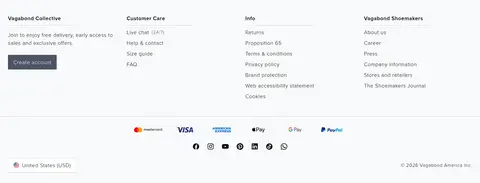
Four compact link columns organize membership, customer care, information, and brand details over a pale surface.
Imagery · Use polished fashion and shoemaking photography rather than illustration or 3D. Campaign images are large, closely framed portraits arranged side by side; product and craft images appear in orderly grids with restrained crops. Keep photography natural and cool-toned, letting garments, shoes, people, and workshop details provide the page’s color. Avoid heavy overlays or decorative image treatments.
Let fashion photography dominate the first viewport.
Keep interface text black on quiet white or pale gray surfaces.
Use Proxima Nova-style sans-serif typography with light weights.
Give editorial copy generous whitespace and restrained alignment.
Build collection browsing from clean image grids and concise labels.
Use pale hairlines and minimal control framing.
✕ 不该做
Do not add saturated brand accents absent from the measured palette.
Do not place large text overlays across campaign photography.
Do not use heavy shadows, gradients, or prominent rounded cards.
Do not crowd navigation or editorial content.
Do not treat photo colors as interface tokens.
Do not turn understated labels into bold, all-caps display text.
给 AI 的提示词
想快速出一个同风格的新页面,把这段话连同 DESIGN.md 一起发给 AI。
Build a new fashion-commerce page in Vagabond’s restrained Scandinavian editorial style. Use Gallery White (#ffffff) as the main surface, Soft Ink (#000000) for navigation and text, Cool Mist (#e9ecef) for quiet canvas or product-card areas, Porcelain (#f8f9fa) for secondary surfaces, and Quiet Line (#ced4da) for subtle borders. Keep Slate Text (#343a40) rare. Use a Proxima Nova-like sans serif, mostly light weights with gently open tracking. Organize the page around large, natural fashion photography, clear category paths, centered editorial copy, and orderly product imagery. Keep spacing generous, content hierarchy simple, and controls understated. Prefer flat surfaces and hairlines over shadows or decoration; let the photography supply most visual color.