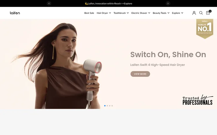
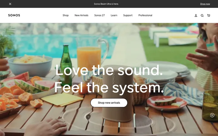
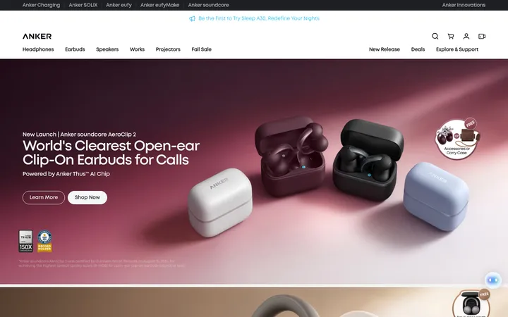
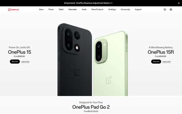
North star · Let the product imagery carry the emotion; keep typography, color, and interface chrome quiet and precise.
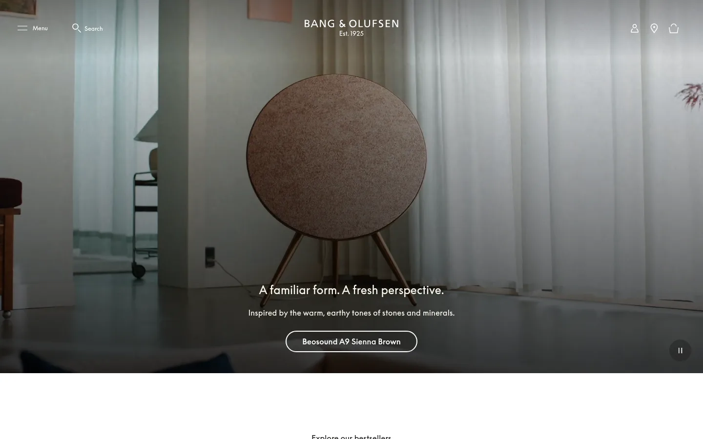
The visual strategy is built around contrast between immersive imagery and an exceptionally quiet interface. A white canvas carries most of the page, leaving product photography and lifestyle video to supply warmth, texture, and color; the dark hero uses a subtle black overlay so centered white copy and navigation remain legible. Near-black ink anchors headings and interface text, while muted gray supports product names and links. A saturated blue marks the community and footer as a distinct closing band rather than a general-purpose accent. BeoSupreme is used throughout, with regular-weight editorial headings and slightly tracked body copy; uppercase, widely tracked eyebrow text provides a restrained label style. The page alternates full-bleed media with open two-column stories and a broad bestseller lineup. Generous section breathing room, minimal borders, and pill-shaped outlined or dark buttons keep the presentation refined rather than decorative.
Site-wide font for headings, body copy, navigation, buttons, captions, links, and eyebrow labels.
角色
示例
字号
字重
行高
字距
一级标题
Centered hero statement over lifestyle footage.
Bang & Olufsen
36px
400
1.5
-0.014em
二级标题
Section titles for bestsellers, editorial features, and promotions.
The quick brown fox 敏捷的狐狸
24px
400
1.5
0
正文
Product descriptions, supporting editorial copy, and newsletter text.
The quick brown fox 敏捷的狐狸
16px
400
1.63
0.013em
辅助文字
Small supporting labels and compact secondary details.
The quick brown fox 敏捷的狐狸
12px
400
1.67
0.008em
按钮
Primary and secondary CTA labels, including outlined hero controls.
The quick brown fox 敏捷的狐狸
16px
500
1.5
0.006em
导航
Menu, search, and account or shopping utility labels.
The quick brown fox 敏捷的狐狸
16px
400
1.63
0.013em
链接
Compact inline editorial or footer links.
The quick brown fox 敏捷的狐狸
12px
400
1.15
0
眉题
Uppercase section or campaign label with wide tracking.
The quick brown fox 敏捷的狐狸
14px
400
1.43
0.143em
间距与布局
基准单位 8px · 密度:适中
60px版块间距
8px元素间距
—卡片内边距
1392px内容最大宽度
1px
4px
5px
6px
8px
14px
16px
24px
32px
36px
40px
48px
50px
56px
60px
64px
The page uses a wide desktop composition, with a measured maximum content width of 1392px and a comfortable density. A full-bleed video leads, followed by an eight-item bestseller row and alternating two-column editorial features, then a blue community band and footer. Section boundaries are expressed through generous vertical breathing room rather than rules or card framing. Headings are often centered for campaign and grid sections, while story modules align text to the start. Preserve the shift from immersive, edge-to-edge media to spacious, contained product content.
圆角与层次
按钮 · 9999px
没有测到阴影:页面是扁平的,层次靠底色和描边区分。
The page is essentially flat: measured styles show no shadows, and most product cards have no visible border or radius. Separate content with whitespace and image composition rather than elevated panels. Reserve thin borders for controls when needed, and use pill-shaped CTA outlines or fills as explicit interaction affordances.
组件
下面的预览按实测的按钮、输入框、徽标、卡片样式重建(字体用替代字体)。
Immersive hero
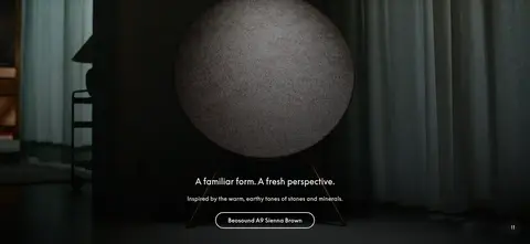
Full-bleed lifestyle video with a darkened lower image area, centered white campaign copy, and a white outlined pill CTA.
Utility navigation
Minimal overlaid menu and search controls at left, centered wordmark, and compact account, location, and basket icons at right.
Bestseller lineup
A centered section heading above eight open product entries, with product imagery, muted names, and pricing.
Editorial feature
Open two-column storytelling pairs product or artwork imagery with a regular-weight title, short copy, and restrained link.
Pill CTA
Rounded capsule action with measured 40px radius; use a thin white outline over media or a dark fill with warm-white text.
Blue newsletter and footer
A strong cobalt closing band combines community messaging and signup inputs with compact service and policy link columns.
Imagery · Lifestyle video and product photography are the primary visual content, showing speakers in considered interiors and highlighting sculptural silhouettes, materials, and color finishes. The hero image spans the viewport and receives a dark gradient for readable centered text. Product and editorial images sit in open layouts with little decorative framing. Treat imagery as the source of texture and mood; the palette data from photographed objects should not be mistaken for interface colors.
Separate sections with whitespace rather than boxes.
✕ 不该做
Do not add generic colored section bands.
Do not apply shadows to product cards.
Do not crowd full-bleed imagery with interface chrome.
Do not treat image colors as brand palette tokens.
Do not use heavy display type or bold all-caps headings.
Do not turn every link or button cobalt.
Do not outline every content block.
给 AI 的提示词
想快速出一个同风格的新页面,把这段话连同 DESIGN.md 一起发给 AI。
Build a new premium product page in the Bang & Olufsen visual style. Use Gallery White (#ffffff) as the main canvas, Soft Charcoal (#191817) for primary text and dark controls, Muted Graphite (#555555) for secondary links, and Warm Porcelain (#fcfaee) for text on dark surfaces. Keep Signal Cobalt (#060daa) for a deliberate community or closing band. Use a BeoSupreme-like clean sans serif, regular-weight editorial headings, lightly tracked body copy, and widely tracked uppercase eyebrow labels. Create a spacious wide layout, alternating full-bleed lifestyle media with open two-column product storytelling and unboxed product listings. Keep imagery richly atmospheric but interface chrome minimal. Use subtle dark overlays behind white hero copy, flat surfaces, almost no borders, and rounded capsule CTAs. Avoid shadows, busy decoration, and extra palette colors.