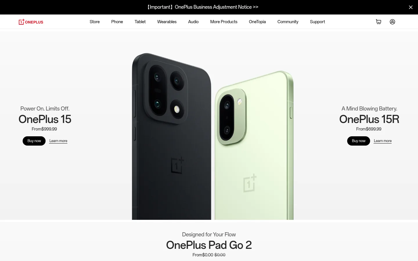
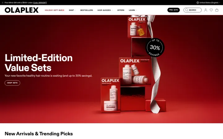
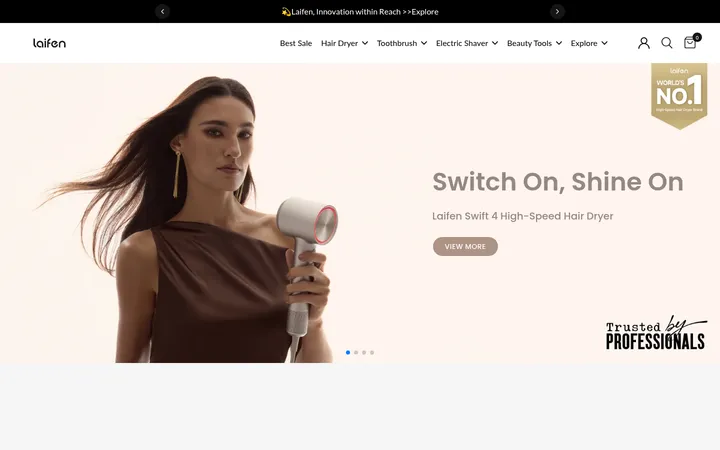
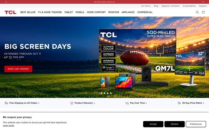
North star · Keep interface elements quiet and let large, cleanly framed product imagery lead each section.
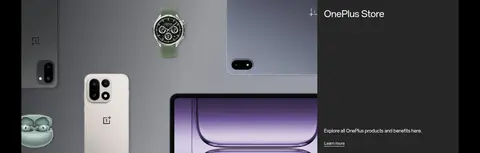
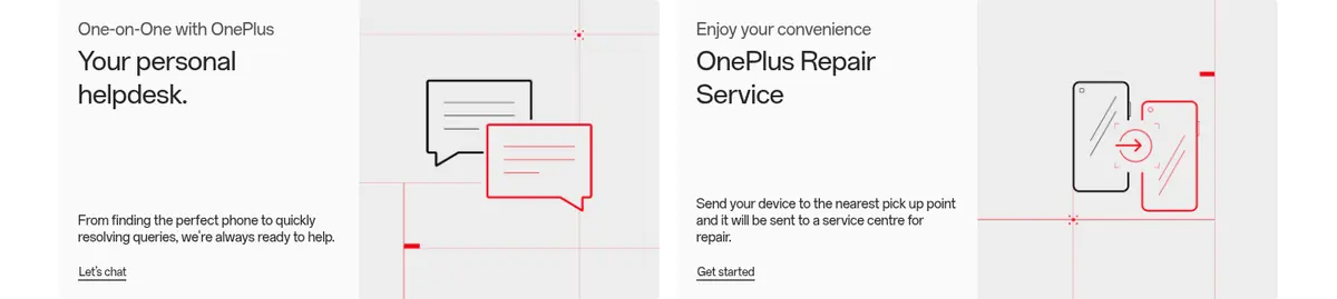
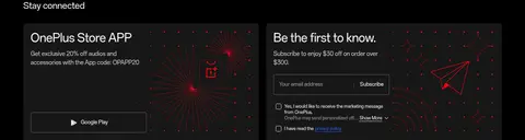
The page uses a mostly white canvas, crisp near-black text, and black pill-shaped purchase buttons to keep attention on product launches rather than interface chrome. Pale neutral tones appear in subtle section bands and media backdrops, while dark full-width areas mark community and newsletter content. OnePlus Sans carries navigation, product names, prices, and supporting copy in a clean, compact sans-serif voice; headings are regular-weight and product titles gain prominence through scale and placement rather than decorative typography. The layout alternates between full-bleed hero imagery with copy at the edges, centered single-product showcases, and multi-column accessory cards. Lower editorial and support blocks use split layouts, while the footer returns to a dense dark surface. Large, carefully framed device photography supplies most of the color and texture. Spacing is compact but sections remain visually distinct through broad media areas and clear shifts in background tone.
Primary family for navigation, product headings, prices, descriptions, links, captions, and buttons.
Aa 设计
OnePlus Sans Medium
网络字体 · 字重 400 · 占比 4%
免费替代:Inter
Secondary measured family used for selected headings.
角色
示例
字号
字重
行高
字距
一级标题
Primary campaign and hero product title.
OnePlus
40px
400
1.2
0
二级标题
Section-level feature and editorial heading.
OnePlus
36px
400
1.19
0
三级标题
Secondary product and content-card heading.
OnePlus
32px
400
1.25
0
四级标题
Smaller feature, service, and support heading.
OnePlus
28px
400
1.29
0
正文
Prices, descriptions, supporting copy, and card content.
The quick brown fox 敏捷的狐狸
14px
400
1.29
0
辅助文字
Fine print, labels, and compact secondary details.
The quick brown fox 敏捷的狐狸
12px
400
normal
0
按钮
Purchase and other short action labels.
The quick brown fox 敏捷的狐狸
14px
400
normal
0
导航
Compact global navigation and product navigation.
The quick brown fox 敏捷的狐狸
12px
400
normal
0
链接
Inline calls to action and supporting navigation links.
The quick brown fox 敏捷的狐狸
16px
400
1.5
0
间距与布局
基准单位 4px · 密度:紧凑
32px版块间距
12px元素间距
—卡片内边距
1312px内容最大宽度
2px
4px
8px
12px
16px
20px
24px
32px
64px
Use the measured 1312px page maximum as the desktop content boundary, with compact overall density and a 4px-based spacing scale. The homepage alternates full-width product campaigns, centered single-product presentations, and multi-column accessory cards. Editorial, support, and community content shifts to two-column splits. The measured section gap is 32px and the element gap is 12px; use the larger measured spacing steps to give full-bleed media room. Keep headings and copy aligned to the content of each block rather than forcing a single page-wide alignment.
圆角与层次
按钮 · 9999px
卡片 · 4px
链接 · 4px
没有测到阴影:页面是扁平的,层次靠底色和描边区分。
The measured interface has no shadows. Favor flat surfaces and clear tonal separation: bright white shopping areas, dark full-width community and footer sections, and restrained pale media backdrops. Use fine borders on selected secondary controls rather than adding card shadows. Cards are measured with a 4px radius; purchase buttons use pill shapes.
组件
下面的预览按实测的按钮、输入框、徽标、卡片样式重建(字体用替代字体)。
Product hero
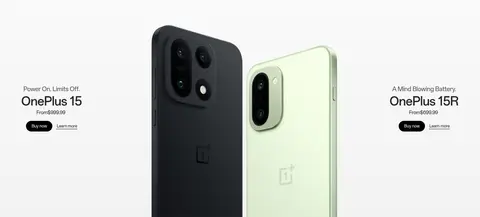
Pair a product campaign and compact price/action copy with oversized full-bleed device imagery; the opening showcase places copy on both sides of the featured phones.
Buy now button
Black pill-shaped action with white text; measured at 12px OnePlus Sans Regular, medium weight, with horizontal padding of 16px.
Text link
Use a restrained, typically underlined or inline link treatment instead of a filled button for secondary actions such as Learn more.
Accessory card
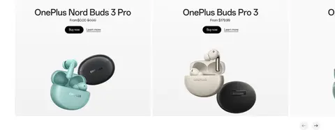
Arrange products in a multi-column row with a small title and purchase details above product imagery; cards use a measured 4px radius.
Support control
Secondary outlined pill control with a 1px #dddddd border and horizontal padding of 24px; retain a lightweight text treatment.
Dark content band
Set community, newsletter, and footer content on black, with light text and media-led panels or compact link groups.
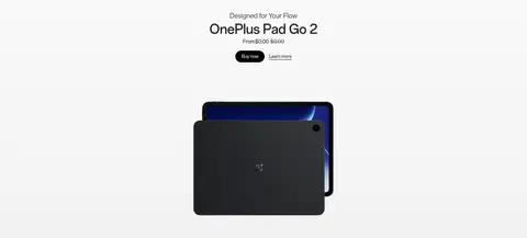
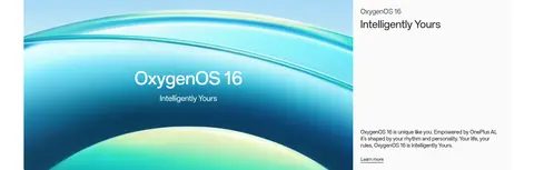
Imagery · Large product photography and rendered device images are the main visual feature: phones dominate the opening hero, followed by a tablet showcase and accessory cards. Use clean studio-like framing, uncluttered backgrounds, and generous image areas. Lower sections mix product montages with community artwork, a photography-award visual, and branded software graphics. These vivid colors belong primarily to image assets; keep the surrounding interface neutral.
Reserve Carbon Black for primary purchase actions and intentional dark bands.
Give product photography the largest visual area in product sections.
Use OnePlus Sans or a close neutral sans-serif substitute.
Keep secondary actions visually quieter than purchase buttons.
Separate major content groups with background changes and section rhythm.
✕ 不该做
Do not add shadows to cards or buttons.
Do not make Signal Cyan the dominant page accent.
Do not surround every product image with a heavy card treatment.
Do not use decorative display type or all-caps styling.
Do not compete with imagery using dense interface ornament.
Do not apply dark backgrounds to every section.
给 AI 的提示词
想快速出一个同风格的新页面,把这段话连同 DESIGN.md 一起发给 AI。
Build a new OnePlus-style consumer electronics page with a quiet, product-first visual hierarchy. Use Gallery White (#ffffff) as the main canvas, Graphite Ink (#252525) for text, and Carbon Black (#000000) for primary pill buttons and a few deliberate dark content bands. Use Soft Ash (#f2f2f2) and Quiet Gray (#8c8c8c) only for muted details; Signal Cyan (#0099cc) should remain rare. Set type in OnePlus Sans or Inter, favoring regular weights and compact navigation. Organize content into broad image-led product campaigns, simple product grids, and occasional two-column editorial or support sections. Keep cards flat, add only measured subtle borders such as Border Mist (#dddddd), and avoid shadows. Give product imagery more visual weight than interface decoration, and use clear tonal transitions to pace a long page.