North star · Keep the shopping interface quiet and consistent, then let large, immersive product imagery carry the visual impact.
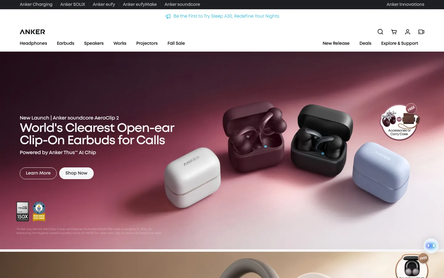
The page uses a cool, near-white canvas and near-black typography to keep a long retail homepage calm and legible. Bright cyan is reserved for selected links, announcement details, and the newsletter action rather than applied as a broad background. The hero banners break the neutral frame with full-bleed campaign photography: product renders sit against richly colored scenes, while lower sections return to pale surfaces and compact card grids. MontForAnker supplies a rounded geometric sans look; bold headings use tight tracking, with the same family carrying navigation, product labels, and controls. Layout alternates wide campaign panels with category tiles, product cards, editorial imagery, and service information. Generous separation between major groups offsets the denser shopping grids. Cards and buttons use soft rounded shapes; borders and shadows remain understated, letting imagery provide most of the depth.
Site-wide headings, body copy, navigation, product cards, links, and buttons.
角色
示例
字号
字重
行高
字距
一级标题
Primary campaign headline in the large product hero.
soundcore
48px
700
1.1
-0.04em
二级标题
Major section headings for category and editorial groups.
soundcore
40px
700
1
-0.04em
三级标题
Product, feature, and card titles within shopping sections.
soundcore
32px
700
1.2
-0.04em
四级标题
Supporting headings in service and membership content.
The quick brown fox 敏捷的狐狸
24px
700
1.5
-0.02em
正文
Descriptions, campaign supporting copy, and general storefront text.
The quick brown fox 敏捷的狐狸
16px
700
1.4
-0.02em
辅助文字
Compact product notes, metadata, and secondary card details.
The quick brown fox 敏捷的狐狸
14px
700
1.5
-0.02em
按钮
Shop Now, Learn More, Subscribe, and other action labels.
The quick brown fox 敏捷的狐狸
14px
700
1.2
0
导航
Header navigation and product-category menu labels.
The quick brown fox 敏捷的狐狸
14px
700
1.4
-0.02em
链接
Small supporting links and inline promotional references.
The quick brown fox 敏捷的狐狸
12px
700
1.5
-0.02em
间距与布局
基准单位 4px · 密度:适中
72px版块间距
8px元素间距
24px卡片内边距
1312px内容最大宽度
4px
8px
10px
11px
12px
16px
20px
24px
32px
40px
64px
A full-width storefront moves from a compact multi-row header into stacked, edge-to-edge campaign banners, then into centered content groups. The measured content reaches a 1312px maximum width, with flexible multi-column product and category grids. Headings are predominantly left-aligned. Large gaps between major sections create a comfortable rhythm, while card collections are denser and consistently aligned. The page alternates broad imagery, smaller shopping grids, editorial panels, and service or membership blocks.
圆角与层次
按钮 · 9999px
输入框 · 8px
卡片 · 16px
链接 · 9999px
md · button
The interface is mostly flat: pale backgrounds, restrained borders, and clear surface changes do most of the separation. Rounded cards and buttons create soft silhouettes, with a measured medium shadow used sparingly on buttons. Hero depth comes from photographic lighting and layered product renders, not interface shadows.
组件
下面的预览按实测的按钮、输入框、徽标、卡片样式重建(字体用替代字体)。
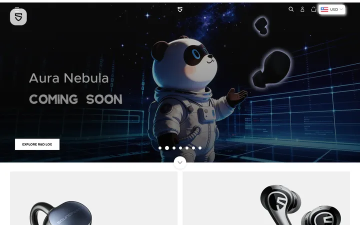
Campaign hero
Full-bleed product campaign with left-aligned launch copy, supporting text, promotional links, and product imagery across a richly colored scene.
Pill CTA
Rounded Shop Now and Subscribe controls; pale or dark Shop Now variants contrast with dark text or white labels, while Subscribe uses #17bbef.
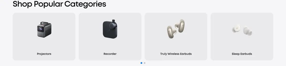
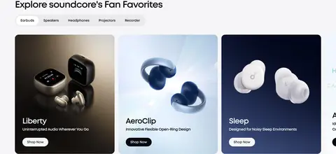
Category tiles
Compact image-led category cards arranged in a multi-column row on the pale canvas, using softly rounded surfaces.
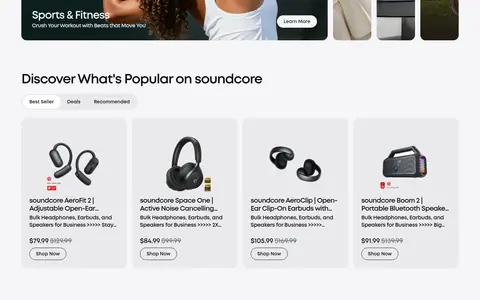
Product cards
Shopping cards combine product photography, concise product names and descriptions, pricing, and a rounded action button.
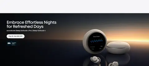
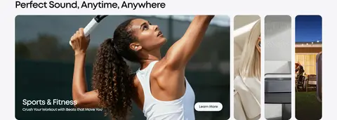
Editorial feature cards
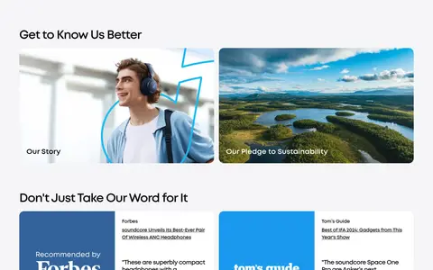
Large lifestyle or product image panels pair a short headline and supporting copy with a clear Learn More or Shop Now action.
Service cards
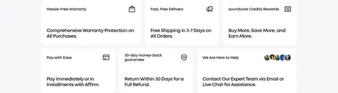
White rounded information cards present warranty, shipping, rewards, and related purchase support details.
Newsletter footer
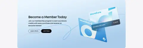
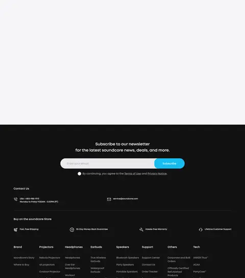
A dark footer block centers a subscription message and email field, with a cyan Subscribe action and supporting store links below.
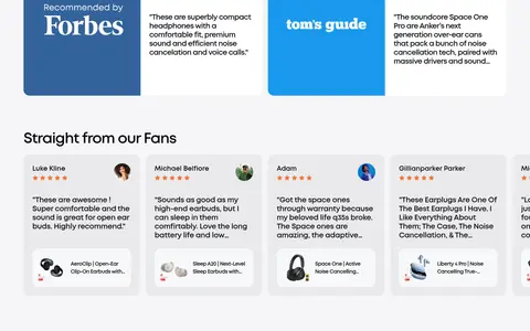
Imagery · Product renders and lifestyle photography dominate. Hero campaign images run edge to edge and use richly colored, sometimes cinematic backdrops, while shopping cards crop imagery to fit rounded panels. Lower editorial areas include lifestyle scenes, press references, and customer reviews; embedded video is also present. Keep product imagery prominent and avoid decorative effects that compete with it.
Let full-bleed campaign photography lead the hero.
Use bold, tightly tracked MontForAnker-style headlines.
Keep shopping cards rounded and image-forward.
Separate major content groups with generous breathing room.
✕ 不该做
Do not turn the entire interface cyan.
Do not add gradients to neutral interface surfaces.
Do not crowd the hero with extra controls.
Do not rely on heavy shadows for card separation.
Do not force headings or navigation into uppercase.
Do not confuse colors found inside campaign imagery with interface palette.
给 AI 的提示词
想快速出一个同风格的新页面,把这段话连同 DESIGN.md 一起发给 AI。
Build a new soundcore storefront page with a calm, product-first interface. Use Gallery Mist (#f5f5f7) as the main canvas, Midnight Ink (#080a0f) for primary text, Soft Alloy (#eaeaec) for subtle card and input surfaces, and Signal Cyan (#17bbef) sparingly for links and primary subscription actions. Set a MontForAnker-like geometric sans, with bold, tightly tracked headings and compact navigation. Start with a clear header and a wide, edge-to-edge product campaign image; follow with left-aligned section headings and orderly category or product grids. Keep buttons pill-shaped and cards softly rounded, with restrained borders and little shadow. Use real product and lifestyle imagery for impact, not decorative interface gradients. Maintain generous spacing between sections and denser, consistent alignment inside shopping grids.