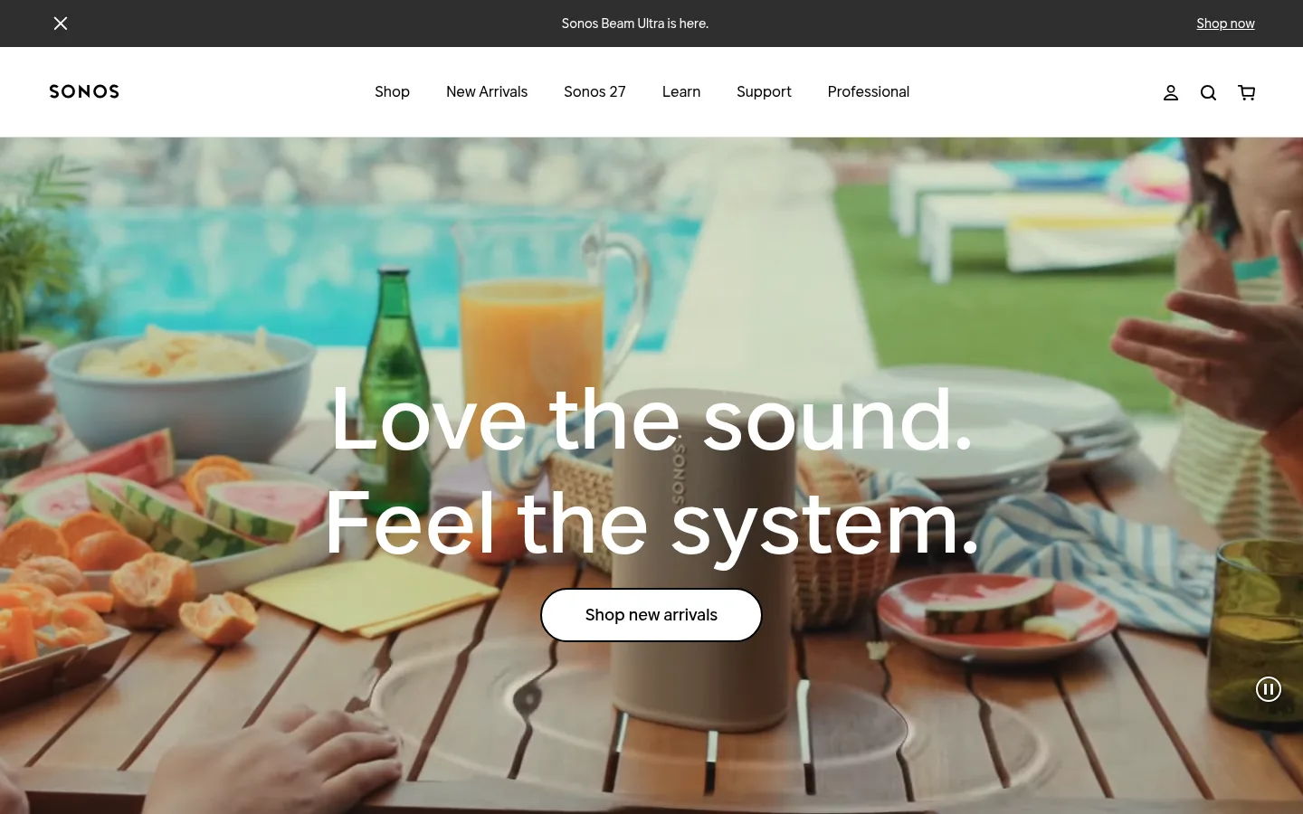
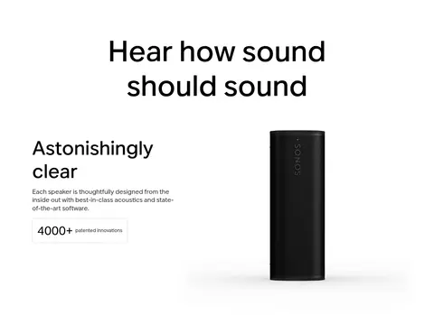
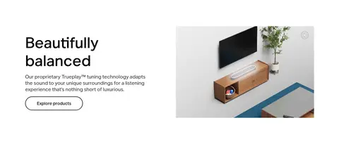
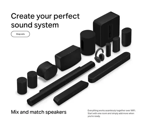
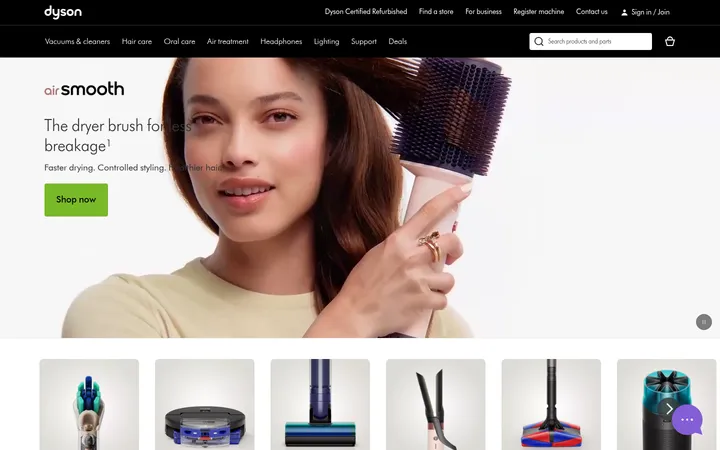
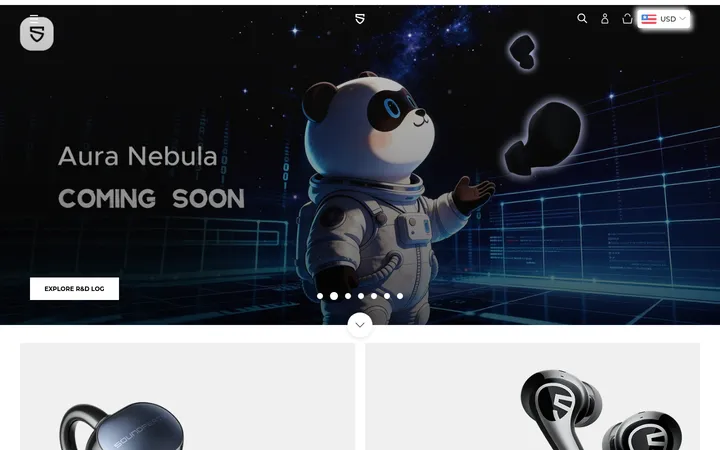
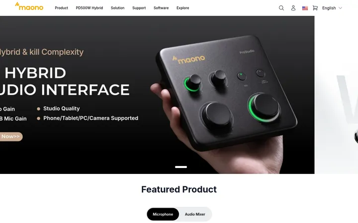
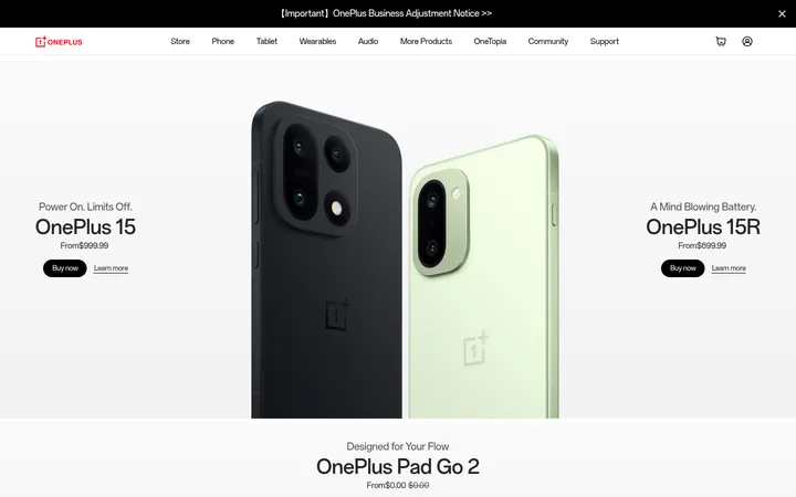
North star · Keep the interface nearly monochrome and spacious so product imagery and human listening scenes provide the color and emotion.
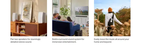
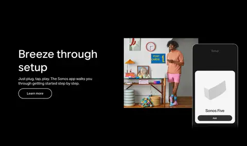
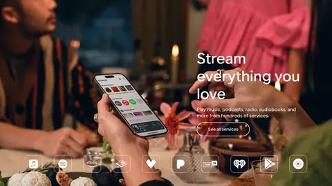
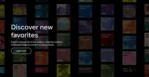
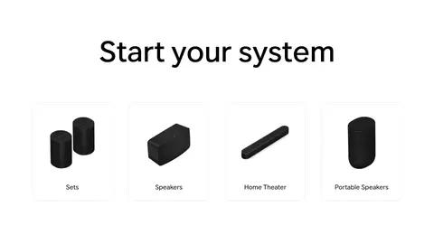
Sonos uses a restrained monochrome interface to let its sound products and lifestyle media carry the visual character. White is the primary canvas through the shopping and product-education sections; black anchors a long, immersive app-and-services sequence, while charcoal distinguishes the announcement strip and footer. Pale gray appears in restrained supporting surfaces, with fine gray borders defining product cards rather than heavy shadows. Aktiv Grotesk supplies a consistent voice: large, medium-weight headlines sit apart from compact, readable supporting copy, and navigation remains quiet. The layout alternates centered statements, split editorial features, product-led galleries, and full-bleed video. Generous whitespace gives individual products room to read clearly, while rounded cards and pill-shaped outlined controls soften the otherwise precise grid. Real home and listening scenes bring color and human context; imagery colors are content, not a competing UI palette. The page shifts from bright product discovery to a cinematic dark experience, then returns to a clean category grid and practical footer.
Display and headings, body copy, navigation, links, captions, and buttons throughout the page.
角色
示例
字号
字重
行高
字距
特大标题
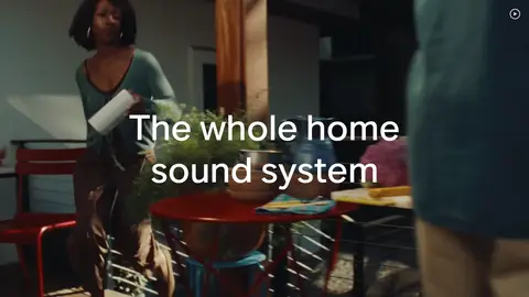
Oversized campaign headline over the opening lifestyle video.
Sonos
96px
500
1.2
0
一级标题
Primary page or major campaign headline.
Sonos
72px
500
1.2
0
二级标题
Section titles such as product education and category introductions.
Sonos
64px
500
1.2
0
三级标题
Feature and editorial block headings.
Sonos
48px
500
1.2
0
四级标题
Smaller prominent feature or card headings.
Sonos
42px
500
1
0
正文
Standard explanatory copy alongside products and imagery.
The quick brown fox 敏捷的狐狸
18px
400
1.4
0
辅助文字
Compact product, testimonial, and card captions.
The quick brown fox 敏捷的狐狸
14px
400
1.43
0.014em
按钮
Pill CTA labels such as Shop new arrivals.
The quick brown fox 敏捷的狐狸
18px
500
1.3
0
导航
Announcement and main navigation labels.
The quick brown fox 敏捷的狐狸
16px
400
1.3
0
链接
Inline secondary actions such as Learn more.
The quick brown fox 敏捷的狐狸
18px
400
normal
0
间距与布局
基准单位 8px · 密度:宽松
107px版块间距
6px元素间距
8px卡片内边距
1227px内容最大宽度
4px
6px
8px
12px
16px
20px
24px
32px
48px
53px
56px
80px
107px
112px
Use a spacious, responsive editorial grid, with content constrained to the measured 1227px maximum width and select media spanning the viewport. Alternate centered statements with two-column feature splits, image-led galleries, and immersive full-bleed media. The measured section rhythm is generous, with 107px section gaps and a sparse overall density; keep supporting copy short and visually subordinate. Align product and editorial content to clear edges, while centering headline-led moments and the category section.
圆角与层次
按钮 · 9999px
卡片 · 20px
图片 · 24px
导航 · 9999px
inset · button
inset · nav
The page is predominantly flat: white and black section bands do most of the grouping. Use measured hairline borders for cards and navigation separation rather than pronounced shadows. Card corners are rounded, media is softer still, and pill controls are outlined; retain only the subtle inset treatment where buttons require it.
组件
下面的预览按实测的按钮、输入框、徽标、卡片样式重建(字体用替代字体)。
Announcement bar
Slim charcoal strip above the white navigation, with a centered launch message and a right-aligned Shop now link.
Main navigation
White header with Sonos mark at left, centered category links, and compact account, search, and cart icons at right; use a fine lower divider.
Outlined pill CTA
Transparent button with a 2px black or white outline, 9999px radius, 16px 48px padding, and 18px medium Aktiv Grotesk label.
Feature split
Pair a product or lifestyle image with a concise heading, short explanatory copy, and optional secondary link or outlined CTA.
Product card
Image-forward card with a white or pale setting, 20px corners, a 1px #e0e0e0 border, and restrained captioning.
Immersive media band
Full-width lifestyle video or image, with readable white text placed over darker content where needed.
Category tile
Four-column white product category grid with centered product image and compact category label.
Newsletter footer
Charcoal footer block with signup headline, short description, email field, subscription action, and dense link groups.
Imagery · Favor cinematic lifestyle video, candid home scenes, and high-quality photography of people listening or using the app. Set isolated speakers and soundbars against clean, pale backgrounds so their dark forms read clearly. Use rounded media frames for editorial cards and allow selected video and image bands to run full bleed. Keep product renderings and photography sharp, realistic, and uncluttered; their varied colors belong to the imagery rather than the interface palette.
Keep the interface palette monochrome and measured.
Let lifestyle photography supply most color.
Use generous whitespace around products and headings.
Alternate split editorial blocks with immersive media.
Use outlined pill controls for primary actions.
Keep copy concise beside product imagery.
✕ 不该做
Do not add bright UI accents absent from the measured palette.
Do not crowd product photography with decorative elements.
Do not use heavy drop shadows for ordinary cards.
Do not make every section full bleed or dark.
Do not replace the clean grid with dense dashboard layouts.
Do not treat image colors as brand interface colors.
给 AI 的提示词
想快速出一个同风格的新页面,把这段话连同 DESIGN.md 一起发给 AI。
Build a new Sonos-style storefront page with a clean, spacious editorial rhythm. Use Gallery White (#ffffff) for the main shopping canvas, Speaker Black (#000000) for text and selected immersive bands, and Charcoal Note (#2e2e2e) for announcement or footer surfaces. Keep Soft Mist (#f5f5f5) and Quiet Line (#e0e0e0) subtle. Use Aktiv Grotesk or Inter, with confident medium-weight headlines and readable regular body copy. Compose alternating centered headlines, split feature blocks, product galleries, and occasional full-bleed lifestyle video. Product imagery should feel realistic and uncluttered; let it introduce color. Use fine borders, rounded media and cards, and outlined pill CTAs. Preserve generous whitespace, clear product hierarchy, restrained navigation, and concise action labels.