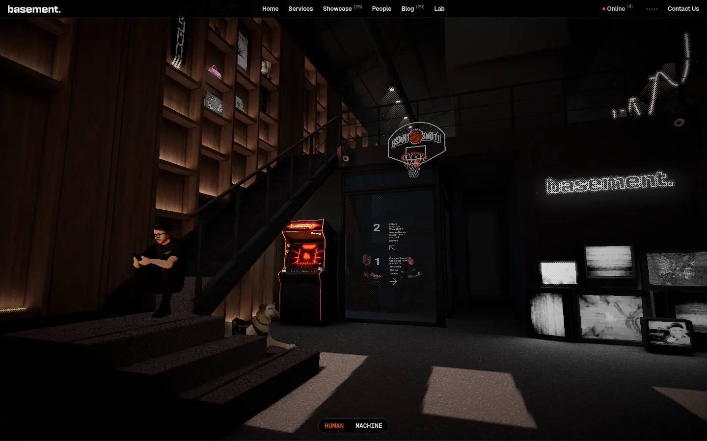
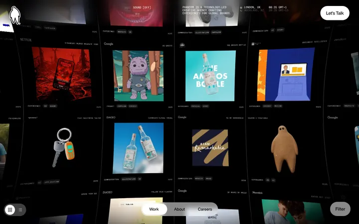
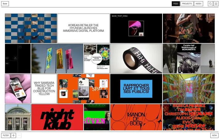
North star · Keep the interface nearly monochrome and let oversized type and vivid, carefully framed project work provide the contrast.
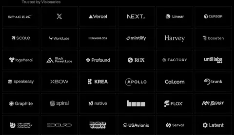
The page is built on a continuous #000000 canvas, with no contrasting section bands; the dark environment gives the work imagery room to shift from warm studio photography to bright campaign graphics. Text alternates between #e6e6e6 for emphatic headings and key links, and softer #c4c4c4 or #757575 for supporting copy and labels. Geist is used throughout, with heavy weights, compressed line heights, and tight negative tracking in large display statements. A small, discreet navigation sits above an immersive full-bleed opening image; below it, editorial text, a dense client-logo matrix, and project rows create changing rhythms without changing the canvas. Thin #454545 rules define logo cells and media edges rather than enclosing elevated cards. Spacious gaps separate major content areas, while the capability columns and footer become compact and information-rich. Project artwork supplies the page’s strongest color, treated as content rather than brand palette.
Site-wide navigation, display headings, body copy, labels, and links.
角色
示例
字号
字重
行高
字距
特大标题
Oversized editorial statements, including the capabilities introduction.
basement.studio
87px
600
0.9
-0.04em
一级标题
Primary headline introducing the digital studio.
basement.studio
76px
600
0.89
-0.04em
二级标题
Major section headings such as Featured Projects.
basement.studio
38px
600
0.89
-0.04em
三级标题
Service and capability column headings.
The quick brown fox 敏捷的狐狸
24px
600
1
-0.03em
正文
Project descriptions, introductory copy, and contact statements.
The quick brown fox 敏捷的狐狸
20px
600
1
-0.02em
辅助文字
Small service tags and supporting labels.
The quick brown fox 敏捷的狐狸
13px
600
1.23
0
导航
Compact primary and footer navigation links.
The quick brown fox 敏捷的狐狸
12px
600
1.33
0
代码
Uppercase compact metadata or technical labels.
const style = 1;
13px
600
1.23
0
间距与布局
基准单位 4px · 密度:宽松
128px版块间距
4px元素间距
—卡片内边距
1408px内容最大宽度
2px
4px
5px
6px
8px
12px
16px
20px
24px
The measured page max width is 1408px, with a spacious section rhythm and a single continuous dark canvas. The hero opens with full-bleed media; subsequent blocks use left-aligned editorial headings, a six-column client-logo grid, then project rows that alternate between media and copy arrangements. Capability content forms four compact columns, while contact and footer content shift back to broad, open compositions. Overall density moves from immersive and spacious to tightly packed in the logo grid and footer.
圆角与层次
导航 · 9999px
没有测到阴影:页面是扁平的,层次靠底色和描边区分。
The interface is predominantly flat: black canvas, text, and media do the work without measured shadows. Thin graphite rules separate logo tiles and media edges. Small dark badge fills and the newsletter field provide limited surface contrast; keep them visually flush with surrounding content rather than turning them into raised cards.
组件
下面的预览按实测的按钮、输入框、徽标、卡片样式重建(字体用替代字体)。
Top navigation
Compact horizontal navigation over the opening scene; small Geist labels use light text, with the brand mark aligned at the left.
Hero media
Full-bleed cinematic studio image beneath the navigation, with a small centered Human/Machine selector near the bottom.
Client logo grid
Six-column matrix of client marks in individual dark cells, separated by fine #454545 rules.
Project rows
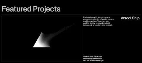
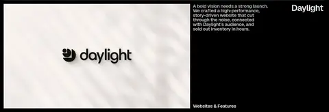
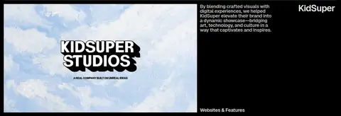
Large rectangular case-study media paired with concise descriptions, category labels, and prominent client names.
Capability columns
Four compact service columns with bold headings, short descriptions, and small muted service tags.
Contact statement
Oversized invitation and email link on the black canvas, with minimal surrounding interface.
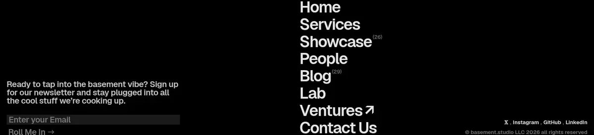
Newsletter footer
Email input in #1a1a1a, compact signup action, and a concentrated stack of navigation links.
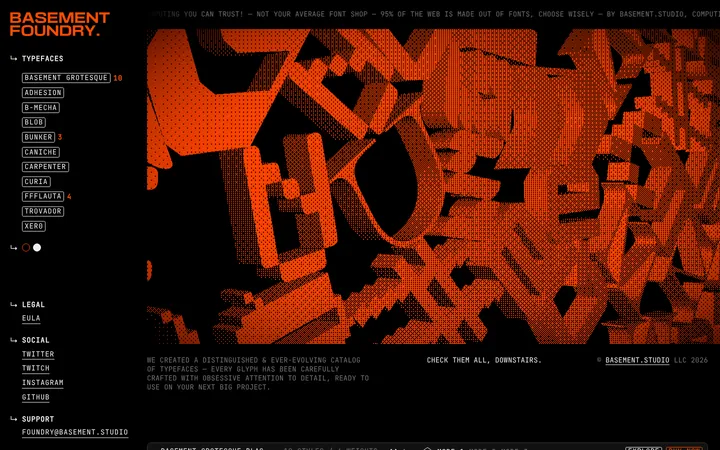
Imagery · The opening viewport is dominated by a dark, cinematic studio interior, framed edge to edge beneath the navigation. Project media varies deliberately: abstract monochrome visuals sit alongside bright, branded campaign artwork. Keep imagery large and rectangular, with thin borders where measured, and avoid adding decorative overlays or unrelated illustration. The vivid colors belong to client work, not the core brand palette.
Use #c4c4c4 and #757575 to establish copy hierarchy.
Let client imagery provide the strongest color.
Separate media and logo cells with fine #454545 rules.
Use bold Geist with tight tracking for large statements.
✕ 不该做
Do not add bright brand accent colors to the interface.
Do not alternate contrasting section background bands.
Do not turn every content group into a raised card.
Do not crowd the hero with explanatory interface elements.
Do not make muted copy as bright as primary headlines.
Do not mistake colorful project artwork for the site palette.
给 AI 的提示词
想快速出一个同风格的新页面,把这段话连同 DESIGN.md 一起发给 AI。
Build a new page in the basement.studio visual language: use Basement Black (#000000) as a continuous canvas, Studio White (#e6e6e6) for primary statements, and Soft Concrete (#c4c4c4) for secondary copy. Use Geist or a close sans-serif substitute, favoring bold weights, tight tracking, and compact line heights in large editorial headings. Keep navigation small and discreet. Organize content into broad sections with generous separation, then introduce denser grids or columns where useful. Frame client and project media with fine Graphite Rule (#454545) lines rather than elevated cards. Use Input Charcoal (#1a1a1a) only for a practical input surface and Badge Slate (#2e2e2e) for small labels. Let imagery carry its own color; do not add a competing accent palette.