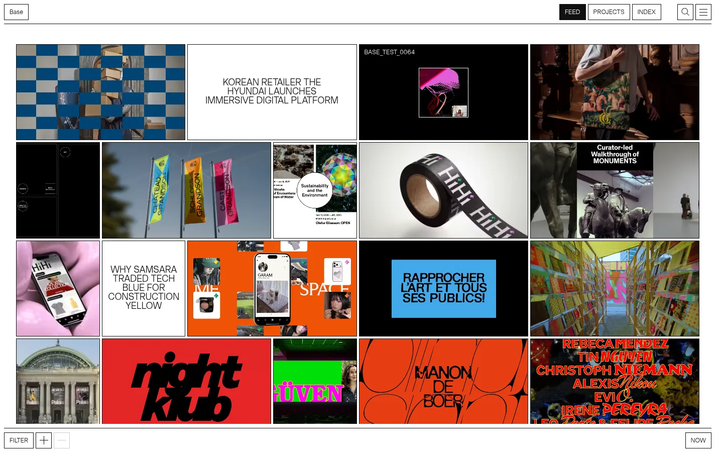
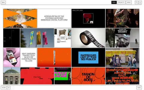
Base Design 首页以密集、可持续浏览的项目流展示品牌与数字设计作品。克制的黑白界面将色彩与视觉个性留给风格各异的项目内容。
North star · Keep the interface monochrome and sharply gridded so each project’s own visual identity becomes the page’s accent.
The page uses a restrained interface palette: white canvas, near-black type and rules, pale gray panels, and occasional black media tiles. Most of the screenshot’s vivid colours come from project artwork and photography, not the site chrome; keep them within the individual feed tiles rather than turning them into global accents. Lightweight uppercase Base Grotesk gives navigation, labels, and editorial project titles a consistent, direct voice. A thinly ruled header sits above a compact, tightly joined mosaic of project cards, mixing imagery with white text-only tiles. The grid varies tile widths and heights while maintaining crisp rectangular edges and narrow gutters. Project videos, photographs, graphics, and motion imagery carry the visual variety. Flat surfaces, fine borders, and minimal ornament preserve a gallery-like feel. Small filter and navigation controls anchor the experience without competing with the work.
配色
点色块复制色值。用途说明来自对页面的实测位置(背景、文字、描边、按钮)与截图判读。
品牌色
表层色
中性色
功能色
页面底色 · Paper White表层 · Gallery Gray表层 2 · Pure Black主文字 · Soft Ink次要文字 · Gallery Gray描边 · Gallery Gray
Navigation, project labels and titles, controls, and interface copy.
角色
示例
字号
字重
行高
字距
正文
Uppercase project titles and prominent feed text.
The quick brown fox 敏捷的狐狸
18px
300
1
0
辅助文字
Compact uppercase project labels and metadata.
The quick brown fox 敏捷的狐狸
12px
300
1
0.01em
按钮
Uppercase navigation and filter controls.
The quick brown fox 敏捷的狐狸
12px
300
1
0.01em
间距与布局
基准单位 2px · 密度:紧凑
32px版块间距
4px元素间距
—卡片内边距
—内容最大宽度
4px
8px
9px
10px
21px
32px
56px
A slim, full-width header spans the top, with the brand at left and compact navigation and utility controls aligned right. Below it, a dense five-column project mosaic fills nearly the entire content area. Card widths and heights vary to create an irregular editorial grid; text-only tiles sit alongside image and video work. Thin gutters and rules keep the composition tightly organized. Content aligns to the grid rather than a narrow reading column, and the feed continues vertically with compact section rhythm.
圆角与层次
没有测到阴影:页面是扁平的,层次靠底色和描边区分。
The interface is predominantly flat: no measured shadows or rounded corners. Thin dark rules define the header, controls, and card edges, while narrow gutters separate tiles. Layering comes from the varied artwork inside the grid, not from floating panels or decorative depth effects.
组件
下面的预览按实测的按钮、输入框、徽标、卡片样式重建(字体用替代字体)。
Top navigation
A compact horizontal bar with the Base label on the left and outlined FEED, PROJECTS, INDEX, search, and menu controls on the right.
Feed mosaic
A dense, five-column grid of mixed-size project tiles, with narrow separations and crisp rectangular edges.
Project card
A flat rectangular tile that displays cropped project imagery, video, or artwork; some measured cards use #eeeeee.
Editorial text tile
Centered uppercase project title on a plain white field, using lightweight Base Grotesk.
Selected feed control
FEED is a compact #121212-filled button with white uppercase text and a fine dark outline.
Filter and view controls
Small outlined controls sit along the lower edge of the feed, including FILTER, plus/minus, and NOW.
Imagery · The feed combines project photography, video stills, graphic identities, product mockups, and typographic artwork. Tiles crop content tightly to their rectangular frames, while selected text cards use plain white or black fields. Saturated reds, oranges, blues, and greens belong to individual projects; preserve this diversity rather than applying a shared colour filter.
Do not apply one colour treatment across all project media.
Do not loosen the feed into a sparse card layout.
Do not let decorative interface elements overpower the work.
给 AI 的提示词
想快速出一个同风格的新页面,把这段话连同 DESIGN.md 一起发给 AI。
Build a new agency page in Base Design’s restrained portfolio style. Use Paper White (#ffffff) as the canvas, Soft Ink (#121212) for typography and key rules, and Gallery Gray (#eeeeee) only for quiet surfaces. Pure Black (#000000) may frame selected media. Set a light grotesk sans serif, using uppercase labels and compact navigation. Organize the main content as a dense, asymmetrical rectangular project mosaic with narrow gutters, mixed tile proportions, and crisp edges. Let each project provide its own colour through photography, video, graphics, or typography; do not impose a global accent palette. Keep the header and controls small, flat, and clearly ruled. Avoid shadows, rounded corners, gradients, and excess decoration. Prioritize the work while preserving clear navigation and usable project links.