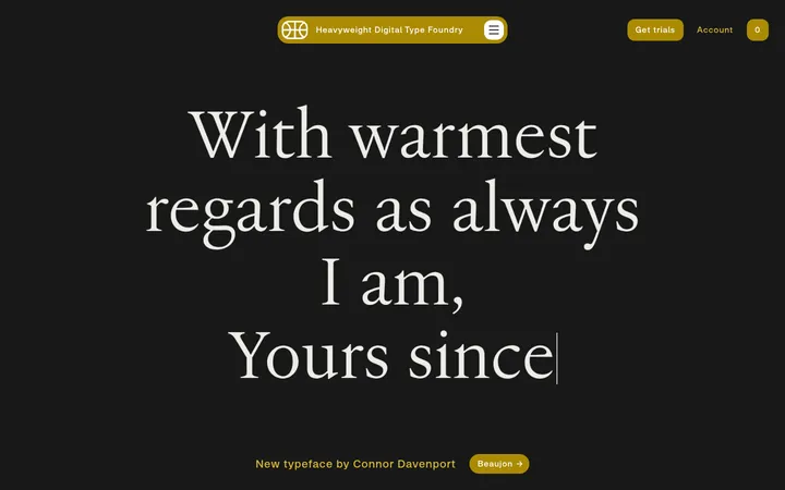
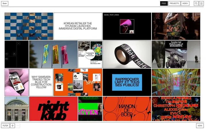
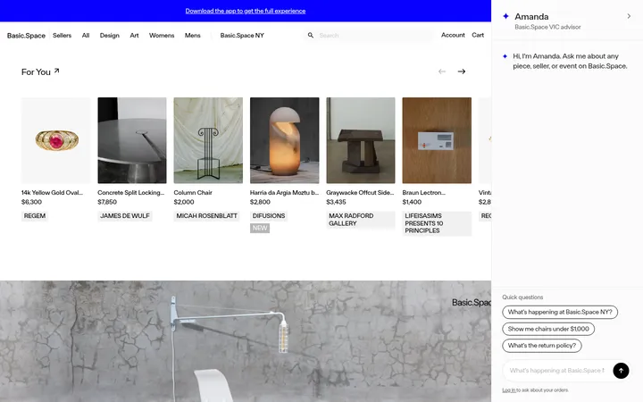
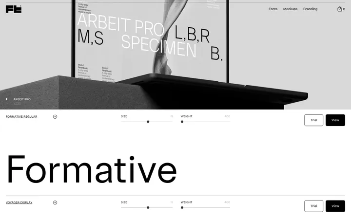
North star · Keep the interface restrained and let oversized, distinctive type specimens carry the visual drama.
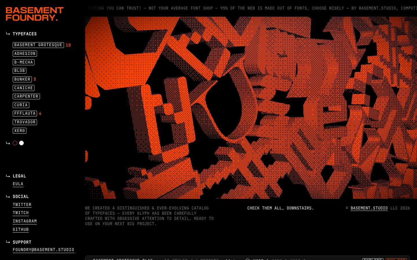
The visual system is built on a near-total black canvas, with #efefef lettering and thin #3a3a3a outlines establishing a stark, print-like contrast. #ff4d00 is a deliberately scarce signal: it marks selected navigation details, purchase actions, and the oversized halftone hero artwork rather than becoming a general background colour. The opening composition pairs a narrow, persistent left navigation rail with a broad media stage; below it, a single-column catalog lets each typeface claim a large specimen card. Cards remain flat and dark, so their lettering—not interface chrome—provides variety. Display faces change from specimen to specimen, while JetBrains Mono supplies uppercase utility text, metadata, navigation, and controls. The page is compact in its labels but generous around the large wordmarks, creating a rhythm of dense information and dramatic typographic pauses. Fine borders, minimal radii, and the absence of shadows keep the storefront closer to a graphic specimen sheet than a conventional retail grid.
配色
点色块复制色值。用途说明来自对页面的实测位置(背景、文字、描边、按钮)与截图判读。
品牌色
强调色
表层色
中性色
功能色
页面底色 · Foundry Black表层 · Deep Surface主文字 · Paper White次要文字 · Muted Graphite描边 · Rule Charcoal强调 · Signal Orange
文字
背景
对比度
WCAG
#efefef Paper White
#000000 Foundry Black
18.26:1
AAA
#efefef Paper White
#121212 Deep Surface
16.29:1
AAA
#747474 Muted Graphite
#000000 Foundry Black
4.49:1
AA-large
#747474 Muted Graphite
#121212 Deep Surface
4.01:1
AA-large
#ff4d00 Signal Orange
#000000 Foundry Black
6.31:1
AA
#ff4d00 Signal Orange
#121212 Deep Surface
5.63:1
AA
字体
字号阶梯:Custom(比例约 1.699,正文 14px)。示例用免费替代字体渲染,数值为实测。
Aa 设计
JetBrains Mono
网络字体 · 字重 400 / 700 · 占比 85%
免费替代:Space Mono
Navigation, body copy, captions, links, badges, buttons, and specimen metadata.
Aa 设计
Inter
网络字体 · 字重 400 · 占比 12%
免费替代:Inter
Occasional interface and card text, including compact specimen-card details.
角色
示例
字号
字重
行高
字距
特大标题
Hero-scale uppercase wordmark and prominent expressive specimen typography.
BASEMENT FOUNDRY
198px
400
1.1
0.01em
一级标题
Primary featured font specimen headline.
BASEMENT FOUNDRY
169px
400
1.1
0.01em
二级标题
Secondary large specimen titles or section headlines.
BASEMENT FOUNDRY
164px
400
1.1
0.01em
三级标题
Bold expanded uppercase display headings and specimen names.
BASEMENT FOUNDRY
120px
400
0.95
0.01em
四级标题
Distinctive display face for smaller feature or specimen headings.
BASEMENT FOUNDRY
90px
400
1.1
0.01em
正文
Compact uppercase catalog descriptions and supporting copy.
The quick brown fox 敏捷的狐狸
14px
400
1.3
0.01em
辅助文字
Tightly set uppercase metadata and small helper labels.
The quick brown fox 敏捷的狐狸
12px
400
1.5
0.06em
按钮
Uppercase mono text on explore and purchase controls.
The quick brown fox 敏捷的狐狸
14px
400
1.14
0.04em
导航
Uppercase mono labels in the persistent navigation rail.
The quick brown fox 敏捷的狐狸
14px
400
1.29
0.06em
链接
Small uppercase mono links for social, legal, and catalog navigation.
The quick brown fox 敏捷的狐狸
12px
400
1.5
0.06em
眉题
Short uppercase category labels and section identifiers.
The quick brown fox 敏捷的狐狸
14px
400
1.14
0.04em
代码
Mono-styled technical details and font specimen metadata.
const style = 1;
14px
400
1.3
0.01em
间距与布局
基准单位 4px · 密度:紧凑
38px版块间距
8px元素间距
—卡片内边距
1392px内容最大宽度
1px
2px
4px
6px
8px
10px
12px
15px
20px
23px
24px
30px
90px
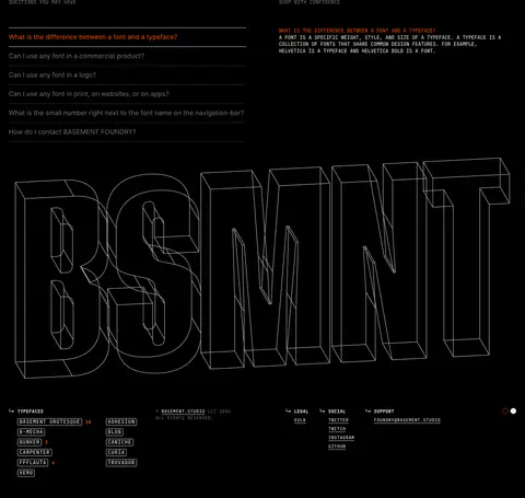
Use a measured page max width of 1392px and a compact, asymmetric composition. On desktop, keep navigation in a narrow left rail while the main column carries the hero and a vertical run of wide specimen cards. Align utility text and card headers consistently; let the oversized specimen words occupy most of each card. Use the measured 4px base spacing system and compact element rhythm, with clear pauses between major sections. The long catalog ends in FAQ content and a large graphic footer.
圆角与层次
按钮 · 50%
卡片 · 8px
徽标 · 3px
导航 · 3px
没有测到阴影:页面是扁平的,层次靠底色和描边区分。
The interface is predominantly flat: no measured shadows or gradients. Separate specimen cards with fine #3a3a3a outlines and restrained rounded corners, using contrast and spacing instead of elevation. Keep layering concentrated in the hero collage and outlined footer lettering.
组件
下面的预览按实测的按钮、输入框、徽标、卡片样式重建(字体用替代字体)。
Persistent side navigation
A compact black rail with an orange brand wordmark, uppercase mono links, outlined font-name chips, and grouped legal, social, and support links.
Hero artwork
A broad, high-contrast typographic collage in orange and black, framed by small uppercase ticker-like copy and supporting catalog text.
Font specimen card
A wide, dark card with a 1px #3a3a3a border and 8px radius; place a compact metadata header above oversized sample lettering.
Explore and buy labels
Small uppercase JetBrains Mono controls, usually outlined; use #efefef for Explore and #ff4d00 for Buy Now emphasis.
FAQ block
A compact two-column section with a stacked question list, fine dividers, and a short answer panel in small mono text.
Outline footer wordmark
A large wireframe-style typographic graphic above a dense, small-text footer navigation.
Imagery · The hero uses a dense orange-and-black typographic collage with a halftone texture, functioning as a graphic specimen rather than product photography. The catalog cards are primarily large rendered font samples on black, each showcasing a distinct face. Lower-page artwork includes outlined, dimensional letterforms; keep this as a monochrome graphic accent, not a competing full-colour illustration.
Reserve orange for selected actions and focal artwork.
Make type specimens the largest elements in the content area.
Set utility text in uppercase monospace.
Use thin charcoal borders to define specimen cards.
Keep navigation compact and aligned to the left rail.
✕ 不该做
Do not add gradients or drop shadows.
Do not use bright orange as a broad page background.
Do not standardize every specimen into one display typeface.
Do not turn the catalog into a dense multi-column tile grid.
Do not introduce decorative imagery that competes with the lettering.
Do not soften the interface with large, pill-shaped controls.
给 AI 的提示词
想快速出一个同风格的新页面,把这段话连同 DESIGN.md 一起发给 AI。
Build a new page in the BASEMENT FOUNDRY visual style. Use Foundry Black (#000000) as the near-total canvas, Paper White (#efefef) for primary text, and Rule Charcoal (#3a3a3a) for thin card outlines. Apply Signal Orange (#ff4d00) sparingly to key actions and selected visual accents; use Muted Graphite (#747474) for secondary text. Create a compact left navigation rail beside a broad main content column. Set utility labels and navigation in uppercase JetBrains Mono, and give the main content expressive, oversized specimen typography with varied display faces. Keep cards flat, dark, and outlined, with small metadata headers and ample room for samples. Favor clear vertical sequencing, tight information labels, and dramatic typographic contrast. Avoid shadows, gradients, ornamental UI, and generic product photography.