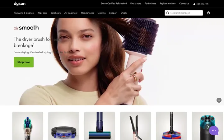
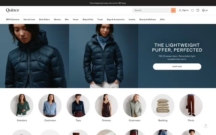
North star · Keep the storefront interface quiet and precise so striking gear photography and clear editorial hierarchy carry the experience.
The page uses a white canvas and near-black text as a quiet frame for gear photography, with black announcement and campaign bands supplying strong contrast. Pale gray-green surfaces distinguish controls and selected product areas without introducing a loud interface accent; warm yellow and earthy colors belong mainly to the hero artwork and product imagery, not the measured UI palette. Typography mixes expressive editorial headings with practical sans-serif navigation, product details, and forms. Some campaign headlines use uppercase display lettering, while section titles retain a more literary feel. The layout alternates wide, image-led campaign blocks with compact product and category grids, then returns to editorial split panels and a restrained footer. Generous white space separates these modules, while cards remain mostly flat and rely on image content, alignment, and subtle borders rather than shadows.
配色
点色块复制色值。用途说明来自对页面的实测位置(背景、文字、描边、按钮)与截图判读。
品牌色
表层色
中性色
功能色
页面底色 · Gallery White表层 · Soft Concrete表层 2 · Deep Black表层 3 · Mist Sage表层 4 · Night Panel主文字 · Deep Black次要文字 · Gallery White弱文字 · Forest Ink描边 · Quiet Line
Body copy, navigation, product details, links, and form text
Aa 设计
bryant
网络字体 · 字重 700 / 500 · 占比 20%
免费替代:Montserrat
Display headlines, uppercase section labels, and CTA buttons
Aa 设计
Exposure-10
网络字体 · 字重 400 · 占比 9%
免费替代:Cormorant Garamond
Editorial H1 and H2 headings
Aa 设计
Geist Mono
网络字体 · 字重 400 · 占比 3%
免费替代:IBM Plex Mono
Code-style or technical microcopy where present
角色
示例
字号
字重
行高
字距
特大标题
Large uppercase campaign headlines and prominent promotional statements.
Peak Design
64px
700
1.1
-0.005em
一级标题
Primary editorial heading within a campaign or feature panel.
Peak Design
48px
400
1.1
-0.01em
二级标题
Section-level editorial titles such as product and story introductions.
Peak Design
40px
400
1.1
-0.01em
三级标题
Bold uppercase category or feature titles.
Peak Design
32px
700
1.1
0
四级标题
Supporting card headings and secondary content titles.
The quick brown fox 敏捷的狐狸
25.5px
700
1.4
0
正文
Compact product descriptions, helper copy, and supporting text.
The quick brown fox 敏捷的狐狸
14px
400
1
0
按钮
Uppercase shopping and action labels.
The quick brown fox 敏捷的狐狸
14px
500
1
0.057em
导航
Main navigation and utility links.
The quick brown fox 敏捷的狐狸
16px
400
1.5
0
链接
Product names and inline destinations.
The quick brown fox 敏捷的狐狸
16px
400
1.5
0
眉题
Small uppercase labels above campaign or editorial headings.
The quick brown fox 敏捷的狐狸
16px
700
1.2
0.038em
代码
Occasional technical or code-like details.
const style = 1;
14px
400
1
0
间距与布局
基准单位 8px · 密度:适中
64px版块间距
24px元素间距
—卡片内边距
1312px内容最大宽度
2px
4px
8px
12px
16px
20px
24px
40px
64px
Use a full-width announcement strip and a clean horizontal navigation, followed by broad campaign imagery. Keep the main content within the measured 1312px maximum width and align sections to a consistent page grid. Product collections use dense multi-column rows; editorial stories switch to two- or three-column image-led blocks. Alternate compact shopping bands with spacious campaign sections, preserving the measured 64px section rhythm and 24px element rhythm. The overall density is comfortable, not sparse.
圆角与层次
按钮 · 4px
输入框 · 4px
卡片 · 8px
图片 · 8px
没有测到阴影:页面是扁平的,层次靠底色和描边区分。
The interface is largely flat: no measured shadows, with separation coming from white space, image boundaries, dark bands, and thin pale borders. Cards use restrained rounded corners, while controls have tighter corners. Keep image panels visually layered through cropping and contrast rather than artificial drop shadows.
组件
下面的预览按实测的按钮、输入框、徽标、卡片样式重建(字体用替代字体)。
Announcement strip
Slim black top band with a mission link, centered shipping and warranty message, and store-finder utility in light text.
Primary navigation
White horizontal bar with logo, product categories, search field, support, account, and cart utilities; use Geist for navigation.
Campaign hero
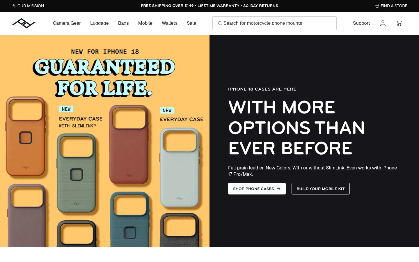
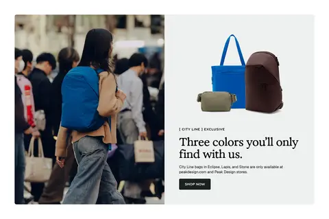
Large split promotion pairing colorful product artwork with a #15151a text panel, uppercase eyebrow, oversized heading, and contrasting CTAs.
Product carousel
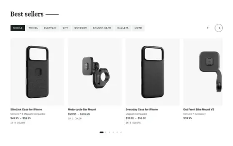
Best-seller row with category filters, isolated product images, compact names and pricing, and simple directional controls.
Category tiles
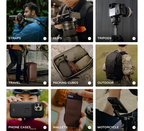
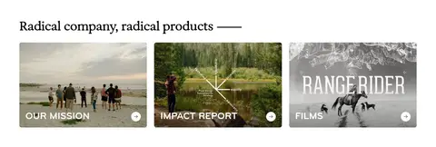
Image-filled gear category cards with bottom-aligned uppercase labels and small circular arrow affordances.
Editorial feature split
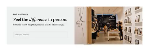
Two-part story panels combine lifestyle or factory photography with concise editorial copy and a clear action.
Newsletter form
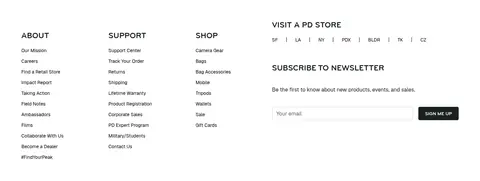
Footer subscription area with compact heading, supporting sentence, outlined email input, and dark signup button.
Imagery · Photography is the primary visual asset: isolated gear product shots sit beside outdoor, travel, and workshop lifestyle scenes. Use large edge-to-edge campaign images and tightly aligned product thumbnails; category tiles crop photography to fill their cards and apply dark overlays where white labels need contrast. The hero’s warm yellow field and colorful case lineup are artwork within the promotion, not a general interface palette. No decorative illustration system is needed.
Use white space to separate clear, purposeful content bands.
Keep navigation and shopping controls quiet and readable.
Let real product photography provide most visual color.
Use near-black panels for focused campaign contrast.
Pair editorial display headings with practical sans-serif details.
Make product grids easy to scan with consistent alignment.
✕ 不该做
Do not add gradients or decorative shadows.
Do not treat hero artwork colors as global UI accents.
Do not crowd product cards with excess copy.
Do not replace the restrained palette with bright interface colors.
Do not use one typeface for every hierarchy level.
Do not round large panels more than the measured card treatment.
给 AI 的提示词
想快速出一个同风格的新页面,把这段话连同 DESIGN.md 一起发给 AI。
Build a new Peak Design-style ecommerce page with a quiet, precise interface around expressive gear photography. Use Gallery White (#ffffff) as the primary canvas, Forest Ink (#1a211e) for light-surface text, and Deep Black (#000000) or Night Panel (#15151a) for focused inverse sections. Reserve Mist Sage (#eef1f0) for subdued control or card surfaces and Quiet Line (#cccfcd) for thin input borders. Pair editorial display headings with practical Geist-like navigation, body copy, and product details. Structure the page as broad campaign panels, scannable product grids, and image-led category or story blocks within a consistent content width and generous section rhythm. Keep cards flat, use photography rather than decorative graphics, and avoid inventing accent colors or shadows.