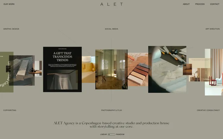
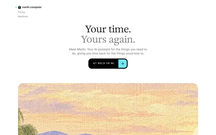
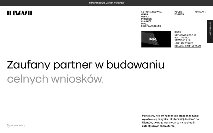
North star · Let the near-black canvas and generous empty space frame expressive type and large, purposeful content rather than decorating every section.
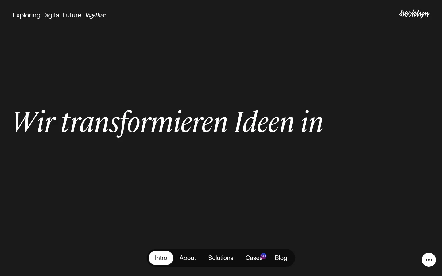
The visual system is built around a near-black #1a1a1a canvas that carries almost the entire page, with white type providing crisp contrast. Near-black #000000 appears in dark UI details, while #3b3b3b distinguishes cards and section surfaces without breaking the monochrome mood. The restrained blue-to-magenta-to-wine gradient is an accent, not a general background treatment. UniversalSans-500 handles navigation, body copy, service listings, and most headings; Cambon adds italic editorial character to the oversized hero and selected display lines. The layout favors a left-aligned reading edge, broad open areas, and long vertical pauses. Portfolio work and people imagery appear in substantial card-like frames, while services become a precise ruled list. Small white capsule controls contrast with dark floating navigation. Hairlines in muted gray quietly divide content; the page stays visually flat rather than relying on shadows.
配色
点色块复制色值。用途说明来自对页面的实测位置(背景、文字、描边、按钮)与截图判读。
品牌色
强调色
表层色
功能色
页面底色 · Studio Charcoal表层 · Absolute Black表层 2 · Card Slate主文字 · Paper Light次要文字 · Quiet Graphite描边 · Quiet Graphite强调 · Signal Blue强调 2 · Violet Wine强调 3 · Mulberry Red
Primary face for navigation, body copy, headings, service rows, links, and controls.
Aa 设计
Cambon
网络字体 · 字重 400 · 占比 7%
免费替代:Cormorant Garamond
Editorial display face for the expressive hero line and selected italic statements.
角色
示例
字号
字重
行高
字距
特大标题
Oversized editorial statements and expressive serif display lines.
Becklyn
92px
400
1
-0.013em
一级标题
Primary sans-serif hero heading and prominent page titles.
Becklyn
68px
400
1
-0.059em
二级标题
Section headings such as services, clients, and team.
Becklyn
42px
400
1.05
-0.024em
三级标题
Subsection titles and secondary content headings.
Becklyn
36px
400
1.15
-0.014em
正文
Introductory agency copy, descriptions, and article text.
The quick brown fox 敏捷的狐狸
20px
400
1.15
-0.025em
辅助文字
Compact card metadata, labels, and footer details.
The quick brown fox 敏捷的狐狸
12px
400
1
-0.042em
按钮
Navigation controls and interactive calls to action.
The quick brown fox 敏捷的狐狸
20px
400
1.15
-0.025em
链接
Inline navigation and text-based calls to action.
The quick brown fox 敏捷的狐狸
20px
400
1.15
-0.025em
间距与布局
基准单位 4px · 密度:宽松
260px版块间距
10px元素间距
—卡片内边距
1360px内容最大宽度
2px
6px
7px
8px
10px
20px
24px
40px
48px
Use a spacious, mostly single-column page structure within the measured 1360px maximum width. Keep content aligned to a consistent left edge, while project showcases and team content expand into multi-column grids. Long vertical gaps give each block a distinct entrance; the measured section gap is 260px. Case cards alternate broad full-width compositions with paired columns. Service content forms a full-width list with ruled rows. Maintain low density and generous negative space rather than filling every viewport.
圆角与层次
按钮 · 50%
卡片 · 10px
没有测到阴影:页面是扁平的,层次靠底色和描边区分。
The visual language is predominantly flat, with no measured shadows. Separate content through charcoal-on-charcoal contrast: #3b3b3b cards sit above the #1a1a1a canvas, while #000000 creates darker UI layers. Use thin #606060 hairlines for list separators. Card corners are measured at 10px; the floating navigation uses a dark pill and a white circular active control.
组件
下面的预览按实测的按钮、输入框、徽标、卡片样式重建(字体用替代字体)。
Floating section navigation
A compact black pill near the lower viewport edge, with text links and a white circular active item. Keep labels white and the active state sharply contrasted.
Editorial hero
A sparse, left-aligned statement on the dark canvas. Pair the large Cambon display treatment with UniversalSans for the contrasting continuation.
Project cards
Large portfolio media blocks arranged as full-width and paired-column compositions; card surfaces use #3b3b3b and measured 10px corners.
Services list
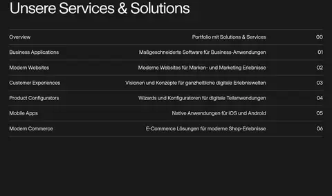
A full-width sequence of service names, short descriptions, and indices, separated by subtle #606060 hairlines.
Team cards
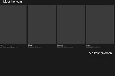
A multi-column row of portrait-led cards with names and role captions; maintain consistent framing and restrained dark treatment.
Editorial cards
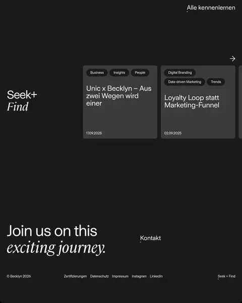
Charcoal article cards with compact dark category chips, white titles, and small date captions; pair with a separate editorial display label.
Footer statement
A large closing line combining sans-serif and italic serif styling, alongside contact and compact legal or social links.
Imagery · Large case-study images and team portraits provide the main visual material; client marks appear as a broad logo collection. Project imagery sits in substantial grid frames with softly rounded corners on cards. The page also includes editorial cards in charcoal surfaces. Treat media as content, not decoration: preserve its scale, let dark margins frame it, and avoid adding unmeasured illustration or color effects.
Keep essential copy and navigation in crisp #ffffff.
Reserve Cambon for selected expressive display lines.
Use #3b3b3b to distinguish cards from the canvas.
Preserve large, deliberate pauses between content sections.
Use #606060 hairlines to organize dense service rows.
✕ 不该做
Do not turn the gradient into a full-page background.
Do not introduce unmeasured palette colors.
Do not fill the negative space with extra UI.
Do not add drop shadows to the otherwise flat surfaces.
Do not use serif styling for routine navigation or body copy.
Do not shrink portfolio media into decorative thumbnails.
给 AI 的提示词
想快速出一个同风格的新页面,把这段话连同 DESIGN.md 一起发给 AI。
Build a new page in Becklyn’s dark, editorial agency style. Use #1a1a1a as the continuous canvas, #ffffff for clear type, #3b3b3b for card surfaces, and #606060 only for muted details and hairlines; keep #000000 for deeper UI layers. Treat Signal Blue #004eff, Violet Wine #710966, and Mulberry Red #8e2e45 as restrained gradient accents, not broad fills. Set routine interface and copy in UniversalSans-500 or a close sans-serif substitute; use Cambon or an elegant free serif only for large editorial statements. Align content to a consistent left edge, preserve very generous vertical pauses, and let case imagery occupy substantial grid areas. Use restrained card rounding, thin rules, and flat surfaces without shadows. Keep navigation compact and high contrast.