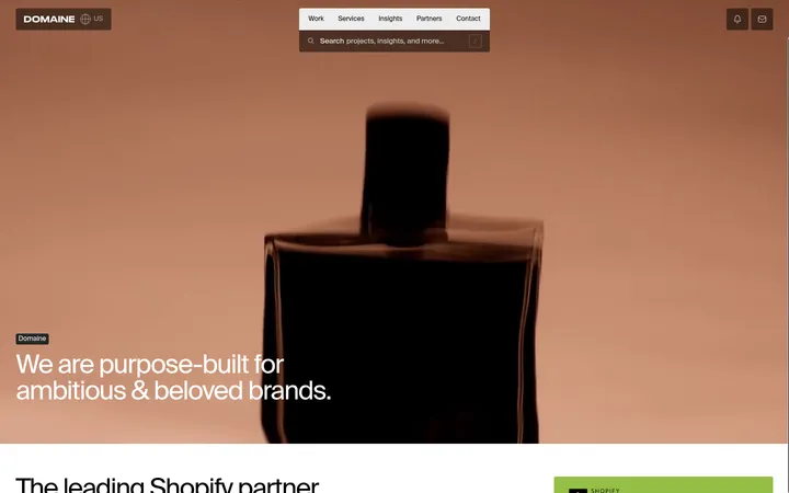
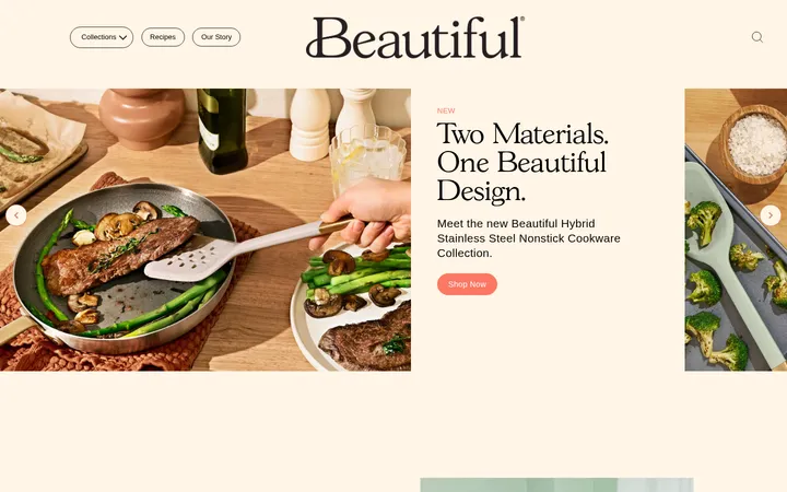
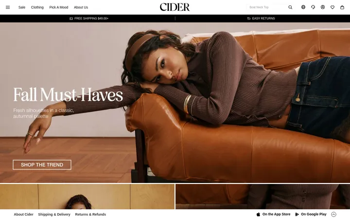
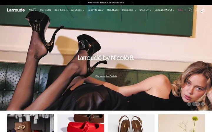
North star · Keep the page anchored in deep black and warm yellow, letting oversized editorial type and immersive beauty imagery lead while commerce remains concise.
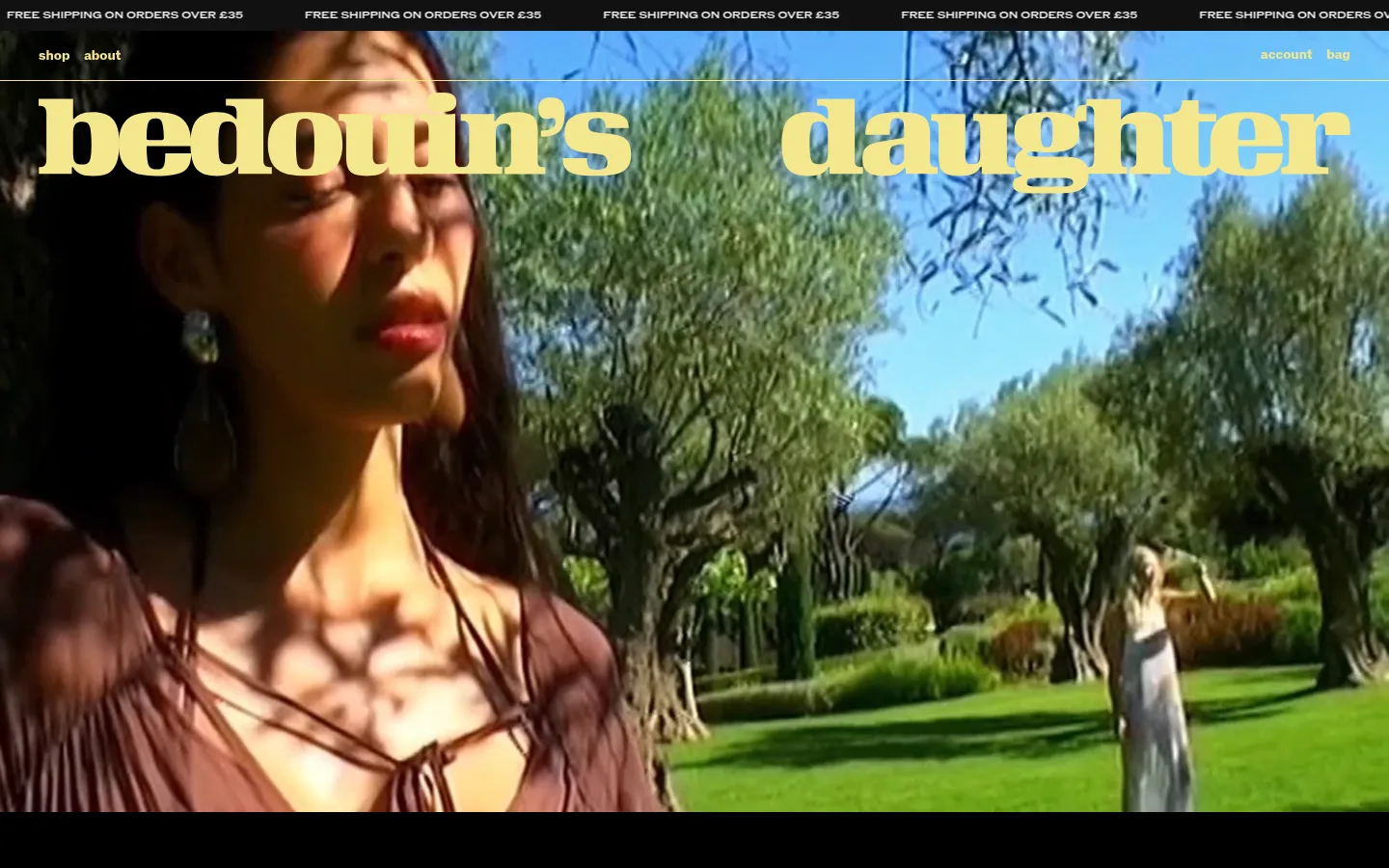
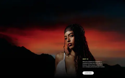
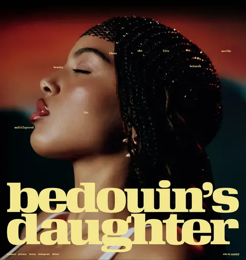
The visual identity is anchored by a black canvas (#000000) and a pale, warm yellow (#f5e78d) used for the oversized wordmark, navigation, headings, and fine rules. White carries product and campaign copy, while muted gray is reserved for secondary details. Near-black and charcoal surfaces separate the product area without breaking the continuous dark backdrop. ROM Extended creates bold, uppercase editorial headlines; ROM handles compact navigation and functional copy, while Gaisyr adds a distinctive serif-like voice to selected headings and captions. The page alternates full-bleed video and photography with spacious black intervals and a tightly organized product row. Campaign portraits are close-cropped, high contrast, and richly colored, with text layered sparingly over the image. The result feels like an independent beauty campaign rather than a conventional storefront: product information stays compact, and imagery, scale, and pacing establish the mood.
Navigation, body copy, buttons, and functional links
Aa 设计
ABC ROM Extended
网络字体 · 字重 500 · 占比 31%
免费替代:Space Grotesk
Small uppercase captions and editorial micro-labels
Aa 设计
Gaisyr
网络字体 · 字重 700 / 400 · 占比 19%
免费替代:Cormorant Garamond
Editorial subheadings and short expressive eyebrow text
Aa 设计
ROM Extended
网络字体 · 字重 400 / 700 · 占比 4%
免费替代:Bodoni Moda
Large hero wordmark and uppercase section headlines
角色
示例
字号
字重
行高
字距
一级标题
Oversized uppercase brand and campaign headline.
Bedouin's Daughter
48px
700
1.2
0
二级标题
Uppercase section and campaign titles.
The quick brown fox 敏捷的狐狸
24px
400
1.2
0
三级标题
Compact editorial subheads, often in Gaisyr.
The quick brown fox 敏捷的狐狸
20px
700
1.1
0
正文
Product descriptions and short brand-story copy.
The quick brown fox 敏捷的狐狸
14px
400
1.4
0
辅助文字
Small uppercase product and image labels.
The quick brown fox 敏捷的狐狸
10px
500
1
0
按钮
Bold uppercase shopping and action labels.
The quick brown fox 敏捷的狐狸
12px
700
1
0
导航
Bold lowercase primary navigation links.
The quick brown fox 敏捷的狐狸
14px
700
1.4
0
链接
Bold uppercase secondary action links.
The quick brown fox 敏捷的狐狸
12px
700
1
0
眉题
Spaced uppercase editorial overlines.
The quick brown fox 敏捷的狐狸
15px
400
1.4
0.04em
间距与布局
基准单位 4px · 密度:宽松
100px版块间距
64px元素间距
—卡片内边距
1360px内容最大宽度
3px
4px
6px
8px
10px
12px
14px
16px
20px
22px
24px
47px
64px
71px
100px
Use a spacious, full-width composition with a measured page maximum of 1360px. Build a continuous black frame that alternates full-bleed media with deliberately quiet dark intervals. The hero and campaign sections favor edge-to-edge imagery; the story uses a two-column split, and the product showcase presents a horizontal multi-item row. Align headlines and overlays to the image composition rather than forcing a uniform center. Keep generous measured section and element gaps, with dense information limited to product labels and small navigation.
圆角与层次
按钮 · 9999px
徽标 · 2px
链接 · 9999px
inset · button
inset · link
inset · button
The design is mostly flat: black canvas, dark section fields, and images create depth rather than card shadows. Use thin warm-yellow or white rules as separators and small outlined yellow badges. Buttons are pill-shaped and visually simple; avoid floating panels, heavy shadows, or layered card chrome.
组件
下面的预览按实测的按钮、输入框、徽标、卡片样式重建(字体用替代字体)。
Announcement strip
A narrow black top ticker repeats the white uppercase free-shipping message across the viewport.
Header navigation
Minimal overlay navigation uses warm-yellow lowercase links, with account and bag controls aligned to the opposite edge.
Hero wordmark
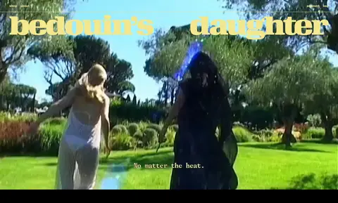
A very large warm-yellow ROM Extended wordmark sits over full-bleed video; keep the film visible as the background.
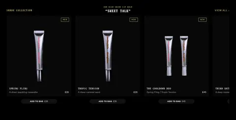
Product showcase
A compact horizontal row of product pack shots on dark surfaces, with small product names, prices, outlined NEW badges, and pill add-to-bag actions.
Campaign CTA
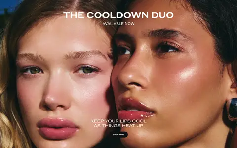
A full-bleed beauty image carries a centered white uppercase headline, supporting copy, and a small shop action.
About split
Pair a cinematic editorial image with a concise brand introduction and a white pill-shaped LEARN MORE button.
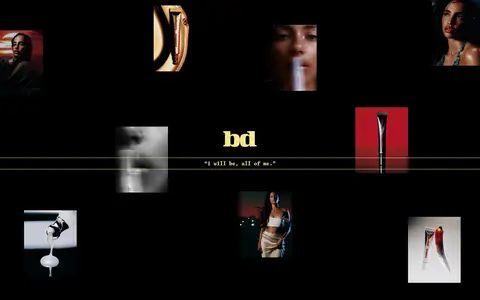
Editorial image gallery
Scatter varied campaign and product images across a black field, then anchor the composition with a centered warm-yellow statement.
Imagery · Lead with fashion-film video and editorial beauty photography, not illustration or decorative graphics. Use full-bleed campaign frames, close portrait crops, outdoor greenery, and warm sunset scenes; keep product pack shots on dark backgrounds in the showcase. Images can carry rich natural and skin tones, while dark fades near their lower edges support overlaid copy. Treat photography as the primary visual event and keep text overlays sparse.
Reserve #f5e78d for signature headlines, navigation, and fine accents.
Let full-bleed beauty imagery establish the mood.
Keep product details small and easy to scan.
Alternate immersive images with quiet black intervals.
Use uppercase display headings and compact functional labels.
✕ 不该做
Don't introduce unmeasured brand colors into the interface.
Don't wrap every product in a raised card.
Don't let copy compete with the campaign photography.
Don't replace the black canvas with a light storefront layout.
Don't use generic gradients as a substitute for the film imagery.
Don't overfill the spacious editorial sections with controls.
给 AI 的提示词
想快速出一个同风格的新页面,把这段话连同 DESIGN.md 一起发给 AI。
Build a new beauty-brand page in the Bedouin's Daughter visual language. Use Velvet Black (#000000) as the continuous canvas and Lemon Veil (#f5e78d) for signature navigation, wordmarks, and fine rules; use Studio White (#ffffff) for legible copy and light CTA treatment. Structure the page as cinematic, full-bleed beauty media alternating with calm black intervals and concise commerce content. Use ROM Extended-like display lettering for oversized uppercase headlines, ROM-like sans for navigation and controls, and restrained editorial contrast for subheads. Keep product photography on dark fields with small uppercase labels, compact prices, outlined badges, and pill actions. Favor close portraits, rich natural color, and sparse text overlays. Avoid heavy cards, pronounced shadows, decorative gradients, and crowded layouts.