North star · Keep the interface quiet and spacious so colourful skincare photography leads, reserving the vivid lime for the footer.
The page uses a nearly white canvas and dark charcoal text to keep attention on skincare packaging and campaign photography. Most sections stay visually quiet; pastel blue, pink, lavender, and mint appear chiefly in product imagery rather than as interface colours. The vivid lime footer is the page’s clearest chromatic brand statement, forming a strong closing band beneath the white content. Brown is the primary sans-serif voice: large, clean headings and readable product descriptions sit alongside compact uppercase labels and purchase actions. Sentinel SemiBold adds a secondary display character. Layout shifts between broad hero compositions, a compact bestseller product grid, paired editorial panels, a promotional split, and an image-led social gallery. Section spacing and simple alignment give each block room to breathe. Borders define actions and product controls; cards remain light and unshadowed, so imagery provides most of the depth and texture.
Primary body copy, product names, links, and several heading styles.
Aa 设计
BrownBold
网络字体 · 字重 700 / 400 · 占比 16%
免费替代:Inter
Bold headings, uppercase eyebrow labels, and compact purchase buttons.
Aa 设计
SentinelSemiBold
网络字体 · 字重 375 · 占比 10%
免费替代:Lora
Secondary display and editorial emphasis where a more distinctive heading voice appears.
Aa 设计
Brown
网络字体 · 字重 400 · 占比 9%
免费替代:Inter
Large section headings and prominent button text.
角色
示例
字号
字重
行高
字距
特大标题
Oversized campaign or hero heading treatment.
Drunk Elephant
66px
400
1
-0.03em
一级标题
Primary page or section headline.
Drunk Elephant
57px
400
1
0
二级标题
Major section headings such as Bestsellers.
Drunk Elephant
45px
400
1
0
三级标题
Editorial panel and feature headings.
Drunk Elephant
34.5px
400
1.2
0
四级标题
Smaller promotional or product grouping headings.
The quick brown fox 敏捷的狐狸
24px
400
1
-0.03em
正文
Campaign descriptions and product information.
The quick brown fox 敏捷的狐狸
20px
400
1.2
0
辅助文字
Compact supporting labels and metadata.
The quick brown fox 敏捷的狐狸
12px
400
1.4
0
按钮
Prominent action label styling.
Drunk Elephant
45px
400
1
0
链接
Product names and inline navigation links.
The quick brown fox 敏捷的狐狸
16px
400
1.2
0
眉题
Small uppercase category and section labels.
The quick brown fox 敏捷的狐狸
12px
700
1.2
0.05em
间距与布局
基准单位 2px · 密度:适中
50px版块间距
10px元素间距
10px卡片内边距
1400px内容最大宽度
3px
4px
5px
6px
7px
8px
10px
12px
15px
20px
40px
50px
57px
60px
The page alternates wide campaign compositions with contained shopping and editorial modules. The measured maximum content width is 1400px; sections range from a three-column hero to a six-column product area, paired feature panels, and a dense image-led social strip. Headings align to their section’s reading direction, with centered feature copy also present. Comfortable spacing separates major blocks, while product labels and controls are compact. The footer shifts into a broad, multi-column directory and a narrower legal and region-selection row.
圆角与层次
按钮 · 50%
输入框 · 5px
卡片 · 5px
图片 · 5px
徽标 · 3px
没有测到阴影:页面是扁平的,层次靠底色和描边区分。
The interface is predominantly flat, with no measured shadow system. Product and editorial panels sit on pale backgrounds, and thin charcoal borders make buttons legible without heavy framing. Subtle rounded corners appear on cards and media, while strong visual separation comes from spacing, photography, and the lime footer band rather than layered effects.
组件
下面的预览按实测的按钮、输入框、徽标、卡片样式重建(字体用替代字体)。
Announcement strip
A narrow charcoal top bar carries centered shipping information in small light text, with simple carousel controls at the edges.
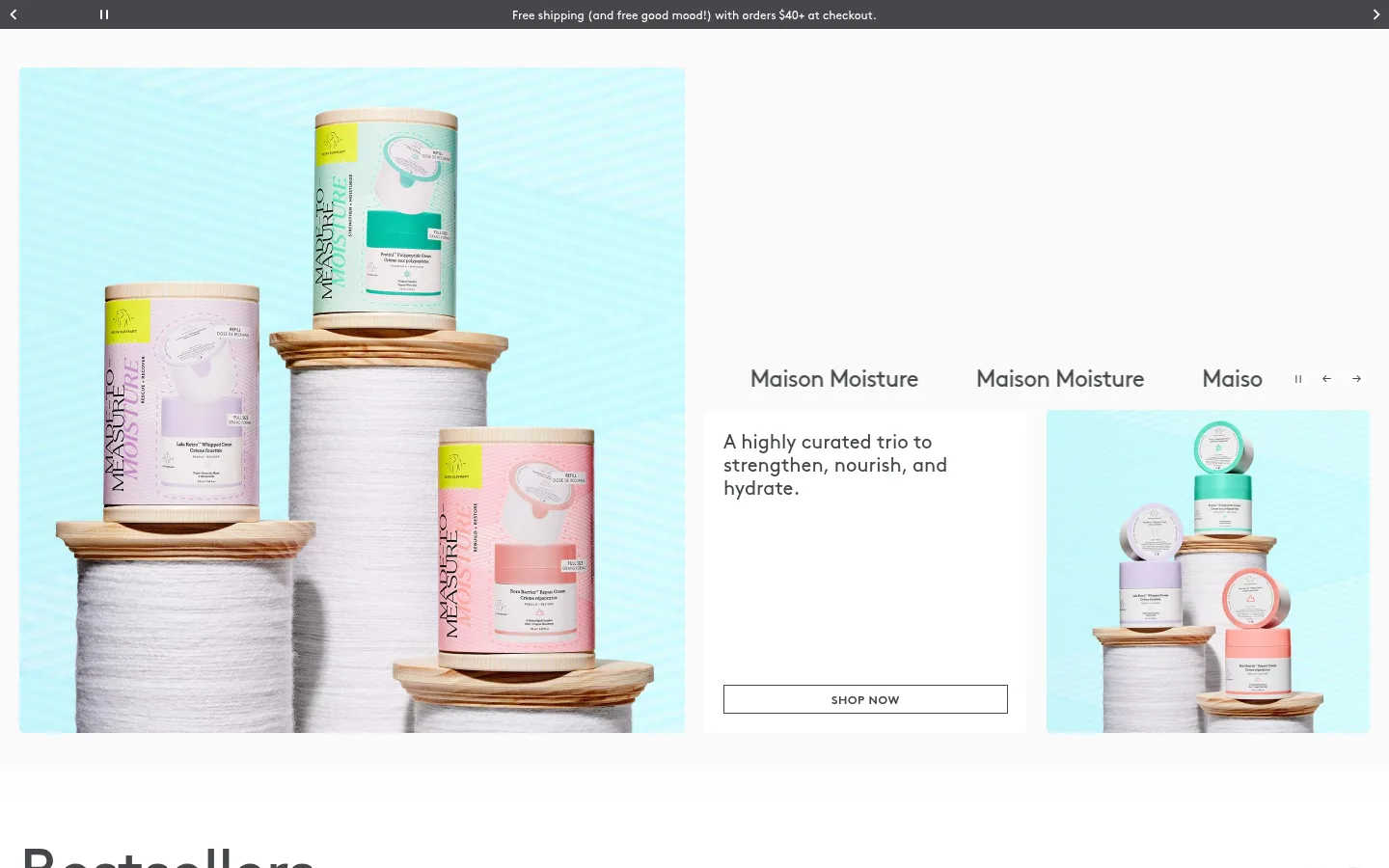
Campaign hero
A broad, media-led opening combines product photography, campaign copy, carousel labels, and an outlined SHOP NOW action.
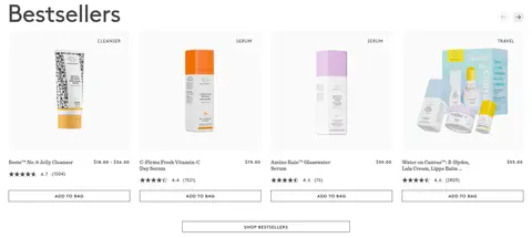
Bestseller cards
Product cards pair compact uppercase category badges, pack photography, product and price details, reviews, and outlined ADD TO BAG actions.
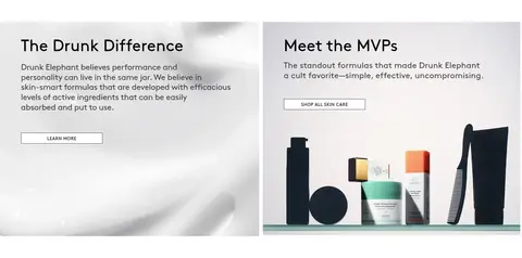
Editorial feature panels
Two adjacent panels mix a short brand story and a product-focused MVP feature with concise copy and simple outlined links.
Promotion split
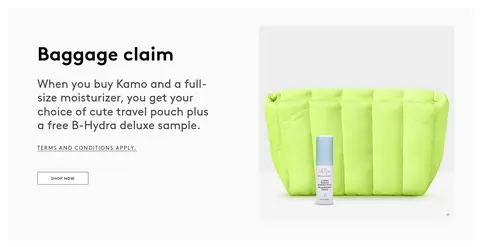
A text-led offer sits beside campaign imagery, with supporting terms and a small outlined SHOP NOW control.
Social gallery
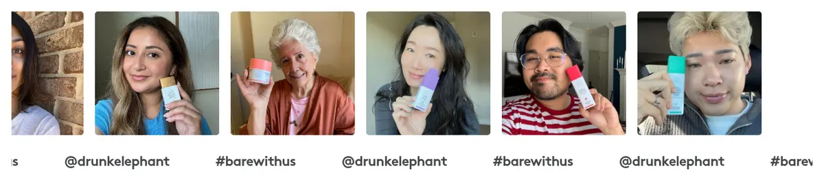
A horizontal feed of customer photos and creator handles adds human context and product-in-use imagery.
Lime footer
A vivid lime directory groups shopping and brand links into columns, followed by social icons, region selection, and legal links.
Imagery · Photography carries the colour and character: pastel-packaged jars and bottles are shown against pale blue, soft neutral, or clean white settings. The hero pairs a large product scene with a smaller campaign image and copy. Product cards use cutout-style pack shots, while promotional panels mix lifestyle imagery and product arrangements. The social gallery shows people holding products in a consistent horizontal strip. Video appears in campaign and promotional sections; there is no dominant illustrated interface.
Use near-white space as the default interface canvas.
Let packaging and campaign photography provide most colour.
Keep text and outlines in Soft Charcoal.
Reserve Citrus Flash for a strong footer or similarly contained brand band.
Use thin outlined actions with compact uppercase labels where appropriate.
Separate content into generous, clearly defined modules.
✕ 不该做
Do not turn pastel product-photo colours into dominant interface fills.
Do not add heavy shadows or layered card effects.
Do not crowd product imagery with decorative framing.
Do not use the lime accent as a full-page background.
Do not replace the quiet hierarchy with oversized blocks of dense copy.
Do not make every section use the same grid or alignment.
给 AI 的提示词
想快速出一个同风格的新页面,把这段话连同 DESIGN.md 一起发给 AI。
Build a new Drunk Elephant-style beauty storefront page with a restrained, bright visual system. Use Gallery White (#fafafa) as the quiet canvas and Soft Charcoal (#45474a) for readable copy, links, and fine button outlines. Keep Citrus Flash (#e6fe52) concentrated in a contained brand band such as the footer; Mist Blue (#e5f5fc) should remain a minor supporting accent, not a dominant interface fill. Set clean sans-serif typography with clear weight contrast, compact uppercase labels, and generous breathing room. Organize content into varied modules—campaign hero, product grid, editorial split, promotion, and gallery—rather than repeating one template. Let pastel product photography bring colour and texture. Keep surfaces mostly flat, use light borders instead of shadows, and make shopping actions easy to scan.